Havn.blog News
AITAH for Wanting 50% of Someone's Income, to Drive Them to the Hospital?
https://havn.blog/2025/03/01/ait...Last night I came across a guy, who had been mugged, stabbed, and was bleeding out. He desperately needed me to drive him to the hospital.
First I said: “Well, you shouldn’t have started it, when you allowed yourself to be attacked!”
Secondly, I said I could help him if he promised me 50% of his income, for the rest of his life. And then, for some reason, he got mad??
I said to him: “You don’t have any cards here.” And I told him that keeping 50% his income is better than the 0% he’ll get if he dies…
Am I the asshole, just because I wouldn’t help someone innocent in need, unless there’s something in it for me? Should I be punished, just because I had the means to help, with a car and all the time in the world?
(On a completely unrelated note: Slava Ukraini! ✊🏻🇺🇦)
1.3.2025 15:07AITAH for Wanting 50% of Someone's Income, to Drive Them to the Hospital?
https://havn.blog/2025/03/01/ait...On the Need for Friction
https://havn.blog/2025/03/01/on-...Imagine talking to a medieval farmer, about the concept of excercise. Giving yourself “useless” physical strain, to improve your health? Let’s call this idea artifical physical excercise. That wouldn’t make any sense to someone who would get more than enough strain through just living their life.
And while it will vary greatly, from person to person, how much artificial exercise is needed, everyone agrees that we need to look after our physical health in today’s society.
When discussing this, people will mention which of these they enjoy the most, which they find effective, how to fit it into their lives, etc. Some of it are games, competitions, sports, and more – and it can be your job, a favourite pastime, a hobby, or just something you tolerate.
It can also be adjustments you make to your life, like riding a bicycle to work, or changing your desk setup. Let’s call this incidental physical exercise, in opposition to deliberate physical exercise.
But, in this context, this is my main point about this: It’s very accepted to talk about doing things for your physical health, even though it might not be the most comfortable, fun, or easy.
And similar to how technological improvements increased the need to look after the health of our bodies, it has now made it important to look after the health of our minds as well.
Learning and AI
If you’re at the gym, there are many examples of how technology can enhance the effectiveness of our artificial physical exercise. However, using a forklift to lift weights might be more effective and comfortable, compared to doing it yourself – but it also makes the action completely useless! The point isn’t that the weights get lifted, but that you do it. This is in contrast with a warehouse, where the point is to get the stuff lifted.
One framework here, could be the difference between a tool and a machine. The former will enhance the user, while the latter replaces it. And when using AI, specifically for learning, some discipline is required to make sure that it remains a tool, and doesn’t slip into becoming a machine. This is one reason why I’m highly skeptical of giving young students unfettered access to LLMs.
A custom LLM implementation, with guard-rails that helps with this discipline, could be great for students, though. And LLMs also have great potential for teachers, as a machine can be more useful when the main point isn’t exercise.
It’s quite similar to the way we think about calculators in mathematics didactics. They’re obviously useful, and are a tool students need to learn to use. But they have to be used consciously. And when training your thinking, and establishing core understanding, they can be problematic.
Articles and videos with titles like “Junior Devs Can’t Code Anymore” are popping up, and give an interesting example of a border-case: In this case we are in a professional environment, where the work getting done is an important point. But over-relying on a tool, that might not help you develop as a professional, especially early in your career, can be quite dangerous.
As someone who only dabbles in programming, LLMs has made it possible for me to do and learn much more than I could’ve previously. But I’m trying to be conscious about it, by trying to do it myself the next time, really understand the core concepts and code I get in return, etc.
Cognitive health
I want it to be just as common to talk about doing things that are good for your cognitive health as for your physical health.
One example of this, was a recent video, by the beautifully nerdy YouTube channel Technology Connections, called Algorithms are Breaking How We Think. He’s talking about the value of friction, and I think it explains why we should be careful not to always do things the easiest way. This can be compared to taking the stairs even though the lift is easier – and would be an example of:
Incidental cognitive exercise
One of the problematic aspects of feeds like TikTok’s (and everyone wants to make those nowadays) is that they remove any kind of friction. And I don’t think it’s a good thing that we’re getting used to just having the apps serve us something, without making any choices. “I want to listen to music. Just give me some, Spotify – I don’t care what.” This is neither great for the arts nor our minds, I think.
I’m not saying that there are no good things about algorithms, and that we shouldn’t ever use them. For instance, discovery algorithms can be great to find new people. But it’s a bit like how it’s no problem for Jane Doe to always take the lift at work, if she’s very active in other parts of her life. But I, being a lazy slob, shouldn’t always default to the lift.
Relying less on algorithms isn’t only good for your mind – it also takes back some power from the platforms. If I follow a page on Facebook, it only nudges the algorithm to give me their content – Meta still decides. However, if I follow a blog via RSS, I will get the things they write – because I made a choice.
Junk food for thought
Incidental cognitive exercise is about making choices for “the future you”. But it does require some more effort to curate a Mastodon or RSS feed, as opposed to just opening an app that always gives you unlimited amounts of stimuli.
I think it makes sense to look at the hyper-algorithmic feeds, especially for video (TikTok, Reels, YouTube Shorts), as junk food for the mind. And that’s why I’m so annoyed when people over-emphasise “revealed preference”:
Placing this option in the context of Facebook and Instagram actually suggests that this feature won’t matter very much; both services make it hard to find, and revert back to the default algorithmic feed, and for good reason: users may say they want a chronological feed, but their revealed preference is the opposite.
— Ben Thompson / Stratechery
If I had the choice between a salad and a pile of McDonald’s, my stupid brain would want the burgers and fries every day. But I wouldn’t use that as proof that McDonald’s “is better”.
I don’t subscribe to every argument of Jonathan Haidt’s The Anxious Generation (some of which can be heard in this Hard Fork episode.) But if we gave our kids free access to McDonald’s, 24/7, how do we think that would affect their physical health? Would they be equipped to regulate that? And how often would they be too full to bother with the healthy dinner their parents have made?
I know that I can’t have candy in the cupboard, and that I’ll eat better if I make sure to have healthy snacks available. Doing this kind of effort can be compared to curating some (finite) feeds, like Mastodon or RSS, so that mindless scrolling isn’t the only decent option. Other things could be to charge your phone away from your bed (and keeping some good magazines and books close instead), and to only have good games on your devices.
Friction is underrated
There are many great parts about modern technology – including algorithms. It’s much easier to just say: “Let’s throw it all out!” But I think we need to strive towards keeping the good parts, like how social media can help to connect us, and LLMs can be great tutors, without being naïve regarding the negative.
And similarly to how it’s very common to discuss artifical physical excercise (both deliberate and incidental), to improve our physical health, we need to be more conscious about our cognitive health. I want more conversations about cognitive excercise – deliberate and incidental.
It’s very natural for us to want to avoid friction, of any kind. But the simple fact is that it’s good for us! And when technology has removed much of both the physical and mental strain, we have to add some of it back.
1.3.2025 14:24On the Need for Friction
https://havn.blog/2025/03/01/on-...In Defence of Netflix Not Being in the Apple TV App
https://havn.blog/2025/02/22/in-...I like the Apple TV (box). It’s the only way I watch TV! I like that it’s a competent and fast piece of hardware, without ads*, that gives me easy access to all the streaming I want.
That it’s an app platform, makes it easy for even my niche Norwegian services to be a part of the platform. It can also have things like the excellent Infuse media player (for local files and Jellyfin).
Apps can also choose to serve their content to Apple’s frameworks: This makes the content searchable with the global search, and also adds the content to the Apple TV app. A section of the app is “Up Next”, where you can continue watching things from different services:
It's called "Fortsett å se" (continue watching) in Norwegian. Here you can see things from both Max, Disney+ and Apple TV+.
However, annoyingly, Netflix doesn’t participate.
And before I defend them, I want to highlight the cynical reasons they don’t:
- It’s better for them if you stay in their app.
- The reason is that they can advertise new stuff (you’re not watching yet), to make sure you stay with the service. This is also why Continue Watching isn’t always at the top.
- If you’ve finished watching a show (perhaps through Apple TV (app)), you’ll might go on to something from another service next. And then you’ll might cancel your subscription after a while.
- They don’t have to.
- Even though they’re not as dominant as they used to, Netflix is really popular. So they feel like they can get away with not participating.
The mistake
Last week, there was a bit of writing because someone accidentally flipped the switch, and made Netflix actually participate:
Image from this Six Colors post.
Netflix quickly turned it off again – and the take that was the most popular in this cycle, was perfectly summarised by this great quote:
Netflix deeply regrets accidentally making Netflix a better product for its customers.
— Joe Rosensteel
As someone who uses both Netflix, the Apple TV (box), and Apple TV (app), Netflix participating would be better for me. But I think I have more understanding towards Netflix than most.
The defence
My first thought was that it was funny hearing someone like John Gruber criticising the move. When Apple themselves don’t play nice with others, to instead give users a unified experience (or whatever), he’s usually quick to defend them. And when they do this, it’s also because they’re dominant enough to not have to.
But I also think John Siracusa had plenty of good points on this, in the latest episode of Accidental Tech Podcast. And I’m stealing some of these here.
Control and competition
Because I think this, mostly, is a story about control. Apple is saying to the streaming providers: “Just give us the power and your content, and we’ll take care of delivering it to customers.” And as a user, I can see the appeal of this – but I think it’s a bit short-sighted.
I’ve noticed a major difference between the way antitrust and competition is viewed in the US and here in the Nordics: In addition to looking at things that directly affect consumers, we also think it’s important to make things better for small- and medium-sized companies – as this will indirectly be positive for customers in the long run.
And I get that Apple is far from being all-powerful in the streaming market. But they’ve shown what they do when they are, so I get why Netflix doesn’t want to contribute to this. Being the aggregator really matters.
If Apple’s business model here only was selling Apple TV boxes at a profit, I would 100% get behind blaming Netflix. A hypothetical contrast is the TV box Sonos is making: If I were the streaming providers, It would be much easier to trust Sonos to be fair, as they don’t have their own streaming service, and currently don’t demand a cut of everything.
But even though Apple do sell their hardware with great profit-margins, you can never have enough money. So they also want to inject themselves everywhere, and think they deserve 30% of every transaction that happens on their platforms.
But it doesn’t stop there: Apple also intends to compete in as many markets as possible themselves. (A 100% cut is even better than a 30% cut.) They’re investing a lot to build a direct competitor to Netflix, with Apple TV+.
Home screen vs. Apple TV (app)
On the home screen here, the competition between the services is fair.
However, Apple is pushing hard for Apple TV (app) to become the hub of the Apple TV (box), instead of the home screen. And here, there’s no reason to think they’ll fight fairly.
If you look at the screenshot above, from Apple’s own documentation, you can see that Apple TV+ and MLS are up top, while Max and STARZ are relegated to the bottom. And if you search for a movie, that can be purchased both on iTunes and on other platforms, which one do you think the UI will surface..? And I haven’t mentioned the millions of ways Apple can give preferential treatment to its own service in the Home tab.
Netflix could ask companies like Dropbox how much fun it is to compete with Apple’s services on Apple’s platforms… I’ve written previously about how I’m annoyed that I’m not allowed to use part of the 2 TB I have on Dropbox to store my photo library and automatic device backups. Apple is also the one controlling all the APIs etc.
So, when it comes to the balance between Apple and the other streaming providers, it’s easy to see why it’s more advantageous for Apple to funnel users to Apple TV (app), compared to the home screen. And a great example of how Apple uses its power in other areas, is that they’ve changed what the home button of the remote does by default: It will now send you to the app instead of the home screen. Also notice how this puts pressure on Netflix: As it causes users to need more clicks to go to the Netflix app. And remember that there isn’t a separate app for Apple’s own streaming service, so this is also a bit like turning one of the buttons on the remote into something similar to the Netflix or Hulu buttons you’ll see on some TV remotes.
If I’ve understood it correctly, services aren’t allowed to have their content show up in OS search unless they also provide the content to the Apple TV app. This is another example of how it’s easier to compete with other trucking companies if you also own the roads.
Don’t worry, Netflix will probably cave in the future.
They’ve obviously built support for this feature (that they accidentally turned on), which might be a part of an ongoing negotiation. And I won’t claim that this won’t be better for consumers! Because the simple argument is that choices are always good, and you’d then be able to choose to watch through the Netflix app or the Apple TV app. Let’s not forget all the cynical reasons why Netflix wants to keep you in their app!
And I get that it’s tempting to not have much sympathy for any company – especially one as large and powerful as Netflix. But do think it’s a bit short-sighted of consumers to push for even more concentration of power in the tech sector.
22.2.2025 13:39In Defence of Netflix Not Being in the Apple TV App
https://havn.blog/2025/02/22/in-...As a European, from a country that literally borders Russia, the US feels like less of a friend than someone like China. If you’re an...
https://havn.blog/2025/02/19/as-...As a European, from a country that literally borders Russia, the US feels like less of a friend than someone like China.
If you’re an American reading this, think about your own views on China, and their companies… And perhaps this makes it easier to understand why I’m so bothered about American companies insisting on owning and controlling every part of my life.
(Not that I like the CCP… People are usually fine, though! 🫶🏻 Also, I wouldn’t mind arguments for why I’m wrong. 🙏🏻)
19.2.2025 16:50As a European, from a country that literally borders Russia, the US feels like less of a friend than someone like China. If you’re an...
https://havn.blog/2025/02/19/as-...My Blog's Photo Workflow, Powered by Shortcuts
https://havn.blog/2025/02/18/my-...And Thoughts on Alt Text
I use many images on my blog. But that’s not because I’m a photo blogger, or use a lot of decorative illustration images – it’s usually because I want to show and/or explain something.
I’m pleased with where my flow for uploading these, and adding them to my blog posts. So I would like to show what it looks like, and give thanks to Jarrod Blundy over at Hey Dingus, as I’ve built it around a shortcut of his.
The shortcut starting point
Jarrod has shared plenty of cool shortcuts, over at his Shortcuts Library. And the one I started with, was the one called Bulk MB Image Uploader. The point of this was to be able to upload several images at once to Micro.blog – which is the hosting provider we both use. However, uploading in bulk like this isn’t necessary to me. I just used the framework surrounding access to the Micro.blog API/app token, so I don’t have to use the website, and can do it all from shortcut actions.
More features
After being yelled at, by various web efficiency tests because my website used too many resources, I wanted to optimise the way I use images. And this involves two steps: Compress the main images, and add lazy loading (with a temporary lazy image, that keeps the layout while the image loads).
So, my version of the shortcut (which only works with one image at the time), actually uploads two images to Micro.blog:
- One “full-sized” WebP version,
- and a lazy placeholder PNG version (that has only 24 pixels as its max height/width).
I’m using Jason’s GLightbox plugin for Micro.blog to get a lightbox for the images, and I combined that with this guide for lazy loading.
So the code my image uploader shortcut spits out, looks like this:
	<div class="lazy-placeholder large"
		style="background-image:
		url(LINK-TO-LAZY-PLACEHOLDER.png);">

		[[<glightbox src="LINK-TO-MAIN-IMAGE.webp"
		alt="MORE ON ALT TEXT LATER." title="" description="" >]]
	</div>
I can edit "large" to "medium" or "small" if I don't want the image to be full width. And I rarely add title or description – but I thought I'd just leave them there.
Annoying conversion journey
Shortcuts has a built-in Convert Image action (shown above) – but it’s really lacking. It can only convert to JPEG, PNG, TIFF, GIF, BMP, PDF and HEIF (so now WebP), and you generally don’t have plenty of options, for instance for compression. The good thing, is that these work on mobile as well!
I do use the built-in actions to create my lazy-placeholders, though. 👆🏻
But as I almost always do this on my Mac, I went searching for third-party Mac apps to help me with the conversion of the main image.
Both Squash and Permute have seemingly perfect Shortcut actions for stuff like this.
But Squash has an annoying bug, where it will add a “you’re using the free version” watermark, even though I’ve unlocked the app. It’s also very slow. The good thing is that, just like the built-in action, it’s able to just do the conversion and hand off the new images to the next part of the shortcut.
With Permute, I have to save the converted images to disk before passing it on. The thing that bothered me with this solution, though, is that it kept asking where I wanted to save the images, and also open up Permute when it performed the action.
The optimisation app Clop trotted in to save the day, though!
I still need to save to disk, though – but I just save them into a temp folder I've made, that I just clean out from time-to-time.
Framing screenshots
As my images will often be screenshots, I’m also a heavy user of the app Shareshot. This will take a screenshot, and either add a device frame, or some padding like on the images I’ve had in this post until now.
My uploader shortcut now asks me, “Do you want to frame the image?”, and will perform this before sending it to Clop etc. I can choose the following:
- No
- Yes, Square
- Yes, Fit Frame (with small padding)
- Yes, Fit Frame (with medium padding)
The image above is of the Square preset (when it detects an iPhone screenshot), and is from this blog post about Tapestry.
Alt text
The original shortcut has the option of adding automatic alt text generation with a module and OpenAI Vision. (And this just got a nice update!) However, I’ve turned this off.
Here’s the thing: The generated alt text is very competent – but it doesn’t know anything about the context in which I’m using the image. So I found myself heavily editing the alt text 100% of the times.
It is intended that this image description be used as a starting point for your alt text. You should review it, and edit or add to it as needed. – Jarrod Blundy (creator of the shortcut)
I can see the benefit of this starting point. But for me, it turned out to be faster to just have the shortcut allow me to manually type in the alt text.
My approach to alt texts
Let me first say that I would love to get feedback, especially from users of alt texts, if there's something off about my approach, or practice of it!
When I write alt texts, I like to think of it like I’m reading the blog post out loud to someone (over the phone, or whatever).
I also don’t want to waste the time of those reading with screen readers, so I try to reduce redundant and unimportant details. For instance, the alt text of the Tapestry screenshot above, in this post, is: “An iPhone screenshot with an iPhone frame, and padding that makes it a square.” As the point in this context was to show off that specific screenshot type, I focused on that. I didn’t mention that it was from Tapestry, as that’s mentioned in the caption. And the text content of the screenshot was completely irrelevant.
Mentioning the iPhone frame and padding would’ve been completely irrelevant when I used the exact same screenshot in the post about Tapestry. And this is an example of how alt text completely changes from one context to another.
I’m also not afraid of having the alt text simply be “explained below/above” if I truly give all the relevant information in the blog post itself. This is because I imagine it being annoying to get the same information twice.
Another example, from another blog post:
“And I get that many might like the things I don’t. So I think the answer is more customisation – like this settings screen from Mona:”
In the original context, my alt text was “I can adjust text size, text spacing, how much of the display name to show, the shape, size, and placement of the avatar.” — while in this context, it was simply “explained below”.
The o1 model (even more powerful than the 4o from the original shortcut) gave me this, by using Jarrod’s great “complex prompt”:
A smartphone settings screen shows a Mona app preview, displaying a welcome message to @MonaApp with a cat-face emoji, and listing customisation options like text size, username, and profile photo details.
— o1
It is good – but it wouldn’t really help me get to my alt texts faster.
I think it’s more relevant with other types of images, though (not screenshots) – but when I’m in blog writing mode, I don’t think it’s a big issue to just type out the description.
So, this is the flow I get when I hit the global hotkey to upload images for my blog posts:
I usually pick from Photos.app, as my Cleanshot screenshots also gets added there automatically.
The alt text for the image above here, is: "I then get prompted for the alt text. (Writing this alt text was kind of meta…)" If I think of one, I don't mind adding little easter-eggs to the alt text – (hopefully) as a treat. ☺️
I wait a bit, and then get this notification. Then the code is ready to be pasted into the blog post.
A bonus shortcut
Here’s a link to the shortcut from above – but I’m not sure how useful it is. It’s very customised to my need, and I like to create module-based shortcut. So, for instance, the WebP Converter and Lazy Image Generator are different shortcuts. This makes it easier to plug-and-play with different ones (like one for Clop and one for Permute). But perhaps someone would like to poke around, and can get some inspiration from the mess…
I’ve also made a much simpler shortcut, for when I just need a quick markdown image (like in a note): This just uploads one compressed image, and then gives a simple markdown image link, with no alt text.

So with this, I just get back something like this. 👆🏻
Now, I haven’t managed to get this shortcut to work with uploaded videos – so I would love to hear if someone has had success with this. Oh, and remember to check out Jarrod’s blog and Shortcuts Library!
18.2.2025 13:40My Blog's Photo Workflow, Powered by Shortcuts
https://havn.blog/2025/02/18/my-...✉️ Tapestry Feedback Feedback Feedback
https://havn.blog/2025/02/15/tap...Not too long ago, I wrote some feedback to Iconfactory’s latest app, Tapestry. I just got some great feedback on that, from them, so I wanted to provide a response.
Here’s what they wrote, on Mastodon:
There’s a lot in your post. Thx for such thoughtful feedback, it’s appreciated. Some things like the ability to turn off the service name is coming. The thing to keep in mind is this: just because a particular part of the design doesn’t work for you, doesn’t mean it wasn’t designed that way for a reason that you may have not considered.
The service name is a perfect example. Lots of people are colorblind or even unsighted. To them they cannot tell posts apart simply by color.
So while we are going to add the ability to turn off the service name, that’s why it’s there by default. Avatars are never going to move to the right side. Their placement was carefully considered as was how they appear with their transparency.
Everything you see is the result of over a full year of design, testing by over 1,500 TestFlight backers & then tweaking to adjust things that didn’t work as well as originally planned.
In the end Tapestry may not be for everyone & that’s fine
If Tapestry ends up looking & behaving like Reeder or Surf or… what’s the point? We designed the app the way we wanted it to look & behave using feedback from our testers as a guide. The design will continue to evolve based on feedback like yours (which is thoughtful) but it can never be all things to all people.
Many have told us they love Tapestry so it seems to be doing a lot of stuff right but it can always be better. We’re gratified but will continue to improve going forward. 👍
— Iconfacory
Here’s my response:
Thanks for reading my feedback, and getting back to me with such an interesting response! And looking back at my own feedback, I see that it was harsher than what was intended… Sorry!
The thing to keep in mind is this: just because a particular part of the design doesn’t work for you, doesn’t mean it wasn’t designed that way for a reason that you may have not considered.
Yeah, I totally get this! And as I said in the original post, I know that you are great designers (better than me), so I assume you don’t just do things at random, hehe. This isn’t necessarily a 1.0 feature, but that’s why I love being able to do little tweaks and customisations in the settings of apps: Because what’s right for some, isn’t right for others.
And I didn’t mean that I expected every piece of customisation to be there in 1.0. I just meant that, as the app evolves, it’s possible to allow users to tweak things to their liking. (Like how I, in the Markdown app I’m writing this in, can choose if Cmd+I give me underscores or asterisks for italics.) It was absolutely the right move to first launch with both colours and service name. 👍🏻
Avatars are never going to move to the right side. Their placement was carefully considered as was how they appear with their transparency.
(…)
If Tapestry ends up looking & behaving like Reeder or Surf or… what’s the point? We designed the app the way we wanted it to look & behave using feedback from our testers as a guide.
I’d love to hear about your considerations for the avatars. (I assume you’re right, and that there’s just something I don’t see.) I especially don’t understand why you wouldn’t even consider being able to move them as an option, heh…
I did a quick mockup of what it could look like: 👇🏻
The most obvious compromise is the timestamp.
And the original, the way it is currently: 👇🏻
And here’s another version, where I’ve taken back some left-margin, and made the avatars small enough to fit the timestamp below (even on short posts, like the second Mastodon post): 👇🏻
With this setup, the content could've been a bit wider (to the right).
And while it’s perfectly fair to prefer them on the left, I don’t think it’s fair to say that it doesn’t still look and feel like Tapestry. I’m “just” advocating for the user to be able to do some tweaks (specifically being able to, as options, turn off service name, adjust font sizes, and move the avatars) – not demanding that it looks just like Reeder. (Even though the specific thing with the avatars on the right is available there.)
There are plenty of things I like about both the app and the design! (I’ve been using it full-time since the last post. I especially like the colourful design, and the way I can quickly move between compact, expanded, and full view of posts.) I guess that’s why the things that bother me matters more, if you know what I mean.
And sorry for not coming with the feedback sooner. I’m also a Kickstarter backer, has had the TestFlight since it launched, and has had these opinions since then, heh. (Not that it necessarily would have mattered, if I’m alone in having those opinions: Loving the colours and vibe, but wishing for tweaks to clean it up a bit.)
You, of course, don’t have to listen to, and spend time on, a noisy customer like me! But I’m genuinely interested in hearing about the considerations – as I both find it interesting to discuss, and something to learn from.
Have a nice weekend!
-Erlend
15.2.2025 22:25✉️ Tapestry Feedback Feedback Feedback
https://havn.blog/2025/02/15/tap...✉️ Micro Social: A New Third-Party iOS App for Micro.blog
https://havn.blog/2025/02/15/mic...And Some Very Early Feedback
Greg Morris is someone whose blog I’ve followed for a while, but I didn’t know was a developer. But now he has released a third-party iOS client for Micro.blog!
As he’s mentioned, it happened “quite accidentally”, and it’s very early days. So this post is just me letting people know it exist, and providing some very early feedback.
To Greg:
Oooh, I love that you’re making this! I’m 100% in the target demographic for Micro Social. (Someone who uses, but doesn’t like, the default Micro.blog app — and is willing to pay for something better.)
I’ll try to provide some more useful feedback later, as I’ve used the app more, that you can use if you’d like. 🙂
Here are some first-impressions:
(In general I like it! So these “negative” comments are meant to be constructive. 🫶🏻)
I’m currently running an iPhone 13 Mini — so the phone is probably both older and smaller than what you use. ☺️
I had several crashes two updates ago, but it’s fine now. But I’ve noticed that avatars load slowly when I scroll (even if I scroll slowly). Maybe you can have the lazy loading start “earlier”?
I really like that you have avatars and names on a separate line, so you can use full-width content. (Instead of having weirdly large left-margins, that far too many apps has. I have strangely strong feelings about this…)
I also really like the “card look”:
The muted card around the OP is a nice touch.
However, on my Mini phone, I wish you were a bit more stingy with the padding, as the content gets too narrow. Especially on the timeline, due to the extra arrow on the right side. Is this needed?
I don’t know if it’s possible, but perhaps consider moving the arrow to the block with the avatar and username, to allow (full) full width for the content? Not as pleasing – but the little arrows take up a lot of space now, as it’s the full height of the entire content (including images).
My blog is proof …
… that I like the look, hehe. And I don’t know if you have as much control over spacing as I have with CSS and clamp. But as I’ve already worked on optimising very similar spacing for my little phone, I wanted to show my work. And then you can steal it if you would like to, or ignore it if not.
We have very similar padding on “the card” – but I went for half that amount on the outside/gutter. I mashed up the screenshots here, to show the effect (but the largest effect is on the right margin, due to the arrow):
That’s it, for now!
I’ll keep using it, and might provide additional feedback later. It’s already better than the official app, IMO. 👏🏻
I’ll also be the first to buy it when you launch that part of the app. Best of luck!
15.2.2025 15:22✉️ Micro Social: A New Third-Party iOS App for Micro.blog
https://havn.blog/2025/02/15/mic...Det må være lov med kompliserte løsninger på kompliserte problemer
https://havn.blog/2025/02/12/det...Støtte til Høyre (fra en som aldri vil stemme på dem)
For litt siden presenterte Høyre sine forslag til tiltak mot problemer grunnet høye strømpriser. Og i lys av svake målinger for dem, har blant annet Aftenposten flere ganger kritisert forslagene for å være for kompliserte. Dette irriterer meg. Men jeg mener også det er alvorlig.
For, det viktigste med en løsning er ikke om den er lettfattelig, men om den virker etter hensikten.
Selv er jeg noen som nok aldri kommer til å stemme Høyre – og jeg må innrømme at jeg synes det er bra at Arbeiderpartiet gjør det godt på målinger. Jeg er heller ingen ekspert på strøm-anliggende – men for meg virker det som om Høyres forslag har noen gode ting for seg:
- I Arbeiderpartiets forslag, vil de som bruker mest strøm være de som får mest i strømstøtte.
- Dette er hverken særlig sosialt, eller noe som gir riktige insentiver til sparing, ENØK-tiltak, kraftutbygging, osv.
- I tillegg har de ikke løsninger for bedrifter.
Men hovedpoenget mitt er ikke om løsninga til Arbeiderpartier eller Høyre er best. Jeg bare vil ikke at media skal mase om at politiske løsninger først og fremst må være enkle.
Det er selvsagt helt greit å mene at en løsning ikke er god, og eventuelt forklare hvorfor. Men hvis ikke, vil jeg heller at de skal hjelpe folk med å forstå – ikke kreve fordumming.
Altså, det er jo fryktelig flott når det enkle viser seg å være det beste. Og det er viktig at politikk kommuniseres på en så lettfattelig måte som mulig. Men verden er ganske komplisert (inkludert kraft- og klimapolitikk) – og ikke alt har enkle løsninger.
Jeg synes særlig en avis som Aftenposten burde holde seg for god til å nøre opp under et forenklet verdensbilde, som først og fremst tjener populistene. Det er utrolig viktig at nyanser har livets rett.
En myte om skriveredskaper i verdensrommet
Legenden vil ha det til at NASA på et punkt oppdaga at kulepenner ikke fungerte særlig godt uten tyngdekraft – og dermed brukte mye penger på å utvikle en penn som kunne skrive i vektløshet. De sovjetiske kosmunautene løste det med å bare bruke blyant.
Denne historia trekkes ofte fram for å vise at “det enkle er ofte det beste”. Men, ikke bare er den usann. I tillegg viser seg at romfart også er ganske komplisert! (Noen vil kanskje til og med kalle det “rakettforskning”.) Og grunnen til at de ikke ønsket å bruke blyanter var at de kan brekke, og at flak fra dem kunne komme på avveie og skade utstyr og personale. I tillegg er blyanter brennbare – noe NASA hadde stor respekt for.
Derfor viste det seg at en bedre løsning var en penn av tungsten og karbon, som skrev ved hjelp av trykk skapt av nitrogen, og med tiksotropisk blekk – selv om den er mer komplisert enn en blyant.
Det kan godt være at Arbeiderpartiets løsning er bedre enn Høyres. Og i såfall er det jo en fin bonus at den er enklere! Men “enkelthet” bør ikke være for høyt på lista over kriterier, når vi vurderer løsninger på kompliserte problemer.
12.2.2025 19:54Det må være lov med kompliserte løsninger på kompliserte problemer
https://havn.blog/2025/02/12/det...The Paper Dev Should Give Their Take on a Tot-Like App
https://havn.blog/2025/02/11/the...I recently wrote a review of Iconfactory’s great app, Tot.
I like it – but editing text in it does make me miss my favourite places to do this: Paper and Bike.
And this process made me realise that the Paper dev has all* the pieces in place to give their take on an app like this. And it makes sense from a business perspective!
The reasons I don't just use Paper for this now, is that I would like it to be a separate app that could have its own hotkey, and that I could turn on Stay in Front just for this other app. I'm looking into options for having two instances of it open, heh.
The pieces
- A best-in-class text engine, that can jump between Markdown (plain-text) and Preview (rich text) Modes.
- This is also already great on both Mac, iOS, and iPadOS. (No Apple Watch, though.)
- The UI is made to be minimalistic, mimicking just a piece of paper.
- Paper ships with several beautiful accent colours, and great support for them in the UI.
- It also provides good export features. (Including for copy/paste.)
Here’s what I would do:
My suggestion for a name (also to make it easier to discuss here) is Slate.
A slate is a thin piece of hard flat material, historically slate stone, which is used as a medium for writing.
— Wikipedia
The next question is how much it’s OK to copy from others. Let’s pretend it’s fine to take all …
The best parts from Tot:
Fixed number of notes
I really like that Tot only supports 7 notes, that are all “internal” to the app. I also love how they’re distinguished from each other by colours.
These 7 accent colour options are already built into Paper (plus black and custom). As you can see, you can tint both the icon, text, Markdown syntax and background.
Having exactly 7 would a bit on-the-nose… But one of the reasons I liked the “Slate” name, is that you could one-up, rhyme, and go for 8!
Perhaps the 8 notes could be regular, accessible Markdown files in the app’s iCloud folder, to simplify automation? But that you can’t create other notes with the app, and it can’t “find” other notes if you place them there.
The business model
Tot is free for the Mac, and a one-time purchase for each extra platform (iOS and Apple Watch). I think something like this could be a good idea for Slate as well.
You could also consider just having it be free, and the business model being to funnel people into Paper. Once people get the taste for the great writing feeling, they might want a more powerful app, that can also edit files.
The whole point of this post, is that I don't think it would be that much work for the dev to make this thing. But as Paper doesn't already have an Apple Watch app, that would have to be something for a later time…
What to take from Paper
See my full review for why the general text engine is terrific. I’d, of course, bring this over.
Accents
I really like how the accents in Paper colour the icon, scroll bar, caret, and iOS UI. It can also subtly colour the background, text colour, and Markdown syntax. Like in Tot, this can be used to distinguish between the different notes.
Here you can see six different colours on the Mac. (It can be both more or less subtle than this.) I love the caret and scrollbar!
Here I've shown two colours for iPhone.
The minimal UI, and visuals in general
Opening a new note in Paper, just gives you this:
You can even turn off the counter! But options for this are needed.
On Mac, you’re supposed to rely on keyboard shortcuts and Markdown, and on iOS you have the great, customisable toolbar above the keyboard.
You would probably have to add something to show that there are different notes somewhere, though, like Tot has:
But in general, I really like the way Paper looks, with square corners, paper texture on the background, sleek caret and scrollbar, and more. You could toy with going for a more stone-like thing, though – if going for the slate metaphor… Skeuomorphism is back, baby!
I would have the amount of formatting options somewhere between Paper and Tot. You can also compare with Raycast 🖇️ Notes:
I think not having headers is a good idea. Both to focus the app, and because the Markdown syntax would be messy.
For instance, you could bring over:
- Bold
- Italics
- Ordered lists
- Unordered lists
- Task lists
- Links
- Quotes
- Horizontal Rule
(I wouldn’t mind support for code as well – but support for that is one of Paper’s weak points. I also think quotes and horizontal rule needs some visual work.)
I’d also keep the options to set your own preferred syntax.
Markdown Mode and Preview Mode
I don’t like auto-hiding Markdown syntax (as the text jumps around), and I don’t like separate preview windows, like NvUltra/Marked. So I love how Paper handles its two different modes.
The Markdown Mode is an honest mode, that shows all the syntax. But this is muted and applied (bold text is bold, etc.), for better readability. (You can also place the header symbols in the margin, like God intended.)
In Preview Mode, the app acts and looks more like a rich-text editor. This also has a little UI element helping you know if you’re about to type some bold text (etc.). Here’s an image of the two modes:
Markdown Mode on the left, and Preview Mode on the right. I, generally, prefer the former on Mac and the latter on iOS.
What about the rest?
I really like Typewriter Mode and Focus Mode – but I don’t think they’re needed here.
Perhaps keep the Export features, but not the Publish ones?
I’m unsure about the general level of customisability, for things like animations, fonts, spacing, accents, etc. As the options are already made, perhaps just give it?
Or just pick my defaults, which are objectively the correct ones:
- 1.1 Line Height
- 0 indentation
- 0.5 Paragraph Spacing
- 1 Chapter Spacing
- Soft blinking caret, with slow smooth movement (except when typing)
However, I think giving all the customisation options could be good advertisement for the proper Paper app.
I get that it’s harder than it seems…
I’m not claiming that moving forward with my idea would be a negligible amount of work for the dev! Just maintaining two apps would be a hassle – like how, if you made a new feature, you’d want to add it to both apps.
But I really think an app like Slate, could both be a great app on its own and be a good way to funnel people towards Paper. Adding it to Setapp 🖇️, like Paper already is, could also generate some extra income and exposure.
And apart from the UI and logic behind the limited number of notes, it would mostly be about taking features away from an app that’s already built.
11.2.2025 12:31The Paper Dev Should Give Their Take on a Tot-Like App
https://havn.blog/2025/02/11/the...Quick Recommendation #6: Arco (video game)
https://havn.blog/2025/02/08/qui...Original, Tactical, Recreational
Last year, Panic published a terrific indie game I’d like to recommend: Arco. I’ve only played the first two acts, but I like it a lot so far.
It has great pixel art, music, writing, and story.
It also has a genuinely innovative turn-based combat, and guilt system, which makes in-game choices interesting.
The launch trailer.
It’s available on PC, Mac, and Switch. I’m playing it on Mac, with a controller – and it works flawlessly. (If you want to get it for desktop, I recommend getting it through Epic, as the dev gets a larger piece of the pie.)
Click here to see all my quick recommendations!
8.2.2025 14:18Quick Recommendation #6: Arco (video game)
https://havn.blog/2025/02/08/qui...App review: Tot
https://havn.blog/2025/02/06/app...Yesterday, I wrote about Iconfactory’s newest app, Tapestry. Today, I want to do a little review of another great app of theirs, Tot.
“Your tiny text companion”
Tot is a scratchpad app, for fleeting notes. It was inspired by Tyke, which explains the need for this well:
I made Tyke because when I’m working I often need a little bit of scratch paper to jot something down.
Sometimes it’s because I need to paste it someplace or other times it’s because I just want to clear the formatting and edit it.
I used to use a new text editor window for that job. Now I don’t have to.
I use Tot for things like writing down everyone’s take-away orders. I also use it when I need to keep some text in a small Mac window that stays on top, or small pieces of info I might want to look up from time-to-time.
The business model is also both clever and fair: It’s totally free on Mac, and then you pay once for iOS (€20) and Apple Watch (€2).
My favourite part of it, is that it allows you to store 7 notes. It’s more than 1, but still limited. You swipe between them, and they are beautifully colour coded. This makes it so you don’t fall into the trap of wanting to name your notes, or keep them forever. You’re supposed to move on.
These 7 notes are synced between Mac, iPhone, iPad and Apple Watch, with great apps for each.
Purposeful limitations
It supports a limited amount of rich text features: Bold, italics, links, and lists. The latter can either be regular unordered ones, or “smart bullets”, which can be toggled like a task list.
You get a little toolbar above the keyboard on iOS, and you can pick 3 shortcuts to list types.
Plain-text
You can also switch it into plain-text mode. (And this setting is remembered for each note.) The app knows about Markdown, so the formatting will be transformed into this in the plain-text mode – and hotkeys, like Cmd+B, works.
Additionally, Tot handles imported text intelligently by doing Markdown conversion:
In plain text mode, any rich text will be converted to its equivalent in Markdown. If you copy “something bold” on a web page, it will end up as “something **bold**” in the plain text.
With rich text mode, the opposite happens. Any pasted text with Markdown formatting will be styled using your selected font.
The same conversions happen during drag and drop. — From the app’s documentation
It also has thoughtful details,
like counters, sharing options, Shortcuts support, colour-blind mode, and more.
Not perfect
I’ve seen Tot being mentioned as “finished software” – but I don’t agree with that.
Alternatives:
I don't think it should become more powerful – because I like the limitations! But if you want something similar, but that's a bit more powerful, I recommend checking out Antinote. The beta is free until March 2025, so jump in now!
And if you're a Raycast 🖇️ user, the new version of notes built in there is great as well.
If you want something that's simpler (and cheaper) than Tot, check out Scratchpad.
When I jump between Tot and my favourite text editors, Paper and Bike, there are a couple of things I miss. (And that’s why I would’ve loved it if the Paper dev made an app like this!)
Tot doesn’t really support lists…
Hitting tab will only indent a list item if you have the caret before the list symbol.
When doing text selection, it also doesn’t distinguish between the list content and symbol, like Paper does. And it doesn’t wrap properly.
Hitting Cmd+B doesn’t just format the text you have selected – it puts you into some sort of Bold Mode. This makes any text you type bold, until you turn it off. The inverse is true as well.
Bike handles rich text ambiguity better than any app I’ve seen:
You're never unsure about what you'll get when you type.
In Paper, having the caret near a bold section (without having anything selected) and hitting Cmd+B, will turn off bold for the entire section. I love this, as you don’t have to precisely select the section first.
There are also some edge cases, like multi-line formatting, which Paper handles better:
I also wish Tot would do some light formatting like this in plain-text mode. (It could still show every symbol, like now.)
I also miss having hotkeys to move paragraphs/list items up and down.
And wouldn’t mind folding. (Paper lacks this as well, though.)
It’s still a great app! I love the way it looks, and the limitations. It’s just not at the absolute top, when it comes to being a place to handle text.
I highly recommend trying it out on Mac, and maybe buy it for the other platforms if you use it a lot.
6.2.2025 13:17App review: Tot
https://havn.blog/2025/02/06/app...Norske mediehus, med NRK i spissen, bør omfavne de åpne sosiale mediene
https://havn.blog/2025/02/05/nor...De siste 15 åra har mer og mer blitt dreid over på lukka plattformer, som Facebook, Instagram, X, Snapchat, TikTok, Twitch, Discord og YouTube. Dette konsentrerer stor makt på få hender – og de redaksjonelle og etiske problemene med avhengigheten, blir stadig større.
Den dystopiske maktovertakelsen i USA har gitt oss nye påminnelser om hvordan tech-millardærene ikke styrer etter de demokratiske verdiene som mediene har som oppgave å vokte og styrke. Gode problembeskrivelser er blant annet skrevet av Trygve Kalland i Dagsavisen og Mala Wang-Naveen i Aftenposten.
Jeg ønsker å fokusere på løsninger – som heldigvis ligger helt klare. Vi trenger bare at enda flere tar dem i bruk.
Eier, ikke leietaker
Løsningene jeg skal vise til er bygget på de samme prinsippene som det åpne internettet. Og disse kjenner mediehusene godt til, siden egne nettsider fortsatt er en viktig av nett-tilstedeværelsen.
Her har de full kontroll på blant annet design, funksjoner, serverplassering og håndtering av brukerdata. De trenger bare opprettholde én nettside, som så kan nås av alle brukere, om de bruker Chrome, Safari eller Firefox, mobil, nettbrett eller laptop. Og brukerne kan vite at de er på den offisielle sida kun ved å dobbeltsjekke nettadressa, og sjekke at det er riktig domene.
Mediehusene har også full kontroll over tredjepartstjenestene de bruker, sånn som serverleverandør og domenevert. Og publikum vil ikke merke om deres vante nyhetsnettsted en dag endrer disse.
Grunnen til dette er at det åpne internettet er bygget med standarder og protokoller. Dette gjelder ikke de lukka plattformene.
Sentralisering
Mediehusene har mye mindre kontroll på sidene sine hos de store aktørene. Innholdet kjøres gjennom skjulte algoritmer – og både disse og generelle funksjoner kontrolleres (og kan når som helst endres) av plattform-eieren. Det er også denne som styrer verifisering – noe vi så problemet med da Elon Musk brått fjerna New York Times sin verifisering på X. Det er også et problem at man må ha en viss størrelse (eller betale) for at plattformene skal bry seg med å verifisere deg.
Tredjepartene plasserer seg her mellom innholdsprodusentene og publikum. Og sistnevnte seksjoneres, så plattformene skal opprettholde kontrollen.
Eksempler på relasjoner.
For å fasilitere denne seksjoneringa, og for å bedre kunne spore brukerne, dyttes det mot å måtte være logget inn, og å bruke plattformens egen app.
Det hjelper ikke om jeg har både Snapchat-, TikTok- og X-konto.
Vi ser altså at de lukka plattformene sentraliserer makt – mens åpne løsninger desentraliserer den.
Det handler om å eie sin egen tilstedeværelse på nett, i stedet for at vi alle, både privatpersoner og bedrifter, er leietakere hos noen svært få utleiere. Å eie innebærer selvsagt litt mer ansvar – men slik er det alltid med makt.
Derfor trenger vi sosiale medier som også er bygget på åpne standarder og protokoller. Vi trenger plattformer som gjør at mediehusene kan beholde makten over innholdet, og på den måten ivareta de demokratiske prinsippene som journalistikken selv kjemper for.
Den gode nyheten er at dette allerede finnes, og er støttet av konsortiumet for internett-standarder, W3C.
Denne digitale infrastrukturen heter ActivityPub, og er et system som gjør at ulike plattformer kan “snakke sammen”. Og mange er allerede godt i gang med å bygge støtte for dette:
- Mastodon, som ligner på gamle Twitter, er en aktør som alltid har hatt full støtte.
- PixelFed, som minner om gamle Instagram, er en annen tjeneste.
- Ukarakteristisk nok bygger Meta støtte for dette i Threads (med sine 200 millioner brukere).
- WordPress, som over 60 % av alle nettsider kjører på, har også bygget inn støtte,
- og det har også Tumblr gjort.
- Det samme gjelder blogge- og nyhetsbrev-tjenestene Ghost og Micro.blog.
- og nettmagasin-tjenesten Flipboard.
Dette nettverket, av ulike tjenester som snakker samme språk, har norske brukere gitt det flotte navnet Allheimen.
Den nye virkeligheten (hvis vi vil)
På samme måte som mediehus allerede har servere for nettside og e-post, bør de også eie sin egen tilstedeværelse på sosiale medier. Og mitt konkrete forslag her, er at de setter opp en Mastodon-server. BBC er blant mediehusene som allerede har gjort dette.
Mastodon er kanskje den mest modne av de nevnte tjenestene, og er laget av en non-profit basert i Tyskland. Den har åpen kildekode, som også gjør at mediehusene har kontroll og kan tilpasse tjenesten hvis de ønsker.
Opplevelsen minner litt om e-post
Som eksempel, så har jo NRK kunnet lage e-post-adresser som 03030@nrk.no og ytring@nrk.no. Og disse kan fint kommunisere med både brukere av Gmail, Hotmail, og andre.
Med en Mastodon-server, vil NRK fritt kunne lage de kontoen de ønsker, som @forsida@nrk.no. Ikke bare vil denne være tilgjengelig selv om man ikke er logga inn – brukere vil også kunne følge den, og få oppdateringene på sine tidslinjer, med både Mastodon, Threads, PixelFed, og mer. De vil også kunne dele, kommentere, osv. Dette gjør at man, på samme måte som med nettsida, kun trenger å opprettholde én tilstedeværelse på sosiale medier.
Innleggene som legges ut vil alltid nå ut til følgerne (i motsetning til på Facebook), og det er ingen reklame eller sporing å spore. Og dersom man ønsker å bytte tilbyder, kan man også ta med seg følgerne sine. Problemet med å mangle denne muligheten, har TikTok-skapere i USA fått kjenne på, nå som de er usikre på om tjenesten vil forbli lovlig i landet.
Både avdelinger og personer kan ha sine kontoer, slik som @underholdning@nrk.no og @fredrik.solvang@nrk.no – og disse kan fremheve hverandres innlegg. Andre medier, etater og partier kan gjøre noe lignende, og vi kan få kontoer som @oslo@aftenposten.no, @politilogg.vest@politiet.no, @eivind.traedal@mdg.no, og så videre.
Og gjennom domener, kan disse verifisere seg selv – helt uavhengig av noen tredjepart.
Gode funksjoner for mediehus
Vi ser altså en relasjonsmodell som ligner mer på det åpne internettet – hvor innholdsprodusenten har kontroll på egen flate, og med direkte relasjon til publikum. Samtidig har man også fordelene med andre sosiale medier.
I tillegg har Mastodon en fin funksjon jeg tror mange mediehus vil like: Man kan knytte lenker, for eksempel til artikler, til spesifikke kontoer.
Hvis noen (også utenfor redaksjonen) deler en lenke til deres artikkel, kan man se hvem som er opphavet. Her er et eksempel på dette, fra Robb Knight:
Legg merke til "More from Keenan" nederst. Det er han som har skrevet innlegget, så han blir attribuert selv om det ikke er han som deler lenka.
Så hver gang noen deler en lenke til en NRK-artikkel, kan det stå “Mer fra NRK”, med lenke dit NRK ønsker.
Sommerfuglen i rommet
Et alternativ, som tross alt er blant de mer åpne, er Bluesky. Men det er et par grunner til at jeg ikke anbefaler dette i denne saken:
- De har valgt å ikke støtte W3C-standarden ActivityPub, og har i stedet gått for å lage sin egen.
- I tillegg er denne er laget på en måte som vil gjøre det mye vanskeligere for aktører som NRK å drifte selv.
- Og selv om Bluesky nok har edlere hensikter enn de største der ute, så er det likevel risikokapital og Silicon Valley som står bak – som jeg selv tenker ikke trenger mer innflytelse.
- Det vil dessuten være mulig å sette opp en bro fra Mastodon-kontoer som
@p3@nrk.no så Bluesky-brukere vil også kunne følge dem.
Drive utvikling, ikke bare følge etter
Forslaget mitt er ikke nødvendigvis å stenge ned tilstedeværelsen på de lukkede sosiale mediene, slik SVT har gjort. For det er fortsatt absolutt slik at det er flest folk på disse stedene.
Det jeg forslår, er at man starter å bygge opp tilstedeværelse på åpne plattformer nå – som i starten kan være parallellt med de etablerte. Da vil vi redusere nettverkseffektene og sentralisering av makt hos noen få selskaper langt unna oss, og legge grunnlaget for å kunne kvitte oss med avhengigheten av disse.
For, problemet er at man fort kan bli stående og vente på hverandre: Brukere blir værende på lukka plattformer, for det er der det er folk og innholdsskapere, og innholdsskapere blir værende fordi det er der det er folk. Men da blir vi fanget i en sirkel, hvor det kun er tek-gigantene som vinner.
Derfor trenger vi at mange bidrar til å bryte denne. Og hvem er bedre til å gå foran her, enn en allmennkringkaster? Ja, oligarkene er mektige – men sammen er vi ikke maktesløse.
For noen år sida uttalte Laurie MacGregor, sosiale medier-rådgiver i NRK følgende, i en sak om deres tilstedeværelse på Facebook: “Publikums medievaner endrer seg over tid og en allmennkringkaster må endre seg i takt med sitt publikum.”
Jeg forstår denne tanken. Samtidig kan også en allmennkringkaster påvirke publikums medievaner gjennom hvor de velger å være tilgjengelige.
Plattformene vi baserer så mye av livene våre på, har vist sitt sanne ansikt. Og heldigvis fører dette til at flere og flere søker bedre alternativer. Denne bølgen bør mediehusene ønske velkommen, og bidra til. Vi burde nok aldri gitt fra oss så mye makt i utgangspunktet – men det er bedre å gjøre noe med det nå, enn å bare gi opp. Det er også et etisk spørsmål, om man skal bidrar til vekst for dem som selger brukerdata og demokratier, eller om man vil gjøre sitt for å grave oss ut av denne gropa.
Dersom du ønsker noen helt konkrete tips til aktører for å få en tilstedeværelse på Mastodon, og i Allheimen:
-
Vivaldi er et selskap som lager en nettleser, og har hovedkontor i Oslo. Og alle kan lage seg en Mastodon-konto gjennom dem her. Det er også lett å lage konto gjennom den offisielle appen.
-
MastoHost er en leverandør som gjør det lett å sette opp sin egen server.
https://havn.blog/2025/02/05/nor...✉️ My Issues With the Tapestry Design
https://havn.blog/2025/02/05/my-...The 1.0 of Iconfactory’s latest app, Tapestry, just landed. Like the new Reeder, it’s a “unified timeline app”, that collects feeds from many different sources, like RSS, Reddit, YouTube, Mastodon, and more.
Some really like this idea (for instance for collecting Bluesky, Mastodon and Micro.blog in one place), while others don’t. I’m not yet sure where I stand.
I backed the Tapestry kickstarter way-back-when, so I’ve been able to beta test it. I like a lot of the ideas – and the way it handles feeds/connectors and default apps seems fascinating and robust. But due to some issues with the visual design, I’ve never been able to get into it… This post is my feedback letter to the devs, which might also be interesting to others.
Edit:
I got some feedback from Iconfactory on this post. That, and my response back, can be read in this blog post.
Great designers
I spent €40 on the Kickstarter – but even if I’ll never get into the app, I won’t call it a complete waste. Because Iconfactory is a cool company, that I don’t mind supporting.
And they are excellent designers! So when I disagree with things about their work, I’m, of course, a bit nervous, heh.
Mini Gang, unite ✊🏻
I’m still rocking my trusty ol' iPhone 13 Mini. And I think part of my issues stem from me using a phone that’s probably smaller than what they’ve optimised for. I also get that it’s a 1.0, and that much of the work has gone into some really cool tech on the backend. So I hope it’s possible to see that this feedback comes from a place of love, and hope for the future!
And I get that many might like the things I don’t. So I think the answer is more customisation – like this settings screen from Mona:
Messy and cramped
I like colourful designs. And Tapestry has this neat idea, where it gives timeline entries different colours depending on the type.
Here: Mastodon, Bluesky and RSS feeds ("Blog").
This is what it looks like when I just browse my blogs, like a regular RSS reader.
It might not come across perfectly in screenshots, but with my Mini phone in hand, I find a combination of things here unpleasant.
Large fonts, lack of space
In general, the app has very little white space – and this becomes worse by the fact that some fonts are larger than necessary. And to save more space, I wish I could turn off the part where it says the type of feed. The colours already communicate this, and it’s especially useless in the feeds of just one type. (So this should probably be a per-timeline toggle.)
In most screenshots, I’ve used Dynamic Type to turn down the font size 1 notch. I like Tapestry the most if I can turn it all the way down – but then all my other apps get too small. Here you can see Tapestry with the default font size, and then the smallest possible:
I like the smaller fonts a lot more. But that settings messes up the rest of my phone…
Edit: You can adjust text size per app!
You have to
- add a Text Size control to Control Center,
- go into the app,
- tap the widget in Control Center,
- click Tapestry Only, and adjust.
This helps – but it’s not perfect, IMO. And now my menus are comically small…
Borders and avatars competing
I like the darker coloured border on the left side, and how it goes all around when you expand the entry. But the lines going through the avatars, that sometimes have plenty of different colours and varying degrees of transparency, makes it very messy, IMO.
Here you can see that the Platformer and Six Colors avatars have transparency.
I wish I could move either the avatar or the border to the right side – like you can in Reeder:
Having the option to turn off avatars (like in Unread below here), would also be nice. The names are already communicated. (I do see how having the avatars makes scanning more quickly easier, though.)
Some things are better on my 11" iPad.
At least things are less cramped! But I would still like to be able to move the avatar to the right…
It also feels more unfinished than the iPhone version: Expanding and collapsing on the timeline doesn’t seem to work, and it really needs a multi-column view, like the one in Reeder below.
Here you can see the title font sizes of Tapestry (purple) and Lire – on the same Dynamic Type size:
Here’s how they display entries:
It’s OK that Tapestry uses less space for an entry – but I don’t think it should then also use a larger font size. (Also, props to Tapestry for having to display one more piece of info: The type of feed (“Blog”).)
And the entire feed screen:
I’m not saying Tapestry has to become as minimalistic as Lire, or that the latter is a perfect example of design. But I wish I could tweak Tapestry, as it currently feels a bit claustrophobic to me.
Summing it up, and looking ahead
Iconfactory told me on Mastodon, that they’ve optimised for being able to quickly scroll through the timeline “and instantly be able to spot a post from a particular service”. And I guess I don’t do that all that much. But even though, I don’t agree with them that “[y]ou can’t do that in those other apps”.
Nevertheless, my wishes, for now, are these:
- Allow me to tweak the general font size of the app. (And as titles are coloured, I don’t think the difference in font size, compared to the body size, needs to be as large as it is now.) A spacing setting might also be a good idea, as some might want the tighter look.
- Have an option to toggle the feed type text on/off (per timeline).
- I also want to be able to display all content in posts on my Mastosky timeline – so settings like this should also be possible to do per timeline.
- You could have default values in the main settings, and then in the timeline settings, have a toggle for “Custom setting X” and then select what you want.
- Be able to set avatars to be either left, right or off.
- On the iPad, it would be nice to be able to browse the timeline with some of the entry visible, and then being able to click to expand for a bit more, and then also be able to open the entire thing. Something closer to what you can already do on the phone, but perhaps with different break points.
- There also needs to be some sort of multi-column view.
And two, more technical things, I’ve thought about while testing:
- Using Apple to sign in to Micro.blog doesn’t work for me. Doing that just allows me to browse Micro.blog within Tapestry – I don’t get sent back to the app to finish the connector.
- My RSS backend is currently Miniflux, which also uses the Fever API. I get that Tapestry isn’t a regular RSS reader, so I don’t expect the feeds themselves to be synced through something like that. But it would be cool if I could sync just which feeds I subscribe through!
I will continue trying out the app, as I like both the company and several of the ideas. But for now, for me, it needs more work before it’ll become a staple in my daily surfing. Which might be expected for a 1.0 product.
I recommend checking out the app for yourself!
5.2.2025 12:22✉️ My Issues With the Tapestry Design
https://havn.blog/2025/02/05/my-...Quick Recommendation #5: The Mad Max Video Game
https://havn.blog/2025/02/03/qui...It’s not often I finish video games… One of the reasons, is that I often play games you can’t finish – like Europa Universalis and The Bazaar 🖇️. But I actually just finished, an r/patientgamers favourite: the Mad Max game, from 2015.
And it’s actually at 80% off on GOG at the moment!
It’s not a fantastic game – but if you like Mad Max (like me), I can recommend it. I saw someone on Reddit call it “the perfect mid-budget game”, and I agree.
It’s an open-world game, with a world of great flavour. The car-combat is especially good and unique.
But one piece of advice, if you decide to check it out: Exploring the open world gets quite repetitive – so it’s not worth it to approach the game with a completionist’s mindset. Just treat it as a bite-sized little treat, and do the stuff you find fun and run through the story. If you buy it for like €4, just try to get that amount of money’s worth.
I played in through Steam, and on my Mac Mini. It says it’s not available for Mac, but installing it still works, for some reason. (Not 100% sure about the GOG version, though.)
A bad image of a video game's credits. A rare sight for me.3.2.2025 13:19Quick Recommendation #5: The Mad Max Video Game
https://havn.blog/2025/02/03/qui...Let's Try to Always Provide a Dignified Way Forward
https://havn.blog/2025/01/24/let...And a Message to My Fellow Straight, White, Cis Men
It’s been a rough couple of days over at my part of the internett… And this has made me think about something I learned on a teacher seminar once: While dealing with tough student situations, always provide a way for them to come out of the situation with their dignity intact, while still achieving the goal behind the intervention.
It’s not an easy exercise, I can assure you! But I think it’s an important principle, that can be applied to many other situations as well.
We can disagree and still love each other – unless your disagreement is rooted in my oppression and denial of my humanity and right to exist.
— James Baldwin (via Patrick Rhone)
It’s a time for vigilance.
Especially for straight, white, cis men like myself. Because, people not like me are under attack (so they’re vigilant whether they want to be or not) – not because of what they do, but who they are. And we can’t let them fight this battle alone.
So here’s a little message to my brethren (and I’ll try my best to do my part):
- Let’s pay extra attention – both IRL and online. Let’s try to speak up when someone’s harassed – or ask if there’s something we can do after-the-fact. Maybe they want us to talk to the insensitive boss for them, or perhaps not. Let’s not make a scene when one isn’t warranted.
- Let’s take the time to explain why some things might be hurtful or important – even if it’s not any of those to us specifically. It’s tiring to always have to be the one to educate – so try to pitch in. (But see the last sentence in point 1.)
- I know it might seem performative to wear a little flag on your lapel, bio, or whatever. But I like to think that it signals, to whomever might need it, that “I think who you are is OK”.
- Keep learning. There’s so much I don’t know about not being like me – so I want to stay humble and curious. (And this very much applies to this very post as well! Feedback is greatly appreciated.) Kind questions might be perfectly fine – but at the same time: Read the room, and see point 2. No one likes a voyeur, or to be made into something exotic. Sometimes, maybe just let someone be a regular human being, and research a bit on our own. And, for the love of God, when someone shares with us: Listen.
- And lastly, let’s not make pronouns into a big deal. I get that it might seem unnecessary to share our pronouns, as perhaps no one (including us) has ever been in doubt. But doing it (quickly, and without jokes) is a good way to make others, with a larger need, feel less alone. And no one will lynch us if we say the wrong pronoun to someone – just say “sorry”, and (genuinely) try our best. (If you’re in doubt, it can be a good idea to ask privately beforehand.) What’s really hurtful is when people don’t care.
Some people are out of reach.
They might have lost the will to care for those unlike them a long time ago. And when it comes to these, spending time figuring out a way forward, is pretty pointless.
But many are not.
And if we are to take this battle seriously, we’ll also be in situations with people whose hearts might very well be in the right place, but could still need a nudge. I’m far from perfect when it comes to stuff like this myself: I sometimes say hurtful things – and don’t always use inclusive language. I also don’t do close to enough concrete action to help those around me. So I absolutely also require these nudges! We are not lost causes – just causes.
And this is a spectrum: From those who need a little nudge, to those who need a larger one, and off to the unreachables. **And one thing I want to see much less of, is people who equate those in need of a small nudge to the lost causes. **
I get that comparing this with a teacher/student interaction can give off a whiff of condescension – but that’s not my intension. I’ve just seen, too many times, how people who don’t see a dignified way out, will harden. And if they don’t see a way back into the community, they’ll strike out on their own (perhaps finding other outcasts). Everyone wants, first and foremost, to be loved. A good second option is to be liked, and a third one is to be accepted. But if all of these feel out of reach, they’d rather be feared than ignored.
To be clear, I’m not talking about letting things slide, or a lack of accountability. And I get that what I’m saying can be hard (and some people just don’t deserve it) – especially if one is tired, scared, or worse. That is why allies are needed!
But let’s try to imagine what it would look like if amends were made. What would have to be done? What would have to be said? (Now, and going forward.) Even though we can’t drag someone across them, let’s try to build the bridges we need.
I can only speak for myself: But if you want to be someone who respects, accepts, and supports others, no matter their race, sexuality, gender identity, religion, etc. – you can hang with me. And that door is always open, even though you might’ve said and done stupid things in the past. You do have to be accountable, and walk the bridge yourself – but you don’t have to be perfect.
I don’t want anyone to feel trapped in an identity of hatred.
I’ll end on what I’d categorise as a genuine and beautiful apology someone shared online. It’s easy to fuck up – let’s not make it harder than necessary to make proper amends.
I’d like to apologise what has happened from the bottom of my heart.
I have grossly overstepped the trust and respect of you specifically, the community and all people who identify as LGBTQ+. I made a mistake by my own doing and disregard of other people’s feeling and identity.
It was incredibly stupid, childish, and disrespectful of me to make that comment, which I realised on the day as rightly pointed out by the community. It was irresponsible, insulting, and insensitive to all — and rightly have been called out for.
It was never my intention to hurt you or make you feel this way. It is, and was, very out of character of me to say what I said, and there is nothing I can say here to make you feel better.
I made a terrible mistake. I ask for your forgiveness.
This specific forgiveness isn’t primarily mine to give. But I still give what I have.
-Erlend
24.1.2025 19:04Let's Try to Always Provide a Dignified Way Forward
https://havn.blog/2025/01/24/let...I Don't Have to Convince Myself That "The Model Y Is Bad, Actually" to Not Buy One
https://havn.blog/2025/01/24/i-d...As we’re expecting a child in May, we need a bigger car. And here in Norway ~90% of new cars are EVs, so we’ll obviously buy one of those.
If I look at price, range, charging, tech, and practicality, the best choice is the Tesla Model Y. I have to pay significantly more to get something similar, or get something significantly worse. However, I do not want to add that much money to Elon Musk’s bottom line – so I won’t buy one.
And to land on that conclusion, I don’t have to first convince myself that “the Model Y is a bad car, actually”. It’s OK to admit that it’s a great car (for the price), and perhaps point out things you wish others could learn from it – while still not choosing it for other reasons.
But my car purchase isn’t the main point of this post. I use it as an example to point out a fallacy I see too much. Because, the following pattern is both dishonest and (sometimes) counter-productive:
| Elon Musk is a terrible person → |
Model Y is a terrible car → |
I won't buy a Model Y |
Because, suddenly, your purchasing decision hinges on “Model Y being a terrible car” (which it simply isn’t). Now, this might not matter to you! But if someone hears this, and then finds out that the car is good, they’ll lose the reason to not buy it. So, I think this is a better thing to communicate:
| Elon Musk is a terrible person → |
I won't buy a Model Y (whether it's good or not) |
You are, of course, allowed to actually think the Model Y is a bad car! My point is that one thing doesn’t necessarily lead to the other.
And you don’t have to think that everything about SpaceX is lame, due to Musk and other problematic parts about the thing. But you can choose not to fawn over it. In a similar vain, one might decide not to recommend the Model Y.
The way generative image tools have been trained is deeply problematic – and that’s the reason I won’t use them on this blog. I don’t have to also find them useless. That’s a pointless and, for the reasons mentioned, sometimes counter-productive middle step.
It’s a problem when the more ethical choice also has to be the “best” choice. I think it’s better to normalise accepting something slightly “worse”, and/or more expensive, because it’s the right choice.
One of the cars high up on our list is the Opel Grandland. Perhaps we would be more happy with that than with a Model Y – or maybe not. My point is that it doesn’t matter. I don’t have to convince myself that Model Y is a worse choice. I won’t get one anyway. And I don’t think you should either.
24.1.2025 13:17I Don't Have to Convince Myself That "The Model Y Is Bad, Actually" to Not Buy One
https://havn.blog/2025/01/24/i-d...Det er på tide at NRK, og offentlige instanser, går foran og omfavner åpne sosiale medier
https://havn.blog/2025/01/23/det...I dag kan jeg gå in på nrk.no uansett om jeg bruker Chrome, Safari eller Firefox.
Og jeg kan sende et nyhetstips til 03030@nrk.no uansett om e-postadressa mi er noe@gmail.com, noe@hotmail.com eller noe@mittnavn.no – og uansett om jeg bruker Outlook, Apple Mail, eller Fastmail.
Jeg kan også melde meg på nyhetsbrevet til regjeringa uavhengig av hvilke e-post-leverandør jeg bruker. Og når de sender ut e-poster, så vet de at alle følgerne vil motta dette. Dette er fordi det åpne nettet, og e-post, er bygget på åpne standarder og protokoller.
Internett-domener er også ganske sterke saker: Et kjent tips for å unngå phishing, er å se nøye på domenet – enten i nettleseren eller i e-post-adresser. For det skal ganske mye til at utenforstående får tilgang på noe som slutter på nrk.no eller regjeringa.no.
Men de fleste sosiale medier er ikke åpne på samme måte.
Likevel så synes jeg absolutt det er relevant for både tradisjonelle medier og offentlige instanser og personer å også være på disse.
La oss bruke NRK som eksempel – og først deres Facebook-side, som et eksempel på manglende åpenhet og kontroll:
Fra et brukerperspektiv, er det ikke bra at jeg må ha en Facebook-konto (med alle personvern-implikasjonene dette medfører). Jeg kan ikke følge sida med en SnapChat- eller TikTok-konto – eller en konto som ikke sporer meg. Vil jeg følge NRK der, må de lage (og opprettholde) separate sider der.
Så det er ikke optimalt fra NRKs perspektiv heller! I tillegg er det slik at det er Meta som er ansvarlige for verifiseringen (i motsetning til med domenet). Og selv om NRK har 474 tusen “følgere” på Facebook, så er det algoritmene som bestemmer i hvilken grad det NRK poster når ut. Og det er Meta som har kontroll på disse følgerne – NRK kan ikke ta dem med seg et annet sted.
Tech-milliardrene fra Silicon Valley er ikke våre venner. De holder våt offenlige samtale fanget. Det er en direkte trussel mot demokratiet vårt. - Trygve Kalland
Kallands ypperlige innlegg går mer i detalj på hvorfor dette er noe det er viktig å gjøre noe med. Jeg vil fokusere litt mer på hva vi kan gjøre med det.
Alternativet
- Men det kan være sånn at jeg, uansett hvilket type sosialt medium jeg foretrekker, kan følge
@forsida@nrk.no, eller @underholdning@nrk.no, og så få hva enn de velger å legge ut der.
- At NRK da kun trengte å opprettholde én flate ut mot sosiale medier – en flate de selv har kontroll på og eierskap til.
- At brukere kunne vite at det var de offisielle kontoene, ikke fordi et stort selskap langt borte har bestemt det, men fordi at NRK (og andre) kan bevise det gjennom domener.
- At det er NRK selv som har kontroll, så det ikke blir som da Musk plutselig valgte å fjerne verifiseringa av New York Times.
- Og at NRK kan velge å flytte følgerne sine til en annen tjeneste, hvis de skulle ønske.
Protokollen
For, på samme måte som e-post, og nettet generelt, er åpent på grunn av protokoller og standarder, finnes dette også for sosiale medier og nærliggende tjenester. Og den mest åpne av disse, som også støttes av W3C (nettets kontrollorgan) er noe som heter ActivityPub.
Det er selvsagt ikke like mange brukere på medier som støtter dette. (De største aktørene har, av åpenbare grunner, kraftige insentiver for å låse ned innholdet sitt og brukerene sine.) Men nettopp derfor er det viktig at allmennkringkasteren og offentlige instanser, som ikke har de samme profitt-drevne kravene, går foran.
Og det er ikke som om dette er noe bare noen ytterst få driver med: Meta selv bygger faktisk ut støtte for dette i Threads (med sine 200 millioner brukere), mens Mastodon er en annen aktør, som alltid har hatt full støtte. Instagram-alternativet PixelFed er an annen tjeneste. WordPress, som over 60 % av alle nettsider kjører på, har også bygget inn støtte, og det samme gjelder blogge- og nyhetsbrev-tjenesten Ghost og nettmagasin-tjenesten Flipboard.
I sterk motsetning til Meta, så er Mastodon er non-profit basert i Tyskland – og hele kildekoden er åpen og tilgjengelig for alle. Så NRK kan altså for eksempel kjøre @nrk.no (og så legge til alle slags brukere og undersider de vil) gjennom Mastodon og ActivityPub – og da vil de ha full kontroll selv, mens brukere kan følge dem med kontoer fra både Mastodon, Threads*, Pixelfed, Micro.blog, valgfri RSS-leser, og mer.
Kollektivet av alle disse tjenesten, som kan snakke med hverandre via ActivityPub, har fått det hyggelige navnet Allheimen.
Sommerfuglen i rommet
Et alternativ, som tross alt er mye mer åpent enn X og Instagram, er Bluesky. Men det er et par grunner til at jeg ikke anbefaler dette i denne saken:
- De har valgt å ikke støtte W3C-standarden ActivityPub, og har i stedet gått for å lage sin egen.
- Og denne er laget på en måte som vil gjøre det svært mye vanskeligere for aktører som NRK å drifte selv.
- Det vil dessuten være mulig å sette opp en bro fra ting som
@forsida@nrk.no, så Bluesky-brukere også kan følge dem.
- Og selv om Bluesky har mye edlere hensikter enn de største der ute, så er det likevel risikokapital og Silicon Valley som står bak – som jeg selv tenker ikke trenger mer innflytelse.
Svaret er ikke å lukke ned, men å åpne opp
NRK har snakka om viktigheten av å ikke være for avhengige av tredjeparter, og om å styrke egne plattformer – og dette støtter jeg. Men måten NRK “løste” dette med egne podkaster, var helt feil. For i stedet for å omfavne den åpne standarden bak podkaster så valgte de å tvinge folk inn i egen app. Dersom de ikke ønsket å bidra til Apple og Spotifys bunnlinje med sitt eget innhold (fair!), så kunne de gjort sånn jeg måtte gå inn på NRK-brukeren min på nettet for å få podkast-strømmene. Da kunne jeg fortsatt hørt på dem i podkast-spilleren jeg foretrekker, men NRK beholdt kontrollen.
I saken nevnt over, sa også rådgiver for sosiale medier i NRK følgende:
Publikums medievaner endrer seg over tid og en allmennkringkaster må endre seg i takt med sitt publikum.
Men jeg vil i tillegg si at en allmennkringkaster også påvirker sitt publikum. Og derfor er det problematisk å basere tilstedeværelsen i sosiale medier på platformer som bidrar til at brukerne låses ned og spores. Og da har jeg ikke en gang nevnt de andre tvilsomme aspektene ved firmaer som Meta, X og ByteDance. NRK kan kombinere det å ha sterke egne flater og det å være til stedet der folk er (som i sosiale medier) – så lenge de velger riktig teknologi.
Offentlige instanser
I tillegg til allmennkringkasteren, så er mye av det jeg har nevnt også aktuelt for offentlige instanser (og personer). Og her vil jeg bruke Politiloggen som eksempel: For det var bra de sluttet å basere seg på en X-konto! Men de valgte altså å lage en egen nettside og egen app (som sikkert ikke var helt gratis). Denne løsninga skalerer dårlig – for det ville være irriterende å måtte laste ned en egen app for hver eneste instans man vil følge.
Hvor mye bedre hadde det ikke vært om politiet satte opp en løsning med for eksempel Mastodon? Politiet ville fått masse kode og infrastruktur gratis (på grunn av åpen kildekode), og likevel hatt full kontroll. Og da ville brukere kunne følge @loggen@politiet.no eller @oslo.loggen@politiet.no, fra den tjenesten de ønsker, og få oppdateringer. Og i motsetning til X, vil man også kunne se strømmen uten å logge inn, og det er ingen reklame eller sporing å spore.
Jeg kunne også abonnert på @skred@varsom.no, og så videre, uten å måtte ha en ny app eller sjekke en ny nettside.
Vi har gjort oss alt for avhengige av noen svært få selskaper – som blir mer og mer problematiske. Heldigvis lages det gode alternativer! Men monopoler og lock-in er fryktelig vanskelig å bryte. Og derfor trenger vi at allmennkringkasteren, og andre offentlige instanser, går foran.
23.1.2025 17:29Det er på tide at NRK, og offentlige instanser, går foran og omfavner åpne sosiale medier
https://havn.blog/2025/01/23/det...Makspris på strøm er en årlig idé
https://havn.blog/2025/01/23/fra...Fra “strømstøtte” til “strømbonus”
Støre, og Arbeiderpartiet, kom nylig med forslag til strømstøtte. Noen jubler – men makspris (som en fastpris er en variant av), og flat momskutt på nettleie, er ikke optimalt.
Jeg snakker absolutt ikke om at vi bør “bruke” mindre på å gjøre strømregninga grei å håndtere for folk! Men vi bør bruke den samme summen annerledes.
Problemet med makspris og momsfritak
La oss si man går for fastprisen på 40 øre per kWh, at den egentlige prisen er 90 øre per kWh, og så se på noen konsekvenser av en slik ordning:
- Familien Andersen (fire medlemmer) skulle gjerne hatt et stort hus, hvis de hadde hatt råd, men bor i en leilighet, og bruker 900 kWh en måned. Dette koster egentlig 810 kr, men de vil få 450 kr i strømstøtte og betale 360 kr.
- Familien Hansen (også fire medlemmer) bor i en stor villa, og bruker 2.400 kWh en måned. Dette koster egentlig 2.160 kr, men de vil få 1.200 kr i strømstøtte og betale 960 kr.
- Familien Pettersen (også fire medlemmer) bor i en like stor villa – men har jobba for å spare litt på strømmen, så de brukte 2.100 kWh i stedet. Dette koster egentlig 1.890 kr, men de vil få 1.050 kr i strømstøtte og betale 840 kr.
Denne løsninga har et stort problemer: Folk som bruker mindre strøm, enten fordi de ikke har råd til å bruke mer, eller jobber for å spare på den, får vesentlig mindre i støtte.
I eksempelet over så klarte Pettersen å spare 300 kWh av strøm til 90 øre per kWh. Men i stedet for å ende opp med 270 kr mer på konto, så sparte de bare 120 kr! Hvor ble det av de siste 150 kr? Jo, de havna i lomma til Hansen, som ikke gadd å spare.
Og idéen om momskutt på nettleia har det samme problemet. Hvis vi skulle sett på momsen der, ville jeg heller gått for en løsning a la elbiler: At man har momsfritak på de første 500 kronene av nettleia, eller noe sånt.
Strømbonus (eller strømutbytte)
Familiene fikk altså til sammen 2.160 kr i strømstøtte. Hva skjer om vi fordeler det litt annerledes, og på andre premisser? La oss si at vi gjør støtta likere, men at man får litt mer om man har større bolig:
| Familie |
Strømstøtte |
Strømbonus (i stedet) |
| Andersen (i leilighet) |
360 kr |
620 kr |
| Hansen (i villa) |
960 kr |
770 kr |
| Pettersen (i spare-villa) |
840 kr |
770 kr |
Kan noen forklare meg hvorfor ikke dette er mye mer rettferdig?
Men her er den viktigste forskjellen: Familiene beholder støtta uavhengig av strømforbruket. Det betyr at familien Pettersen, som klarte å spare strøm for 270 kr, faktisk vil sitte igjen med denne summen!
Idéen er enkelt og greit at når inntektene fra norsk kraft går opp, så øker bonusen strømforbrukerne i Norge får. Strømmen vi forbruker vil jo også bli dyrere – men vi får mer igjen for å spare strøm og å gjøre ENØK-tiltak, og vi har fått hjelp til å betale for den.
Et viktig punkt: Jeg tror bonusen ikke bør være kobla til strøm_prisen_, men strøm_inntektene_. Fordi det bør være insentiver for å bygge ut mer kraft, som kan gi større salgs-volum, og som da også kan bidra til inntekter.
Det er mange detaljer som må finnes ut av, og diskuteres, ved denne idéen!
- Skal utdelinga skje gjennom strømselskapene eller annet hold?
- Hvis ikke alle skal få nøyaktig samme sum, hvordan skal fordelingsnøkkelen være?
- Hvordan kan vi sørge for at de som blir “lidende” av utbygging av kraft-infrastruktur får noe igjen for dette?
- Skal det deles ut like ofte som strømregninga? Hadde det vært mulig å kunne søke om et forskudd for å gjennomføre ENØK-tiltak?
- Hvordan kan man likevel sørge for en rimelig forutsigbarhet?
- Og hvordan løser vi alt dette for næringslivet?
Den norske kraften kommer fra vår felles natur, og er noe som må komme alle til gode. Den genererer også mye inntekter! Men med strømstøtte basert på forbruk, så har vi lagt opp til at noen med villa, badebasseng, oppvarma oppkjørsel og tre hytter, får mer av dette overskuddet, enn en familie i en vanlig enebolig. Kan noen forklare meg hvorfor dette så selvfølgelig er riktig og rettferdig? Jeg sier ikke at man skal “straffes” for å ha disse tinga! Bare at det ikke gjør en fortjent til en større del av fordelene ved norsk kraft-produksjon.
Mange er i en situasjon hvor det ikke er så voldsomt mye strøm å spare. Klær må vaskes, og mat må lages! Men en slik ordning som jeg skisserer, vil disse få mer hjelp med strømregninga enn i dag.
Å kun basere støtten på forbruk, er en veldig upresis måte å gi mest støtte til dem som i størst grad trenger hjelp med strømregninga – og den gir gale insentiver. Så la oss heller knytte den til inntektene fra å være en del av strømmarkedet. Og så bør heller politikerene diskutere hvordan vi best gjennomfører en løsning basert på et slikt prinsipp.
En løsning som:
- Gjør strømregninga relativt forutsigbar, og grei å håndtere for alle,
- fordeler inntekter fra vår felles natur på en rettferdig måte,
- og som samtidig insentiverer tilstrekkelig kraftutbygging ENØK-tiltak, og å ikke sløse strøm generelt.
23.1.2025 10:26Makspris på strøm er en årlig idé
https://havn.blog/2025/01/23/fra...Hurrah: My Favourite Markdown Editor Just Dropped on Setapp
https://havn.blog/2025/01/22/hur...The magnificent Markdown editor Paper just became available on Setapp 🖇️, making it more accessible for more people to try out! I’ve written a thorough review of it previously, but here are the things you need to know:
- It’s simply the best Markdown editing experience I know of. (And I’ve tried a lot.) Only Bear comes close.
- And it’s excellent both on Mac, iPad, and iPhone.
- It’s very minimalistic (just opens as a blank, white “sheet of paper”).
- At the same time, it has a bunch of hidden advanced features and customisation options.
- It’s a file-based editor, as opposed to being library-based.
- One good thing about this, is that it can be used in conjunction with other Markdown apps,
- like using it as a nicer editor for notes stored in NotePlan, Obsidian, etc.
So, I wouldn’t primarily say it’s a “notes app”. It’s more of a “writing app” and “Markdown editor”. You could, of course, use it as a notes app – but then you have to rely on Finder/Files and x-callback-URLs for the organisation.
I highly recommend giving it a go, and play with the settings to make it behave like you want! Perhaps my favourite feature, is the combined Typewriter Mode and Focus Mode:
22.1.2025 16:38Hurrah: My Favourite Markdown Editor Just Dropped on Setapp
https://havn.blog/2025/01/22/hur...The Terminal – For Noobs (Like Me), Part Three
https://havn.blog/2025/01/19/220...A More Noob-Friendly Terminal
This is the third, and final, part of my terminal guide.
- The first one was about basic concepts,
- the second about why you might want to use and become familiar with the terminal,
- and this is how you can make your terminal more noob-friendly (regardless of what you’ll end up using it for).
I’m not saying these things are stuff everyone should do – but they are things that have helped me like the terminal much more. And feel free to just pick-and-choose the things you want to try out.
Also, as I’m a Mac user, this might be a bit Mac-centric. But I think all of the programs I’m mentioning also exist for Linux – and many of them for Windows as well. (And installation is probably similar.)
Choice of app
One thing that has tripped me up quite a bit, is that terminals adhere to different text manipulation conventions than the rest of the OS. For instance, Shift+Command+Left will usually select text from the caret and all the way to the left – but it doesn’t in terminals. To be fair, the hotkeys in the terminal are probably better, if you know them. But to me, it’s just impractical that they’re different when I spend so much more time with “regular” bindings. (Here’s a video showing some of the default bindings in most terminals!)
The only terminal I’ve found that behaves like regular apps, when it comes to text, is Warp 🖇️. It also has several helpful AI tools integrated. However, this is a controversial recommendation. Among other things, it has gotten a lot of flack for the fact that you used to have to log in to use it, and that it’s quite bloated compared to other terminals. But I still think it’s a good choice for beginners!
In this example I've sent a command, and the result takes up more space than I have room for. Normally the command itself wouldn't be visible – but in Warp you can always see the command up top. You can also see it suggesting the next command.
If you want something leaner, either to start with or if you’ve graduated from Warp, I recommend Ghostty. I’m currently using Ghostty – and the screenshots in these posts are from it. I don’t miss the AI features, as I prefer to keep a chat going in Raycast 🖇️ anyway. And I’m getting by with the, in my opinion, poorer text manipulation.
Ghostty is cleaner – but you can't see the top of the command. Maybe it can be configured somehow?
Customising
In this world, programs typically don’t have a regular settings screen, where you can hit buttons to make your choices. Instead, they’ll usually have a text file, where you add the changes you want to make to the default settings. These settings files often start out empty, or perhaps not even made at all (so you have to create it manually).
Let’s use the code editor Zed as an example: The settings.json file starts existing, but empty. To show you the things you can change, how what you need to write, they show you the default settings in a “filled out” file.
You can see what that looks like at this link – and one way you can adjust settings, is by copying and pasting everything from the default into your settings.json, and then change what you want.
But you can also just write new values for what you want to change, which is what I have done. Below is my entire settings.json for Zed – and you can probably understand what every line does!
{
  "uifontsize": 16,
  "bufferfontsize": 13,
  "bufferfontfamily": "FiraCode Nerd Font Mono",
  "theme": {
    "mode": "system",
    "light": "macOS Classic Light",
    "dark": "Quill"
  },
  "indent_guides": {
    "coloring": "indent_aware"
  },
  "git": {
    "inline_blame": {
      "enabled": false
    }
  },
  "journal": {
    "hour_format": "hour24"
  },
  "scrollbeyondlastline": "verticalscroll_margin",
  "softwrap": "preferredline_length"
}
Some config files use json, like this. Others use toml, other languages, or something proprietary. In general, it’s a good idea to open these files in code editors, with syntax highlighting (like Zed).
.zshrc
A file you need to create yourself, is the config file for the shell (zsh). In your home folder, create a file called .zshrc (with no extension or anything). This is where you customise the shell itself. And a nice thing about this, is that these settings follow you between different terminal emulators (like Warp and Ghostty).
Files and folders that start with a . is usually hidden. So to see them, you have to enable showing these. The hotkey in Finder is Shift+Cmd+..
Later in this guide you’ll be asked to add stuff to this file. Furthermore, the order of lines usually doesn’t matter in files like this – but hierarchy might.
When you’ve changed the .zshrc file, it won’t be apparent in your terminal immediately. You can restart the shell with exec zsh, or by just quitting and re-opening the terminal window.
Starship
There are many ways of configuring your prompt – and one of them is Starship. For it to work optimally, you need to have a nerd font installed, and used as your font in the terminal. These are fonts that have a bunch of extra, specialised, glyphs. I like FiraCode! (Click here for a preview, and here to download. You can also do brew install font-fira-code-nerd-font)
- To install Starship, first just run
brew install starship,
- then paste the following into .zshrc:
eval "$(starship init zsh)",
- and lastly, create a config file, if you want to customise it.
Let’s look at the command, from the documentation, to create the config file:
mkdir -p ~/.config && touch ~/.config/starship.toml
The && separates two different commands, and states that they should be performed one after another. So first mkdir -p ~/.config, and then touch ~/.config/starship.toml.
mkdir creates a directory/folder – and the -p is there so that it won’t throw an error even though the folder exists. You might already have the .config folder!
touch is a command for creating files, and it will create the starship.toml file, where you’ll add your settings.
I’m explaining this to show that it isn’t magic! And you can also manually create the file and folders in Finder, if you’re more comfortable with that. You also need to locate the file, to be able to open and edit it.
Starship also comes with presets, which are snippets you can copy into your config as starting points. The only thing I’ve done is adding command_timeout = 1000 to the top (I got some errors related to this), and adding the Nerd Font Symbols preset.
Starship in use
Helpers
These two apps are little helpers that will make life in the terminal a little easier.
thefuck
You install this simply with brew install thefuck. (See how easy Homebrew is??)
Then I’d add the following to .zshrc: eval $(thefuck --alias)
Now, if you get an error, after giving the wrong command, you can just type “fuck” – and it will suggest a fix.
Here you can see that I wrote “brwe” instead of “brew”, so I got an error. Just writing “fuck” gives a suggestion for fix, and hitting enter sends it. I can also go up and down to see other suggestions, and ctrl+c cancels.
I mentioned it in part one, but if you don't know how to exit/cancel something in the terminal, try hitting esc, q, ctrl+q, or ctrl+c, or type :qa.
tldr
This is installed with brew install tlrc
Typing man brew will give you a complete manual for Homebrew. But these are sometimes very long!
Typing tldr brew instead, gives me this neat little thing:
zsh-autosuggestions
As mentioned, Warp has built-in AI suggestions. However, you can add something similar to Zsh (so all terminals) as well! And one option is zsh-autosuggestions.
- First run
brew install zsh-autosuggestions,
- and then paste
source $(brew --prefix)/share/zsh-autosuggestions/zsh-autosuggestions.zsh into your .zshrc.
- I also added this, to change the colour of the auto suggestions:
ZSH_AUTOSUGGEST_HIGHLIGHT_STYLE='fg=10'
- Many terminals operate with themes that have 16 colours, numbered from 0-15. So you can try adjusting the number (from 10) to find something that you like, and that fits your theme.
After typing "cd", it suggests "Havn". It adapts to my history, in addition to known commands.
Some of the most common commands aren’t the most user-friendly. Luckily, you can swap them out for more modern alternatives!
What I’ve tried to focus on is not to make them more advanced (which you also can, of course) – but simply doing the same thing in a more user-friendly way.
bat
An example of this is the command cat, that will give a preview of a file. However, it doesn’t have things like syntax highlighting, so it’s harder to read. But someone has made something named bat! (“A cat clone with wings.")
As you perhaps could guess, you install it with brew install bat.
OK, so now you can preview things, in a nicer way, with bat instead of cat. But we can improve things further! Because, if you’d like to, you can paste this into your .zshrc:
alias cat="bat"
This means, that if you write the old command (cat), it will automatically use bat instead! Making aliases like this can be really useful – so please remember it! The syntax is simply alias command="What should be done instead".
In addition to man and tldr, another way to get help with a command, is things like brew --help. And bat can make that help text nicer as well! Add this to your .zshrc:
alias -g -- -h='-h 2>&1 | bat --language=help --style=plain'
alias -g -- --help='--help 2>&1 | bat --language=help --style=plain'
Now, both --h and --help commands will be highlighted.
Not that this is the most exciting example! But I do like some colour.
In general, these apps will often be able to improve other parts of the terminal! For instance, you can use bat to improve file previews of programs I’ll get to later.
micro
As mentioned, as I’m not used to it, I don’t like the way the terminal handles text differently than every other part of my OS. So while I get that things like NeoVim can be very effective when you learn it, I try my best to edit text outside of the terminal.
Another of the classic terminal text editors is nano. But a more user-friendly alternative is micro.
brew install micro gives you this, of course. Typing micro path_to_file opens a file in this editor. And if you’d like, you can create an alias in .zshrc: alias nano="micro"
You can also make micro your “default terminal editor” by adding this to .zshrc:
export EDITOR='micro'
However, you can also do this:
export EDITOR='open'
That makes the default editor to open the file in the default app set in macOS.
eza
Another classic command is ls (list), which shows you the content of the working directory. But here’s what my messy Dropbox folder looks like with the default command:
Then take a look at what it looks like if I use the tool eza instead:
The folder is still messy, but it's much easier to read!
However, the command I’ve run above isn’t just eza. It was the following:
eza --icons=auto --group-directories-first --no-symlinks -x
So here I’ve also made an alias (in .zshrc), so that writing ls instead gives me that:
alias ls="eza --icons=auto --group-directories-first --no-symlinks -x"
You can, of course, tweak the variables to fit your taste!
fzf and zoxide
You’ll often use ls in conjunction with cd (change directory) – and it’s a common way to get around via the terminal. However, this can also be improved – with zoxide. And it gets even better with the help of fzf (fuzzy finder).
- Install both, with
brew install zoxide fzf
- Add these lines to .zshrc:
source <(fzf --zsh)eval "$(zoxide init --cmd cd zsh)" (They say this needs to be close to the end of the file, to override other cd command definitions.)
Now using cd will use zoxide instead. This will get smarter with use. And among other things, it makes it so you don’t have type the entire path to a folder you’ve been in before. Take a look at this video for more on this! 👇🏻
You can also run fzf by itself, by just typing fzf. However, hitting enter on a file will just print the path.
But let’s combine some things we’ve already set up. For instance, we can do the following:
fzf --preview 'bat --style=header --color=always --line-range :50 {}' --preview-window=right:60% | xargs open
This will run the fzf fuzzy finder – but it will preview the files with bat. And hitting Enter will open the file in the macOS default. You can create an alias, and adjust the parameters, if you like. For instance:
alias fz='fzf --preview "bat --style=header --color=always --line-range :50 {}" --preview-window=right:60% | xargs open'
With the alias above, running fz will give me this neat window and preview, which I can type to search in.
A nice file manager
Now, this is a bit more advanced. So feel free to skip it for now, and perhaps come back to this later!
yazi
Lastly, I want to show a nice file manager – that you can use for things like changing your working directory, opening, copying and moving files, etc.
In addition to a nerd font, it also becomes better with multiple other tools (some you might have already). So I recommend installing all of these:
brew install yazi ffmpeg sevenzip jq poppler fd ripgrep fzf zoxide imagemagick
Then you should add this to your .zshrc:
function y() {
	local tmp="$(mktemp -t "yazi-cwd.XXXXXX")" cwd
	yazi "$@" --cwd-file="$tmp"
	if cwd="$(command cat -- "$tmp")" && [ -n "$cwd" ] && [ "$cwd" != "$PWD" ]; then
		builtin cd -- "$cwd"
	fi
	rm -f -- "$tmp"
}
Now you can just type y to open it.
All actions can be found here, but here are some of the more important ones:
- Move around with arrows.
q = Quit, and change working directory to where you were in yaziQ = Quit, without changing the working directorySpace = Toggle selection of a file.
o = Open selected file(s)y = Copy selected file(s)x = Cut selected file(s)p = Paste file(s)P = Paste file(s) (and overwrite)d = Trash selected file(s)
z = Jump to a directory, using zoxideZ = Jump to a directory, or reveal a file, using fzfs = Search files by name, using the program fdS = Search files by content using the program ripgrep
This app also has a similar config story. You can copy the default config files, and then play around with the variables. Personally, I’ve adjusted the column widths, and made it open files in the macOS default!
This app is quite new for me, but I like it so far.
Phew – OK, that was a lot… But hopefully this guide has been of some value to other noobs like me. Would love to get feedback! From noobs, or pros.
Oh, and for reference – here’s my current .zshrc file:
eval "$(starship init zsh)"
eval $(thefuck --alias)

export EDITOR='open'

source <(fzf --zsh)
source $(brew --prefix)/share/zsh-autosuggestions/zsh-autosuggestions.zsh
ZSH_AUTOSUGGEST_HIGHLIGHT_STYLE='fg=10'

alias cat="bat"
alias nano="micro"
alias ls="eza --icons=auto --group-directories-first --no-symlinks -x"
alias -g -- -h='-h 2>&1 | bat --language=help --style=plain'
alias -g -- --help='--help 2>&1 | bat --language=help --style=plain'
alias fz='fzf --preview "bat --style=header --color=always --line-range :50 {}" --preview-window=right:60% | xargs open'

eval "$(zoxide init --cmd cd zsh)"

function y() {
	local tmp="$(mktemp -t "yazi-cwd.XXXXXX")" cwd
	yazi "$@" --cwd-file="$tmp"
	if cwd="$(command cat -- "$tmp")" && [ -n "$cwd" ] && [ "$cwd" != "$PWD" ]; then
		builtin cd -- "$cwd"
	fi
	rm -f -- "$tmp"
}
19.1.2025 21:01The Terminal – For Noobs (Like Me), Part Three
https://havn.blog/2025/01/19/220...The Terminal – For Noobs (Like Me), Part Two
https://havn.blog/2025/01/19/215...The Why and What
In part one, I tried to establish the basic concepts, like terminal emulator, shell, prompt, and CLI. In this part, I want to go into why people use the terminal – and in the next part, how to make it more noob-friendly.
“But why do people use this archaic thing?”
As mentioned in part one, I’m absolutely not one of those who live in the terminal. But if I were to guess (and this applies to my basic usage as well), I’d say two things are the most important: It’s fast, and it’s powerful.
One way it can be fast, is that CLI programs are computational efficient, as there’s a lot of stuff (like graphics) they don’t need to render.
Another way is that you can do quite complicated tasks in a single* command. For instance, I’ll sometimes run this:
for dir in */; do
(cd "$dir" && mkdir -p .Originals && cp * .Originals/)
done
This will
- run through all folders in a parent,
- add a hidden folder in each, named .Originals,
- and place a copy of each file in that hidden folder.
I use this to create backups of files before editing them (in a specific workflow), and it happens instantly. 👌🏻
CLI tools are both powerful in terms of what they can do, and also in that they’re usually highly customisable. They’re also generally easy to combine with each other, because they often do one thing.
And the combination of being fast and powerful, if you know what you’re doing, makes it a valuable tool in which to invest.
“But what can you use it for?”
If you’re a programmer, you can become a beast (with plenty of bragging rights) by using the text editor NeoVim, that runs in the terminal. But I’m not, so I’ll only say that if you find yourself stuck in something you can’t exit, try hitting q, ctrl+q, ctrl+c, or type :qa.
And if you use many terminal applications, you’ll might want to use stuff like Tmux, which is a sort of window manager within a terminal.
But as I don’t know what I’m talking about, I want to stick to more basic use cases:
- Random commands
- Package management
- Navigate and search the file system
- Git
- Control other computers/servers
- Set up, and run, background tasks
Random commands
After a while, you’ll collect several little snippets that do useful stuff for you, like the examples with .Originals I mentioned above. There are also tools for converting files, batch renaming, and other little things that might be annoying and repetitive.
You can also control OS settings that might not be available elsewhere (or are impractical). One example here are the ones I use to swap the dock layout depending on whether I’m using an external monitor. Another one is a command to turn off font smoothing (which you should):
defaults -currentHost write -g AppleFontSmoothing -int 0
I like to keep these as snippets in Raycast 🖇️.
Package management
This is just a fancy way of saying “installing, updating, and uninstalling apps”. And Homebrew is a good one for Mac, which I’ve written a guide for.
Navigate and search file system
A nice terminal setup for this can be a great alternative to Finder, and also file search with launchers like Raycast or Spotlight. I’ve given an example at the end of part three.
Git
Git, and version control, is another area where I want to write a For Noobs (Like Me) post someday… Because I only almost understand it! And one of the reasons I find the text editor Nova to be more noob-friendly, is that it has built-in support for Git in a GUI, so I don’t have to use it in the terminal.
However, as long as I don’t have to deal with conflicts, it’s really fast to just do it in the terminal! So I’ve (mostly) graduated to this now.
I’ve written previously about having a M4 Mac Mini as a secondary computer. And the only monitor I have connected to it is our TV – and I don’t really have a mouse and keyboard connected to it either. This means I mostly have to control it with my MacBook.
And while I can share the entire screen and control it like that, it’s also really practical that I can just type ssh erlend@192.168.12.34 into my terminal, and suddenly, it’s like I’m running a local terminal instance on the other Mac.
SSH is a way you can securely interact with something remote. In addition to the above, I use it when I use git, and when I have to access a Digital Ocean 🖇️ droplet that runs a Discourse forum I run. It’s also really nice that 1Password handles the SSH keys flawlessly.
Set up, and run, background tasks
In the post I linked above, I also mentioned that I managed to replace Feedbin as a host for the RSS feeds I read. Currently, everything is hosted on my Mac Mini, with Miniflux – and I had to set everything up using the terminal and CLIs.
But now it’s simply a background task that starts up with the Mac.
There are lots of YouTube videos out there, like “7 essential CLI tools”. And the things mentioned are often cool – but often not relevant for a noob and non-programmer like me. But I’d love to hear about other use cases out there! And especially if you think they can be useful for me and my fellow plebs.
Click here to go to part three, about making your Terminal more noob-friendly.
19.1.2025 20:52The Terminal – For Noobs (Like Me), Part Two
https://havn.blog/2025/01/19/215...The Terminal – For Noobs (Like Me), Part One
https://havn.blog/2025/01/19/the...The Basic Concepts
If you’re like me, from time-to-time you’ll come across tasks that should be done in the terminal. But as you’re not very familiar with it, you wince a bit, and then just paste whatever they say, and hope for the best. The guide might also assume you know a bunch of concepts, that you don’t really understand. Like, why do some commands start with $?
Hopefully, this guide can answer some of the questions you’re too afraid to ask, and make you less afraid of the terminal. I’ll never be a person who lives in the terminal (especially as I’m not a programmer) – but I’ve managed to get to where I like it, and will be happy if a task can be done there.
Sorry that this will be a bit Mac-focused. But hopefully, it can be useful for more than Mac users!
I want to make this part of a series called something like "For Noobs (Like Me)". And when I do that, I'm always very interested in feedback: both from people who know much more about the subject matter than I do (as I don't want to misinform), and from beginners (about whether or not the explanation is understandable). Contact me
here, or comment below!
Basic concepts
To me, things get much less daunting if I understand some basic concepts. And here are some of the basic things you won’t necessarily see explained on guides that include some terminal stuff.
CLI vs. GUI
Most programs we use today, rely on graphical user interfaces, or GUIs. In general, this means things like buttons, graphical icons, and more – and they can usually be operated by clicking around with a mouse (or finger, on a touch screen).
A command line interface, or CLI, is an alternative way of interacting with a program, where the main way is through lines of text called command lines.
Example
Let’s say I want to install Bitwarden.
A typical GUI way of doing it, is by going into the App Store, and click a button to install:
A CLI way of doing it, could be to use HomeBrew (which I’ve also written a noob guide on, here):
Writing brew install bitwarden will tell the program brew to run the command install, with the argument/parameter bitwarden. I like this because it can be faster. But you do have to know what to write!
Terminal (emulator)
A bit simplified, a terminal is a way to give data to, and/or read data from, computers. And in the early days, this was the only way to do this. (The computer literally printing the data on paper, is also a type of terminal.)
If you’re in the GUI environment macOS, you can open the program Terminal.app. This is colloquially called a terminal, but is technically a terminal emulator – because it “only” emulates a terminal (within a GUI environment).
Some examples of terminal emulators (which I’ll get back to more later) are Terminal.app, iTerm 2, Warp 🖇️, Ghostty, Wezterm, and Alacritty.
Shell
OK, so:
- You type command lines into a terminal emulator (like iTerm)
- to use CLI programs (like HomeBrew).
But there’s one more piece of the puzzle: The Shell
As far as I understand it, a shell is a sort of interpretation layer between the operating system on one side, and user input and other programs on the other.
This can be for GUIs – like how the Quartz Compositor is a shell for windows on macOS, and Wayland can be a shell for Linux et al.
But there’s also a shell in the terminal which will interpret your commands.
The image above shows the installation instructions for Homebrew. The thing I want you to look at, is that it starts with a $ symbol. This is related to a shell called Bash. It’s not meant to be part of what you copy and paste, but to let you know that it will work in that shell.
The default shell on macOS is a different shell, called Z shell/Zsh, sometimes indicated by the % symbol. But this is made in a way that everything that works in Bash will work in Zsh. So if you see the $, just copy everything after the symbol, and you’re golden.
Prompt, working directory, and path
The image above is an example of an “empty” terminal window. And it, sort of, “asks” you for a command. Like, “What do you want me to do? Type it in here:”.
And the part that “asks”, is called the prompt.
The parts I’ve highlighted are the prompt – and I can then type in commands below and after it. Currently, the prompt tells me the following:
- The folder Tiny-Havn-theme is the working directory – which is where I “am”.
- It has noticed that it’s a git repo – and this is currently on the main branch.
- It’s also showing that node.js (the icon) v23.6.0 is present.
What is included in the prompt, and how it looks, is highly customisable – and is something many enjoy tinkering with. I will go more into this in Part Three.
This is a simpler example, where the prompt just tells me which folder I'm in.
Working directory is a crucial concept when it comes to working with the terminal! The way I think about it, is that you are always somewhere on your computer when you’re using the terminal. You are always in a folder, like with Tiny-Havn-theme above.
The example above is what things usually look like when you open up a fresh terminal window. And here the working directory is your Home folder (“Erlend” in my case). But as this name varies from user to user, the tilde symbol is used to indicate the home folder. So that’s why the working directory is just ~. And something like “~/Downloads” means the Downloads folder in your Home folder.
The command mkdir will create a folder. And without further specification, it will create it your working directory. This is one way the working directory matters.
But here’s another important way: By default, you can only issue commands to programs within your working directory.
This can be beneficial – however, some programs you absolutely want access to from everywhere. Luckily, you can tell your terminal: “Hey, programs in these folders are accessible from everywhere.” This is called your PATH.
You can run echo $PATH to see a terribly formatted result of the current folders. Among other things, I have this folder there: /opt/homebrew/bin. Both Homebrew itself and the programs I install with it gets placed into that folder. And as it’s “in my path”, I can run brew commands (and everything I install with Homebrew) from any working directory.
Basic concepts, summarised:
- After a prompt (which tells you a bit about your context) you type command lines (and read outputs) in a terminal emulator (like iTerm).
- These commands are then interpreted by a shell (like Zsh),
- before getting passed on to things like CLI programs (like Homebrew).
- You’ll always be “in” a folder on the computer, while using the terminal. This is the working directory. But you can move around, of course!
- In general you can only use commands related to programs located in the working directory. If you want to be able to use a program from everywhere, it has to be placed in your PATH (which you’ll often do!).
- For some commands (like
brew list, which shows you a list of the apps you have installed with Homebrew), your working directory doesn’t matter. You have access to it from anywhere, and the action doesn’t do anything to your working directory.
- However, sometimes a command (like
mkdir) will do something to your working directory (unless you specify otherwise) – so then “where you are” is relevant.
Now, click here to go to Part Two, to read about why people use the terminal voluntarily, and some things you can do with it.
Or, you can jump straight to Part Three, to learn how you can make your terminal more noob-friendly.
19.1.2025 20:48The Terminal – For Noobs (Like Me), Part One
https://havn.blog/2025/01/19/the...More on Using a Mac Mini as a Secondary Computer
https://havn.blog/2025/01/18/mor...Remote Access, RSS, and Storage and Backups
Last November, I started using an M4 Mac Mini as a secondary computer. I’m still pleased with it! And I wanted to provide a little update with some more things I’ve learned.
Remote access
Using the Mini, has been pretty simple. I’ll usually use Continuity, via my MacBook or iPad, if the TV the Mini is connected to is on. And I’ll use Screen Sharing if not. (I can recommend keeping something like an integrated keyboard and trackpad nearby, if you have the space – which I don’t.)
But I’ve also figured out something else! And I get that this is very basic for many of you, but probably not for all.
On the Mini, I’ve gone into System Settings → General → Sharing → Advanced → Remote Login, and turnet it on. Now I can paste in something like this, in my Macbook’s terminal: ssh erlend@192.168.12.34
The terminal instance, on the MacBook, will now be like if I was running it locally on the Mini. This allows me to reduce the number of times I have to control the Mini directly – as it’s nicer to just use the MacBook.
I also think this is an important setting – even though it’s not as secure:
This means you can’t have FileVault turned on – but it makes it so the Mac will log in (and start all login items) on a restart. This is important to keep services running – but if there’s another (more secure) way of doing this, I’m interested in hearing about it.
Speaking of things I’ve done in the Terminal…
My Feedbin plan, for $50/year, was up January 10th – and I wanted to see if I could cancel it and run it from my Mac. I noticed that my RSS client of choice, Lire (and several others), had support for something called Miniflux, so I wanted to install that.
With the help of Claude (via Raycast AI 🖇️), I managed to install it via MacPorts. I also had to create a database, and user, with postgresql. Quite quickly I got Miniflux up and running locally – but I struggled much more to get access remotely. Because, you obviously don’t want to be able to just type in a public IP and get access to what the Mac is serving.
Classic LLM problem…
Claude suggested Cloudflare as a free option. I do have a couple of domains I could use, but I would rather not move them over to Cloudflare. However, Claude said I didn’t have to with their Zero Trust service. I then spent 6(!) hours trying to make it work, before I learned that, no, it doesn’t work without moving the domain. 🤦🏻♂️
Tailscale <3
The reason I didn’t use Tailscale, is that I thought the cheapest option there was the $6/month plan – which is more than I paid for Feedbin. However, it turns out that there is a free plan for personal use! Setting this up, and thus getting remote access to my Miniflux instance, was ridiculously easy.
I also had to follow this guide, to activate both the Miniflux API and something called Fever API (within Miniflux). I was then able to add Miniflux as my syncing service in Lire. (But Lire for Mac has an annoying bug, where you can’t paste into the login window. So I had to type everything, including a long and complicated API key, manually…)
Exporting an OPML file from Feedbin, and importing it to Miniflux worked like a charm – and I only miss one feature from Feedbin: Miniflux supports folders, but not tags – and I prefer the latter. But still, I’ve been more than happy with the experience and performance so far.
Storage and backups
I recently wrote about being annoyed because it feels like Apple is forcing me to pay for much more iCloud storage than I need. I already have a lot of Dropbox storage, so I wish I could only use that. My photo library takes up the largest portion of my 200 GB plan, and it’s annoying how hard it is to reduce how much I use, and that the next option is 2 TB.
iPhone (and iPad) backups
One way I’ve tried to reduce my usage, is to store my iPhone backups on my Mini, instead of in iCloud. And connecting the phone with a cable, finding it in Finder, and turning this on gets me somewhat along the way:
However, I can’t find a way to have the backups happen automatically!
- Apple has made a way for you to access your iPhone via your Mac.
- Here they’ve made a way to back up the entire phone,
- and also sync (which is not as complete as backups) the iPhone and Mac.
- They’ve also made a way for the sync to happen automatically (when locked and connected to power),
- But they’ve not made a way for the backups to happen automatically.
When you know that iCloud backups can happen automatically, it’s hard not to think that Apple’s motivation for developing the same for Mac backups is being hampered by that sweet, sweet service revenue…
Internal vs. external storage
My current setup is only 256 GB of internal storage, but 2 TB of (quite fast) external storage. And one thing, I don’t think I mentioned in my original post, was that why I chose not to move my Home folder to the external drive.
The thing is that, it can create numerous problems – so it has to be worth it. And with the way I use my Macs, a minimal portion of my storage use has to be in the Home folder.
All of these are on my external drive:
- Apps larger than 1 GB (from the App Store)
- Steam games
- iCloud Photo Library
- My Dropbox folder (which is most of my stuff)
- Most backups, including Time Machine backups of our family’s two MacBooks.
Annoyingly, one of the things taking up the most space on the internal drive, is the aforementioned iPhone backups. Because, of course, Apple isn’t allowing those to be placed on an external drive…
By the way, I know that I don't adhere to every backup principle under the sun – so I don't need emails about that, thank you. But [other emails](mailto:erlend@havn.online) are welcome!
More cold storage
While the amount of internal storage works OK, I’ve learned that I could use more external. But that doesn’t mean I wish I bought more than 2 TB for the Thunderbolt enclosure (even though I do intend to upgrade that down the line). I’ve just learned that I want a bunch of slower storage as well.
As mentioned, I’ve placed my photo library on the external drive, and asked it to download everything (about 150 GB). And then I’m currently using ChronoSync Express (via Setapp 🖇️) to create an extra copy of the library every night (and not to not delete files, even though they’re removed from the original).
This is what the action looks like, which can then be scheduled. If I had a more storage, I would turn on the archive feature as well!
- That means that the two copies take up a bit over 300 GB.
- The Time Machine backups take up about 500 GB each,
- and the Dropbox about 450 GB.
That means I’m pretty close to the 2 TB – and I wish I could have an extra copy of my Dropbox folder. So I want to add another drive, with slower and cheaper storage. (Suggestions are welcome!) In addition to apps, games, and media for Jellyfin, I think I might want to keep the Time Machine backups on the faster drive. And move more of the “extra” stuff to the slower drive. Here I’m also planning on keeping a remote backup for a friend of mine.
If you’re considering going down this road, I can still recommend it! I’ve also had fun playing the Mad Max game, and UFO 50. 👌🏻
18.1.2025 16:52More on Using a Mac Mini as a Secondary Computer
https://havn.blog/2025/01/18/mor...Sharing an Open Letter to Mark Zuckerberg
https://havn.blog/2025/01/18/sha...From Pixelfed – an Open Alternative to Instagram
Link to the post.
Dear Mark,
I hope this finds you well. I noticed something interesting today - it seems Instagram is blocking links to my little open-source project. You know, the one that lets people share photos without harvesting their personal data or forcing algorithmic feeds on them.
I have to admit, I’m flattered. Who would’ve thought a small team of volunteers could build something that would catch your attention? We’re just trying to give people a choice in how they share their memories online. No VCs, no surveillance capitalism, just code and community.
Remember when Facebook started? It was about connecting people, not maximizing engagement metrics. Our project might be tiny compared to Instagram, but we’re staying true to that original spirit of social media - giving people control over their online presence without turning them into products.
You could’ve ignored us. Instead, by blocking our links, you’ve given us the best endorsement we could ask for. You’ve confirmed what we’ve been saying all along - that big tech is more interested in protecting their walled gardens than fostering genuine innovation.
Every time you block a link to our platform, you remind people why we built it in the first place. Your action tells them there are alternatives worth exploring, ones that respect their privacy and agency. So thank you, Mark. You’ve turned our little project into a symbol of resistance against digital monopolies.
Perhaps one day you’ll remember what it felt like to be the underdog, building something because you believed in its potential to make the internet better. Our doors are always open if you want to remember what that feels like.
Best regards,
Daniel Supernault
P.S. Keep blocking those links. Every error message is just free advertising for the social web.
18.1.2025 12:49Sharing an Open Letter to Mark Zuckerberg
https://havn.blog/2025/01/18/sha...My Adaptive Smart Light Setup
https://havn.blog/2025/01/17/my-...A Guide, and a Glimpse Into the Mind of a Madman (Me)
I’ve previously written about why I think Smart Bulbs > Smart Switches. And one of the reasons I think that, is that I (for some reason) really love having the colour temperature of my lights change throughout the day.
Sadly, I’ve found the automatic systems for this really lacking. But here I wanted to show how I’ve created a system I like.
The goals:
- Be effortless to use (and relatively easy to adjust)
- Both provide a good experience with simple switches, and with dimmers.
- Working with different brands of switches and bulbs.
- Keep everything in HomeKit.
I want a smart home. But, in use, I want it to be as simple as a dumb one. I want guests to be able to operate things at, at least, the same level as they would in another unfamiliar home. And then I want to add smart benefits on top of this, like colour temperature, automations, some hidden button features, and being able to override stuff with things like a phone.
My most used switch is the Flic 2. And when the light is off, I want one click to turn on to a setting that’s almost always the right one. But as the “right setting” changes throughout the day, I have to do some adjustments in the background…
While you can adjust the brightness in Home.app, I also wanted to be able to do it with a dimmer switch at some places. So I’ve bought a couple of Flic Twists 🖇️ as well. HomeKit/Matter, sadly, hasn’t delivered support for dimmers, though – so I had to be a bit creative to get these to work as I wanted.
You can, of course, do something nicer than this – but the little white tape on the regular light switches is all you need for them never to be turned off.
The principle
I’ve created three “moods” (which correlates to brightness and colour temperature):
- Glow (warmest)
- Cream
- Glass (coldest)
And, currently, my home moves through these moods at these times:
- From the night before 🌙: Glow
- 1 hour after sunrise ⛅: Cream
- 3 hours after sunrise ☀️: Glass
- 3 hours before sunset 🌥️: Cream
- 1 hour after sunset 🌙: Glow
If you turn on a light during “Cream time” it will turn on to that setting, and so on. And when the mood changes (during the day), it will go through the lights that are turned on, and adapt them to the current mood.
The how
Be warned: It’s a very fiddly setup process… But when you’re done, you can easily change when the mood changes, and also what a specific light will look like during a specific mood.
Prerequisites:
- HomeKit enabled bulbs (that can change temperature) and switches
- A bulb that can always be on
- The app Controller for HomeKit
- This is able to do more advanced stuff with HomeKit than Home.app, while still not having to move things out of that system.
1) The always-on bulb
I have this outdoor lamp, that’s always on:
And I’ve created an automation that will change the brightness like this:
- From the night before 🌙: 25%
- 1 hour after sunrise ⛅: 40%
- 3 hours after sunrise ☀️: 60%
- 3 hours before sunset 🌥️: 40%
- 1 hour after sunset 🌙: 25%
What I’m doing here, is using this bulb to help my automations know which mood we’re in.
If that lamp is at 25%, we’re in Glow,
if it’s at 40% we’re in Cream,
and 60% means Glass.
This means that if I, for instance, want Cream to start 2 hours after sunrise instead, I’ll just adjust that one automation controlling that one lamp.
There are a million ways to fill this need, though. It just needs to be something that can be checked, by automations, to see which mood we’re in.
2) 4* scenes per lamp
Now we’re starting to get to the fiddly parts… You see, automations works the best with scenes. So we have to create a bunch of these, for each light.
Let’s use a “kitchen light” as an example. You could get away with 4 scenes:
- Kitchen light Off (yes, you need this)
- Kitchen light Glød (both brightness and temperature)
- Kitchen light Cream (both brightness and temperature)
- Kitchen light Glass (both brightness and temperature)
If you at a later time want to change how the light looks in a certain mood, you’ll go in and adjust the specific scene(s).
Here you can see a scene, in Controller, that includes both setting the temperature and turning it on, and setting the brightness: (I think it increased the reliability to have both brightness and power state together.)
3) Switch automations
Next, you’ll set up automations related to the switches. The basic idea is this:
- I click the switch:
- If the light is On → Set Kitchen light Off
- If the light is Off → Check the outdoor lamp
- If at ≤25% → Set Kitchen light Glow
- If at 40% → Set Kitchen light Cream
- If at ≥60% → Set Kitchen light Glass
Sadly, I think you have to create 4 separate automations, though. One for off, and one for each mood.
Here you can see examples of an Off automation and a Glow automation:
I know it sounds (/is) convoluted – but this method has proven itself to be fast/responsive, and very reliable!
And speaking of convoluted…
I know that I’m crazy – but in my next home, I want to break up the scenes in two: One for brightness, and one for the temperature.
Then we’ll end up with the following scenes:
- Kitchen light Off
- Kitchen light Glow B(rightness)
- Kitchen light Glow T(emperature)
- Kitchen light Cream B
- Kitchen light Cream T
- Kitchen light Glass B
- Kitchen light Glass T
And the basic switch automations are the same – but they only set the “brightness scene”:
- I click the switch:
- If the light is On → Set Kitchen light Off
- If the light is Off → Check the outdoor lamp
- If at ≤25% → Set Kitchen light Glow B
- If at 40% → Set Kitchen light Cream B
- If at ≥60% → Set Kitchen light Glass B
Then we create even more automations, that work like this:
- If Kitchen light gets turned on:
- Check the outdoor lamp
- If at ≤25% → Set Kitchen light Glow T
- If at 40% → Set Kitchen light Cream T
- If at ≥60% → Set Kitchen light Glass T
Separating it like this, means that we’ll get the correct temperature, no matter how we turn on a light. For instance, with a different switch, with voice, or through Home.app. Automations like that looks like this:
But yeah, that means we’re up to 7 scenes and 7 automations per light! 😰
More advanced switching
Buttons like the Flic can have separate actions for single-click, double-click and hold – and the example above only relates to single-click. What I have done is, sometimes, having double-click control a different light in the same way. (Other times I've also made it so holding will turn off all the lights in a room.) But then we're back to making it user-friendly: I want this to be hidden extra-features for us who live here, while just clicking works like a regular light switch. Easily being able to have a single switch controlling several lights, and having a light be controlled by several switches, is one of the reasons I like having smart lights.
The easiest way to do that is to add a separate if statement in your switch automations, like: "When this button is clicked, or this other button is double clicked, then…"
4) Adapt lights that or on, when the mood changes
This step is optional, but I like it. Because, let’s say I turned on a light during Glass time, and kept it on until the evening. I wouldn’t want it to be stuck on this bright setting (even though I could fix it by turning it off and on again).
I’ve fixed this with automations like this:
And here’s another reason why I would break up the brightness and temperatures: Because, I’ve learned that while I want the temperature on lights that are on to change, I don’t want the brightness to change. So for the automation above, I would want it to only set the scene “Kitchen light Glow T”, and not do anything about the brightness.
This brings us to the final sum: 7 scenes and 10 automations per light…
And that’s it! No sweat…
Yes, you have to create a million scenes and a billion automations… But you’re left with a system where you can (relatively) easily choose what each light will look like during each mood, and quickly change when the different moods are.
So, to sum it up:
- Find one thing you can use to indicate to the rest of your home which mood you’re in. (The numbers below are for the use of three moods.) Then add an automation, for instance based on the sun, to this item.
- For each light, create scenes related to each mood (in addition to Off) – preferably separated into brightness (and power state) and temperature. 4 or 7 scenes per light.
- Create switch automations. One for Off, and one for each mood – 4 automations per light.
- Then, preferably create automations for setting the temperature when a light turns on. One for each mood – 3 per light.
- Create “mood checks” for each light. One for each mood – 3 per light.
- Don’t worry about it ever again (except for making tiny adjustments to moods and timing).
Bonus guide: How I got the Flic Twist to work with this setup
I don’t know if this part is relevant unless you have my exact setup. But I wanted to share it anyway, as it could be useful for a similar setup as well – specifically if you have some switches that doesn’t play nice with HomeKit. And it also highlights another reason why I’ll use separate brightness and temperature scenes in my next home.
I backed the Flic Twist on Kickstarter a while back. But when it finally arrived, Matter support for dimmers had not. This button has the following gestures:
- Push (AKA “click”)
- Double Push
- Twist
- Push & Twist
However, if you add it to HomeKit you’ll lose the last two, as they’re not supported! So, for now, I have to keep it totally separate.
The setup in the Flic app:
Here’s how I’ve configured a Twist to control two lights:
Push will just toggle it – and it will turn on to the last used brightness and temperature. Twist adjusts the brightness. Double push and Push & Twist does the same, but for a different light. Twisting when the light is off will also turn it on, from the lowest brightness possible.
However, currently this doesn’t factor in my precious moods! I don’t mind that it doesn’t care about the brightness, as we’re literally using a dial that can set it to whatever we want. But I do want it to go to the correct temperature! Luckily, if you have the “When this light turn on, set it to the correct temperature” automation, this will already work flawlessly. 👌🏻 And that’s the last reason why I, even though it sounds insane, recommend going that route.
17.1.2025 14:06My Adaptive Smart Light Setup
https://havn.blog/2025/01/17/my-...My Wishes for NotePlan
https://havn.blog/2025/01/16/my-...I like and use NotePlan (via Setapp 🖇️), and feel good recommending it to people. But there are a couple of reasons why I don’t love it. So while I keep all my notes and tasks in Markdown files in the NotePlan folder, I prefer editing those in other apps – like Paper. Below are the changes and improvements I would need for me to love it.
The basics needs to be improved
The NotePlan developer is very active, seems like a great guy, and is pumping out updates. Some of these are really ambitious (like more collaboration and a web editor). But the app is, at its core, a Markdown editor – and I think this core requires some improvements, and that getting this right is foundational for the rest.
I get that I can’t expect it to be as good here as the dedicated Paper, and some of the more advanced features, like the Typewriter Mode:
It feels like having an assistant who always scrolls the document to where I want it. And the dimmed text outside the window allows me to know when it's going to scroll. 👌🏻
But NotePlan should be better…
Bold and italics
Let’s say I have a bold sentence, and I then want the middle word to also be in italics. I should be able to select that word and hit Cmd+I. But NotePlan completely messes this up.
I also wish I could say that I want hitting Cmd+I to give me _underscores_ instead of *asterisks*.
Ordered lists
Another thing it can’t handle, is manipulating ordered lists. Neither adding something in the middle of a list, nor moving items around, works as it should. (I’ve shown what I mean here.)
Selection
A couple of updates ago, the NotePlan dev improved how selection works when you’re editing a task or checklist item. Let’s say I’ve written a task, and the caret is at the end of the line. I now want to select the text (to rewrite it, make it bold, or whatever), so I hit Shift+Cmd+Left:
I like that it doesn’t select the task list element here! And if I do want to select it, I just hit the hotkey again:
I really like this behaviour – but the improvement needs to make its way to regular lists and headings as well.
Links
Links look quite nice in NotePlan:
And you can create them easily by selecting the text you want to become a link, and hitting Cmd+K. Then it will paste the link from your clipboard. But there are two problems:
- I don’t think you can edit a link, or see which link is actually there.
- I use the clipboard manager Paste a lot – and occasionally, I don’t want to use the last thing I copied, but something previous instead. This is clunky in NotePlan.
I prefer the way Paper (and several other apps) works here:
If you select some text and paste a link, it will create the hyperlink. This is sort of like how NotePlan works with Cmd+K – but you can also paste something from earlier (with a clipboard manager). Hitting Cmd+K in Paper works like this:
If you’re in Preview Mode (which acts more like a rich text editor), you’ll get a regular link dialog box – and if you have a link in your clipboard, it will pre-fill the link section. If you’re in Markdown Mode, it works like NotePlan. However, there you can always see the link content. And in Preview Mode, you can hit Cmd+K or left click to see/edit the content.
I wish NotePlan copied the paste behaviour, and that Cmd+K opened a dialog box. And, the compact Markdown link appearance is neat, but I wish it would expand on focus – even though I, in general, really don’t like it when Markdown syntax does that. I’ve made my own NotePlan theme (you can download the light mode here, and the dark mode here). And the only syntax I have auto-hide on for is for headings – but that’s only because I can’t place the # symbols in the margin, which I wish I could.
More advanced stuff
I honestly think the stuff I have mentioned until now is table stakes and should be prioritised. However, when it comes to the things I’m getting to now, I get that priorities differ. But the following are my main wishes.
Synced blocks/sections
This feature is currently planned, and is discussed a bit here. But I wanted to add some nuances – and I’m not sure what’s the best solution would be.
Sync vs. transclusion
Let’s say you have a “master note” on a subject, and you want to add info to it from several other notes. For this, Obsidian supports transclusion, which is quite cool. The way it works, is that if you write [[Name of a note#Heading]] you’ll create a link to that note (and heading), but if you instead write ![[Name of a note#Heading]] the app will display the content under that heading directly in the current note.
However, here’s an important detail (that can both be a positive and a negative): The actual content of the master note file will only be the shortcodes (![[Name of a note#Heading]]), and not all the things that will be displayed in the app. The preview of the content will also usually be read-only, and you have to go into the original note to edit it.
NotePlan currently has a Synced Line feature, which works a bit differently:
This allows you to sync a line (like a task) between two notes. The difference here is that the line actually is in both notes. NotePlan will add a little code at the end (which it then hides), to tell the app to sync all instances of that line/code. So a task could look like this:
- [ ] A synced task #Tag ^8r1x8v
A benefit of this, is that the line is equally there in all instances, and you can edit it everywhere. You could also share a file with a collection of those, and the content would be included (without you having to also share the other files).
However, the duplication can create problems with things like search and tagging. For instance, if I check for tasks with #Tag, I would see all the synced lines individually.
My question is, when NotePlan wants to expand in this area, should it go for syncing or transclusion? I guess an answer would be to work towards both. And being compatible with things like Obsidian is an important argument for at least supporting transclusion. But I would’ve loved it if synced blocks/sections could be a thing, and that the duplication issue could be addressed somehow.
I love the way NotePlan has two separate systems for #Tags and @Mentions, and that you can give them to both notes and tasks. But I think it’s underutilised – and an improvement here is one of the largest wishes I have.
Currently, you can create Filters, which have a cool rules system. However, the problem I have with this, is that in only works on tasks, and that the layout takes up a lot of space because it uses a lot of it on margins and showing where every note is placed:
I get that this might be preferred for some – but I wish I could create a Smart Section or Smart List that would just display it as compact as a regular list:
If you went for the Smart Section option, it would be a part of a regular note. And in the example above, it would fetch (and create synced lines) with all tasks matching the criteria. (In this example, having the tag @Hjemme.)
Here’s what a regular folder looks like in the sidebar:
I really wish I could create a smart folder (maybe with the same rules system), and have the notes that fit the criteria just show up as a similar list. I think the only thing I can do now, is to go all the way to the bottom of the sidebar, select a single tag, click it, and then see a clunky list of the instances of the tag.
A more flexible sidebar would also be needed.
The developer recently released an update with a cool Notes Tables feature, that I’m sure many will love. But it’s not for me…
Personal collaboration
Something like this is also planned, I think – and I won’t go into it too much. But currently I only use Apple Notes and Reminders.app for things I share with my wife, and it would be neat if I could move that stuff over to NotePlan. It does have a team feature – however, that’s more of a professional tool. But I get that that’s where the money is…
A bright future
In general, I’m excited about NotePlan’s future! Especially because the developer is so active. And it feels better investing in it when I know that everything is just a folder of Markdown files. However, I really wished I loved being in the app… But I might someday!
16.1.2025 13:04My Wishes for NotePlan
https://havn.blog/2025/01/16/my-...Why I Value Doing Stuff on My Mac With One Hand
https://havn.blog/2025/01/14/the...And How I Do It
I get that it sounds shady or like a great accessibility story, when I talk about being able to use my Mac one-handed. But it’s neither. Allow me to explain!
My default mode for using my Mac …
… is with my right hand on the trackpad, and my left in the home row position – for instance like this:
Here I'm on my couch, with a laptop tray in my lap. More on this later.
I totally get that both hands on the keyboard is the default for many. And I’m there quite a lot as well, and love keyboard-driven software. But, for some reason, the tasks I’m doing call for the above even more.
So I’ve optimised my Mac to be able to do a lot with only that left hand on the keyboard, and only that right hand on the trackpad.
My office setup.
I really like the Magic Trackpad, as I can have the “desktop” setup be really similar to the laptop one. I do have a gaming mouse at the ready – but if I had to use a mouse, I guess I would try to recreate as much as possible on the Magic Mouse.
The right hand and trackpad
I’ve used BetterTouchTool (and some default options) to have the trackpad be extra useful. (I can also recommend Swish, even though it doesn’t fit what I want to do with the trackpad.)
Here are the main gestures I’ve set up, and that work in “every” program:
- I like both Exposé and Mission Control, so these are four-finger swipes up and down.
- Four fingers to the right is New Tab,
- and four fingers to the left is Close Tab.
- Three fingers to the left and right move between tabs.
- Three fingers down will give me the menu from the menu bar where my mouse is (via the app Menuwhere). This is especially nice on big monitors.
- One-finger tap is obviously Left Click, and two-finger tap is Right Click. But I’ve also set it up so three-finger tap is Middle Click (like pressing down on a mouse wheel)– which will open links in new tabs in browsers.
- Three-finger click will send Cmd+R, to refresh stuff.
- Four-finger click will send (Forward) Delete. (For being able to select something, and delete it, without moving from the trackpad.)
While browsing, it’s just so smooth to be able to three-finger tap a link to open something in the background, then (when I want to check it out) just tree-finger swipe to change the tab, three-finger click to refresh it (if needed), and then four-finger swipe to close it when I’m done. Especially while chilling with the laptop in my lap (as God intended), it’s really underrated to have a great browsing experience with one hand! Also neat while drinking coffee. 👌🏻
The left hand and keyboard shortcuts
The two main things I’ve optimised for here, are opening apps and window management. I also use Paste quite a lot (with its paste stack feature). To be able to do this, I’ve had to set up a lot of custom hotkeys. And to have them not conflict with the default ones, most of them use two “modifier keys” that aren’t used normally:
- The ✦ Hyper key (Shift+Control+Option+Command)
- The ¬_¬ Meh key (Shift+Control+Option)
I’ve used Karabiner-Elements to set it up so holding Caps Lock gives me ✦ Hyper, and holding (not tapping) R or U gives me ¬_¬ Meh.
I’m mostly using Raycast 🖇️ to actually set the specific hotkeys (including launching shortcuts).
¬_¬ Meh
This key is used only to launch apps. For instance, I used ¬_¬ + W to open the terminal Warp 🖇️. However, I’m currently using Ghostty – but I’ve kept the same hotkey. So that’s why some make sense, and others don’t.
Here are my current hotkeys:
- ¬_¬ + 1 = 1Password
- ¬_¬ + W = Ghostty
- ¬_¬ + E = Apple Notes
- ¬_¬ + R = Finder
- ¬_¬ + T = Telegram
- ¬_¬ + Y = Tot
- ¬_¬ + U = Ulysses
- ¬_¬ + I = Photos.app
- ¬_¬ + O = Obsidian
- ¬_¬ + P = Paper
- ¬_¬ + A = Tidal
- ¬_¬ + D = Affinity Designer
- ¬_¬ + F = Zen
- ¬_¬ + L = Trello
- ¬_¬ + Z = Zed (or Nova)
- ¬_¬ + C = Shortcuts.app
- ¬_¬ + B = Bike
- ¬_¬ + N = NotePlan
- ¬_¬ + M = Mail.app
- ¬_¬ + , = System Settings.app
Now, one can, of course, also open apps with a launcher and typing – but that requires two hands to be done effectively. And you can also use Cmd+Tab or something similar – but it’s just much faster to immediately launch (or switch focus to) the app you want with a single stroke.
✦ Hyper
This key is both used for window management (which I go more into here and here) and for more general global hotkeys.
When it comes to window management, I’ve (sort of) made a grid under my left hand:
- ✦ + W = Top Left
- ✦ + E = Top Right
- ✦ + A = Left Half
- ✦ + S = Fullscreen
- ✦ + D = Right Half
- ✦ + Z = Bottom Left
- ✦ + X = Bottom Right
As you can probably understand, I can rapidly launch the app I want, and then place it where I want:
Some other uses of the ✦ Hyper key:
- ✦ + V = Activate Paste
- ✦ + C = Activate TextSniper
- ✦ + I = Blog image uploader shortcut
- ✦ + N = A new document from Bike shortcut I’ve made
- ✦ + P = Launching Raycast AI chat
- ✦ + Ø = Run a (low-creativity) English grammar check on the selected text (Claude)
- ✦ + Æ = Run a similar Norwegian check (Claude)
- ✦ + Å = Define the selected word, with examples of use (Claude)
Try it for yourself!
I can strongly recommend setting up (at least some of) this for yourself. The easiest parts are the Hyper key (with something simple like this) (with a bunch of Raycast hotkeys) and some trackpad gestures in BetterTouchTool:
I’ve added some as global gestures (like four-finger swipe right sending Cmd+T), while others (like changing tab) needs to be set per app. But as long as you have a backup of the setup, it’s really a set-and-forget-thing!
Some feedback I’d love to get:
- Have you tried any parts of my setup?
- Do you have a similar setup yourself?
- Is Swish working for you?
- Do you have any advice for me on how to improve the setup further?
- Or doesn’t this make sense to you at all? (Maybe because you’re more of an all-keyboard person?)
14.1.2025 17:18Why I Value Doing Stuff on My Mac With One Hand
https://havn.blog/2025/01/14/the...Rumble Nation – a Terrific, Minimalistic, Japanese Strategy Board Game
https://havn.blog/2025/01/14/rum...Comparison Between the Old, Regular Version and the New, Deluxe Version
A couple of years ago, I got a great recommendation from the Board Game Barrage podcast: The minimalistic area majority board game, Rumble Nation. It only takes about 30 minutes to play, is easy to learn, and is cheap and compact. And all of this while still offering a lot of player interaction and interesting choices.
![Closeup of the deluxe version, showing areas on a map with some tokens on it. There are also some nubmered disks.]()
A rundown of the game:
You're competing for control over 11 areas in feudal Japan numbered from 2 to 12. These will give 2-12 points to the winner (and half points for second place). The winner is the person with the most points.
The game has two phases: One where players will take turns, and there are both chance and choices – and one where you'll see who wins the fights. (But with no chance or choices.)
In phase 2, the person who has the most armies in an area will win it. But here's the most interesting part: You'll determine the winner in order, from 2 to 12. And if you win area 2, you'll be able to add reinforcements, 2 armies, to every adjacent area you have at least 1 army in (and that hasn't been determined yet). So, prioritising high numbers is great, as you'll get a lot of points. But low numbers will give you a lot of extra armies in other higher value fights!
When placing armies, in phase 1, you'll throw 3 dice. You then combine two of them to determine where you place them (if you select 3 and 6, you'll place them in the 9), and the last die determines how many you'll place (half its value, rounded down). You can also, once per game, use a special card ability.
This means you'll place between 1 and 3 armies every round – so everyone won't be done in the same number of rounds. You can't (without using special abilities) move armies you've placed. So, in general, it's best to be the last to commit your armies – but the game has handled this in an interesting way, by having the tiebreaker in the phase 2 fights be whomever finished their phase 1 first.
And as mentioned, phase 2 is 100% deterministic, so the game wraps up really fast and smoothly.
I ordered the original version from Japan, and it’s been a treasured possession. But recently, I was looking at some other games from Japan, and saw that they had made a deluxe version 🖇️ of it – so I ordered it.
I got it in the mail today, and wanted to show how it compares to the original, as I haven’t seen this done anywhere.
The rules
The only gameplay changes compared to the base game is that one tactic card is nerfed a bit, and that the deluxe version includes a Daimyo variant/mini-expansion.
While playing with the latter, you’ll remove two armies and instead be able to place your extra large token as an army. At the beginning of the game, you will have drafted an ability, you can use once, related to this Daimyo piece. So this adds a third option in phase 1, in addition to throwing dice and placing armies, and using one of the publicly available tactic cards. It seems interesting!
But an important difference is that the deluxe version is Japanese only, while the regular version was both Japanese and English. Luckily, the BGG community has come through, and English rules can be found here. Also, only the daimyo cards are language-dependent (but they also have iconography you can learn).
The components
The yellow cubes are armies, and the kabuto is just for the player to keep in front of them to indicate their player colour. In the regular version, there are only 3 dice, which gets passed around. The token with the katanas are used for the mentioned tiebreaker.
In the deluxe version, every player gets their own dice set, and they’re really nice. I also like the new armies (even though I do have a soft spot for cubes in board games), and that the big piece gets game time. The card art is also nicer in my opinion – but the tactic card quality is about the same (while the daimyo cards are in an even higher quality).
Hexagons are huge in board games – but I think this is the first time I’ve seen heptagons! In general, I’d say the tokens in the middle are a more sideways move, compared to the others, though.
I’m someone who does value how a game looks and feels. But I also value it being compact – both on the shelf, during transport, and on the table.
I'd say the box is a bit larger – but not too bad!
However, the only thing I think is a pretty pure downgrade, when going to the deluxe version, is the board. (I’ve added the English names to the original board – so disregard that if you’d like!)
- The original board gets somewhat congested in the end, and the deluxe components are larger. But it’s still a bit annoying that the game now needs more board space.
- I think I like the palette less (even though it fits nicely with the rest of the art direction, which I do quite like).
- Even though it adds boats, it lacks some interior details from the original.
What I would give it, though, is that the combination of size, colours, and lack of details makes it even more readable. But that wasn’t a big problem with the original.
I love the little rivers and buildings. And as they're pretty muted, they don't hurt the readability.
Compared to the original, the deluxe board is pretty bland, in my opinion.
All together now
Here's (almost) all the components, for a 3-player game. (There would be one less katana/tiebreaker token, and in the deluxe version every player would have a daimyo card.)
The player dice are unnecessary, but really nice. They are heavy and have this good-looking texture.
Verdict
The good:
- Nice box- and card-art.
- The box isn’t that much larger.
- The daimyo variant seems like a decent addition.
- Good player components.
The bad:
- Larger board presence.
- Only Japanese rules and components (we’ll see whether I’ll apply a fix for this or not)
- Duller board art.
In general, though – Rumble Nation is a terrific board game for the price and complexity, that I greatly recommend picking up 🖇️. And the deluxe version is good – which is fortunate, as it’s the only one I can find at the moment.
Bonus images
As a side note, here are the other games I ordered from amazon.co.jp:
I’m especially happy with the addition to this little collection:
14.1.2025 12:12Rumble Nation – a Terrific, Minimalistic, Japanese Strategy Board Game
https://havn.blog/2025/01/14/rum...Quick Recommendation #3: What Makes This Song Stink (YouTube)
https://havn.blog/2025/01/08/qui...In general, I prefer positive content. So I prefer the vibe of CinemaWins over CinemaSins. But the series called What Makes This Song Stink, by Pat Finnerty, is an absolute treasure of YouTube content.
I think it can work for anyone – but it’s especially funny if you’ve spent any time on “Music YouTube”. (The series is packed with Rick Beato beats.)
I recommend starting at the beginning (of the playlist linked above), with Kryptonite by 3 Doors Down, and watch them in order. Then you’ll see the evolution of the form, and be in on all the terrific in-jokes. And already the third video, on Weezer - Beverly Hills, is a highlight.
It’s hard to explain, but the series just has so much heart, and Pat is just delightful. I highly recommend giving this series a try! (Also, he releases like a couple of videos a year – so its easy to stay on top of.)
8.1.2025 09:31Quick Recommendation #3: What Makes This Song Stink (YouTube)
https://havn.blog/2025/01/08/qui...Quick Recommendation #2: Better Markdown Preview in Finder
https://havn.blog/2025/01/05/qui...Hitting space to preview files (Quick Look) is one of my favourite Finder features. However, it does a pretty mediocre job with Markdown files. QLMarkdown is a little utility that makes these previews richer.
A preview showing some of the supported features.
You can install it from this link, or by using this Homebrew command:
brew install --cask qlmarkdown
The app isn’t signed – so you need to do the little dance to convince macOS that you want to run the app. (This is detailed in the original link share up top.)
You need to open the app once for the utility to work. And that’s also where you change settings.
I get that many Markdown contexts are outside of Finder – but if you do use them there, I hope this little tool can be useful!
5.1.2025 12:30Quick Recommendation #2: Better Markdown Preview in Finder
https://havn.blog/2025/01/05/qui...Is Apple Forcing Me to Pay Them for Much More Cloud Storage Than I Need?
https://havn.blog/2025/01/03/is-...It’s pretty well-known that the 5 GB of cloud storage Apple includes for free (when you buy a €1,000 phone) is quite pathetic. However, I’ve actually found the 200 GB plan for 39 NOK (€3.33) a month to be decent value. But as I’m close to reaching the limits of that plan – I think it’s highlighting some anti-competitive issues.
My use
I’m currently using 86.7% of my storage.
- Photos.app is the largest culprit, using 128.7 GB.
- Backups use 27.3 GB – but I intend to set this up to back up locally to my Mac Mini.
- iCloud Drive only uses 4.5 GB, as I’m babying it quite a bit.
- Messages uses 3.8 GB – but this could probably be removed as I don’t use iMessage as my default chat app.
- My wife is currently on her own 50 GB plan – but we do have an iCloud family. (So I wouldn’t mind combining these.)
My default cloud storage provider is Dropbox
In my opinion, the largest tech companies have far too much power already. So I like to use services from other companies if I can. I also like how, in general, using third-party alternatives can give you flexibility. So, since we’re using Dropbox in my band, and I think it does the job, using this is my default cloud storage provider makes sense to me.
However, some pros of using third-party alternatives can be thwarted by first-parties, like Apple:
Problem #1: Backups
I’m “lucky”, in that I’ve given Apple even more money, by buying an always-on Mac mini – so I can actually resolve this problem. But Apple has conveniently (you know, for your own security) made it so you can only use their products and services to make complete device backups.
Because things are as they are, I really think the vast majority of people owning an iPhone should pay at least some money to Apple every month, for cloud storage – no matter how much cloud storage they might have elsewhere. And I think this reality is a concern.
Problem #2: Photos
I’m using iCloud Shared Library with my wife – and I think it’s a pretty good experience. (Even though it’s baffling that you can’t create shared albums there yet.) And that’s lucky – because no one is allowed to create a full-fledged competitor on iOS.
And this makes it extra annoying (and problematic) that I’m not allowed to use some of my 2 TB of Dropbox storage to store my photos. Because it could be an argument that it’s fine that Apple uses its investments in Photos.app to funnel people into buying iCloud storage (in addition to Apple’s hardware products), and that Dropbox should make their own Photos.app competitor. But Apple is literally barring them from doing just that.
This is the issue with the ever-increasing bundling of markets: To be able to properly compete in cloud storage (which could be a healthy market in itself, as long as APIs and software hooks are good enough), you need to have your own little monopoly to leverage.
Problem #3: Lack of options
Even though I’m able to trim away everything else, in time, my photo library will become larger than 200 GB. And all of these problems make it all the more frustrating that the next tier in Apple’s offering is to 10x my storage, from 200 GB to 2,000 GB (2 TB), for 3.3x the price. And it’s not like I can go for a competitor, that might offer a 500 GB plan, instead…
Please let me know if you have other ideas for me! But I know that it would be very unpopular at home if I wanted to move our family photo library to something like Nextcloud…
It’s problematic when one company sits on so many parts of the table:
- Why should the Apple, the software maker, build a way to use Dropbox as the cloud backend, when Apple, the cloud storage provider, wouldn’t like this?
- And how does this affect their incentive to support better image compression (like JPEG XL), etc.?
- iMessage gets special treatment on Apple’s platform, and has a firm hold on the American market. But what are their incentives, when it comes to making it be more kind to both your local and cloud storage, when the same company also earns money when you need to pay for more storage of both those varieties?
I’m not saying Apple, and other companies in similar situation, always exploits these things to its fullest. I don’t think there are people at Apple, twiddling their fingers, and saying “Muhaha, let’s make things terrible for Dropbox customers. And let’s make every photo take up twice the amount of space. 😈” And I know I’m harping on Apple here – but to be clear: The reason I do that, is that I use vanishingly few products from the other giants, as I like them way less than Apple. I’m not saying they’re the worst offenders.
It’s just that my recent cloud storage woes have shone another light on the problematic competitive landscape surrounding the tech giants. And I really think it’s important to keep an eye on incentive structures – especially when it comes to things that affect all of us (like the mobile market). Because these structures have effects on priorities and small choices, which compound when the companies making them are multi-trillion-dollar ones.
3.1.2025 12:01Is Apple Forcing Me to Pay Them for Much More Cloud Storage Than I Need?
https://havn.blog/2025/01/03/is-...App Defaults and Home Screen Update – January 2025
https://havn.blog/2025/01/01/app...I wrote a bit more in-depth about it in my original post here – but here’s my update at the beginning of 2025! A bunch of these are paid apps I probably wouldn’t prioritise if I didn’t already subscribe to Setapp 🖇️ – so keep that in mind.
Headers with * have some changes.
Mac dock
I use an automatic shortcut, activated with Shortery, to switch between the dock being “hidden at the bottom” (on the laptop screen) and “shown to the left” (on my 27" monitor).
Here’s what it looks like by default:
The stacks to the right are Apps, Setapp, and my Downloads folder
iPhone home (and lock) screens
My home screens, and backgrounds, change with my Focus modes – but I wouldn’t say I’m great at maintaining these modes. I’ll often use different variants of the same background, for instance from Wallaroo. Some of my modes have traces of this – but I’ll also mix it up, like I have now, with things like photos of my wife.
I always use just one home screen – so I always have one swipe to the Today View and the App Library.
Today View and App Library
No mode
Do Not Disturb
Work
Chill
Sleep (lock screen not relevant)
Driving (home screen not relevant)
Systems and productivity
📓 Notes, tasks, and writing*
Most of this happens in a folder of Markdown files, which I access both through Paper, NotePlan, and Ulysses. At the same time, I just love using Bike (and always think in outlines), so I use that a bit as well. But it’s a big con that I can only access those files on the Mac for now…
I’ve been dabbling with Godspeed 🖇️ for tasks – and I can recommend it, even though I just don’t need a separate task manager.
I’m also using Obsidian for my band, and Notes.app for stuff I share with my wife. And I use Tot as a sticky note and when I need to keep some text floating on top on my Mac.
📖 Journaling*
I’ve switched from Everlog to Diarly because the latter is included in Setapp. But I still don’t journal a lot, and I’d say they’re about equally good.
My wife and I are using Bring.
📅 Calendar
Still using, and liking, BusyCal.
🌦️ Weather app
The free (because it’s run, and paid for, by the Norwegian state 👌🏻) weather service and app Yr is great, and a true hidden gem (for people outside of Norway).
📮 Mail server
Fastmail 🖇️ still works great!
📨 Mail client
Mail.app is still aggressively fine.
💬 Chat app
I don’t love the people behind it, and I don’t use the more “social media”-like features of it at all. But as a simple chat/call app for friends and family, nothing beats Telegram. And the fact that it’s cross-platform is great, as my social circle is that as well.
🌐 Browser
Even though it’s an Alpha product, I’ve used Zen as my main browser for the last couple of months. And I really like it, and the fact that I can use (and enjoy) a Gecko browser.
I currently use Quiche Browser on iOS, and Safari on iPadOS.
🔎 Search Engine
Kagi is still one of my favourite tech products. Luckily, I don’t know what people are talking about when they’re discussing how web search has become bad…
🔖 Bookmarks
Anybox is my box for anything.
🔐 Password management
I strongly believe that it’s a good idea to store your passwords (etc.) in a third-party manager. And I like 1Password – especially as it works great to use with my family.
I still use Feedbin – but I’m looking at the possibility of hosting in on my new Mac Mini!
Lire is still my favourite here. 👌🏻
📁 Cloud File Storage
I try not to use services from the absolute largest companies if I can help it. So that’s one reason why I’m mostly using Dropbox – and I quite like it as well. But I’m fearing that Apple is forcing me to pay for more iCloud storage as well…
🌅 Photo storage and management
I just use Photos.app.
📷 Camera app
I think I would’ve liked something like Obscura or Halide if I had a better mobile camera. But as I’m still rocking my iPhone 13 Mini, Camera.app works OK.
⏲️ Time tracking
Timemator works perfectly for my use.
🤖 Automation and settings
The trifecta of Keyboard Maestro, BetterTouchTool, and Karabiner-Elements makes every other Mac seem broken. PopClip, Hazel, and SoundSource also contributes.
🔩 Text Editor*
I mostly use Nova – but occasionally (including now) I try to run Zed as my main. Nova is more feature-rich, (arguably) prettier, and noob-friendly. But Zed is faster and more minimal!
📟 Terminal*
There’s a similar story here: I’ve mostly used Warp 🖇️ recently – and I love how noob-friendly it is! Especially how it handles text like a normal frickin program! (Instead of doing it in the special terminal-way.) But I’m currently trying Ghostty, which is more sleek and less bloated.
📦 Package manager
I just love installing (and uninstalling) apps with HomeBrew. So I always use that if I can.
🧮 Calculator
On the Mac, I’m using the launcher or Soulver. And on the iPhone, I can’t recommend the weirdly named SC-323PU enough! Take it from a maths teacher: It’s the best – even for simple calculations.
🖼️ Screenshots (and screen recordings)
Cleanshot is just so good. 👌🏻
🚀 Launcher (and more)
I still use, and love, Raycast 🖇️ – both as my launcher, and general LLM interface. It’s really fast, and I love how I can set hotkeys to everything. For instance, I have hotkeys to open numerous apps, different AI commands, running shortcuts, and searching Anybox.
I’ve bought a license for the (even more) indie alternative Monarch – to support the development. The dev is working on the ability to Bring Your Own Key (AI) and support for (Raycast) extensions – and I’ll be interested to see if it can replace Raycast at some point.
🪟 Window management
I mostly use Raycast, combined with Apple’s default actions. (Here’s a post on how I set up the hotkeys, and here’s a post on how I manage windows.)
I also use Lasso when I need something more specific.
📋 Clipboard manager
Paste is terrific.
Nitro PDF is a perfect example of a nice “better default” I would never pay for, but am glad I have access to through Setapp.
Archiver is another little Setapp gem.
I’m interested in the development of something like Ice – but I’m currently happy with Bartender. Especially how it can change dynamically (both when things change, like battery status, and depending on whether I’m using an external screen.)
🗑️ Uninstaller
PearCleaner is great when HomeBrew can’t be used.
🌍 VPN
I don’t use this a lot – but ClearVPN (through Setapp) works well enough.
Still liking the Affinity suite!
Entertainment
If you follow football, no matter the league, I highly recommend (the Norwegian app) FotMob.
Another enjoyable “Setapp default” is Elmedia Player, which I use for local music and video files.
A new addition is me running a Jellyfin server on my Mac Mini, and watching stuff there through the great Infuse player.
🎤 Podcast player
Overcast got (temporarily) worse just after the recent rewrite – but now we’re into the phase where it’s better than it was before, and where the developer is (and thus we are as well) reaping the rewards of going through with it.
🐘 Mastodon client
Mastodon is my social media of choice, and there are so many great apps for it out there! But my favourite, is Mona.
👥 Reddit client
It’s not as good as Apollo was (RIP) – but Narwhal 2 is pretty good.
🎵 Music
I’m still on Tidal, after being on Spotify for a decade. Still don’t like it as much – but it’s OK.
That’s it!
My absolute favourite parts about Apple’s platforms isn’t stuff they do – but all the great software available for it. (Even though I know some of the things I’ve mentioned are cross-platform!) It’s almost like, sometimes, the work of others gives them more business – and not just the other way around…
1.1.2025 17:09App Defaults and Home Screen Update – January 2025
https://havn.blog/2025/01/01/app...Telegram-tips for nye brukere
https://havn.blog/2024/12/28/tel...Jeg har tidligere skrevet litt mer grundig om hvorfor jeg synes Telegram er et godt alternativ for chatte-app. Der har jeg også gått mer i detalj når det gjelder gode funksjoner (og noen negative aspekter) – men jeg ville samle noe kjappe tips i en kortere artikkel her.
Komme i gang
Ikke alle disse punktene er obligatoriske – men jeg anbefaler alle:
- Start på telefonen din, og last ned og lag deg en bruker (gjerne med profilbilde). Denne sida har lenker til apper for alle platformer.
- Pass på at appen har varslinger og andre tillatelser.
- Last ned, og logg inn, på andre enheter du bruker, som PC og nettbrett. Jeg liker å ha varslinger her også – men ikke like nødvendig. Den viktigste grunnen er at jeg liker når “meldinger” ikke bare er noe som lever på telefonen. (Er jo også mye bedre å skrive på ordentlig tastatur!)
- Gi appen en sjanse. Prøv å bruke den litt, siden den sikkert er litt uvant i starten. Sjansen for at du liker den blir også større om du gjør siste punkt:
- Tilpass utseende og slikt til din smak og ditt behov.
Tilpasninger
Jeg anbefaler generelt å trykke litt rundt inne på Innstillinger – men særlig disse to er kjekke å sjekke:
Der kan du tilpasse varslinger (og lyder), og hvordan chattene ser ut. Du kan også tilpasse til enkelt-chatter, hvis du ikke vil at alle skal være like.
Her kan du se hvordan mine chatter ser ut, i lys og mørk modus.
Vanlig kommunikasjon
Noen bruker Telegram nærmest som et sosialt medium – men jeg bruker det bare til enkel kommunikasjon, tekst-chat og video- og lydsamtaler, med familie og venner. Og her er noen gode funksjoner man kan benytte seg av til dette.
Dette er tinga jeg savner mest når jeg må bruke andre chatte-tjenester! (Noen har noen av disse funksjonene, men ingen andre har alle.)
For eksempel på Mac, så kan man formatere deler av en melding ved å markere teksten, høyreklikke, og så gå på Transformations. (På telefoner marker man teksten og trykker på Formatér.)
Her kan du se at man har følgende muligheter:
- Strek gjennom tekst
- Understrek
- Spoiler (som vil si at teksten skjules fram til mottakeren holder inne over den)
- Monospace (teksttype man ofte bruker til koding)
- Kursiv
- Fet
- Hyperlenke
- Sitat
Jeg synes dette er en undervurdert funksjon, som kan gjøre meldinger lettere å lese. Særlig det å kunne legge til hyperlenker kan være nyttig her – så ikke lange lenker roter til teksten.
Når du har skrevet ferdig en melding, kan du også holde inne sende-knappen for å få disse flotte valgene:
- Man kan legge til en emoji-effekt,
- sende uten av mottaker får varsel,
- sende når mottakeren åpner appen,
- eller planlegge et tidspunkt for sending.
Jeg liker særlig den siste, hvis jeg for eksempel skriver en melding etter vanlige folks leggetid, men tenker den gjerne kan sendes klokka 09:00. Da kan jeg likevel få den ut av hodet.
Svare på, og redigere, meldinger
Hvis du holder inne på en melding i en tråd, får du disse valga:
Hvis du trykker Svar kan du også velge å sitere deler av teksten.
Dersom du holder inne på en av dine egne meldinger, kan du også trykke Redigér. Jeg liker at man både kan redigere og slette meldinger!
Lyd- og video-meldinger
Hvis du trykker på dette ikonet, bytter du mellom å sende en rask lyd- eller video-melding. Hold inne for å spille inn. Du kan også velge om den kan høres mer enn én gang eller ikke. (Dette kan du også velge når du sender vanlige bilder, a la Snapchat.)
Organisering
Dersom du har mange samtaler gående, kan det være fint at man kan sortere dem i ulike mapper. Her er et skjermbilde av mappa jeg kun har gitt et emoji-navn (👨👩👧👦), som er for grupper og enkelt-samtaler med familie:
Man kan også feste enkelt-samtaler, så de(n) alltid er øverst. Jeg har gjort dette med samtalen med kona, for eksempel.
Jeg liker også at man kan gå inn på en enkelt-bruker og få oversikt filer og lenker man har delt med hverandre, hvilke grupper begge er med i, osv. 👇🏻
Deling
Dersom du trykker der jeg har satt blå pil, kan du sende emoji, klistremerke eller GIF-er.
Trykker du på under den røde pilen, får du opp denne menyen:
Video, bilde, m.m.
Du kan trygt dele media fra Galleri der – siden Telegram ikke komprimerer så mye at de blir ødelagt. Men dersom du sender dette via Fil, sendes de helt uten komprimering. Derfra kan man dele filer helt opp til 2 GB!
Posisjon
Hvis du trykke Posisjon, får du opp dette:
Jeg liker at jeg kan dele direktesendt posisjon, i en begrensa periode, for eksempel så folk kan følge med på hvor langt unna jeg er. Dersom begge deler slik live-posisjon, kan man også sette på varsel av typen “gi meg et pling når vi er 200 meter unna hverandre”. Veldig kjekt!
Grupper
I tillegg til solide grunnleggende funksjoner når et gjelder chatter, har Telegram i tillegg noen ekstra fine funksjoner til gruppe-chatter. (Og dette er hvorfor jeg ønsker meg så mange som mulig på plattformen!)
Emner
Dette er ikke nødvendig å skru på for alle grupper – men på noen, kan det være veldig kjekt å dele opp i Emner/under-grupper.
Her har jeg laga et eksempel på en inndeling man kan ha:
- 🎄 Gaver – for å dele ting som ønskelister
- 🏠 Samlinger – for å avtale å møtes
- ❓ Hjelp og råd – for tech-support, praktiske spørsmål, osv.
- 🧳 Minner – for å dele bilder etter en samling, gamle bilder man har funnet på loftet, osv.
- # Generell prat – for øvrig kommunikasjon
Jeg synes slike inndelinger gjør det lettere at ting ikke forsvinner i en strøm av meldinger – men det er jo ikke krise om man ikke alltid legger ting “riktig”!
På samme måte som med enkelt-samtaler, kan man enkelt få oversikt over hva som er delt. Og både dette, og ting som varslings-innstillinger, kan både være på hele gruppa, eller kun ett enkelt-emne.
Avstemninger
Telegram har også fine funksjoner for å lage avstemninger, som blant annet kan være nyttig om man skal finne dagen flest kan møtes i romjula!
Generelt en god app
I tillegg til at jeg liker at appen ikke har reklame[^1] og er enkel å bruke, så liker jeg at den generelle kvaliteten på appen er god. Det merkes i en del små-detaljer. Men både for å oppdage disse, og for å generelt bli vant til den (for noen småting vil jo være ulikt fra det man er vant til), så må man jo gi appen en sjanse.
Selv mener jeg jo oppriktig at den er vesentlig bedre enn ting som Messenger og iMessage – så jeg ville prøvd å bruke den med alle som også er på tjenesten! Også viktig å huske varslinger, tillatelser, og å gi den er grei plassering på hjem-skjermer og slikt.
[^1] Utenom i store, offentlige kanaler (jeg aldri bruker). Og disse bruker ikke sporing for å tilpasses.
28.12.2024 12:31Telegram-tips for nye brukere
https://havn.blog/2024/12/28/tel...I Tried to Design an Icon for Zen – My Favourite Browser
https://havn.blog/2024/12/12/i-t...I’m one of those who really likes the Arc browser. But at the same time, I’m quite worried about Google’s web hegemony (and the general trajectory of The Browser Company) – so I want to use and like Firefox/a Gecko browser. Sadly, I just don’t think Firefox is very good…
I get that Mozilla has a lot of things going on, and that creating a browser engine is a lot of work. But I really wish they prioritised having a focused team that's allowed to just working on making Firefox nice.
However, I’ve used Zen as my main browser for the last six months – and I’m pleased with it! (By the way, click here, to go straight to the new icons.)
In short, it’s a Firefox fork, that has copied a lot of the things I like about Arc – like vertical tabs, split-views, workspaces, and nice padding 🤤. It also has some original ideas – and my favourite one takes advantage of the great customisability offered in Firefox:
You can easily install, and adjust the settings of, community created mods. These are mostly little tweaks, like themes, having the close button on the left side (and hidden without hover), cleaner extension menu/right-click menu/navigation bar, etc.
I really like that the browser is enjoyable out-of-the-box, but that I can still customise a lot to my liking.
But be aware: It is alpha software.
This means that not everything is polished, and that things change quite frequently. But, as mentioned, I’ve used it as my primary browser for six months, and I’ve still liked it more than most browsers.
One of the things that has just changed is the graphical profile, logo, and icon.
I like the direction and idea – but I don’t love the execution
The profile used to be harsher and more based on black and white – and with a Z logo. Now everything is a bit more chill, which fits the name better.
I assume the circles are meant to represent zen garden patterns – that sometimes come in circles:
Photo by PlusMinus, CC BY-SA 3.0
Even though I’m not a designer, I tried my best to create a logo/icon, based on the same idea.
And these are the goals that I had:
- Have the circles be of consistent thickness, as this appears to be more common when it comes to the zen patterns.
- Add some more depth, to give a more sand-y vibe.
- (But as I know that Zen has to only ship one version of the icon, it can’t be too detailed – as it must also work in small sizes.)
- Have versions for the 10 accent colours you can choose in Zen. (And light and dark versions of each.)
- Try to make it a bit less generic.
The last one is especially difficult, as “a bunch of circles in a quite minimalistic style” isn’t the easiest to differentiate…
Here’s my best try:
Desktop icons
As this is just an early proof-of-concept, I just made it for my two favourite accent colours: A light blue, and a dusty pink. (Oh, and remember that you’ll probably watch the images much larger than they’ll be in use.)
All icons, for Mac, PC, and Linux, can be found through this Dropbox link, if you want to try them out.
Would love to hear feedback if anyone has any!
And, have you tried Zen for yourself? I greatly recommend it, or (the terribly named) Floorp, if you want something nicer than Firefox, but still see the value in bumping up Gecko market share.
12.12.2024 12:47I Tried to Design an Icon for Zen – My Favourite Browser
https://havn.blog/2024/12/12/i-t...Guess What Apple Paid to "Buy" the Firefox Extension for iCloud Keychain
https://havn.blog/2024/12/04/gue...Good news! As of today, there’s an official Firefox extension for Passwords.app / iCloud Keychain.
“What? There wasn’t one already?" you might say.
Fair question! Maybe it was a bit much to ask of the famously cash-strapped company to take care of those of their users who want to use the only* independent* browser. (To me, this reveals one of the reasons why I think you should rather store your passwords with a third party you trust.)
Luckily, the lonely lad (or lady) Aurélien has been maintaining an unofficial add-on for years! 🫡
“But now Apple has managed to scrape together the cash to build one themselves??"
Not quite… Apple reached out to Aurélien, through Mozilla, to ask if Apple could simply get the code of the unofficial plugin. (Source)
“Ah, so instead of starting from scratch, they instead bought a good starting-point. Smart."
Well, not quite… From the GitHub thread linked above:
The user Hakusaro: “Thank you for all your hard work. And I really hope Apple at least paid you a little for this."
Aurélien: “Unfortunately not. I suggested a $1 one-time GitHub sponsorship as acknowledgement before the transfer, but didn’t get an answer."
This comment was last week, and there hasn’t been an update on this since – but I really, really hope it’s just due to slow processes within Apple. Because fuck them if they can’t contribute a single dollar to someone who has helped Apple’s users for years, and Apple directly now.
I know that large corporations are notoriously bad at sponsoring the open-source projects that they depend on – but this is just so blatant.
"by" Apple Inc.
OBS: If anything has changed since I wrote this, or if I’ve misunderstood something, please let me know! I’ll gladly update the post.
4.12.2024 15:12Guess What Apple Paid to "Buy" the Firefox Extension for iCloud Keychain
https://havn.blog/2024/12/04/gue...✉️ Feedback on the The Verge Subscription
https://havn.blog/2024/12/04/fee...The excellent tech website, The Verge, just launched a subscription – which I know they’ve worked on for a while.
Generally, I think the way they’ve approached it seems pretty sensible – but I still have some feedback. And hopefully, the fact that I’ve subscribed for a year will increase the odds of it getting better, and not decrease it.
Some quotes from the launch, to get you up to speed
All the emphasises are mine – meant to guide you towards the most important parts.
Today we’re launching a Verge subscription that lets you get rid of a bunch of ads, gets you unlimited access to our top-notch reporting and analysis across the site and our killer premium newsletters, and generally lets you support independent tech journalism in a world of sponsored influencer content. It’ll cost $7 / month or $50 / year — and for a limited time, if you sign up for the annual plan, we’ll send you an absolutely stunning print edition of our CONTENT GOBLINS series, with very fun new photography and design.
At the same time, we didn’t want to simply paywall the entire site — it’s a tragedy that traditional journalism is retreating behind paywalls while nonsense spreads across platforms for free. We also think our big, popular homepage is a resource worth investing in. So we’re rethinking The Verge in a freemium model: our homepage, core news posts, Decoder interview transcripts, Quick Posts, Storystreams, and live blogs will remain free.
Our original reporting, reviews, and features will be behind a dynamic metered paywall — many of you will never hit the paywall, but if you read us a lot, we’ll ask you to pay. Subscribers will also get full access to both Command Line and Notepad, our two premium newsletters from Alex Heath and Tom Warren, which are packed full of scoops every week.
Our vision has always been to build The Verge like a software product, and we have a big roadmap of features to come, like a true dark mode toggle, the ability to personalize the homepage feed, and a lot of wacky ideas about what it might mean to follow authors, topics, and streams across the site and — eventually — decentralized social platforms like Bluesky, Mastodon, and Threads.
In general, it seems OK
I get that most people want “everything online to be free all the time”. But if you want people to do high-quality journalism, they need a way to do it while putting food on the table. And I think a freemium model, of sorts, seems like a good way to go about it.
Some problems with only going ad-supported:
- It doesn’t align the incentives of the writers and readers as cleanly,
- and it makes most people subsidise the product (by seeing ads and worsening their privacy) for the people who’s just saying “Nah, I’ll just harden my LibreWolf and block all the ads, to make sure the people making the content I want, doesn’t benefit at all from me consuming it.”
If you’re against this move and want to read stuff from The Verge, I’d love to hear how you envision the creators should benefit from you consuming what they make.
Some feedback, though:
The biggest, is that I absolutely think paying should get rid of all the ads. No mucking about.
One of the benefits they list, is a full-text RSS feed. But if this isn’t included already, I want an option to also get it without the sponsored/affiliate posts, like Apple’s AirTags are cheaper than they’ve ever Benn for Cyber Monday. Firstly, these are ads as well. Secondly, as a Norwegian, these are relevant about 0% of the time. I think they always categorise them as Deals – so shouldn’t be too hard.
I also think they need to offer ad-free podcast feeds.
The print magazine
From the launch post:
(…) and for a limited time, if you sign up for the annual plan, we’ll send you an absolutely stunning print edition of our CONTENT GOBLINS series, with very fun new photography and design.
Now, guess if it’s possible to get this magazine if you live outside of North America (even if you’d pay for shipping)… And guess if you get a further discount instead if you’re not eligible for this reward, or if you have to pay the same price as those who do get it…
I don’t love that it now feels like I’m subsidising rewards I’m not eligible for.
Open standards
From the launch post again:
Most major social media platforms are openly hostile to links, huge changes to search have led to the death of small websites, and everything is covered in a layer of AI slop and weird scams. The algorithmic media ecosystem is now openly hostile to the kind of rigorous, independent journalism we want to do.
I wholeheartedly agree with this point – and that is why I love that they embrace open standards like RSS (for both text and podcasts), and good ol' links.
However, the reason the things they mentioned in the quote happens, is that it often doesn’t make sense, from a business perspective, to support open standards. So, if I’m to renew my subscription, I want them to make good on their promises to also invest in open social media.
And even though I like several of the ideas behind Bluesky and the AT Protocol, I think, when we’re fighting an uphill battle for openness, improving the W3C standards is better than fragmentation. In other words, I want them to spend “my money” on ActivityPub – even though other things could make more business sense. The ability to do that, comes with people being willing to pay you out of loyalty.
Some ideas on how to do it
I absolutely don’t mind them having a presence on other platforms/protocols! But I think they should base things around ActivityPub.
I’m sure they’ve cooked up plenty of possibilities on the inside – but I wanted to provide some thoughts anyway:
- I don’t think they should do something like hosting a Mastodon instance open to the public,
- but having a server so we can follow accounts like @nilaypatel@verge.social, @frontpage@verge.social, and @liveblog@verge.social would be great.
- I also want the Quick Posts to be native ActivityPub posts, that I can get in my timeline.
- (If posts are this, I would use ActivityPub services as the main “comment section” – but that’s just me.)
- Micro.blog could serve as an inspiration (or you could just use the service) for setting up the Quick Posts: Users can follow the account directly – but you can also set up automatic cross-posting to numerous services.
The biggest thing for me, is that I think The Verge’s main home should be their website (they got that right) – while the hub for their social presence (both for brand stuff, journalists, and readers) is based around ActivityPub. In time, I’m sure Threads users would be able to follow these accounts! And with even more time, they can probably be bridged into Bluesky as well! But again: I don’t mind cross-posting elsewhere.
I get the notion that creators (of all kinds) have to “be where the audience is”. But if you have “a massive loyal audience despite industry-wide declines in Google referrals and big social platforms downranking links” and “the most popular single page at all of Vox Media”, you can influence where the audience is!
Some people, and organisations, are in a position where they can choose to put their thumb on the scale – and push the web towards a better future. A future where network effects aren’t hostage effects, where you can follow people from your preferred platform, and where creators can move without losing everything they’ve built up.
The Verge, and Nilay Patel specifically, now that you have the subscription revenue of people like me, I hope you do your part to promote the web I know you want as well. I’m not saying The Verge has been, or is being, bad for the health of the web. I’m only saying you can be better. And especially after this change.
4.12.2024 13:38✉️ Feedback on the The Verge Subscription
https://havn.blog/2024/12/04/fee...I'm Getting a New Car, and I Don't Care About CarPlay
https://havn.blog/2024/11/28/im-...Am I insane?
Time and time again, I’m hearing people say that they wouldn’t buy a new care without Apple CarPlay/Android Auto. (The after-show on the latest episode of Mac Power Users was the last example.) I also hear how stupid some companies are for not including these systems in their cars. And I just don’t get it. Or, to be honest: I think I know some reasons why my opinion seems to differ from most people’s.
I'm intersted in feedback on this! I wrote this (quite warm) take while not getting any sleep last night – and I've edited the post a bit since then. I've expanded on some points, and I've also tried to provide a bit more nuance, after a nice conversation with
Eric, over at Mastodon.
I live in the land of EVs
Norway has been subsidising EVs heavily for many years. And I think this statistic shows the effect well:
|
Year
|
EV market share
|
|
2020:
|
54.3%
|
|
2021:
|
64.5%
|
|
2022:
|
79.3%
|
|
2023:
|
82.4%
|
|
2024:
|
88.2%
|
The proportion of new cars in Norway that are pure EVs.
To put things into perspective: The EV market share in the US is currently at 8.9%, which is well below the 13% we had all the way back in 2014 – ten years ago.
A welcome effect of this, is that we also have a healthy used-market for EVs – so I literally can’t remember the last time I talked to someone who weren’t buying an EV. I’ll come back to why this is important!
My experience
The car I’ve had for the last 3 years, is a 2019 Tesla Model 3, which I bought used. My wife and I are expecting our first kid in May, and we have a large dog – so we need something larger in the next 6 months. That’s why I’ve been looking at new cars again.
I’m pleased with my Model 3! And the Model Y would probably be the best purchase for us. But I simply don’t want to buy one, due to *gestures in the general direction of Elon Musk*. Luckily, we have tons of options over here. But when I started doing my research, I found myself not caring about whether the cars had CarPlay – even though I’m heavily entrenched in the Apple ecosystem.
A harshly made collage of some of the cars we're considering.
The reasons I haven’t missed CarPlay
A big caveat is that I haven’t owned a car with CarPlay – so maybe I’m missing something obvious! However, I’ve never really missed it either.
Another important factor is that the software in the Tesla is pretty great. I entirely understand that CarPlay can be a hotfix for crappy infotainment, though.
But anyway, I just don’t miss CarPlay when:
- I already get my phone calls etc. in the car,
- the map and navigation is great, and picks up events from my calendar automatically,
- I have radio right there,
- and I’m logged into my Tidal account (which changes to my wife’s if she’s driving).
The only things I don’t have access to, is things like podcasts and audiobooks. But when I’m alone, I just listen with my AirPods (on transparency of course!) as I go in and out of the car. And if I’m with someone else – that’s the only time we use the bluetooth connection to the phone. So, yeah – having access to those things would absolutely be a little bonus of having CarPlay. But it’s really minor!
Could a factor be that, since we’re not English natives (and these tools are much worse in Norwegian), there’s some voice stuff I’m missing? For instance, if some like having access to texting by voice. Genuinely confused!
Overlooked negatives about CarPlay
Again, I get that CarPlay can be better than a crappy built-in infotainment – or if you’re borrowing or renting a car. But there are some things that make me dislike the idea of carmakers resting on CarPlay bailing them out:
Disconnected look and feel
Let’s take navigation as an example:
- My car has only one massive screen. And I really like that when I use navigation, it takes up a lot of space. It’s a bit like how the iPhone revolutionised things, by being able to prioritise area.
- Another nice example, is a car that has a decent screen in the middle, a smaller screen behind the steering wheel, and a HUD (head-up display). While navigating, you’ll get a decent showing in the middle, while you also get some information behind the steering wheel. When you should make a turn, you also get notified in the HUD.
- Compared to both of these, just having navigation in a little, disconnected CarPlay window, seems like a substantial downgrade.
With an integrated system, every part of the software (also the non-infotainment ones) can be cohesive. Apple fans should be able to see the appeal in that!
Battery woes
Last year, my wife and I really put the EV lifestyle to the test, when we drove from Norway to Toulouse in southern France. That was a three-day drive – but navigation and charging was effortless:
- We put in where we wanted to end up,
- the car calculated when (and thus where) we needed to charge – which it also changed on the fly if things changed,
- and, importantly, when charging was near, it started pre-heating the battery.
That last point is important for the charging speed – especially in colder climates. And it’s something I think many people are missing, if you’re not used to EVs.
After we got back from France.
Now, please correct me if I’m wrong here – and I know all of this could be fixed in the future, but:
The thing is, for the longest time, CarPlay didn’t know about your battery’s state of charge. And hopefully the example above shows why that’s a big nerf to the navigation! They did start to roll out support for this a year or two ago – but I don’t think many cars support it yet. And I don’t think there’s a way for the CarPlay navigation to tell the battery to start pre-heating.
Maybe I’ll eat my words!
As most cars I’m looking at do support CarPlay, and also might have worse built-in systems than Tesla, I’ll might become a convert in a year…
Some big pros for CarPlay:
- I stand by the idea that the ceiling is higher on integrated systems – but the floor is much lower. And, in general, carmakers are far from having earned our trust, when it comes to creating good software.
- As someone who uses a more niche music streaming app, in Tidal, in lucky that my car supports it natively. CarPlay provides a much larger variety of services.
- It also, probably, provides more longevity – compared to the very real fear that the carmaker just “forgets” about your car.
- I’ve already mentioned the benefits if you’re borrowing or renting a car.
- And it’s also way easier to create more thorough integration with things like messages, calendars, etc.
And as my most important con regarding CarPlay is exclusive to EVs, I genuinely understand it being important if you’re buying an ICE car.
My conclusion
If I were to sum it up, I think there are two main points I want people to think about:
- I want more people to be aware of the significant cons of CarPlay when it comes to EVs.
- And I think it would be more nuanced if people went from saying “my next car has to have CarPlay” to: “My next car has to have CarPlay – unless the built-in software is great”.
And I kind of get why car company CEOs chooses not to integrate it:
- As the ceiling is higher on integrated systems, it can become a differentiation.
- And if they don’t have CarPlay to lean on, they have to work harder on making their own software great. I mean, imagine the pressure on GM to deliver a software experience customers like!
Perhaps you could say that, people who are really serious about making hardware should make their own software?
28.11.2024 01:46I'm Getting a New Car, and I Don't Care About CarPlay
https://havn.blog/2024/11/28/im-...✉️ A Recommendation for the Great Note-Taking and Task Management App, NotePlan
https://havn.blog/2024/11/26/a-r...In the latest episode of AppStories, Brendon Bigley filled in for Federico Viticci. Among other things, they discussed the apps he used, and he said he had research (and some writing) in Obsidian, while using the neat little post-it app Tot for “task management”. By task management, he meant that he kept his daily tasks in a note, and just deleted it at the end of the day.
This workflow made me want to recommend an app I like: NotePlan. And this post is a letter to him, about why I recommend that he takes a look.
Hi, Brendan! I’ve been listening to NPC on and off – but as I’m slightly more interested in the stuff AppStories focuses on, I’m glad you got the chance to bring your voice there as well. I enjoyed the episode!
When listening to your workflows and tastes in apps, I felt the need to throw a recommendation your way (which might also fit someone else who stumbles upon this letter): NotePlan. I think this app would be a nice upgrade over the way you use Tot, while, at the same time, also having the potential of replacing Obsidian. The writing experience is nicer than Obsidian’s – so it might even creep up on iA Writer! However, the writing experience isn’t absolutely top-tier, so I have to admit that I write my blog posts in a different app – while the files are in the NotePlan folder. (My favourite writing Markdown experience is Paper, which I wrote a review of here.)
Furthermore, it’s a bit expensive on its own, so if you don’t already already subscribe to Setapp 🖇️ (where the app is included), it might not be worth it, depending on which apps (if any) it manages to replace.
These are the ingredients the app is made up of:
At its core, it’s an Obsidian-like, as in just-a-folder-of-Markdown-files.
It does have plugin support, but it’s still far from as customisable as Obsidian.
However, if you’re mostly on Apple devices, it’s much more native-feeling than most Electron apps.
As I heard you use Windows at work, it could be valuable that NotePlan has a web app as well – even though it’s not as good as the native experience.
It offers powerful note-taking features, like
- templates (with Javascript support!),
- backlinks,
- embedded images,
- code syntax highlighting,
- foldable headers and list items,
- synced lines,
- (light) front-matter support,
- voice notes,
- sketching and hand-writing transcripts,
- sharing live links to notes with others, and more.
I also like that it has a command-bar interface (with a fast search), and powerful custom themes.
I've made a theme pair (
light and
dark mode) for NotePlan – and most of the screenshots in this post use the light mode version of it. Adding the files to the Themes folder and restarting the app, will make them appear as options.
But the Secret Sauce is the way it handles tasks and calendar notes! But before I go into that, I wanted to touch on …
How you can use it in conjecture with other apps, like Obsidian:
As mentioned, the NotePlan library is just a folder, that looks like this:
You, sadly, can't point NotePlan in the direction of a different folder – but you can point other apps to NotePlan's folder.
The Notes folder holds your regular notes, while the Calendar folder holds the calendar notes. If you wanted to dip your toes into the app, while using Obsidian in parallell, you could just add your Obsidian vault to the Notes folder. Then you just point Obsidian to either just folder, or the whole NotePlan folder (so you’ll get access to the Calendar folder as well). I think note links are cross-compatible between Obsidian and NotePlan.
This folder can be synced in two ways:
- With CloudKit,
- or with iCloud.
If you’re using NotePlan exclusively, the former is recommended – as NotePlan can sync this on command. However, it doesn’t sync without you opening the app. (Thanks, Apple.) So if you’re editing the content of the folder with other apps (like I do), it’s probably better to use iCloud.
Then the folder becomes a regular iCloud folder, like this, which you can do whatever you want with. With CloudKit, it's in Application Support – so still accessible.
But let’s get to the good stuff:
Tasks and calendar notes
This Calendar Notes section is located above the regular folder structure. Clicking on one of them, like the Daily, will take you to today’s daily note. If it’s empty, you can choose to have it autofill from a template – or it can just be empty (with a button if you want to add a template manually). From here, you can easily swipe to the left and right, to get to yesterday’s or tomorrow’s note. The same applies to the other types of calendar notes.
The 7-Day view shows you today + the next 6 days' daily notes in a single view – where you can edit, and move stuff between, all of them.
NotePlan has this nice way of being powerful if you want it to, while staying out of your way, and just being a nice plaintext editor, when that’s your preference. So, you could simply do exactly what you do in Tot today, by doing stuff like this:
Compared to Tot, I think it would be a pleasant little bonus that it’s a full-fledged Markdown editor under the hood, and that you don’t have to delete the note every day (even though that can be a neat thing to do as well!). It could be useful that yesterday’s note is just a swipe away!
But let’s take a look at what we can add, if we’d like to:
One clever thing that NotePlan does, is that it, for some features, has added two separate layers.
Tasks are a bit more “serious”, and will do things like appearing in an overdue list (more on this here), while checklist items are only there for you to have something to click on.
You can also add both @mentions and #tags, which both can be nested. This can be used to bring up “every task with the chosen tag”, or every note with a mention. Personally, I use the @mentions for context (like @Home or @Office), while I use the tags for the subject.
Advanced, but optional, task features
If I like, I can add things like time (or a time block), or importance to a task as well. I can also schedule it for another day (with or without time).
Adding the time stamps creates a notification and/or a time block, which you can decide if you want to appear in your regular calendar app as well. Notice that the cancelled task also had a time block – cancelling it removes the calendar event.
The two at the bottom are scheduled to another day tasks. This can also be used to “send” a task to today (or any other date), from a regular (non-calendar) note.
This task, from my weekly note, appears at the top of my daily note, because I added today’s date at the end. (It’s hidden in this view, though – which is nice.) I can click it, to complete it, right there. But I can also Command + Drag it, to create a synced line somewhere in my daily note.
The purple asterisks signify that the line is synced – so both editing the text, or changing the completion status, would get synced between the two placements.
The big thing here, is that all* of this is accomplished just with plaintext. This makes it straightforward to automate, and perform manually. Like, just writing
- A task @Home >2024-11-30 17:00
will create the task, give it the tag, and schedule it – with no extra clicks.
This screenshot, from a screen capture from the creator of the app, gives an impression of the possibilities:
Notice the calendar sidebar on the right, and the library sidebar on the left. These are nice to have access to, but can also easily be hidden (with a hotkey).
Now, much of this can be accomplished in Obsidian as well! But I do think that they’re mostly smoother here, as they’re built in. It’s also much easier to set up, and the app just feels better. It also doesn’t mind just being a simple Markdown editor, hiding its more advanced features, if that’s your style.
I’d love to hear about it if you’ll give the app a chance, or if you’ve tried it before! And if you do give it a go, this is my recommendation:
- Start by just using the daily notes just like you use Tot today,
- and just keep the more advanced features in the back of your mind.
- Also try adding your Obsidian vault to the Notes folder.
- Please don’t hesitate to continue using Obsidian like you do today,
but know that you have access to the notes in NotePlan as well (if you want to dip your toes),
- and that you can write >2024-11-26 (etc.) anywhere, to “send” a line to your daily note.
Some things could be better about the app, though
As mentioned, I prefer the writing experience of Paper. I go into detail on why in my review – but some things NotePlan handles suboptimally are, numbered lists (moving items around, adding to the middle, etc.), and complex combinations of bold and italics.
You can create custom filters for tasks – but I wish I could create smart folders, that would show a list of all notes that meets the criteria in the sidebar, like regular folders does now.
I really like the synced lines feature – but I wish it was a bit more powerful: It would be cool if syncing a heading also synced the content beneath it, and syncing a list item also synced its sub-items.
But it’s still an app I highly recommend checking out! Especially if you already subscribe to Setapp, and also because it’s so friction-less to move in and out of, due to the file-based approach. 👌🏻
26.11.2024 15:44✉️ A Recommendation for the Great Note-Taking and Task Management App, NotePlan
https://havn.blog/2024/11/26/a-r...Please Care About the Factory's Effect on the River
https://havn.blog/2024/11/21/ple...No Matter Where You Live
Let’s imagine a town, where the river is the main source of fresh water for everyone. Then, one day, someone builds a factory, near the middle of the river. A side effect of what the factory produces, is that it releases toxic waste into the river. The owners are aware of this – but they won’t do what’s needed to clean it up, as it would cut into their profits.
- How would you feel about buying the factory’s products?
- And would it matter if you lived upstream or downstream from it?
Blog posts about Substack
Today I read John Gruber’s blog post Regarding – and, Well, Against – Substack, which also linked to Anil Dash’s post “Don’t Call It a Substack”.
We constrain our imaginations when we subordinate our creations to names owned by fascist tycoons. Imagine the author of a book telling people to “read my Amazon”. A great director trying to promote their film by saying “click on my Max”. That’s how much they’ve pickled your brain when you refer to your own work and your own voice within the context of their walled garden. There is no such thing as “my Substack”, there is only your writing, and a forever fight against the world of pure enshittification.
Anil Dash
This is a great point – and all three of us are in agreement here!
A slight disagreement
However, while I have a slight (and perhaps unimportant) disagreement with the next quote from Dash, I strongly dislike Gruber’s comments on it.
Substack is, just as a reminder, a political project made by extremists with a goal of normalizing a radical, hateful agenda by co-opting well-intentioned creators’ work in service of cross-promoting attacks on the vulnerable. You don’t have to take my word for it; Substack’s CEO explicitly said they won’t ban someone who is explicitly spouting hate, and when confronted with the rampant white supremacist propaganda that they are profiting from on their site, they took down… four of the Nazis. Four. There are countless more now, and they want to use your email newsletter to cross-promote that content and legitimize it. Nobody can ban the hateful content site if your nice little newsletter is on there, too, and your musings for your subscribers are all the cover they need.
Anil Dash
Substack is the factory in my simple analogy at the top. And “normalizing a radical, hateful agenda” is the toxic waste in the river. My small disagreement, is that I don’t think the factory was made with the purpose of polluting the river.
Some might say that’s an unimportant distinction, and that what matters is that they don’t care that they’re doing it. And I get that! My point is that I don’t want to give people the opportunity to think, “Of course they didn’t create an entire factory just to pollute 🙄 – so let me disregard all the points about the factory’s effect on the river."
Gruber’s post also shows another way this type of hyperbole can be unhelpful:
I think Substack sees itself as a publishing tool and platform. They’re not here to promote any particular side. It makes no more sense for them to refuse to publish someone for being too right-wing than it would for WordPress or Medium or, say, GitHub or YouTube. Substack, I think, sees itself like that.
John Gruber
Technically, I think he’s right here. But Dash’s (I believe, exaggerated comment) allowed the discussion to be dragged into Substack’s intent rather than effect – which is not unimportant, but way less important.
A large disagreement
However, I really don’t like where Gruber goes next:
What I can say, personally, is that I read and pay for several publications on Substack, and for the last few weeks I’ve tried using their iOS app (more on this in a moment), and I’ve never once seen a whiff of anything even vaguely right-wing, let alone hateful. Not a whiff. If it’s there, I never see it. If I never see it, I don’t care.
John Gruber
Gruber doesn’t even try to dispute that the factory is poisoning the river. The only thing he’s saying is that, as someone who lives upstream from it, he doesn’t care whether it pollutes. His water tastes good, so why should he care?
He also adds a footnote, saying that he doesn’t judge a social media platform on whether there are objectionable people on them, but whether or not he notices. And, again, I think he overemphasises his own experience.
Let me be clear: Everyone’s personal experience does matter. Choosing not to be a platform, for instance because you’re getting harassed, is of course perfectly valid. What I’m saying is that the total amount of harassment happening on a platform (or other negative consequences something produces) should also matter, even though you aren’t affected by it personally. And this is especially important if you’re, say, a straight, white cis man, like myself (and John Gruber).
Joaqin Windmuller said it well, in the blog post, Just Because You Don’t See It Doesn’t Mean It Isn’t There and Doing Harm.
21.11.2024 15:55Please Care About the Factory's Effect on the River
https://havn.blog/2024/11/21/ple...Alternatives to Forcing Apple to Provide Solutions to Their Competitors
https://havn.blog/2024/11/15/alt...On Anti-Trust, APIs, and Market Participation
This week’s episode of the Upgrade podcast, was a good one as usual. I especially liked the discussions surrounding a potential pair of Apple smart glasses, and the way this connects to the regulatory scrutiny Apple is under currently.
Jason refers to the fact that Federico Viticci loves the Meta Ray Bans, but still really wants Apple to create a pair. And he then asked what I deem to be a crucial question:
Do we want smart glasses from Apple because of what they do better than the competition, or because of what they are allowed to do, but that they bar their competitors from doing?
Let me use earbuds as an example, as they are more common. I’m delighted with my AirPods Pro – and they’re a better fit for me, and my Apple hardware, than a pair of Sony buds (for example). But when looking at the reasons why I pick one over the other, here’s something I think it’s crucial to distinguish between: Which of them are due to things Apple does better, in fair competition (maybe I prefer the sound, or noice cancelling), and which of them are due to things Apple blocks Sony from doing (like pairing fairy dust)?
A side point: Why I think Apple's main markets require more regulatory scrutiny than something like the gaming market:
- Their main markets, especially the smart phone one, is extremely large in absolute terms.
- As opposed to things like the gaming market, it's one everyone* has to participate in.
- Many people game on a PS5, but also on PC and mobile, etc. Very few daily more than one phone OS.
- A complete monopoly isn't the only way to have anti-trust issues. For instance, a duopoly doesn't necessarily mean healthy competition.
This brings me to a clip I wanted to share from the podcast, where I agree with a lot, but wanted to add something:
More solutions
What I wanted to add, was that there are more solutions than Apple being forced to make stuff for its competitors. And I think the European Commission holds this opinion as well.
Solution 1: Don’t block
Because, I don’t think Apple would’ve been forced to share their work with Meta, if Meta was allowed to do it themselves.
Solution 2: Don’t participate in every market
I know this is a crazy question, but: What if being a super-profitable trillion-dollar company was enough? What if we didn’t require growth at all cost, and these behemoths didn’t feel the need to be everything to everyone?
Let’s say Apple mostly focused on their main hardware, like the iPhone, iPad, and Mac. Maybe it would have been healthier if they competed against their competitors in these markets on playing nice with peripherals (in a privacy-minded way), instead of creating their own?
I’ve written about the need for un-bundling and smaller markets before (and also the beauty of third-party services)!
Solution 3: What Jason said
Now, if Apple insists on participating in every market, and on maintaining total control, I do think they need to be forced to create open APIs. And honestly, this might be the best solution for consumers! AirPods are great, Apple doesn’t need to “cheat” – and it would be a shame to lose them. And I don’t think they should be forced to sell the H2 to someone like Jabra. The problem is that competitors literally can’t make something that works as well with my phone. (And the “Jabra should just create their own trillion-dollar phone ecosystem” argument is so bad, that I don’t even want to address it.)
I don’t think my preference for phone should dictate (or at least influence) as many things as it does today. Things like choice of earbuds, smartwatch, cloud storage, note-taking app, etc.
- I’m paying every month for an iCloud storage plan (200 GB), as I need it to back up my devices and Photos library. But why can’t I instead use some of the 2 TB of Dropbox storage I already pay for?
- An argument for using Apple Notes, I hear from time to time, is the reliability of the sync on iOS. But the main reason for this, is that it’s allowed to sync in the background, while something like NotePlan has to be brought to the forefront to sync. I get that every app on my phone can’t get background privilege – but why can’t I swap Notes.app for NotePlan?
Regulation is suboptimal.
It’s ofter better if things shakes out without politicians meddling. However, sometimes, it doesn’t. And I’d say we’re currently at a place where it’s almost impossible for new players to thrive in, and define, emerging technology markets.
AI as an example
For instance, I think the Humane AI pin can both serve as a lesson on hubris, and one on how some ideas have* to come from a company that’s already dominating.
Perhaps a better example (even though I have several issues with the state of AI) is OpenAI. Will they manage to become an important, and independent, player, or, when all is said and done, will things concentrate around Apple, Microsoft, Meta, and Google?
Matt Birchler wrote an interesting post, pointing to some quotes about Apple stepping into the AI space:
It happens all the time. Tech giants ship exciting new technology while Apple’s projects stay veiled in R&D, leading to the constant narrative that the company is ‘behind’ in that area.
With AI, that story may have actually had some truth to it—but things are starting to change.
Apple shipped major AI features to potentially hundreds of millions of devices with iOS 18.1, iPadOS 18.1, and macOS Sequoia 15.1 last month.
(…)
Before the end of the year, I have no doubt Apple’s AI features—especially what’s coming in 18.2—will become more mainstream than any other existing AI product.
Ryan Christoffel
Judging by the early impressions of Apple Intelligence: If Apple ends up being the most successful player in this market (too), it won’t be out of merit – but due to their position in other markets. And that’s not a good thing.
15.11.2024 21:27Alternatives to Forcing Apple to Provide Solutions to Their Competitors
https://havn.blog/2024/11/15/alt...Monitor Resolution Guide for macOS
https://havn.blog/2024/11/14/dis...Seeing as Apple just released a great monitor-less Mac, in the new M4 Mac Mini, it makes sense that there’s more external display discussions surrounding Macs. After answering a couple of questions on Reddit here, I thought I’d try to write a guide. Because, if you don’t use a screen made by Apple, things get a bit complicated…
To keep things simple, I'll be talking about regular widescreen aspect ratio, of 16:9 – but the principles applies to things like ultrawides as well. Also, I know that some of the things I'm saying are simplifications. But I still welcome feedback!
To make this as timeless as possible, I won’t discuss specific monitor models. Instead, I’ll do my best to foster understanding, that will help in your research.
Two uses of the term “resolution”
One way of using it, is when discussing the actual number of pixels a screen has. For instance, a regular 4K screen has 3840 ✕ 2160 pixels. This can be called the physical resolution.
However, look at this image, where I went into settings to set my 4K TV to display as 540p:
The Doro phone of resolutions. This is on a 50" TV!
Changing the setting, luckily, doesn’t delete a bunch of pixels on my TV. So in this context, it can be useful to think of the resolution more like the size of the rendering. This can be called the logical resolution.
The relationship between the physical and logical resolutions matters
The physical and logical resolution can be the same. But for high-resolution screens, this will usually make things too small. And in this context, the resolutions 4K (3840 ✕ 2160) and _1080p_ (1920 ✕ 1080) have a special relationship: The former is exactly 2x the width and 2x the height of the latter. This is why you’ll see people mention 4K being “2x” that of 1080p. But keep in mind: it technically has 4x the number of pixels (since it’s 2x two times).
Let me try to explain why that’s important
Here’s an element on a screen with only 6 ✕ 4 pixels (let’s call it “4p”):
If we swap out this screen with one with 2x the resolution, 12 ✕ 8 (“8p”), we’ll get this:
Without changing the logical resolution, the element became tiny! So let’s have each physical pixel be 4 logical pixels, so the element will look the same:
The 4p screen on the left, and the 8p screen on the right.
OK, they look the same now – but then we haven’t really gained anything by doubling the resolution…
Let’s take advantage of the extra pixels, without changing the logical size, by filling in some pixels to make things nicer:
So now we’re running the 8p screen at 4p logical resolution, but nicer. This can be called 4p HiDPI, and is what Apple refers to when saying their screens are Retina.
The expressions PPI (Pixels Per Inch) and DPI (Dots Per Inch) get used quite interchangeably these days – even though the latter used to only refer to print and ink dots.
I won’t go into why here – but having the physical resolution be exactly 2x (so four times the number of pixels) the logical resolution, is the best. Knowing this, we end up with the following, for some common resolutions:
|
Preferred logical resolution
|
Optimal physical resolution
|
|
1080p
|
4K
|
|
1440p
|
5k
|
|
1692p
|
6k
|
The 14" MacBook Pro, I’m writing this on, runs its 3024 ✕ 1964 screen with the logical resolution of 1512 ✕ 982 HiDPI. The thing is, what you want is ~220 PPI – no matter the screen size.
Apple made a choice
The table above applies to both macOS, Windows and Linux – but it applies more to macOS. That’s ‘cause Apple has prioritised making the optimal resolution look even nicer, to the detriment of suboptimal resolutions. As screen types vary way more on the other platforms, these have (understandably) prioritised making suboptimal resolutions looking better. This is the source of the confusion surrounding monitor resolutions for macOS – while Windows users just buy a 4K screen at a random size, and get on with their life. Personally, I don’t think any of the platforms have made the wrong choice here, as the realities differ so.
However: Sub-optimal ≠ Trash
It’s not that running a 4K screen with a logical resolution of 1440p will make your eyes bleed. But you’ll might get some of the issues shown here – and running it at 1080p HiDPI will look better.
And just like with hi-refresh screens, some people are simply more picky on things like this than others. It also matters what you’re used to!
Three ways to improve the sub-optimal
Getting something _optimal_ might be prohibitively expensive for many – so I hope my guide towards the optimal doesn't give the impression that this is something everyone has to do. And I want to point out four specific initiatives that will lower the gap between the optimal and suboptimal:
- BetterDisplay Pro will make macOS play nicer with more resolutions, and also provides more adjustment possibilities.
- And DisplayBuddy helps monitor controls feel more native.
- If the optimal logical resolution is too "zoomed in" for you, try fixing it with things like accessibility settings, reducing font sizes, etc.
- u/Cg006 had a great recommendation as well, for both optimal and suboptimal monitors: Turn off font smoothing, for instance via this little utility.
Oh, and both advice 1 and 2 above can be good if you have a monitor that does have the optimal resolution, but is not from Apple!
Two examples
1) Let’s say you want a 4K screen:
As mentioned, the logical resolution of 1080p is the friend of 4K. And in general, I’d say this logical resolution is great for screens ~21 inches.
This image is from my band’s studio, and the screens are 24 inches and 4K, running at 1080p HiDPI. In general, this is a bit too zoomed in for my taste – but as the screens are further away than with most setups, it ends up being pretty perfect.
By comparison, Apple’s own iMac is 24", and has a 4.5k resolution. If you’re ever in doubt about the optimal resolution for macOS, just check Apple’s products.
What I hope is pretty obvious by now, is that 4K 27-inch screens aren’t optimal for macOS – which is too bad, as these are very common and affordable.
2) Let’s say you want a 27" screen:
A nice logical resolution, for 27", is 1440p. And 2x 1440p is 5k – so that’s what you want for a screen of this size.
“Ugh, but those are rare and expensive. Can’t I just get a 4K screen?”
Well, of course – I’m just saying it’s not optimal. And while it might feel like “it’s only one K less”, 5K has almost twice the number of pixels:
- 1440p = 2 560 ⋅ 1 440 ≈ 3.7 million pixels
- 4k = 3 840 ⋅ 2160 ≈ 8.3 million pixels
- 5k = 5 120 ⋅ 2 880 ≈ 14.7 million pixels
Not quite – but saying "4K is just like 5K" is almost like saying "1440p is just like 4K".
So, let’s sum it up:
- Start by figuring out your preferred logical resolution – which will greatly depend on the size of the monitor.
- Figure out which physical resolution you need to get 2x that. (Four times in total.)
- If 1440p above, that will be 5k.
- Find out how ungodly expensive that solution is, and go for BetterDisplay, DisplayBuddy, and accessibility settings, to compensate for ending up with a suboptimal monitor.
Good luck!
14.11.2024 14:21Monitor Resolution Guide for macOS
https://havn.blog/2024/11/14/dis...My Setup for the M4 Mini as a Secondary Mac
https://havn.blog/2024/11/12/my-...
I spent the weekend setting up my little new Mac – and I have to say: it went pretty smoothly! Here’s what I did, and how you can do it yourself if you like.
The hardware
As Apple’s upgrade prices are certified insane, I went for the absolute base model. I did briefly consider getting 10 gig Ethernet – but I had to change too much about my setup to get any benefits from it. And I don’t really need that fast a connection for my use case.
16 GB of ram is enough for me, but the built-in 256 GB of storage is obviously too little. But as it’s a stationary machine, getting external storage works great.
There are
some reports that these Macs' storage is actually upgradeable! But that's above my pay-grade.
Some drives will use regular USB speeds (for instance USB 3.2 Gen 2). These are cheaper – but if you go for USB 4 or Thunderbolt 3+ you will get about three times the speed. If you, like me, want to run programs (like games) straight from the disk, you’ll probably want the latter.
Instead of getting a regular external SSD like this 🖇️, I went for getting an enclosure + a separate drive. These are much less compact – but they’re flexible and upgradeable down the line.
For enclosure, I have seen this 🖇️ from HyperDrive and this 🖇️ from Satechi receiving numerous recommendations – and I found both of them in Norway. The only difference between them (apart from looks) I could see, was that the HyperDrive is rated for a maximum of 4 TB, while the Satechi can handle 16 TB. I could only afford a 2 TB drive currently (and don’t need more currently) – but I still went for the Satechi, also because I’ve had good experiences with the brand previously. (BTW, they also have a much cheaper, enclosure 🖇️ for regular USB-C.)
My drive is a Samsung 🖇️ 990 EVO 2 TB SSD. It’s rated for 5000 MB/s, which is probably more than needed (but it was about the same price as slower drives here). Especially if you’re going for regular USB-C, the drive doesn’t have to be fast. (But perhaps get something name-brand, to make sure it’s stable.)
Drive setup
This is what was included with the enclosure. The thermal pad was on the inside – but I removed it for now.
Then I connected the drive, and added the little rubber plug at the end.
The plug was easy to fasten.
There was no mention of the thermal pad in the manual! But I did my best to stick it to the lid so it touches the drive when closed.
There were no tools required, and it was as easy as it could get!
When I then connected it to my MacBook, I got this:
But don’t worry! Hitting “Initialise…”, or launching the Mac app Disk Utility, brings you here:
Hitting Erase up top, and formatting it to APFS, is all you need to make it work. (APFS isn’t the best for cross-platform-ness – but it’s the best for Mac, and needed for Time Machine.)
The speeds
Here are the speeds I got from different devices. 👇🏻 I ran a couple of tests, and these results were representative. Not too bad, IMO!
| Measurement |
Enclosure |
M1 Pro MB |
M4 Mini |
| Sequential R: |
2445 MB/s |
4689 MB/s |
5221 MB/s |
| Sequential W: |
2508 MB/s |
4665 MB/s |
5318 MB/s |
| Random R: |
848 MB/s |
857 MB/s |
768 MB/s |
| Random W: |
844 MB/s |
852 MB/s |
780 MB/s |
I think the sequantials are the most important. And, I have no idea why the Mini seems slower for the randoms. Maybe the disk was busy with something new?
The SSD enclosure is absolutely warm while in use, but not hot. I assume that’s OK? 😅
My placement
Next, I unboxed the Mac, and placed it where it’s supposed to be. The Mac setup would’ve been easier if I took it to my office, where I have my external screen, keyboard, and trackpad. But I made do with my TV and what I had at home.
Mac Mini, Apple TV 4K, Nintendo Switch, Anbernic RG35XX 🖇️, and 8BitDo Ultimate Bluetooth Controller 🖇️.
The following are permanently connected to the Mini:
- Power
- HDMI to the TV
- Ethernet
- The SSD Enclosure
- The 8BitDo dock
I’ve previously made a quick reviewed of the 8BitDo controller here – but things are even better with my current setup: The dock being connected to the Mac, not only gives it power for charging – it also makes it so the 2.4 GHz dongle in the base is connected to the Mac. Out-of-the-box the controller, sadly, doesn’t support Mac – but 8BitDo support sent me a beta firmware for the dongle, which makes it work! So now it’s connected to the Switch via Bluetooth and the Mac via 2.4 GHz – and I can easily change connection with a switch at the back of the controller.
But I had to connect some temporary peripherals as well:
I think the last image, including the USB-C adapter on the mouse’s USB-A cable, shows why the front-ports are nice, and why the lack of USB-A ports is a total non-issue.
Sadly, I don’t think I could set up the Mac Mini by only using my MacBook – so I had to connect some peripherals. I could probably have made do with only the keyboard – but I didn’t know the following: When you tab through to select things like Confirm buttons, you have to hit Space (and not Enter/Return, for instance). So a mouse was practical – even though I didn’t have a wireless one.
I just sat on the floor while running through the initial setup. 🤷🏻♂️
Mac setup
As mentioned in the subtitle of this post, my use cases for this Mac are NAS, media server, and light gaming. And here’s the software stuff I did to make it happen.
Screen setup
My TV is a pretty average older Philips 4K TV (with the, IMO, underrated feature Ambilight) – and I had a couple of issues regarding resolutions in macOS. What I wanted was to run it in 1080p HiDPI, which means that the screen has the size as if it is running in 1080p, but it’s technically running in 4k. Every “pixel” in the 1080p is actually four pixels. (I’ve written more about this here.) However, I could only choose between regular 1080p or 540p HiDPI!
I did find a fix for this, though, by installing (and buying) BetterDisplay Pro. This allowed me to override the given resolution, making sure macOS knew the screen was 4k, and allowing me to select 1080p HiDPI.
More system configuration options and Edit native panel pixel resolution was the answer.
The options available under here also improved the way the TV looks. 👌🏻
File and screen sharing, and remote control
Quickly, I wanted to find a way to control the Mini from my MacBook. And here I’ll outline the two ways I do it.
Doing it via Screen Sharing is nice because then I don’t have to be able to look at the TV while doing it. However, initially, that method was really unstable for me. I think it was because the network was being taxed by initial setup, downloads from cloud storage, etc. So, in the beginning, regular Continuity was the way to go. This meant I could just move my mouse up and above my laptop screen, to have the built-in MacBook trackpad and keyboard control the Mini.
Here’s a video of me moving from my iPad, via my MacBook, and to my Mini, with Continuity:
I tried to lower the volume of my Norwegian mumblings – so don't mind the sound.
You’ll set up screen and file sharing the same place: System Settings -> Sharing
Here you also get a glimpse of the state of my Mini's dock.
This last screenshot is of the File Sharing options – but I forgot to show one thing: I added the home folder (named “erlend” in my case) as being shared. It’s the folder icon you can see in the background. I then right-clicked that folder, and turned on Share as a Time Machine backup destination.
All of this, leads to the following, when I select Erlend’s Mac mini in the Finder sidebar:
As you can see, both my home folder, internal disk (Macintosh HD) and external disk (Satechi SSD) are available. I can also hit Share Screen… up top to take control of the Mini.
Time Machine
If you haven’t enabled Share as a Time Machine backup destination, you’ll get this when trying to set it up:
But by following the steps I outlined above, it becomes possible to select the external drive connected to the other machine here.
Other uses of external drive
As the internal storage is so paltry, I have to set up the Mini to use the external drive as much as possible. And here are some ways I’ve done this:
Dropbox
Due to Apple depreciating some APIs, you can’t have your Dropbox on an external drive if you use the default client. But if you use Maeastral, this becomes possible.
Be warned, though: Running the initial Time Machine on two laptops, while also syncing iCloud and Dropbox on a new machine, is best done overnight…
App Store
Recently, Apple added this new option to the App Store:
I don’t think I’ll install anything over 1 GB on this Mac – but I thought I’d shout it out anyway!
Steam
I’ve installed two versions of Steam on the Mini: A regular macOS install, and a Windows version via Whisky. And if you go to the Steam settings, and Storage, you can select a default destination for your game installs. This can also be on an external drive, so I chose that, of course.
No Mac version? No problem! Loving UFO 50, by the way.
The last step in my setup, was to set up the Mac up as a media server. I’ve used Plex previously, but I wanted to give the open-source alternative Jellyfin a shot. And I love it!
The installation was relatively easy. The only hiccup I had, was that when I followed this guide to turn on hardware acceleration, I also turned it on for AV1 – and this broke stuff. I posted in the forums here, and in minutes I got a reply telling me to turn off AV1, and everything worked.
But the best part about Jellyfin isn’t Jellyfin. It’s that I can use Infuse as a client. I just love un-bundling and third-party options, as I’ve written about here and here. It’s great that the people writing Infuse can be laser focused on making a delightful video player, while it’s OK if the people behind Jellyfin focus on creating a good backend. I love that I don’t have to choose media server software based on whether I like the player!
Infuse is a delightful software experience.
Pretty painless
… is how I’d summarise the process. And I bet I’ll discover new things to use this machine for as times goes by! Will keep you updated – and please don’t hesitate to ask questions!
And I have a question for someone who knows: Can the Mini do its job even if I let it go to sleep? 🤔
12.11.2024 15:12My Setup for the M4 Mini as a Secondary Mac
https://havn.blog/2024/11/12/my-...Early Mac Mini Takes From Someone Who’ll Probably Get One
https://havn.blog/2024/10/30/ear...For a while now, I’ve thought that I’ll most likely get a Mac mini when it gets refreshed. My intended use case is pretty specific — and not as my main computer:
- Connecting some external storage, and using it for
- backups,
- and as a media server. (Jellyfin, perhaps?)
- Maybe use it for some smart home stuff.
- And I’ll also connect it to my TV, via HDMI, for some light big-screen gaming. (Like UFO 50! But also things that I want to play with a controller that’ll run at least as well as on my M1 Pro 16 GB laptop.).
Thoughts regarding my use case
I got to say, the update is pretty perfect for me. The new form-factor is great for my TV furniture, and I can probably get by with the absolute cheapest one. The only upgrades I’m considering, are 24 GB RAM and 10 Gigabit Ethernet. Would love input on this!
General thoughts
In general, I think this is a great update at a good price. And at last we’re finally out of the 8 GB hole! 256 GB is pretty rough, though… But it’s OK for me! So, in principle, if Apple had non-criminal upgrade pricing, I wouldn’t mind it starting that low. But they don’t.
They made the right choices regarding the ports
The new Mini has the following ports on the back:
- 3x Thunderbolt 4/5
- HDMI
- Ethernet
- Power
And the following in the front:
There are two questions we need to look at:
- How many ports should the enclosure size account for?
- And then, which ports should those be, and where?
Partially I think, in a world where the Mac Studio exists, they went for a sensible size and port number (9 — one more than the M2 Mini, and one less than the M2 Pro). It’s OK to disagree with that — but I think we have to keep that separate from the port types and placement.
I’ve seen some disappointment voiced about the jack being on the front. And while I have zero issues with someone preferring that for their specific setup, I still think it’s wrong to say that Apple made the wrong choice for the majority of people. For those with speakers connected permanently, there are _so _many options for connection. And which port on the back should’ve been moved to the front instead, then?
I also think it would’ve been a travesty if they sacrificed USB-C ports for USB-A ones. Just get over it…
I mean, it uses very little power while in sleeping, so how often do you need to turn it off? And it’ll probably be OK to reach anyway. (Remember that the back of the Mac will be closer to you than with the last one, as the footprint is smaller.)
I’ll have to think about it some more, but I think this will be my next purchase. And I think this will be a great Mac for many people for many years.
29.10.2024 23:15Early Mac Mini Takes From Someone Who’ll Probably Get One
https://havn.blog/2024/10/30/ear...I Got the Opportunity to Build My First Wet/Dry/Wet Guitar Pedalboard
https://havn.blog/2024/10/27/i-g...I was lucky enough to be allowed to make this cool rig this week! It’s made to work well with one amp, but great with two. And if you’re a certified mad lad, you can even run it with three amps!
Allow me to explain:
When a signal has effects on it, it’s called “wet” – and when it doesn’t, it’s called “dry”. However, sometimes (like here), only some effects, like chorus, delay and reverb, are categorised as making the signal wet. And whether effects like overdrive and compression are on, the signal is categories as dry.
The board has four jacks in its side panel:
- Guitar in
- Dry signal out
- Wet out L
- Wet out R
Rigs that have those three outputs are called wet/dry/wet rigs.
The first part of the signal is TC Electronics Polytune 3 > Xotic SP Compressor > Van Weelden Royal Overdrive (🤤). This is the “dry” signal, and it’s split (with a JHS Buffered Splitter under the board), and sent to the dry out and into the Musicom Labs Parallelizer II. Via the latter, the Eventide Tricerachorus, Boss SDE-3000D and Strymon Cloudburst are run in stereo parallell – before the signal goes Fulltone Supa-Trem2 > Lehle Little Dual 2.
After the Lehle, the signal goes to the wet outputs on the side of the board.
I also added a couple of aluminium foot switch toppers where it was needed. (Also, notice the colour coding of these on the Parallelizer. 😎)
The Boss delay requires its own power supply – but with a cheeky splitter beneath the board, both this and the Strymon Zuma powering the rest of the pedals, get power from one IEC plug on the side of the board.
Please disregard that my weird angled IEC plug doesn't work well with the customer's lefty setup! 🙈
I did add some cable management and stuff – but in general, I don’t like the Instagram friendly practice of custom fitting everything, as I want the board to be easy to adjust and work with. Here you can also see the splitters and different power supplies:
I added another cable tie to the Zuma after this picture got taken!
I try to do things “nice, but still pragmatic”. So, I want to make it less messy, while still making it workable. My favourite way to fasten things under the board is via the pedal’s (or whatever) own bottom plate screws or similar. I’ll then screw it out, and screw it back in through the board. But when this isn’t possible, I really like using cable ties, actually – especially when you can’t see them up top. They’re light, cheap, flexible, and stable – albeit unromantic.
So, one IEC plug, jack from the guitar, jack to dry amp, and jacks to stereo amps, and you’re good to go! I also love how snugly it fits into the Peli.
Really cool rig, I’m glad I got the opportunity to work on. If you’re in Norway, feel free to contact me if you want some help with a board! And check out the artist I made it for: SJ Sveen!
27.10.2024 12:07I Got the Opportunity to Build My First Wet/Dry/Wet Guitar Pedalboard
https://havn.blog/2024/10/27/i-g...Homebrew – For Noobs (Like Me)
https://havn.blog/2024/10/26/hom...I do not know what I’m doing when it comes to the terminal on my Mac. But one use-case, I really like, is Homebrew. So I wanted to explain what it is, and how to use it, to other newbies!
I want to make this part of a series called something like "For Noobs (Like Me)". And when I do that, I'm always very interested in feedback: both from people who know much more about the subject matter than I do (as I don't want to misinform), and from beginners (about whether or not the explanation is understandable). Contact me
here, or comment below!
How to install it
I get that I haven’t told you why yet, but to install it, you just copy this into your terminal: $
/bin/bash -c "$(curl -fsSL https://raw.githubusercontent.com/Homebrew/install/HEAD/install.sh)"
Then you just follow the quick guide. (I think you only have to copy and paste one set of commands.) For Mac, you can also go here to download the latest .pkg file.
It’s a “package manager”
And this just means that you use it to install, uninstall, and update other apps. These can both be command-line software (called formulae in Homebrew parlance) or what most would recognise as regular apps (called casks).
And here’s how you use it:
Installing something is as easy as typing brew install firefox. That’s it! No going to a website, no downloading of installers, no dragging and dropping, no nothin'! And you uninstall by typing brew uninstall google-chrome. Even though you’d be surprised by how many apps support installation through Homebrew, not every app does. Furthermore, every “app name” has to be only one word – so brew search chrome will help you find out if the app you want is there, and how you should address it.
Remember that Casks are the "regular" apps.
You type brew update to update Homebrew itself. But this leads to something a bit confusing: To update apps installed by Homebrew, you have to type brew upgrade.
Taps are a thing as well.
The main source of casks and formulae are the Homebrew catalog – but sometimes you need to add a different source. This is often a custom source for a specific app, and those are called taps. For these apps, you first have to add the tap by pasting in a command – but the app will include this in its guide.
My favourite consequence of using Homebrew:
Recently, I did a fresh reinstallation of macOS. And one annoying thing, especially if you (like me) have numerous apps installed, is to hunt down every app and reinstall them. But with Homebrew, you can just keep a text-file (script) of the apps you want to install on a fresh OS'. Here’s mine. 👇🏻 I know it’s long, but the only thing you need to bother with is the lists of formulae and casks.
#!/bin/bash

# Array to keep track of failed installations
failed_casks=()
failed_formulae=()

# List of formulae to install
formulae=(
		bat
		eza
		fzf
		zoxide
)

# List of casks to install
casks=(
		affinity-designer
		affinity-photo
		affinity-publisher
		bbedit
		bike
		calibre
		daisydisk
		discord
		dropbox
		fmail2
		hazel
		karabiner-elements
		keyboard-maestro
		lasso
		linearmouse
		memory-clean-3
		menuwhere
		nova
		obsidian
		pearcleaner
		raycast
		setapp
		slack
		soundsource
		squash
		steam
		telegram
		tidal
		transmit
		vivaldi
		warp
)

# Install formulae
for formula in "${formulae[@]}"; do
		echo "Installing $formula..."
		if ! brew install "$formula"; then
				echo "Failed to install $formula."
				failed_formulae+=("$formula")
		fi
done

# Loop through each cask and attempt to install it
for cask in "${casks[@]}"; do
		echo "Installing $cask..."
		if ! brew install --cask "$cask"; then
				echo "Failed to install $cask."
				failed_casks+=("$cask")
		fi
done

# Check if there were any failures
if [ ${#failed_formulae[@]} -ne 0 ]; then
		echo "The following formulae failed to install:"
		for failed_formula in "${failed_formulae[@]}"; do
				echo "- $failed_formula"
		done
else
		echo "All formulae installed successfully."
fi

if [ ${#failed_casks[@]} -ne 0 ]; then
		echo "The following casks failed to install:"
		for failed_cask in "${failed_casks[@]}"; do
				echo "- $failed_cask"
		done
else
		echo "All casks installed successfully."
fi
I've named it installs_erlend.sh, and keep it at an easy-to-access cloud location.
Here’s what I then do:
- Drag the text file to an accessible location – for instance, in a folder called “scripts” in my home directory.
- Install Homebrew.
- Make the script executable, with the command
chmod +x ~/scripts/installs_erlend.sh
- The
~ symbol in the path means the home directory, which in my case is called “erlend”.
- Run the script, with
~/scripts/installs_erlend.sh
It will then install everything in one go! Together with the ability to “install every favourited app” in Setapp 🖇️, getting up to speed is effortless.
An alternative interface
If you’re more comfortable with an interface that looks more like a regular app store, you can install an app called Applite.
This is just an interface over Homebrew, that can make installation and discoverability easier for some! And this, and Homebrew in the terminal, can be used in parallell.
As mentioned up top, I’d love comments on this! Either from people actually knowledgeable about the subject, or from beginners like me. Do you see the value of something like Homebrew?
Edit 1: Cork
Another GUI app I’ve used a bit for Homebrew, is Cork. This app can also search and install stuff – but also makes a bunch of surrounding admin easier to do. Personally I’ve found I don’t need to do the aforementioned admin, so I haven’t used it all that much, heh. But it’s still a good app! I recommend the AppAddict Lou Plummer’s review of the app for more info!
Edit 2: Brewfile
Brendan Thompson gave me a good recommendation: Brewfile. I haven’t looked into it that much, but it seems like a way better version of the noob script I wrote above, that makes bulk installation with Homebrew easier. I’ll definitely use that myself next time! It (and my script, tbf.) also support mas, which is a tool for installing things via the App Store. 👌🏻
Keep the tips coming!
26.10.2024 13:42Homebrew – For Noobs (Like Me)
https://havn.blog/2024/10/26/hom...It's Not Too Late to Listen to the October Trilogy
https://havn.blog/2024/10/25/its...Terrific Albums for the Autumn
For any Norwegians reading this, this recommendation will be categorised as very cliché. But clichés are just that for a reason – and if you haven’t listened to these albums, you’re in for a treat.
The albums I’m referring to, are the following, by the Norwegian artist Thomas Dybdahl:
They were all released in October, and are the perfect companions to wool jumpers, a fireplace, and warm soup. But I get that listening to three albums is a big ask. So as a taste, you can listen to his shortest song, which is also one of my favourites: Dice
This is from his fourth album, not on the list – but the sound is similar! Very early 2000's, but charming, video.25.10.2024 08:48It's Not Too Late to Listen to the October Trilogy
https://havn.blog/2024/10/25/its...A Shortcut for Automatic Mac Dock Changes
https://havn.blog/2024/10/24/a-s...For When You Switch Between Screen Sizes
I switch a lot between using my MacBook as a laptop, and in clamshell mode in my office. And in general, I keep every setting the same between the setups. However, I have different dock preferences:
- While in laptop mode, I want it at the bottom, with automatic hiding.
- But while on my 27" external display, I want it to be on the left, smaller, and always showing.
The great Rafael Conde has made a solution, with his app HiDock. But sadly, in my experience, it’s simply not stable enough (probably due to some esoteric macOS restrictions) – so I’ve made a crude shortcut to replace it. But before the guide to try it out for yourself, a little thing I recommend you paste into your terminal:
defaults write com.apple.dock autohide-delay -float 0;
defaults write com.apple.dock autohide-time-modifier -int 1 ;
killall Dock
This will make your auto-hidden dock appear faster when you mouse over it!
First, create shortcuts for setting the different preferencesmore
In general, I like creating modular shortcuts: Instead of making one monster shortcut, you break it down into modules. So the first shortcuts I created are one called “Dock — Laptop” and one called “Dock — Display”.
They only consist of one action: Run Shell Script.
And my laptop variant runs this script:
#!/bin/bash
defaults write com.apple.dock orientation -string "bottom"
defaults write com.apple.dock autohide -bool true
defaults write com.apple.dock tilesize -int 36
defaults write com.apple.dock magnification -bool true
defaults write com.apple.dock largesize -int 45
killall Dock
I’d say every line is pretty self-explanatory! Just change the variables to fit your needs, and run the shortcut to test. (My preferred way to quickly run shortcuts is with Raycast 🖇️.) The last line, killall Dock, restarts the dock. This will make it blink – and there is a tiny chance that it will remove the little separator in the dock. This comes back on a restart, but that’s a reason to not run this command more than necessary.
My Display variant is like this:
#!/bin/bash
defaults write com.apple.dock orientation -string "left"
defaults write com.apple.dock autohide -bool false
defaults write com.apple.dock tilesize -int 30
defaults write com.apple.dock magnification -bool true
defaults write com.apple.dock largesize -int 36
killall Dock
BTW, you don't need to change any of the options in the Shortcuts action.
For a long time, I didn’t bother with automating this; I just ran the corresponding shortcut when I had changed setup. This works fine!
But here’s a shortcut to have it happen automatically
There are different ways to get shortcuts to run automatically – and one of them is the utility app Shortery. I’ve set this up to run my shortcut, HelloDock, when I unlock my computer.
First a bit on how it works, and then how you can use it if you’d like.
How it works:
- First, it runs a script that checks whether an external display is connected.
- Then it checks which mode the Mac is currently in.
- Lastly, if things have changed (and only then), it will run the correct shortcut of Dock — Laptop or Dock — Display.
Step one is done by this script (made with the help of an LLM):
#!/bin/bash
# Get display information using system_profiler
display_info=$(system_profiler SPDisplaysDataType)
# Count the number of "Display" entries, which generally indicates a connected display
display_count=$(echo "$display_info" | grep -c "Display:")
# Check for "Built-In" display, which indicates the laptop's internal display
builtin_display_present=$(echo "$display_info" | grep -q "Built-In")
# If there is only one display and it is built-in, output "Laptop"
if [ "$display_count" -eq 1 ] && [ $? -eq 0 ]; then
  echo Laptop
else
  echo Display
fi
This spits out "Laptop" if the built-in display is the only active display, and "Display" if not.
I struggled a bit with how I could do step two – but I found a solution that, although not pretty, works well. The shortcut creates a little text file, called hellodock.txt, that currently only consists of the word “Laptop” because that’s the mode I’m currently in. When the shortcut sees that the script output and the current mode is the same, it will just do nothing. Only when there’s a mismatch will it run the correct shortcut action (Display or Laptop), and then change the text file. So the text file should always display the current mode.
How you can set it up for yourself
The start of the shortcut.
Here’s a link to the HelloDock shortcut that’s meant for running separate shortcuts for the dock modes. With this, you need to create the mode shortcuts, and point the “Run Shortcut” actions to them.
And here’s a link to one I’ve named HelloDock One, that has everything in one. It comes loaded with my scripts for Display and Laptop mode, and you can just edit them right there in the shortcut.
It should create and handle the text file in the Shortcuts iCloud folder by itself.
The two different endings to the shortcut variants.
That’s it! Hopefully, it works fine. Feedback appreciated!
24.10.2024 21:00A Shortcut for Automatic Mac Dock Changes
https://havn.blog/2024/10/24/a-s...Waste Your Money on Things That Last
https://havn.blog/2024/10/20/was...A Defence of Buying Things
A couple of years ago, I was working full time as a teacher. And even though the pay in that profession is far too low, I was still quite comfortable (economically). However, the last few years, I’ve had way less spending power. I wanted to take a master’s degree, which (sadly, and luckily) led to my mind sort of rupturing, and me getting diagnosed with ADHD. Now I’m learning how I really work, while trying to get a freelance lifestyle up and running. I’m lucky in that I know that I can get a teacher job if I like (and need) to. And even luckier: I’m in a position where I can survive on less income for a while. So, we’ll see what the future holds – but nonetheless: Currently, I don’t have a lot of money to waste.
Some notes on privilege:
I live in a wealthy country, with plenty of social security, and come from a middle-class background. And the reason I talk about 'not having money to waste' instead of 'being poor' (even though I don't have a lot of income), is that I still have everything I need (and more). After all, this post is about being in the position of having money to waste! So I do know that I'm very privileged. However, I hope the principles I'm trying to get across can be relevant for several levels of affluence.
I’m not saying it’s wrong to spend your money on things like holidays and experiences. And you can absolutely argue that these things last in their own way! But I just wanted to give a little shout-out to something I feel like gets recommended less than those.
Pre-purchased luxury
If my “luxury” habits (you know, from when I worked as a teacher 😅) consisted of things like going to restaurants a lot, which is expensive here in Norway, going to my current lifestyle would be a large downgrade. However, here are some things I’m glad that I bought, as I still get great enjoyment from the money I spent.
“Re-usable” entertainment
Personally, I, in general, don’t love rewatching movies and TV shows. So in terms of “entertaining hours per krone”, other forms give me more bang for the buck. As probably many others, I have a way too large backpack of video games – on both Mac and Switch. I also have plenty of board games. Some of them I haven’t tried, and most of them have tons of plays left in them.
Equipment
Even though it’s not the latest and greatest, I have more technical equipment than I need. I also have what I need to work on music, go outside, build and repair things around the house, etc.
Now, I have a really small flat, and I don’t like clutter or having too much stuff. (And neither does our planet.) What I’m talking about is mindfully investing in useful stuff, not impulsively buying everything you fancy.
Well-made clothes and items
But this post was originally inspired by how lucky I felt, being able to put on clothes I love (that keep me warm and dry), and use good backpacks etc., that I’ve invested in a long time ago.
I like slow fashion (in opposition to fast fashion). And the two most important principles here, are things that have the quality to last, and a timeless style that works for years.
Style is, of course, subjective – but personally, I like things inspired by workwear and classic fits. However, I have more advice when it comes to:
Spotting quality
Construction (how they’re made) and materials (what they’re made of) are, much, much more significant than where they’re made.
Go for things made of (preferably only) natural materials, like cotton, wool, linen, leather, etc., and constructed in a way that makes them repairable.
When it comes to brands, it can be a good idea to go for small brands with close relations to the factory. I’d also primarily buy a brand’s core competency: Know-how when it comes to making jackets doesn’t necessarily translate to making shoes.
What you want, is to find things where the people who made it were provided great materials and the time to do it properly. Sadly, this happens more often in some countries than others, so where it’s made can be an indication. But it’s absolutely not a given! For instance, there are people running (more or less) sweatshops in Italy and the US, and you have brands like Grant Stone making items of top quality in China. See this thread for more on this!
Here’s what I wore yesterday:
For those who are interested:
- You can’t see my T-shirt, but it’s a white loop-wheeled cotton T-shirt, from Warehouse.
- You can’t see my baseball cap, from Poten, either.
- The jumper is a wool jumper from the Norwegian brand Hunting Lodge.
- The vest is a wool vest from Filson.
- The watch is a Vostok Amphibia.
- The jeans are from Tender, and the only thing I bought on holiday to Stockholm this summer.
- I have socks from Decka, in mocs from Rancourt.
I know these things are costly, and not something everyone can afford! But by buying used, and by buying less, most people can push up the quality of the items they own. “Own fewer better things” is always* good advice.
Winter is coming – and in Norway, that matters. So I’m glad I already have both boots, a raincoat (for layering), thick wool shirts, etc.! So even though I don’t have much money to waste these days, I’m glad I wasted the money I had on things that last. I’m still living in abundance.
20.10.2024 15:50Waste Your Money on Things That Last
https://havn.blog/2024/10/20/was...How to Change macOS Keyboard Shortcuts for Window Management
https://havn.blog/2024/10/01/how...
This year, Apple decided to upgrade the default window management on macOS, from terrible to OK. However, I’ve heard some complaints about the keyboard shortcuts, as they use the Globe key, which can cause some problems if you want to automate the hotkeys somehow.
But I have good news: You can change these, and any* other, keyboard shortcuts!
16/10-24: Now updated to work with weird apps, like Discord!
Here’s (one way) how:
If you go into the System Settings app, hit Keyboard and then the button Keyboard Shortcuts…, you’ll open up a screen. In this, you can then hit App Shortcuts to come here:
This screen is for changing the keyboard shortcuts to the items in your menu bar (or adding to those who don’t have one already), like those shown in this image:
You can either add them only to specific apps (like you can see I’ve done), or to All Applications – and when we’re dealing with this window management, we need to do the latter.
Hitting + gives us this screen:
When writing the menu title, you have to be very specific. Here’s what it could look like: Format->Bulleted List
The spelling and capitalisation has to be exact – and you need to separate levels with a - and > and no spaces.
Here’s what it looks like if I want to set a hotkey for tiling a window top left:
Window->Move & Resize->Top Left
As the option sits two levels deep, I have to add a bit more – but it works!
The end result.
Yes, the hotkey is Shift + Ctrl + Optn + Cmd + E, heh. But I use Karabiner-Elements to set up Caps Lock as all of those keys at once. Doing that creates a separate modifier, not used by any apps. A word for this, is Hyperkey, and it’s sometimes denoted by this symbol: ✦
The easiest way to set it up is probably with this little utility by Ryan Hanson, and I greatly recommend doing it.
I go more into how I manage windows here – but this is the short version:
- I always resize with just my left hand
- I’ve made a “grid” that uses Hyperkey (Caps Lock) + a letter:
W and E is Top Left Quarter and Top Right QuarterA is Left Half, S is Maximise/Fill, and D is Right HalfZ and X is Bottom Left Quarter and Bottom Right Quarter
The grid isn’t perfect, as I couldn’t set Hyper + Q as a hotkey, and I like to keep Hyper + C as OCR Copy. But I still really recommend this setup! For the rare cases I need something else, I use Lasso (launced with Hyper + Space).
Cons of the System Settings method:
- Pretty fiddly – you can’t even paste text, as it will think you’re trying to set
Command + V as the hotkey
- Doesn’t get backed up – you have to do it again if you reinstall macOS (Pro tip: Take a screenshot to “back up”!)
- Only works on menu bar items
Pros of the System Settings method:
- Works without third-party software
- Will change the displayed hotkey in the menu bar – making it easier to remember
I've only added new hotkeys to the corner options. I'll go into why later!
An alternative: Keyboard Maestro
You can also use the excellent Keyboard Maestro for the same task.
Here you can see I’ve set it so hitting Ctrl + E will perform the View->Toggle Sidebar action. I think this would work on the window management as well. The Keyboard Maestro action you’re looking for is called Select or Show a Menu Item.
However, sometimes the hotkeys aren’t in the menu bar. And then you can use Keyboard Maestro to simulate a different screenshot. In the example above, hitting Command + K will simulate Command + U in a specific app. However, I don’t think you can use this method to simulate the Globe key – as it isn’t available to third-parties. This Keyboard Maestro action is called Type a Keystroke.
For some reason, the terminal app Warp 🖇️ didn't accept the default method of setting the hotkeys. So I added it to a group that just duplicates them like this, in Keyboard Maestro.
Cons of the Keyboard Maestro method
- Needs third-party software
- Doesn’t change the displayed hotkey in the menu bar
Pros of the Keyboard Maestro method
- You can duplicate actions, etc., to make the workflow easier
- Keyboard Maestro setups can be backed up and shared
- Other powerful features are also readily available
For multilingual users (like me)
As could be seen in the screenshots, I’ve only added hotkeys for the corner options I added these because they have nicer animations than what Raycast 🖇️ has access to – which I use for the halves. The reason is that it’ll cycle between 1/2, 2/3 and 1/3 when you repeat the hotkey. 👌🏻 Please add this within 10 years, Apple!
But anyway – my settings, for Top Left, look like this:
Window->Move & Resize->Top Left
Vindu->Move & Resize->Top Left
Window->Flytt og endre størrelse->Øverst venstre
I had to add all three version separatly – because, for some reason, the wording isn’t consistent depending on whether the app in question is in Norwegian or not. And I’ve no idea why there are two versions with a mix… If I wind an app where it doesn’t work, it’ll probably be one where everything is in Norwegian.
The morale is: You have to check what your menu says.
Update: OK, so I’ve been running my setup for a couple of weeks now. And while the addition of the nicer animation has highlighted the lack of them in Raycast, it has worked perfectly… until I used Discord. For some reason, the (crappy Electron app) doesn’t have the windowing options in its menu bar. 🤷🏻♂️ However, Raycast can resize it!
So, here’s the workaround:
First, I added back the corners (and fill) to Raycast, but on hotkeys I never use/don’t like. For Top Left I used Hyper + 7.
Then, in Keyboard Maestro, I created a group called “Window Mangement Fixes”, which I said should only work in certain apps. Currently the only inhabitant is Discord, but I’m sure I’ll discover others to add later.
Then I added macros for the broken hotkeys. Remember, Hyper + W is the hotkey I’ve set to be Top Left (the default way, with the nice animations) – but this doesn’t work in Discord. But hitting Hyper + 7 will work, as this uses the Raycast method. So, what I’ve done, is telling Keyboard Maestro: “When I’m in Discord and hit Hyper + W, please simulate Hyper + 7”. I do lose the animation, but it works!
1.10.2024 15:07How to Change macOS Keyboard Shortcuts for Window Management
https://havn.blog/2024/10/01/how...Big Milestone for Me: First One-a-Month Member
https://havn.blog/2024/10/01/big...My little blog is added to the One-a-Month Club’s website. It’s “[a] collection of blogs and other web projects that make supporting them both simple and inexpensive by offering access to everything for as little as $1 per month.” The site is run by the excellent Jarrod over at Hey Dingus, and inspired by Manuel Moreale:
But I recently realised that tiers are the wrong approach. At least for me. I believe in kindness. I believe that if you decide to support something I do, you should get all the benefits, no matter how much you pay.
I also realised that 1$+/month is the best price possible when it comes to supporting online creators. The 1 part means you can set it up and forget about it because it’s a low enough amount that won’t make too much of a difference for the majority of people who are considering supporting online creators. The + part allows you to contribute more if you want to do so. And that’s just perfect.
And recently, I achieved two milestones is one, thanks to Numeric Citizen: Get a mention on a blog I follow, and my first donation.
I honestly choked up a bit, as I read his kind words in the latest edition of The Ephemeral Scrapbook:
While browsing my Micro.blog timeline, I met Erlend from Norway. I came across his Micro.blog hosted website that I have found to be gorgeous and unique in its design and appearance. At first, I didn’t believe this website was hosted on Micro.blog using one of the available visual themes, but yeah, it is. Browsing his website is a delight both visually and with the content. I decided to support him via his Ko-Fi page.
This is the first website I’ve ever made, and I’m very new to this whole “posting things I write online” thing – so encouragement like this really means a lot. But I promise to be very happy with my second One-a-Month member as well, so don’t be afraid to go over to Ko-Fi.org and consider it. ☺️
Also, please check out Numeric Citizen – I recommend it! Here are some links:
1.10.2024 12:57Big Milestone for Me: First One-a-Month Member
https://havn.blog/2024/10/01/big...App Review: Paper
https://havn.blog/2024/09/29/app...The Expensive, but Best, Place to Write Markdown
As mentioned previously, I love writing in Markdown – and especially when it’s in normal .md files. I like the clarity of what’s formatted and not, the portability, and that I can use different apps on the same document. However, different Markdown editors are far from being created equal.
Paper is an app, for Mac, iPad and iPhone, that “only” opens/creates .md files and edits them. But it does what it does better than anything else.
Paper could be an app for you, if:
- … you write a lot in Markdown – especially in short to medium lengths,
- … you don't mind (or even prefer) working with files instead of libraries,
- … you value the quality and feel of software, like $1.000 Japanese garden shears.
Mini-tier list of some editors I’ve tried
To set the stage, I’ve made a little tier list. As I prefer writing about Good Stuff, my list doesn’t include bad editors – but Good, Great and Terrific ones. Here I’m not talking about the features of the app, but the writing experience. (The lists are alphabetical, not ranked.)
I will also go into details of things I don't like about Paper – but I hope this tier list helps you understand some apps I think it's better than.
There’s been plenty of memes about how long the team over at Shiny Frog spent on Bear 2.0. But holy croak, it shows – the editor is extremely polished. The app does have good export features, so your notes aren’t held hostage. But the main reason I, personally, don’t use it, is that the note files aren’t easily accessible to other apps. It also doesn’t have as robust publish features as Ulysses, or task/calendar system as NotePlan. However, as a general note-taker for Apple devices, I highly recommend Bear.
Panda is the Bear editor as a stand-alone app, to simply open .md files – so it’s closer to Paper in terms of functionality. However, it’s not readily available for mobile, and isn’t technically a proper product at the moment.
I don’t recommend my favourite pair of boots
I love my pair of Alden Indy Boots. I haven’t found a single boot I like the look of as much, and the last (being rather narrow at the back and wide in the front) fits my weird feet perfectly. However, I don’t generally recommend them – as they’re not technically “worth it”. They’re simply too expensive for what they are, as you can get better made shoes for the same price, or shoes of similar quality for less. But that doesn’t change the fact that I love them, and am happy I bought them!
I could say the same thing about my Filson Journeyman backpack: Is it too expensive? Yes. Do I still love it? Also yes.
Paper is in the same category: I won’t claim that it’s worth it – because it’s very expensive. But if you end up splurging for the app, you’ll get something terrific. Let me try to explain why.
The price for Paper varies from region to region, and the dev keeps experimenting. But it can be as much as €200! Personally I bought it after getting paid extra for a job I did – and at least the money went to a small indie dev. How much money people have to "waste" on nice stuff like this varies. So I'll focus on the good, and the bad, of the app – and then it's up to you to figure out if it could be worth it to you. It also has a 50% educational discount.
How I use Paper
As mentioned when talking about my default apps, I currently store my notes, blog posts, tasks, etc. in NotePlan. The app’s database is stored with CloudKit, but is still accessible by other apps. As I prefer writing in Paper, I will do that as much as possible, while jumping into NotePlan and Ulysses for stuff that those apps do better.
For instance, I’ve made different shortcuts for creating a new general note or a new blog post. This creates a .md file that gets saved into the NotePlan database, and then opened in Paper.
What makes it great
The biggest con of Paper, is that it’s a file-based app – and I really prefer the use of library-based ones. I am just not used to/don’t like relying on Finder/Files. I have the same issue with another favourite app of mine, Bike Outliner – which is files-based as well. But here I’ll try to explain why I still jump through hoops to write in Paper. It’s difficult to explain, but it just gets so many little things right, which makes it hard to move to other apps.
I understand that Paper's price and feature set may not be suitable for everyone. However, perhaps this review can also serve as a source of inspiration for good text editor features! The Paper dev has also written
two interesting
articles about the nitty-gritty of the app!
Markdown syntax
The first thing it does right, is allowing you to choose your preferred syntax. This dictates which symbols will be used when using hotkeys – but it still “accepts” all variants when typed.
Also, note that you can choose whether a space after a # symbol is needed to create headings.
By default, Paper shows the Markdown syntax – but in a muted colour. This is my preferred mode, as I don’t like it when text jumps around with automatic hiding, while finding it distracting if it’s as visible as the text. It also applies the formatting:
The # symbols are in the margin, to align the header with the paragraphs. 👌🏻
However, at the hit of a button, you can enter Preview Mode. This turns Paper into a rich text editor of sorts – while the file beneath remains Markdown. I find this especially useful on iPhone, where space is at a premium.
While in Preview Mode, hitting a formatting hotkey while no text is selected, will bring up this little window, showing which formatting you’re currently typing with:
It also handles selection and combinations of bold and italics perfectly. Have a look at this example:
The middle part of the sentence has both bold and italics applied – but what should happen if I select a word in the middle and hit Cmd + I?
Paper nails it, by turning off italics, but only for the selected word. If my caret had been in the middle, but without having selected the word, it would turn off italics for the entire section. This last option is nice for when you quickly want to turn off the formatting of an entire section, without having to exactly select the whole thing. Ulysses lacks this, for instance.
Obsidian, on the other hand, turns off italics for the entire section even if the word is selected:
While NotePlan just completely messes up:
Paper also rocks at edge-cases when it comes to selection and formatting. Here’s an example, from this article by the developer. (Sorry that you probably have to zoom in to see the text!)
It will also, unlike Ulysses (for instance), always remove spaces before and after syntax. 👌🏻
It also handles links well: If you select text and paste a link, it will create a Markdown link with the selection as the text. However, if you paste without any selection, you can choose whether it should create an empty Markdown link or just paste the URL. Personally, I prefer the latter.
Lists
OK, let’s say I’ve written a numbered list, with three items – but then I want to add something between 2 and 3. However, maybe I regret it, and want to delete it again! Let’s see how three different apps handles it:
As you can see, Obsidian and Paper both handles adding a new item in the middle. However, if I delete an item in the middle, things break in Obsidian. Neither NotePlan nor Obsidian handles deletion in the middle of a numbered list.
I couldn’t find this hotkey in Obsidian (don’t know if it exists – it’s a big omission if not), but both NotePlan and Paper has a hotkey for moving the paragraph with the caret/the selected paragraphs up or down. (I have it mapped to Ctrl+Cmd+Up/Down.) Let’s compare what happens if I move List item 3 up:
This, and the things regarding formatting, are examples of how Paper just works.
Another thing is how it always seems to copy and paste like I want. And if you like, it has options for copying and pasting between Markdown and HTML.
The app also has rudimentary support for task lists.
Markdown Mode on the left, and Preview Mode on the right.
Looks and feel
In addition to working well, the app also looks and feels great.
There’s no UI – the app is just a white square (which can even be without rounded corners) with your text. However, notice the paper texture on the background, and the sleek and matching caret and scroll bar. The caret can also be set to blink softly, and move smoothly as it moves from line to line (at a customisable speed).
These are in an accent colour I’ve chosen:
All the accent options look great – but you can set your own colour as well. You can also have it give a slight tint to the text and background – and it also changes the selection colour and even the app icon (which also has a dark mode variant, of course).
Edit 14/11-24: Now the dev has also added that you can tint the Markdown syntax. 👌🏻
Text editing tour de force.
It can also be set up to have proper paragraph spacing. (But I do have some notes on this, which I’ll come back to.)
Of all the apps I’ve used, there’s only one app which I like the feel more of than Paper – and that’s Bike Outliner.
Navigation
The scroll bar doesn’t just look good – it has a hidden trick: If you hover over it, it expands, and shows you “chapters” (which are your headings).
Some more neat navigation features, can be seen here:
Moving words within sentences, and paragraphs within the document (also list items in a list), works on where the caret is currently, or on what you have selected (even partially).
Rearrange Chapters opens a screen, where you can drag your headings (with its content) around, in a list. You can also change the heading level of them.
However, my favourite navigation feature is the excellent Typewriter Mode. All other typewriter modes I’ve tried, work something like Ulysses here:
So, as you type, and create new lines, the vertical position of the caret stays constant. This can be nice – but I don’t like that it moves every line. That’s a bit too disturbing for me.
I’ll show it in action afterwards – but have a look at the options for Typewriter Mode in Paper:
- That I’ve set Offset at -10% means that I’ve set my sweat spot to be a bit over the middle of the screen.
- However, you can set it to not move every line! As I’ve set the Window to be 21 lines, it only moves when I’m more than 10 lines away from the sweet spot.
- Speed is how fast the scrolling is. I like to keep it slow.
- Delay is how quickly it reacts when I go outside the window. I think I prefer 0.
- Focus on Click is whether it should only move while typing.
The results is a Typewriter Mode that just feels like a human is scrolling up and down for you, in a natural way, to always keep the caret at a nice vertical position.
It also has a cute Move to Center and Hide Others feature, shown here:
Great iOS and iPadOS counterpart
Until now, I’ve mostly shown examples from the Mac app. But the mobile counterparts are also great. And here’s an important point: Most of the things I’ve mentioned are customisable. So it’s great that you can set different options on different platforms.
For instance, my beloved Aligned Headers take up too much horizontal space on my Mini phone – so I turn it off there (but mostly use the Preview Mode).
Both apps also has a completely customisable toolbar, with numerous clever buttons – like this one, for Soft Returns:
I like the third-party keyboard SwiftKey – even though Microsoft hasn’t done an impressive job with it since they bought it. But for some reason, it doesn’t play nice with some Markdown apps, like Drafts. However, it does play nice with Paper!
Other, and things I don’t use much myself
Another little thing Paper just nails, is undo/redo. The developer touches on it in this article – but yeah, it just works. He’s also made a nifty touchpad gesture, where you can rotate to undo/redo! That looks like this:
You can also pinch to change the size of the window – and holding Command, while scrolling, changes the text size.
Paper also has some rudimentary exporting and publishing features. It’s not as robust as Ulysses', but I like that they’re there.
Some will be happy to know that the app is far from trying to be an “AI app”. But it does have an AI hotkey! If you don’t have any text selected, you’ll get this:
And if you have selected some text, you get this instead:
When using the latter, it will edit the text, while also providing an explanation. Both right in your document. Yeah, and as it uses native text tools, the Apple Intelligence features can work out-of-the-box as well (when they eventually ship).
Two other features I don’t use much, but that some might, are a Focus Mode and Counter. The first allows you to mute the parts of the document your caret isn’t in – and you can choose if it should focus on the current line, sentence, or paragraph. You can also decide if you should exit the mode on click.
Plenty of options for the Counter
Some other niche features are the option to not be able to edit or delete text (only write), typing sounds, and showing hidden characters. It’s also supposed to smartly handle switching between non-alphabetic languages (like Chinese or Hebrew) and alphabetical ones (like Norwegian) – but I can’t really test that.
Lastly, it also has a Callback URL Scheme, which also makes it work nicely with Hookmark. I also recommend checking out the overview of the keyboard shortcuts, which gives an impression of how much can be done with those.
But there are also things that could be better!
I’ve focused heavily on the positives until now – both to show why I really do love this app, and as I hope it can serve as inspiration for other apps. But that doesn’t mean the app is perfect. Some of the things I’m mentioning here, I know are hard/impossible to implement due to how the app is built. Nonetheless, I still think it’s a good idea to point them out here, as they are things I miss with the app, and that others might miss as well.
Price
I get that it might be easier to capture fewer customers at a price of €200 than 10 times as many with a €20 price… Nonetheless, I still think the price is wild – and it makes me a bit sad, as it keeps the app niche. Another thing that bums me out, is that the dev told me he had pitched the app to Setapp, but that it got rejected because they already had enough writing apps. I really think Setapp made a mistake here, as they might not have realised how high quality the app is. If you agree with me, or are curious and have Setapp, join me in sending them a friendly email to ask them to reconsider.
Personally, I view Paper as a luxury writing instrument – like a nice fountain pen. And if you write a lot, and have the funds, it’s not that crazy to spend a bit to provide more joy to that experience!
Surrounding features (and name)
I don’t like how generic the name is – as Paper is hard to both talk about and search for, heh. However, it does suit the app well: Not only does it look like a piece of paper (with its paper texture and square corners) – it also simulates single pieces of paper, as opposed to something like a notebook. This brings me back to a con I’ve already mentioned, that it’s a simple files-based app, with little to no surrounding features. I would’ve loved it if I could get the writing experience of Paper, with the extra chrome of apps like NotePlan or nvUltra!
A quick thing I would love, would be if I could point it at a folder and say “Hey, please know about things in this folder”. (It would have to create a hidden .paper folder in it.) This could be a way to make links [[like this]] work. I’ve pointed both NotePlan and nvUltra at the same folder – so both of them follow those links, regardless of which of the apps I made it in!
It also doesn’t have any dedicated shortcut actions, for automation. But as we’re dealing with plain-text files here – it’s far from impossible to work around that!
Lastly, in this section – the dev has made a choice, for the Mac app, that I don’t agree with: To keep with the minimalist approach, the app doesn’t have a settings screen at all. And every option is accesses via the menu bar. The basic ones are visible all the time, while the more advanced ones require you to hold Option. I love a good settings screen, so I think having one of those would be better – at least in addition to the current menu. When I’ve evaluated this app, I’ve often found myself thinking, “That would be a good option to have in a settings screen – but it would be overcomplicated if it were just in the menu bar”.
The app’s simplicity can also be sensed in some formatting options, or lack thereof. And while I do love how the app looks, it could be even better, in my opinion.
Headings
Here are some headings – in Preview Mode on the left and Markdown Mode on the right:
So, the app does acknowledge h1-h6, which is good. But I have two problems with it:
- In Markdown Mode, all headings have the same size and paragraph spacing. (However, at least the spacing is larger above than below, as it should be!)
- And Preview Mode has the same size for h3-h6.
I know that several markdown editors, like iA Writer and MarkEdit, do the first thing as well – but I still don’t like it. I get the principle of wanting to stay true to the original plaintext file – but I don’t see any philosophical differences between “showing bold text as bolder than regular text”, and “having heading 1 be larger than heading 2”. It should at least be an option.
Here’s a mockup of how I would like it to be:
I've also given the \\# symbols slightly smaller font size, but that's not necessary.
I’d also love it if the headings could be collapsible, like in NotePlan (and many others). Collapsible list items would also be great!
Some niche things that haven’t got much love
Paper’s main focus has been on doing the basic Markdown things extremely well – and do them well it does! But that means that some more niche features haven’t got the needed attention. But I hope they can get it eventually!
The app has little support for tables and images. It will show images, but only ones that are hosted online, and only in Preview Mode. It will also show Markdown tables in Preview Mode – but I don’t think it really has a way to make them.
I know it’s not trivial to add support for images in .md files when you’re not a library app. One improvement could be to show the images in Markdown Mode as well. And maybe the app could offer to convert the file to TextBundle if you want to add a local image? Or perhaps the “Hey, please know about this folder” suggestion from earlier would make it possible to add attachment folders, like NotePlan does?
I also wish footnotes were improved. Hitting the hotkey only creates this: [^] While I wish the app used its terrific logic from numbered lists, and did the following:
- Add the correct number in the footnote syntax
[^3]
- Then moved to the bottom of the document, and write
[^3]:
Then you could quickly add the footnote content at the bottom – and if the number was clickable, to quickly go up and down between them, it would be even better.
When writing blog posts, I’ll mix in some HTML here and there – like when adding images, callouts, etc. And I prefer the way Ulysses displays this, as Paper doesn’t really recognise it. Here’s an example:
The example is from this blog post.
In Paper, the HTML is just there, while in Ulysses, it’s recognised as what it calls “Raw Source”. The latter makes it easier for me, at a glance, to see what’s text and what’s code. This, together with the “Built-In Proofreader and Editing Assistant” and publish features, is why I finish up my blog post in Ulysses.
Some apps, like Obsidian, will try to render the HTML inline. This can be a cool option to have, but it can also be a bit messy.
A possible implementation could be to recognise, and render, things that start with < and end with > as code:
Paper’s doesn’t love code blocks either. Let’s compare it to Ulysses and NotePlan:
Not great…
Better!
But NotePlan wins this one! You can even choose highlighting colours in the theme settings. 👌🏻
I don’t think Paper has to be as good as NotePlan here – but it should be better. This also brings me to an example where a settings screen would be nice.
The font menu.
Variants lets you set weight for Heading, Body and Bold – but that’s it. You can’t set the font for code and have a different font for headings. And the letter spacing is the same for everything. Having this be more robust would be much easier if not everything had to fit within the menu bar…
Edit 14/11-24:The ability to set different fonts, and font variants, to headings, body, bold, and code, has been added! 🙌🏻
Block quotes, horizontal rules, and more accents
The Markdown Mode has a very strict paradigm, where it won’t hide or show any elements that aren’t there in the plain-text file. But an effect of this, is that horizontal rules look very rudimentary:
They do look a bit better in Preview Mode – but I would want them to be in the accent colour and match the caret and scroll bar.
Block quotes are also too simple:
Here’s one idea for how it could be improved (in my opinion), without adding anything:
But I would also like a line, that matches the thickness of the caret and scroll bar:
The accent colours are so beautiful, that I would like to see more of them! I also think having sharp lines in those colours, like the caret and scroll bar has now, as part of the branding is a cool idea I think could be developed further. But I get that not everyone wants the accent colour everywhere – so, again, a settings screen would be nice. For instance, here are some accent ideas I’d like:
Some might find my suggestion a bit too much! That's why they shouldn't be mandatory.
Here are the changes I made:
- The list bullets are bold, like originally, but I gave them the accent colour. I’ve also given them more transparency as you move up indent levels.
- The asterisks around the bold word isn’t bold. (Just to make them a bit less prominent.)
- With links, I’ve given the square brackets and underline colour the accent colour, to “link them together”. One idea is more transparent and another is less.
- I’ve also muted text in parentheses a bit, which is just a thing I think is a bit fun.
A way to present the options, could be to have a list of the different Markdown syntax (maybe the same place as you choose your preferred syntax), and the option to pick between regular, muted, accent, and muted accent.
Another option could be to just have a toggle that says “Tint syntax”, and choose a pleasant default. For instance something like this:
Edit 14/11-24:The ability to tint all Markdown syntax has been added now! This is quite nice. To keep it simple, all syntax (except finished tasks) gets the same tint – but you can adjust the amount. It's slightly less nice (as I want a strong accent on some things, and little or no on others), but still a neat addition. I've set the tint percentage to 40% on the image below – but personally I use just 20%.
I also had fun playing with an icon idea that took a bit more from the app itself. Being literally the only app on my Mac who has square corners, I think the icon should be the only one with the same. I also tried to incorporate the caret in the P. I think my favourite is the one with it being slightly thicker than the letter – but in general, I’m not claiming that the icon is better than the original, hehe. And now we’re firmly into spitballing territory, and out of the review.
Conclusion
Paper is simultaneously one of my favourite pieces of software, and also pretty hard to recommend. It has a rather narrow use case and a very steep price. But if you write a lot in Markdown, and value excellent tools, there are worse ways to waste your money! Personally, I think it’s worthwhile to spend money to make things we do every day more enjoyable. Both if it’s work-related, as it could make you more productive, and if it’s (like it is for me) connected to something that’s just a creative endeavour – as it makes me pursue it more. The app has also got meaningfully better in the six months I’ve used it, so I’m excited about the future as well – including any other projects the developer might build.
29.9.2024 19:19App Review: Paper
https://havn.blog/2024/09/29/app...I'm Anti Anti-Growth and Anti-Commerce on Open Social Media
https://havn.blog/2024/09/28/im-...I don’t like it when people say “People on this platform are like this” – because all platforms contain multitudes. However, one quite prevalent multitude on Mastodon, and other open social media platforms, is the idea of being against growth and commercial activity on these platforms. And while I agree with some parts of these notions, in general, I really don’t agree with them.
The reason can be summed up in three points:
- If we agree that open social media, free from ad-tech monopolies, is a good thing, everyone deserves the chance to take part in it.
- This includes those who use online platforms to make a living, and those who want to follow them.
- And resources flowing through the ecosystem, makes it more realistic to achieve this goal.
Let’s name this abstract “good thing” after something else most people agree is good: Cake
I think everyone deserves cake! But we might have to bake more of it to have enough to go around. And being able to do that, and delivering it in a safe and timely manner, is a big challenge.
Nuances on growth
So, the main reason I think there should be some focus on growth, is that everyone deserves things like good privacy. And to achieve this, we need to focus on accessibility, usability, communication, actually being enjoyable, and more. Now, some of those who argue against growth, are really talking about being against “growth at all cost”, “growing past the security measures”, etc. And with that, I’m 100% aligned.
Nuances on commercialisation
Lots of the commercial activity online is toxic, in many ways – and we absolutely shouldn’t welcome everything. But there’s also lots of commercial activity that’s absolutely fine! Some examples include promoting art, creating content, offering services (IRL or online), and selling products.
The current landscape is dominated by ad-tech, lock-in and opaque algorithms. But we’ll never get past this, and to a better place, if we don’t allow commercial activity. Instead, we must work on making this activity healthier. That is why I strongly agree on being critical towards ideas!
A good example of someone trying to build something healthy, is Sub Club, for creating paid subscriptions via ActivityPub. This post, by Anuj Ahooja, sums it up well:
Three neat features of sub.club:
- You can post to premium subscribers by DMing your sub.club from your existing Fediverse account. 🤌🏼
- There's already an API, so devs can integrate with the platform from day one. 🔌
- Ice Cubes and Mammoth are the first clients to have a 'subscribe' button for sub.club, and it'll show up on other apps soon. 💲
The long-term goal is standardised "Subscribe" button for every premium subscription platform on the Fediverse, not just sub.club.
As it’s built on ActivityPub, users would be able to follow the creators on whichever platform they prefer. And I also like the long-term goal.
But of course, there were comments like this beneath the launch post:
I’m not sure what you’re on, but late stage capitalism will NEVER work on the fediverse.
That is not the culture here, never has been, and almost definitely never will be.
And this is the notion I just find so misguided. Like, if you have specific criticism of sub.club, that’s fine! But by lumping it together “late stage capitalism”, without giving any justification, it just seems like anything related to making money = evil. I don’t think it’s unfair to say that the only alternative to open social media is the ad-tech monopolies. And I think it’s pretty crummy to demand that those who make money online, and those who want to follow them, stay there.
Sub.club also plans to be useful for making it easier for instances to be funded. I love amateur instances, funded by donations, as much as the next guy. But if we want cake for everyone, safely, we need people to be able to do the necessary work. And people require money (to eat and stuff). So it’s a good thing if donations can become easier.
But also, it’s next to impossible to challenge the giants with just those servers. So I think services like omg.lol and write.as, that offers a Mastodon instance as a part of a paid service, is nice as well. I also think Mozilla.social could’ve been a good thing if they gave a damn. And the client, Mammoth (which is freemium) running an instance, is also cool.
Now, let’s take Mastodon accounts as an example. For the reason mentioned above, I think there’s room for all of these types:
- Randoms just talking about their day and interests
- Small blogs and publications
- Journalists and official accounts for larger publications and newspapers
- Politicians and government entities
- People who are personalities on other platforms (like YouTube), who want a social media presence
- Heck, even brands and influencers
It’s perfectly fine in some instances to not allow self-promotion – and some might demand that it’s marked with a hashtag. Others might demand that ads for others (like sponsorships) are marked as well. (I’d say most should do this.) This would make it trivial for users to create their own ad blockers, by simply ignoring #ad.
For an example of useful “brand accounts”, have a look at the instance indieapps.space!
Now, I’m not saying I love the idea of more commercial activity on “my” part of the web. But categorically being against it kind of screams of NIMBY, in my opinion.
Oh, and if we want large accounts (which I think we should), we need good tools for them. Technology Connections has has several threads about the short comings of Mastodon in this regard.
My message:
If you’re finding yourself being a fan of open social media, but also be against growth and commercialisation, I have a few questions for you:
- Why doesn’t everyone deserve to take part in the thing you think is good?
- Do you think it’s OK for people to make a living doing things like making videos, selling art online, writing blogs, etc.? And if so, why should the people doing that, and those who follow them, be forced to stay on the ad-tech platforms?
- How do you expect open social media to compete without resources? (And again, we all know what the alternative is if it can’t.)
Nah – my message is instead: Let’s work on healthy and secure growth, having the open social media be a flexible and private place to both sell and buy, and getting enough resources into the ecosystem to provide cake for everybody.
28.9.2024 14:05I'm Anti Anti-Growth and Anti-Commerce on Open Social Media
https://havn.blog/2024/09/28/im-...The Idea of Marques Brownlee's App Panels is OK
https://havn.blog/2024/09/25/the...But I Have Several Problems With It
With the review of the latest iPhones, Marques Brownlee/MKBHD also revealed his latest project: The app Panels.
And I don’t mind the idea:
He’s hinted at expanding it in the future, but currently the app is an app to get wallpapers. You can get some of them for free (and by watching ads), but you can also buy packs of them, or subscribe to the app to get access to everything. The money is split between the app and the artists.
Wallaroo, by Iconfactory, is already a paid app for wallpapers, and Walli is an example of an app with a model where artists can upload their work.
In general, I feel like people’s expectations of stuff being free online is too high, so I don’t mind a new paid option in the market.
But these are my problems:
- The name
- The price
- The split
- The privacy
I want to mention that, in general, I quite like Marques and MKBHD! So this criticism isn't coming from hate.
1) The name
I get that it’s difficult to come up with an original name, as there are so many apps and companies out there. And, yes, “panels” can refer to screens – but it can also refer to comic panels. And the name Panels is already taken, by a great app for reading those!
Check out (the original) Panels, if you like reading comics! The iPhone version is also pretty clever.
2) The price and 3) The split
Panels (the wallpaper app) splits the income with artists – kind of like what music streaming apps do. So let’s compare it to, say, Spotify:
- With Spotify, you get access to all* the music in the world, for $12/month | $144/year.
- And they get a lot of flack for “only” giving 75% of revenue to artists.
Panels also cost $12/month – but has a heavily discounted yearly price of “only” $50/year. But that’s still far too much. 1-2/month | $10-20/year would be fair, IMO. I’d value “all music” more than three times higher than “some wallpapers”…
However, the worst part is the split: Where Spotify gives 75% of revenue to artists, Panels give 50% of profits. The difference between “revenue” and “profits” is important here! And in what world is that a fair assessment of how much value the app maker and the artists provide!? What would the app be without content?
He might say (or secretly think) “Pff, my name is so big – and if you want access to my audience, you have to pay up.” But anyone who thinks that, has forever lost the right to complain about Apple’s 30%, or YouTube’s cut, ever again…
If the app took about 20% of revenue, I’d say that seems about right.
4) The privacy
This The Verge article touches on some of the criticism of the app, including on privacy. And it also includes a post from Marques addressing some of it.
In short: It collects more than it should and needs to. But the data disclosures were also a bit overzealous.
For me, his answer to the criticism is far from hitting the mark. In terms of pricing, he only talks about improving the free version. But in general, the free version is challenging to combine with decent privacy – as the ads are tracking. And he doesn’t address the two things I’m most offended by at all: The pricing of the paid version, and the slap-in-the-face ratio of the split.
25.9.2024 12:47The Idea of Marques Brownlee's App Panels is OK
https://havn.blog/2024/09/25/the...My Biggest Small Gripe With Apple Notes
https://havn.blog/2024/09/20/my-...And (Obviously) Objectively Correct Principles for Paragraph Spacing
I think Apple Notes might be one of the best pieces of software Apple ships. They’ve nailed creating a simple app, with great ease-of-use, that still has more powerful features hidden, for those who want it. There are a couple of reasons why I don’t use it much, though:
- In general, I like to rely on third-party services.
- I also like the portability of Markdown, and being able to use several apps on the same files.
- I like that, in NotePlan, I can use the same app for notes and tasks.
However, Notes has numerous nice features, like:
- Good apps on both Mac, iPad and iPhone, while also being accessible on the web
- Pretty good collaboration features, with shared notes and folders
- More than enough options for formatting
In addition to these, you have to-dos (that can sort) and tables.
- Collapsible headings
- Embedding of files, photos, and illustrations (especially good with PDFs)
- Audio recordings
- Links between notes (no backlinks, though)
- Tagging and smart folders
- Quick notes (which Apple, selfishly, reserves for itself)
- Math notes.
So I’ll gladly recommend it to most people!
However, as most Apple software, Notes is pretty inflexible. If you don’t like their choices, you’re out of luck. And I really don’t like their choices when it comes to paragraph spacing.
My paragraph spacing commandments
Have a look at this screenshot from Notes:
I really don’t like the lack of spacing around the headings, and that it’s difficult to tell that there are two separate paragraphs below Heading 1.
A way to fix this, is by adding newlines before headings and between paragraphs. But I think this both looks a bit inelegant, and is annoying to have to do.
So, I’ve made four commandments, that I think every text editor should adhere to. (And one extra, for Markdown editors.) Apple absolutely isn’t the only sinner. But most(?) other apps can at least customise these things!
The image above, is an example of what I want to see in terms of spacing – and none of it is created with newlines.
1) Paragraph spacing must be larger than the line height
This makes it easy to see that there are two separate paragraphs below Heading 1. To avoid complexity, if the app has an option for adjusting line height, you could have the paragraph spacing be a multiple of the line height.
2) There must be a separation between hard and soft returns
Many text contexts on our computers distinguishes between hitting Shift+Return or just Return. For instance, in some chat apps, Return will send the message, while Shift+Returns creates newlines.
In most text editors, Return creates a new paragraph – and usually a new regular body paragraph. (So if you were writing a heading, the next one would not be a heading.) However, if you are writing a list, it creates a new list element. This is a hard return.
However, if you hit Shift+Return (or Ctrl+Return in some contexts), you will create a new line within the same paragraph. This is a soft return. It can be used like this:
- This is the first list element.
- This is the second,
which goes over two lines.
If I had made a hard return after “second”, I would have created a new list element (3.) instead of just a new line. This also works in headings, etc.
Adhering to the first commandment can be annoying if your app doesn’t support soft returns. Because occasionally, you want a new line without the extra paragraph spacing. For instance, while writing things like this great pop song by the Norwegian artist Astrid S:
From everything to nothing at all.
From every day to never at all.
And everyone says that I should be sad.
Is it normal that
I don’t feel sorry for myself,
care if your hands touch somebody else.
Wouldn’t get jealous if you’re happy.
It’s okay if you forget me.
I don’t feel empty now that you’re gone.
Does that mean it did mean nothing at all?
But I’ll tell you what the worst is:
It’s the way it doesn’t hurt,
when I wish it did.
You need soft returns to be able to separate between line changes and new parts. Supporting these on mobile apps is a bit more complicated – but as not everyone needs it, I like the approach by the excellent app Paper:
The toolbar is totally customisable, so you can add the soft return if you'd like to, and place it wherever.
Apple Notes does have this distinction. But you require a keyboard to type soft returns – and it’s less useful when they don’t have paragraph spacing.
3) Scale paragraph spacing to heading level
To help with distinguishing heading levels, it’s a good idea to give more paragraph spacing to level 1 than level 2, etc. Here’s my example from earlier, but with added pixel values:
In this example, I’ve used 16px between regular paragraphs, and also below headings. And this leads me to the next commandment:
4) Make sure headings are closest to the content it applies to
Notice that I’ve added the scaled spacing above the headings, while keeping the spacing below them the same.
This screenshot is from Ulysses. As you can see, they do allow for spacing scaled to headings, but they make a different mistake: They apply the same spacing above and below. This doesn’t make sense, as headings explicitly apply to content below it. So standard information hierarchy theory dictates that it should be closer to that paragraph than the one above.
However, Ulysses does adhere to a bonus commandment, only relevant to Markdown editors:
5) Align Markdown headings, by putting the syntax in the margin
I prefer having the Markdown syntax being shown, but muted, as I don’t like it when the text jumps around (when showing/hiding automatically). But if you don’t put the # symbols in the margin, the headings won’t be aligned with the rest of the text:
However, as this takes up extra horizontal space, I like that I, in Paper, can align the headers on Mac and iPad, while not doing it on mobile.
With and without aligned headers. It takes up far too much space – especially on my Mini phone. As it doesn't look optimal without the aligned headers either, I often use the (great) preview mode while editing on mobile. This makes it, more or less, a rich text editor (while the file remains .md).
Fixing Apple Note’s spacing
I’ve made a mockup, where I’ve adjusted the spacing in Apple Notes. I’ll show the default spacing, my adjustments, and default spacing with added newlines.
In general, think the default line height in Notes is too tight, and this also makes the visual difference between the latter two smaller. So keep in mind that the middle option would also be functionally easier to use, as you don’t need to add space yourself.
In addition to higher line height, I'd also increase the difference between the headings a bit!
Defaults and customisability
Now, I’m not saying everyone has to have the same preferences as me – so lots of customisability, like in Paper, of course has its value. And I also genuinely understand if many just don’t care! But I really think adhering to these commandments makes for the best default.
What do you think? Could it be that the world-renowned design company is correct, and I (a nobody, who’s not even a designer) am wrong? 😲
20.9.2024 12:02My Biggest Small Gripe With Apple Notes
https://havn.blog/2024/09/20/my-...The Apps I Use From Setapp
https://havn.blog/2024/09/17/the...And Why I Think It’s Great Value
Setapp — which apps do you use? Many, us pay for SetApp yet don’t get all the value because we don’t know the full extent of all the shiny toys. This was last asked 4 yrs ago, so it feels relevant againWhat the hidden gems have I missed?
A while ago, someone, on the MPU Forums, asked the question above. And here’s my answer to this question.
I also got around to writing this, as many of My App Defaults are from Setapp, and because I recently read about the Setapp iOS store in the EU (which Norway, sadly, isn’t a part of).
I hope this post can be useful if you’re considering the service, and wonder if it’s worth it, or if you’re new to the service and would like some tips to get started. If you want to give it a try, I’d appreciate you doing so through my affiliate link to Setapp 🖇️. 🫶🏻
I've paid for the service for a couple of years, and keep paying for it. This post is me explaining why, and giving some tips. But I get it if some might find the use of an affiliate link to make me biased - so here's a
regular link, if you'd rather use that.
I’ve sorted them into the following categories:
I also have a couple of honorable mentions, that are (or seem like) good apps, but that I, personally, don’t use that much.
I’ve added the price outside Setapp as well. Setapp is €10-15/month, or €100-150/year. However, some things to keep in mind:
- Many of the apps are one-time purchases (but often not with unlimited updates), so it’s difficult to compare with a single subscription.
- Many of the apps I use, I wouldn’t pay for if it weren’t included in Setapp. I’d either use a free/cheaper alternative, or just not use something like that at all.
I still find it to be great value – and I like that I can use nice, paid apps like explained in the second point.
Always-running utilities
These are apps I have running in the background all the time.
The grandad of menu bar organisation. Ice is an interesting free alternative, but I’m still pleased with Bartender – especially as I can have it automatically change layout when I connect my Studio Display.
I mostly use this to set up trackpad shortcuts – which it does amazingly. But it can do much more as well.
Terrific tool for screenshots, annotations, and screen recordings. An alternative for the latter, called IShowU (€80 or €22/year) also just dropped on Setapp.
This app powers up the open and save dialogues on your Mac – with things like recent folders and the ability to click on folders you have open in the background to save there.
This is an app for creating deep links between different documents and parts of apps (like specific emails).
Recently updated, with a beautiful coat of paint, this highly customisable app lets you place what you want in the menu bar. I have RAM and CPU usage, and a weather widget.
My laptop mode menu bar, dictated by Bartender. If I hit the weather widget, iStat gives me a detailed forecast. And hitting the memory and CPU bars, gives me more details about those things.
I only use this to allow me to close windows from Exposé. Worth it!
Paste (€27/year)
My favourite clipboard manager. Both pretty and powerful.
Used for measuring things or your screen. I think xScope might be a more powerful version of this.
App that mimics the menu you get when you select text on iOS – but you fill it with what you want. I’ve turned off mine coming up automatically, but I get this with a hotkey:
From the left:
- The left one is a specific one for working with subtitles. It splits the selected line into two, down the middle.
- This wraps text in
<figcaption>, and is used for blog posts.
- This wraps the text in a “callout div”, that I use to create callouts like the one about the affiliate link up top.
- If I want to format text in image captions or callouts, I have to use HTML. This creates an HTML hyperlink,
- this is italics,
<em>
- and this is bold.
<strong>
- The pen is some custom stuff for my band’s website.
- The Last One Will Title Case the Selected Text.
New defaults
These are tools that do the same thing as built-in tools, but a bit nicer/and more in a more powerful way.
Just a nice zip/unzip tool. The Unarchiver (free) is more or less just as nice!
And this is just a nice video player. But here Iina (free) is also just as nice.
It lacks some of the most powerful Fantastical features – but I also prefer some things about BusyCal. And seeing as it’s so much cheaper, this is a great alternative if you want something more powerful than Calendar.app, but don’t want to pay €60/year. It also has a nice menu bar widget (as seen in the screenshot above).
I’ve no idea why this is so expensive! I guess it offers features some businesses just got to have. 🤷🏻♂️ But for me, it’s just a nice PDF reader/editor.
These are apps that I might not use every day, but that are nice to be able to call upon when needed.
Neat little tool to sync different folders.
A Pretty VPN that seems to do the job – on Mac and iOS. But I’m a very light VPN user.
Great app and browser extension for downloading anything from the web. (For instance, YouTube videos.)
Together with an LLM, this app makes it possible for me to make useful regex patterns.
Torrent and general download manager, with browser extensions as well. Not the most used on my Mac, but I like it.
Simple tool to turn any image into good-looking app icons.
I’ve aimed this at my screenshot folder (for Cleanshot X), and it will automatically rename the screenshots into something searchable and rememberable.
Let’s say you normally want to open .md files in App 1, but if it’s in Folder X, you want it to open in App 2 instead – then OpenIn is for you. You can also use it to open links in different browsers depending on which app you click it, and more.
Some PDFs have an ungodly size, and this app fixes that.
An app from the same developer as Downie, and an excellent converter tool. Works on images, videos and sound, and has Shortcut actions.
Great time-tracker, with some automatic Mac features. (But I only use it for billable stuff.)
Gives you a colour picker everywhere, and some useful palette tools, like a floating colour dock for easy copying.
Image from the app's website.
Now, this app got sherlocked pretty hard by the new Math Notes feature in this year’s OSs – but it’s still a great app for the combination of natural language notes and a calculator.
I wrote more about it here, in the post The Case for Soulver, and an App Between a Calculator and a Spreadsheet.
Sleek app for batch image actions.
An app for creating “desktop apps” from websites/web apps. Just like you can do from Safari or Chrome, but with more customisability.
Workflow staples
These are apps you can build a lot of your workflow around, and that I use quite a lot.
This is probably the app I like to use the most, of any app of any type. However, as it’s files-based and doesn’t have an iOS app (yet), it’s a bit challenging to integrate into my Markdown-focused workflow. But I highly recommend it nonetheless.
This app has a lot in common with Obsidian. But it gives you a much more native feel, and tasks and calendar notes are first-class citizens. This app can be the backbone of your digital life, for notes, tasks, time-blocking and more.
While I prefer the writing experience in Paper, Ulysses is still a great place to write, and I use its publishing features for Micro.blog all the time. If you’re writing long-form, like a novel or thesis, Ulysses is terrific.
Honorable mentions
These are apps that don’t suit me, or that I just don’t need. But I’ve tried them, and seen that they’re good, or heard good things about.
BusyCal’s sister-app. But I don’t use contacts much. 🤷🏻♂️
This came to Setapp after I had used BusyCal for a while, so I don’t know how it compares. (I didn’t feel the need to try it out.) However, it looks like a great calendar app, from a good developer.
Decent email client if you like AI tools.
Craft (€86/year)
Powerful and flexible note-taking app, with sharing and co-operation features.
I currently use Everlog for journaling, but this also looks really solid!
If you use several external displays, and especially if they’re not made by Apple, this app (and BetterDisplay Pro) will be your best friend.
Drag and drop enhancer. From the website:
Dropzone makes it faster and easier to: Move Files, Copy Files, Install Apps, Launch Apps, AirDrop, Run Shortcuts, Imgur, Amazon S3, SFTP Server, FTP Server, Rename & Move Files, Shorten URLs, Resize Images, Compress images, Download YouTube Videos.
App built on top of the Reminders.app database, which gives it more powerful features (while keeping the database, for sharing, Siri features, etc.).
More powerful file search for Mac.
With this, you can record specific actions (with mouse and keyboard), and then give them keyboard shortcuts. For those things that don’t have a proper hotkey!
App, by the great Brett Terpstra, for showing Markdown previews from everywhere.
App for writing blog posts, and publishing them to things like WordPress, Micro.blog or Mastodon.
A mind-mapping tool I’ve heard good things about.
A decent Finder replacement, with some more powerful features.
Secrets (€85 or €34/year)
As mentioned in this post, I think it’s a good idea to use a third-party password manager. And Secrets is one of them.
Probably my favourite email client (which, admittedly, is a pretty low bar), as I can’t use Mimestream before it supports JMAP. However, as I share my Power User Setapp account with my wife, only one of us can use Spark – so I let her have it.
Ultra-fast plain-text task manager, from the same developer as Bike.
Classic tool for cleaning up your text.
A more powerful version of the built-in Font Book.
A place for storing temporary files, text, and more.
Like Dropzone and Unclutter, an enhancer for drag-and-drop.
Especially if you haven’t bought many of these apps already (or enough of them are due for a paid upgrade), I’d say Setapp is absolutely worth it. And I do like it as a place to go look for something when I discover a need! That’s how I found many of these tools.
I get that many people prefer to purchase apps, instead of having a subscription. In that case, paying for a couple of months of Setapp can be a great way to test/discover plenty of apps and learn about what you might want to buy.
17.9.2024 13:26The Apps I Use From Setapp
https://havn.blog/2024/09/17/the...The Story of My 1962 Bass Guitar
https://havn.blog/2024/09/15/the...My Most Treasured Possession
In 2010, I went on a school trip from Norway to Los Angeles. I wanted a new bass, so I took a chance, and sold both basses I had at the time, to have funds to spend in L.A.
I sold this 1979 Rickenbacker 4001, in my favourite finish: Autumnglo. I also sold the bass in the background, a 1982 Squire JV Jazz bass.
I was looking for a P-bass
But after not finding anything interesting in Guitar Center and other “regular” music stores, I searched online. There I found a store called Norman’s Rare Guitars. I didn’t know it at the time, but it’s one of the world’s most highly rated vintage shops – and they had a real bargain. You see, Fender instruments from the early 60s are expensive – especially the “Pre-CBS” ones. To put things into perspective: Norman’s have one currently, in great condition, which they want $10,900 for!
Mine looked like this when it was new. But not any more!
The one I ended up buying was even older, from 1962, but “only” $3,000. Not only that, the currency rate was much more favourable, from Norwegian Kroner, at the time. I paid what today would be $1,700.
Why it was so much cheaper
The guys as Norman’s said that the bass spent most of its life in the possession of a man they know who was. However, he wasn’t a stranger to experimenting with chemistry and his own blood – and the bass bears witness to this.
Here’s what I know about originality
I know that the volume pot is new (as I’ve swapped it myself) – and I don’t think the knobs are original. The rear strap button has been moved (to accommodate the heavy tuners). The headstock strap button is missing, alongside the pickup and bridge covers. However, as far as I know, the rest is original: Neck (more on this later), thumb rest, bridge tuners, pickup, and electronics.
As mentioned, my bass used to look like the one in the image above here – same finish and all. But now, and when I bought it, it looks like this:
The tortoise pick guard has been sanded down, or something, to appear matte. The sunburst finish has been removed, and then he's applied a gold finish before adding a dark purple. The pickup also got a bit of the dark purple colour. He's also made notches on each side of the neck, for some reason. And even weirder, is that he's made tiny holes in the clay dot inlays, and filled them with a bit of lime green paint.
I think he was a bit lazy, or something, with the backside. It’s a much lighter shade of purple, so I think he only bothered with one layer. More notches, above the neck plate. It’s a bit hard to tell here, but you can see that when the purple wears away it shows gold first, then wood.
He also made notches around most of the headstock. I think the decal is newer (late 60s). It might've been from the time he did this weird notch job? Because they've actually been lacquered over properly! A bit of lime green here as well. 👍🏻
Quite a bit of wear on the neck.
The pick guard is quite wobbly – which I like, as it gives a nice spot for my pick. Here you can also see that he filled the inlays on the side of the neck with green as well. (But, funnily enough, not the one furthest in. I guess it was too much of a faff.)
"All the best swords instruments have names"
I’ve named the bass Hufsa, which is the Norwegian name for The Groke. Not only does my bass and her share colour and general shape – I also like the idea of both being a bit off-putting, while only looking for friendship.
The neck
I love, love, love the neck of this P-bass – precisely because it’s not a P-bass neck. I don’t have the largest hands, so I love that, according to Norman’s, the original owner asked the Fender factory (which was local to him) to deliver it with a jazz bass/A neck.
The bass serial number indicates that it was delivered in early 1962, and the neck is dated September 1961 – so the story is very plausible, as Fender would make bodies and necks separate, and match them up later.
Re-fret and more
Currently, the bass is “in the shop”. It’ll get new frets, new clay dot inlays, and a bit more – but I won’t be going for a refinish or other restoration efforts. I want to keep the mojo!
I’m glad it has the story it has
Now, if the bass was closer to mint, it would obviously be worth way more than it is today. But then I would never, ever been able to afford it! And it’s a remarkable player, that keeps its tuning forever and sounds terrific. And I will never get rid of it. The only bad thing, is that it’s completely removed my GAS (Gear Acquisition Syndrome) for new basses…
Sound examples
Here’s a song from my band Klondike:
Feet in the Water
And another one:
Healing
15.9.2024 12:48The Story of My 1962 Bass Guitar
https://havn.blog/2024/09/15/the...🌱 My App Defaults
https://havn.blog/2024/09/12/my-...Extremely late to the party, I finally got around to write about my app defaults. A bunch of these are paid apps I probably wouldn’t prioritise if I didn’t already subscribe to Setapp 🖇️ – so keep that in mind. I’ll also give alternatives places where I remember some.
Click here to see the hardware I use this software on!
Lastly, I know that these posts are “supposed” to be simple lists – but I thought I’d add a bit more info.
Systems and productivity
📓 Notes, tasks, and writing
I want to get this one out-of-the-way first, as it’s the most complicated one. (The other entries are much shorter!)
All my notes, tasks, and writing is in a bunch of Markdown files held within NotePlan. But these are also local files I can access with other apps, write to with automation, etc.
I prefer to do as much as possible with Paper, which is a super slick Markdown editor. So I use this for writing of blog posts, note-taking, sticky notes, as the default app for random .md files, etc.
I use Ulysses to edit and publish blog posts to Micro.blog.
And occasionally, I’ll use TaskPaper to manage more complicated projects – but as mentioned, all of these apps points at the same NotePlan files!
This is from NotePlan, and I’ve added one extra feature to every task down the list – and as everything is plain-text, I can add it from wherever.
- Farta means “out-and-about” in Norwegian, and is a tag list I use for things I can do if I’m driving around.
- If I add a time, and the task is in a daily note, I’ll get a reminder notification at that time.
- I can add a date at the end, to move it to a daily note (to give me the notification if I’m not in a daily note, or to schedule it for another day).
- You can also create time blocks, by adding an end-time.
I also really, really like Bike Outliner – but I struggle getting it to fit into my workflow. I also dabble in Tot, when I need stickies that stay on-top.
📖 Journaling
I absolutely fall into this cliché: I wish I journal more than I do. But when I do, I do it in Everlog. I like that it’s Markdown and linkable.
📅 Calendar
I use BusyCal. It’s way cheaper than Fantastical (and included in Setapp), while being almost as good. (There are some things I prefer in BusyCal, as well, actually.) I think this is a nice sweet point if you want something a bit more powerful than Calendar.app, but don’t want to pay Fantastical money.
🌦️ Weather app
Here’s a great tip (that probably mostly Norwegians know about): Here in Norway, we have a publicly funded weather service, called Yr (which means drizzle). It’s good, completely free (and without ads), and has good apps for both Android and iOS. And guess what: It’s available in English as well!
Pronunciation guide: The y is a monophthong, that sounds like the ui sound in “build”.
My wife and I use Bring, which is a great little uni-tasker!
📮 Mail server
I host through Fastmail 🖇️. I go into why here.
📨 Mail client
I sincerely hope Mimestream gets to building JMAP support because I don’t like any of the mail client options out there… I think I prefer Spark – however my wife is on my Power User Setapp account, so only one of us can use Spark through that. So I let her have it, and just use Mail.app. It’s aggressively “fine” – but I at least like it better than the Fastmail client.
💬 Chat app
The one I use the most, and prefer, is Telegram. I don’t use their more “social media like” features at all, so it’s annoying that these have a tendency of getting them in trouble (for good reasons!). Because as a simple chat app, it’s terrific. It’s very much like if iMessage was better and cross-platform!
However, I also pay close attention to Signal and Matrix, as I have to evaluate when Telegram does enough things I disagree with that I “have to” switch. (I would rather not switch to one of the more “monopolistic” options.)
🌐 Browser
As I mentioned in this post, I don’t think it’s necessary to use the same browser on desktop and mobile. Sadly, Apple is blocking third-party browsers from having extensions on iOS/iPadOS, so I use Safari on iPad. On iPhone, I switch between Safari and Quiche Browser, which has enough nice things built in to be a good experience.
On the desktop, I think Arc is my favourite browser. But I try to avoid using Chromium/Blink, and I don’t love their direction – so I don’t use it. I’ve used Firefox – and I don’t mind it if I spend some time adjusting it. I’m very interested in how the vertical tab update turns out! However, I’ve used Zen the last couple of months, and I really like it!
It’s a really promising Firefox fork, which is pretty pleasant out-of-the-box, with a good design and built in vertical tabs. But a really cool idea, is a “modification market” of sorts, where you can install little adjustments made by others. In addition to Firefox’s general customisability, you can really make it your own!
🔎 Search Engine
I use, and love, Kagi Search. I wrote more about it here! They also make a WebKit browser, called Orion – but it’s not for me. However, Kagi is still available in every other browser, through an extension.
🔖 Bookmarks
To quote myself, from this post:
For bookmarks, I use Anybox, and I really like it! I love that it’s not a read-later app. It’s specifically built for getting anything in and out of a box – and not for consuming it in-app. Goodlinks and Raindrop are other alternatives.
🔐 Password management
Another quote from the same post:
I use 1Password for passwords (and much more). I like it – but here is the fact that it’s cross-platform significant. The reason is that I have my family members on the plan, and I would rather not force them onto specific devices. For a free alternative, I’d go for something like Bitwarden over the built-in OS or browser features.
I also use it to store things like secure notes, SSL, a scan of my passport, company number, etc.
To make it easy to move between clients (and for some newsletter features), my RSS feeds are in Feedbin.
These are the reasons I use Lire: It’s cheap, feels and looks pretty good, can cache truncated feeds, and display sites (on a site-by-site basis) in inline browser. The latter is so that I can browse blogs on their native websites, while getting new articles in my feed.
📁 Cloud File Storage
I use, and quite enjoy, Dropbox. I like that it’s a larger player while not being one of the absolute giants. It’s a bit more neutral than something from Apple, Google, or Microsoft.
🌅 Photo storage and management
I do store my photos in Photos.app, though – and use iCloud for the backups. I intend to get a Mac Mini, though – to set up some extra backup. I’ve tried Photomator a bit, and I really like it! If I worked a bit more with photos (which I might in the future), I think I’d pay for that.
📷 Camera app
I just use Camera.app. But in a year or two I intend to upgrade my iPhone 13 Mini, and then perhaps to a Pro phone (for the better cameras). At that time, or maybe before, I think I’ll look into things like Halide or Obscura!
⏲️ Time tracking
I hear everyone mentioning Timery – but I use TimeMator. It’s included in Setapp as well, so “free”, and I like that it doesn’t need another backend. (Timery uses Toggl.) It has slick apps for Mac, iPad and iPhone, and also supports automatic tracking (which I don’t use).
🤖 Automation and settings
Much of the lube in my workflows comes from the trifecta of BetterTouchTool, Karabiner-Elements and Keyboard Maestro.
🔩 Text Editor
For coding, I use Nova. It’s a Mac-assed Mac app, and it offers some features that make life easier for a noob like me. I’ve also used, and recommend, Zed: It’s even faster than Nova (which is also fast), but a bit more bare-bones and harder to get into. And it’s free, and also available for Linux (and soon Windows)!
📟 Terminal
Speaking of noob friendly tools, I really like the terminal app Warp 🖇️. It looks slick, has a bunch of things that make it behave more like other apps (for instance, in how you select text), and gives a little help here and there. I’ve also used, and like, iTerm.
🧮 Calculator
For good reason, PCalc gets a lot of love. But I don’t think any of its modes reaches my favourite,SC-323PU. I just love the great overview you get! And I’m a maths teacher, so you can trust me.
Screenshot of one of the modes in SC-323PU. (Catchy name, I know!)
🖼️ Screenshots
On Mac, I use the excellent CleanShot X. On iOS/iPadOS, I use a combination of Annotable and Shareshot. The former is a better version of the built-in Annotate tools. The latter is a way to frame screenshots with devices, like the one of the calculator. It’s a bit expensive for what it is, so I would recommend getting the Apple Frames shortcut. But every so often, when I have a little extra money, I like to splurge a bit on apps that I don’t need, but that are nice!
🚀 Launcher
I really, really like Raycast 🖇️. Not only is it a great launcher, but (among other things) I also use it for this:
- Setting keyboard shortcuts for opening apps and running shortcuts
- Window management
- AI chat and commands
- Text snippets
It also has tons of extensions you can install. For instance, I have one to create masked emails from Fastmail, and another to search for links in Anybox.
📋 Clipboard manager
Raycast also has a decent clipboard manager – but Paste is better, and included in Setapp.
I use NitroPDF. It’s an app that I would never pay for – but it’s included in Setapp, so I’m happy that I get a slightly better tool than the default one. There are several apps like this on the list, including the next one:
Archiver stays out of the way, and does just what you want it to do nicely. However, the free The Unarchiver is also great!
I also use Bartender through Setapp, and I like it. It did get purchased recently, so if you want an alternative, I’d check out Ice. There are some advanced features I use in Bartender, though, which I fear aren’t in Ice. I like that it can automatically show the battery when it gets low, and that I can automatically change layout when I connect to my Studio Display.
🗑️ Uninstaller
Pearcleaner is a simple app that does what it does so well.
🌍 VPN
I very rarely use a VPN – but when I do, I like that Setapp comes with a nice one, called ClearVPN.
I use, and greatly recommend, the Affinity Suite of apps. I use all three, but I’m, by far, most comfortable with Designer.
Entertainment
🎬 Video player
I don’t view a lot of video on my Mac, but when I do, I use Elmedia Player. Where it not for Setapp (again), I’d use Iina.
🎤 Podcast player
I’m a long-time Overcast user. The developer recently released a complete overwrite of the app. This was clearly needed, and absolutely the right move for the app’s future, which I’m excited about. But currently I like it less than I did pre-rewrite.
🐘 Mastodon client
Mastodon is my social media of choice, and there are so many great apps for it out there! But my favourite, is Mona.
🎵 Music
A couple of months ago, I switched from Spotify to Tidal. The better sound quality I viewed as a bonus, while the main reason was due to the higher artist payments. However, I’m not sure I, and most other people, evaluate the payments correctly – so not sure if I got that right. (More on this here!) I also think Spotify is a better app and service, so I do miss it. But I don’t have a plan to move back at the moment.
That’s it! These apps have stayed the same for a while – but I still love checking out new stuff, so there will probably be changes down the line.
12.9.2024 17:22🌱 My App Defaults
https://havn.blog/2024/09/12/my-...My Take-Away From the iPhone Event: This isn't a "Pro year"
https://havn.blog/2024/09/10/my-...A friend of mine had to buy a new iPhone a couple of months ago – and I liked his phrasing while asking me for advice: Is this a “Pro year”? Now, to some, the things you always get with a Pro phone are so important that every year is a Pro year. But I’m discussing how much you get for your money with the upgrade – because this will vary from year to year.
To be clear: I don't think most people should buy new phones more often than every 3-5 years. But as that interval will hit many people every year, it's still always valuable to analyse this year's phones.
However, I'll be holding on to my precious 13 Mini for at least another year! 💪🏻
So, while we haven’t seen any reviews of this year’s models, to me, it seems like last year was a “Pro year”, while this year isn’t. Let’s find out why.
These are things that are the same – things you’d get for the upgrade last year, and still get this one:
Both from 15 to 15 Pro and from 16 to 16 Pro:
- ProMotion display (high/variable refresh-rate)
- Always-On display
- Added Telephoto camera
- Night mode portraits
- Support for Apple ProRAW
- Faster USB-C speeds
- Aluminium → Titanium (With increase weight as well, though.)
- LiDAR Scanner
The iPhone 16 colours. One thing I don't touch on in this post is that the regular version gets all the fun colours!
Going from 16 to 16 Pro
In addition, the aforementioned stuff, this year you also get:
- Increased screen size, from 6.1" to 6,3" / 6.7" to 6.9", and smaller bezel (A negative for me, but not for most, I assume!)
- 22 hours to 27 hours battery life (video playback), helped by the larger size
- Substantial upgrade to the Ultra-Wide camera
- Support for 4K video at 120 fps
- Added four-mic array (and access to some finesse regarding this)
The iPhone 16 Pro colours. Boring, but still pretty nice, IMO. I like that the black is pretty black, the natural titanium will probably patina pretty nicely, and that the Desert Titanium will look great with brown leather.
If someone asked me for advice, I’d simplify it down to this:
- Screen size, and the associated effect on weight and battery life (Interesting that they now have options in 6.1", 6.3", 6.7" and 6.9".)
- Screen tech (Always-On and ProMotion)
- Better cameras
However, last year there was more:
Going from 15 to 15 Pro
In addition to the stuff mentioned up top, last year you also got:
- Action button
- A16 → A17 Pro chip (a more substantial bump)
- 6 GB → 8 GB RAM
- Apple Intelligence (due to the last two items)
- 20 hours to 23 hours battery life (video playback)
- Better Ultra-Wide camera (But not as large an improvement as this year.)
- Support for Macro photography
- Support for spatial video
- Thread radio
Now, I don’t care much about Apple Intelligence (as English isn’t my primary language) or spatial video – but their inclusion makes the 15 Pro more future-proof. And the more substantial increase in performance and the extra button is something everyone can appreciate.
So, my temporary conclusion, also based on all the changes outlined in this blog post, is that going from the regular model to the Pro one is less worth it than it was last year – and that paying a bit more for an iPhone 16, compared to buying last year’s iPhone 15, is well worth it.
In general, this year’s iPhones aren’t that exciting – they’ve looked like this for a while now. At the same time, the design is well-refined, and I really like that they’ve added two more buttons since the phone I currently have!
10.9.2024 12:09My Take-Away From the iPhone Event: This isn't a "Pro year"
https://havn.blog/2024/09/10/my-...Summarised – This Year's iPhone Changes
https://havn.blog/2024/09/10/sum...While working on a different blog post, I made a list of changes to the different iPhone models. Instead of just scrapping it, I thought I’d post it here.
Improvements across the line(s)
- Camera Control button added
- Support for Dolby Vision video
- Latest generation Photographic Styles
- Anti-reflective lens coating
- Improved glass
- Faster MagSafe charging
- Lower minimum brightness
- A bit longer battery life
iPhone 15 Pro → 16 Pro
- Larger screen size, from 6.1" to 6.3" / /6.7" to 6.9" (A negative in my book, but not in most’s, I assume.)
- Upgraded chip, from A17 Pro to 18 Pro (Doesn’t seem like the largest bump.)
- Improved thermals
- New ultra-wide camera (Seems substantial!)
- The non-Max also gets last year’s 5x tele lens
- Improved microphones
iPhone 15 → Iphone 16
- Upgraded chip, from A16 to A18 (All-new architecture – more substantial upgrade.)
- More RAM, from 6 GB to 8 GB.
- Support for Apple Intelligence (Due to the last two things mentioned.)
- Added Action button
- New ultra-wide camera (With support for Macro photography – but not as large an upgrade as on the Pro.)
- Support for spatial video
- Thread radio
- 1 whole gram lower weight (🤓)
Anything I missed? Feel free to let me know!
My recommendation is that it seems like the iPhone 16 (regular model) is the best buy at the moment. And that the €100 higher price compared to buying last year’s iPhone 15 is well worth it. (Where a used 15 Pro fits in the calculation, is a more complicated question!)
10.9.2024 11:07Summarised – This Year's iPhone Changes
https://havn.blog/2024/09/10/sum...I Love My Little Charging Bundle
https://havn.blog/2024/09/09/i-l...I recently wrote about not needing USB-A, and mentioned the USB-C Lifestyle™️. That reminded me of a little bundle of cables I always keep in my backpack. So here are some …
Advice for frustration-free charging
When I talk about "chargers", I generally refer to the brick itself – not including the cable.
Here’s my bundle:
The trick is that I don’t need any of these elsewhere – they are extra. I have other chargers in my office, next to my bed, etc. I get that this is a bit more wasteful than just having one charger that you move around everywhere. But I think this is resource spending that’s worth it – and hopefully the devices you buy don’t come with (sub-par) chargers you don’t need. Furthermore, try to keep chargers for a long time.
2) Think about colour and texture of the cables
These are the cables in the bundle:
- USB-C, 3 meters (black, braided)
- MagSafe for Mac (light gray, braided)
- Lightning, 1 meter (white)
- Micro-USB (black)
As you can see, all of them have a different combination of colour and texture. This makes it easier to pick out the correct one!
3) Don’t buy “original” chargers
In general, buying “original” accessories will give you something that might be pricier, but at least is among the best. But when it comes to chargers, and especially compared to Apple, the third-party chargers are objectively better. The reason being that Apple doesn’t use GaN, a relatively new technology that allows for significantly smaller size to power ratio.
Mine’s a 65 watt Anker charger 🖇️, that I really like. Because while I don’t necessarily recommend getting chargers from Apple/Samsung/etc., I do recommend getting a “name-brand” one. Anker is a brand I’ve always been pleased with, so I haven’t tried many others. But I think Ugreen and Belkin might be decent as well. Would love to hear about it if you have other recommendations I can add here!
4) Get enough wattage, but not more
The number you want to look at when buying chargers, is the wattage. Here’s an overview:
- 5 watts: The old, little iPhone chargers. Not worth using.
- 20 watts: Great for phones, adequate for tablets. Will charge most laptops, but a bit slowly.
- 30 watts: Good for tablets, adequate for laptops.
- 65 watts: Around the max for devices like the MacBook Air. More than fast enough for my MacBook Pro as well.
- 100 watts: Great for fast charging of more demanding laptops.
There’s no issue with using a more powerful charger than necessary – you can safely plug your phone in a 100-watt charger. But they become larger, and more expensive, as they increase in size – so that’s why I recommend getting enough, but not more.
In general, I use 30 watts for chargers I have “here and there” – and I carry 65 watts in my backpack. I’ve never needed more.
5) Consider having fewer(!) ports
I get the urge of buying chargers with more than one port –** and occasionally that’s absolutely a great option**.
The charger above is in my kitchen, with a MagSafe puck 🖇️ and USB-C cable always connected. It provides 47 watts – but that’s, obviously, shared between the ports. It tries to doll out the power to where it’s needed – but it doesn’t always work flawlessly. So sometimes I have to unplug the MagSafe puck to get more juice for the USB-C cable (even though I don’t have any devices on the puck).
But for the times when you “always” need two outputs, I’d still go for one of these. But the reason I went for the one-port-version for my backpack, is that I really like the simplicity and reliability of always knowing what you’re getting. When I want to charge several things at once, I can usually charge through another device. For instance, I’ll charge my phone via my iPad or MacBook, or iPad via the MacBook.
Bonus recommendation: 3-in-1 charger(s)
If you have a smartwatch, like my wife, you might want something other than just loose cables for your travels. So I bought this for her one Christmas:
I swapped out the charger it came with, to one from Anker, that was smaller while providing the same wattage. Then I placed the one I got with it somewhere in the house where size doesn't matter. I also swapped the cable for a longer one. This experience is a good example of why I, in general, prefer it when charger/cables are not included. Because then you can, instead, buy better ones/the type you need. However, I don't mind there being a bundle available that includes these things.
This is the Mophie 3-in-1 charger. There are many variants of 3-in-1 chargers, but the 2023 version of the Mophie charger has two important details:
- The MagSafe/Qi 2 pad in the middle charges the full 15 watts,
- and the Apple Watch can fast charge.
The latter is not true of the previous versions of the Mophie charger.
You can recognise the previous version, which I don't recommend getting, on the travel case. It doesn't have a zip, but instead has this button and rubber band.
So, when researching these chargers, always check the charging speed of the different parts! However, if you always charge over-night, you might not need the fastest charging – and something like form-factor might weigh more. I’m just saying it’s good to be aware. Also, keep in mind how powerful the power brick needs to be.
So, my summation is:
- Buy extra. Don’t just move around one charger. (My wife only uses the Mophie above while traveling.)
- Think about colour and texture of the cables, to make the different types easy to pick out.
- Don’t buy “original” chargers. Instead, buy name-brand GaN chargers, from brands like Anker.
- Get enough wattage, but not more. 20 watts for phones and tablets, 30 watts for phones, tablets and consumer laptops, and 65 watts for everything mentioned above, but also pro laptops. 100 watts is more niche.
- Consider getting fewer ports, as this is simpler and more reliable.
- Check charging speed, especially when buying chargers that can charge several devices at once.
Edit: I got an «answer post» from Eric, that I liked! 👌🏻
9.9.2024 14:29I Love My Little Charging Bundle
https://havn.blog/2024/09/09/i-l...No, You Don’t Need USB-A on Your Desktop Computer
https://havn.blog/2024/09/06/no-...The first redesign in a decade for the Mac Mini is near. And the rumours point towards Apple removing the USB-A ports on the current models, in favour of USB-C ports. And to the surprise of no one, people are moaning about losing their precious ports, as if they were buying a laptop in 2016.
But, just like Freedom …
USB-A isn’t free
First, let me be clear: I’m not discussing the number of USB ports – I’m discussing the types. So, for instance, I’m evaluating 5 USB-C ports vs 3 USB-C ports and 2 USB-A ports. So “just keep the USB-A ports” wouldn’t come for free, it would come at a cost of more of the future-proof port type.
Another “cost”, is that the longer computer makers ship products with the port, the less pressure Logitech et al. feels to update their peripherals to USB-C.
I know this might sound a bit harsh, my clear advice is …
Get over it
“But I don’t want dongles”, I hear you say. Well, I think there are satisfactory ways to adopt the USB-C Lifestyle without becoming a permanent resident of Dongle Town – which doesn’t include buying numerous new devices. Yes, I know this comes at the cost of maybe €10-30 (depending on your setup) – but just factor it into the cost of the €500-1000 computer, and it will be fine. And your life will be better for it!
Here are my two main tips, as someone who’s deep into the lifestyle.
1) Buy some new cables
I have an older Satechi presenter, which charges with Micro-USB (boo) and came with a USB-A to Micro-USB cable.
However, I’ve bought this cursed contraption:
A USB-C to Micro-USB cable!
I don’t love having to lug around that stupid cable – but it sure works to pull an older device into the USB-C age. All my power bricks 🖇️ are USB-C, so I can charge it directly there. It can also charge from my tablet, laptop or the theoretical USB-A-less Mac Mini.
I’ve most often used it with an iPad Pro (with a Magic Keyboard) – and an advantage of bringing things into USB-C, is that it also makes things work better with more “port constrained” devices, like the iPad. So I would, for instance, run things like this:
- USB-C Power brick (in the wall)
- USB-C to USB-C cable
- iPad Pro’s Magic Keyboard (which charges the iPad)
- USB-C to Micro-USB cable (in the iPad itself)
- Satechi remote
That cable would (probably?) also allow the remote to be charged from a newer iPhone!
So, my first recommendation is to see if any of your “USB-A devices” could become “USB-C devices” by just buying a new cable.
2) Buy some adapters
One of my peripherals, where the aforementioned approach doesn’t work, is my (tragically underused) gaming mouse – a Steelseries Rival 700. I can’t (easily) swap out the cable from the USB-A it came with. But instead of buying a dongle, I’ve bought an adapter 🖇️.
Are you really telling me that that tiny increase in bulk is so terrible on a desktop computer? Heck, if you use many different USB-A devices, where none of them can get a new cable, just leaving that adapter in the computer, wouldn’t be half-bad!
Bonus tip:
A few devices, like the
Anbernic hand-helds, charge via USB-C (in the device itself) – but need a USB-A on the other end. However, using an adapter like this, you can make yourself a special little USB-C to USB-C cable. Sure, you still need a different cable than your iPad – but at least you don't
also need a different charger!
Now, I’m sure there are some very niche examples, that my workarounds don’t cover, that would make having USB-A over USB-C much better. But please remember the “costs” associated with this, that I mentioned up top. To me, this is the epitome of a non-issue.
6.9.2024 14:34No, You Don’t Need USB-A on Your Desktop Computer
https://havn.blog/2024/09/06/no-...The Beauty of Third-Party Services
https://havn.blog/2024/09/05/161...and Open Protocols and Standards
I’m very much what you’d might call a software snob. Not only do I care about unnecessary things like how an app looks – I also care about how it feels. I’d also say that apps are an interest/hobby of mine, and I love testing new things. So I love open and portable stuff, so that I’m always able to use the software I prefer. Allow me to explain, with four examples: RSS, Email, Browsers, and Markdown.
My current RSS reader of choice, is Lire. It doesn’t look and feel quite as nice as Reeder and Unread, but it is still good in this regard. However, I love that I can customise the look, that it caches truncated RSS feeds, and that I can (on a feed-by-feed basis) load an inline web browser. This makes it possible to read blogs with their original design, which I think is neat.
However, my feeds don’t live in one client. They’re synced with Feedbin. This makes it trivial to move between clients, and I can even use several in parallell, as things like sorting and read status instantly sync between them. Maybe I prefer Lire on mobile and Unread on Mac, for instance?
Shoutout to the excellent people/blogs in this Lire screenshot: MacSparky, Hey Dingus, LJPUK and Pixel Envy.
Portability is an important principle here. And if I want to move from Feedbin to Inoreader, for instance, I can easily export my feed subscriptions as an OPML file, which I can then import into Inoreader.
So I’m not locked in anywhere, and I can use the client I prefer everywhere. This reality is what I wish I could have for music streaming as well, as I’ve touched on here. It also shows why I want less bundling and integration.
Notes on cross-platform-ness
My best friend, and fellow nerd, has always been adamant in using cross-platform tools – the reason being that he can be flexible in terms of which hardware he uses. He can easily switch between Windows, Mac, iPhone, Android, etc. However, this doesn't gel well with my software snobbery, as most of the
best apps (in my opinion) simply aren't cross-platform. I have the same issue with web apps – I love their flexibility and portability, but
I don't love using them. So the approach laid out in this post, is my approach to the same idea. But yes, it would be even more robust if I only used web based and cross-platform tools.
Email
Now, as opposed to with RSS, there’s not many good email clients… But the same principles apply!
I host my email with Fastmail 🖇️, and I’m very pleased with it. But if I still want to switch later, I don’t use an @fastmail.com address. Instead, I use my own domain, hosted on Hover 🖇️ – so I don’t have to change address if I change hosting. I can also change where I have my domain without having to change anything regarding my email.
Now, I don’t like the default Fastmail client – but email being email, I can use a client I dislike less instead!
Browser
Most browsers are very “helpful”, in offering to store things like your passwords and bookmarks. However, I’d regard this as a trap, as it locks you in. So I use third-party services for both passwords and bookmarks. Not only does this make it a breeze to switch browsers – it also makes it unproblematic to use different browsers on different devices. I know it sounds like hyperbole, but a weight was lifted off my shoulders when I realised I don’t have to use the same browser on mobile and desktop. Turns out I (almost) never need tab syncing, as my web use is so different on different platforms – and duplicating things like Favourites doesn’t take a long time.
I try to stay away from Chromium browsers – and my current favourites are the WebKit browser SigmaOS 🖇️ and the Firefox fork Zen.
I love that I can use whichever desktop app I prefer, without having to worry about whether I also like the mobile counterpart. This is especially important in the Apple ecosystem, as Apple refusing third-party browsers extensions severely nerfs these browsers on iOS and iPadOS. So I, begrudgingly, use Safari on the latter – and swap between it and Quiche Browser on iOS.
I use 1Password for passwords (and much more). I like it – but here is the fact that it’s cross-platform significant. The reason is that I have my family members on the plan, and I would rather not force them onto specific devices. For a free alternative, I’d go for something like Bitwarden over the built-in OS or browser features.
For bookmarks, I use Anybox, and I really like it! I love that it’s not a read-later app. It’s specifically built for getting anything in and out of a box – and not for consuming it in-app. Goodlinks and Raindrop are other alternatives.
Markdown
When you write in Markdown format, instead of editors like Word og Pages, your text is all about content – rather than both content and styling/layout. The words and meaning matter, and whether the text is regular paragraph text, or things like bold, italic, headers, links, footnotes, etc. So you do get formatting – but not styling.
This provides two main benefits:
1) Portability and clarity
You know that you can copy text from one Markdown source into another, and all the formatting will transfer, without any unwanted styling or issues with file formats. It’s also clear exactly which text has which formatting. For instance, in the screenshot below, I know that when I continue to write, it won’t be in bold.
This screenshot is from Paper – and only Bear is its equal when it comes to handling of combinations of bold and italics in Markdown.
2) Access
If you’re in a file-based Markdown setting, you can also do what I’ve pointed to in the other main examples: Access the same information from different clients.
I have all my notes, tasks, and blog posts in NotePlan. But as it saves everything as (accessible) Markdown files, I’ll often use other apps to access the same information:
- Occasionally, I’ll use TaskPaper, when working on larger projects,
- I prefer to write in Paper (both blog posts, notes, and things like email drafts),
- and I use Ulysses to publish (and edit) blog posts.
And when I make changes in one app, it still only edits a single file – so it then (of course) propagates everywhere.
The data is also much easier to manipulate with automation and the like. Compared to data saved in Obsidian (which is just a folder of Markdown files), data saved in apps like Notion and Apple Notes is much more locked down and inaccessible.
To sum it up, this is my advice
- Be weary of time and money investments in systems you can’t easily move out of.
- Try to avoid attaching one choice to another. For instance, your choice of password manager shouldn’t dictate your choice of browser, or your email address your choice of email services.
- Stick to open systems, files, and protocols.
- Find tools that gives you joy to use. It will make everything you do, especially work, a better experience.
Now, I know that some of my choices are a bit technical, and that not everything is possible for everyone. I’m not saying these are things everyone has to do – and my approach is far from perfect. But I do think these principles are something everyone could benefit from striving towards.
5.9.2024 14:14The Beauty of Third-Party Services
https://havn.blog/2024/09/05/161...Please Stop Saying "Telegram Isn't Encrypted"
https://havn.blog/2024/09/02/ple...You’re not helping - draft 2
Telegram is back in focus these days – and, as usual, not for good reasons. I will write more on this later, as I will have to figure out how to deal with the very real concerns I have with the chat app I use the most. But now I wanted to focus on one thing that’s annoying me a lot, for instance in the latest Vergecast episode.
Another annoying thing in that episode, is that they all say they've (more or less) never used it, while still saying it's a bad app. The reason
I think it's hard to know what to do with Telegram, is that it's simultaneously problematic,
and objectively a
great app for regular chatting. It's significantly better than the alternatives (I go into why
here) – so it shows when people talk about it without having used it. But I won't go into my qualms around it in this post.
Why it’s a bad idea to say things that aren’t true
I think it’s crucial to get the word out, that Telegram isn’t as safe as Signal – and I applaud those who want to shine a light on that fact. The problem is, that many of them (like Nilay Patel) do it by saying that “Telegram isn’t encrypted”. But what happens if someone has heard that phrase, and then later learns the fact: That Telegram is encrypted. They will then perhaps disregard the entire notion, and maybe assume that Telegram is as secure as Signal after all.
My issue with that phrase is that it erases the essential distinction between just “encryption” (or “server encryption”) and “end-to-end-encryption”.
Here’s the difference:
Simply put, encryption means that something is “locked”. But the distinction, is: Who has the key?
We can take iMessage/SMS as an example
If you send an SMS, it’s unencrypted – so “open”.
While if you use iMessage, the message gets encrypted – so “locked”.
However, I assume most people have iCloud backups turned on when they use iMessage. And unless all users of the chat have turned on the special Advanced Data Protection, or has iCloud backups turned off, Apple holds the key. Now, to me, that’s a good thing. I don’t mind that they hold it, as they can then help me with the backup. But the downside, is that American law-enforcement can force Apple to give it the key.
So while all iMessage communication is encrypted, most of it is probably not end-to-end-encrypted. Because that means that only the chat participants, and not Apple, holds the key.
Something like Signal is always end-to-end-encrypted.
Telegram uses the same approach as regular iMessage: It is encrypted, but not end-to-end. An important distinction in my mind – because occasionally that’s absolutely not enough. And it also gives Telegram a much greater ability to moderate the content on their platform, which I absolutely think they should do.
A comment, I got on the first draft of this post, said that this is as bad as plain-text/no encryption. But if this was the case, I don’t think Telegram would be in as much trouble with law-enforcement as they are!
A parallell:
There’s no denying that driving with a seat belt and helmet is more secure than driving with just a seat belt. There’s a reason race car drivers wear helmets! But it doesn’t make sense to say that driving with “just” a seat belt is as bad as driving without one. There are shades between “no security” and “the best security”. If anything, I fear a message like that could lead to people thinking that if they don’t wear a helmet (if they find it cumbersome), they might as well not bother with a seat belt either – as both are “equally insecure”.
I get that I’m trying to thread a tight needle… What I’m trying to say is that both of these two statements are wrong and counter-productive, if the goal is to increase the security awarded to the average consumer:
- It’s not more secure to drive with a helmet in addition to seat belt. (“Telegram/iMessage is as secure as Signal.")
- If you don’t wear a helmet, you don’t have to bother with a seat belt. (“Telegram/iMessage is as bad as no encryption.")
Now, security minded people have little trouble distinguishing between all matters of nuance in terms of security – and I agree that we should simplify while communicating these things. But I don’t think a binary understanding, where things are either “secure” or “insecure”, is the right level – as we’ll get lots of over and under estimations. Either we lump Telegram/iMessage in with Signal, or with SMS – and both are wrong. I think we can manage three (broad) categories – that there’s room for something between “No security” and “The best security”.
(Hot Take: I like that Telegram and iMessage mostly isn’t end-to-end-encrypted! But that’s a discussion for another day.)
#Technology #Musings #English
2.9.2024 20:33Please Stop Saying "Telegram Isn't Encrypted"
https://havn.blog/2024/09/02/ple...A Good Conversation About Apple and APIs
https://havn.blog/2024/09/01/a-g...
A couple of days ago, I hastily wrote a quite spicy blog post, about the removal of a good Spotify feature on iPhone. I got some pushback from Jason, and it led to a conversation I liked.
Me and Jason often disagree on stuff – but I always find his comments fair, interesting, and leading to me adjusting my opinions. One important takeaway in this for me, was whether or not this was just a case of someone whining, and putting a spin on, an API getting deprecated. Which is something that sometimes has to happen, but will still often lead to complaints which I often disagree with.
I mean, it also could be there was an old way of accessing volume controls, Apple built a new way to work with HomePods, AppleTV, and likely Matter devices. They then deprecated the old API in favor of the new one to maintain one pathway, that yes, means access to its products comes along, but also means one, more modern, more standards compliant API to control devices.
I don’t trust Spotify comms for shit, and don’t know that’s what Apple did, but that story is equally like Apple– get rid of an old API for a new one that does more stuff, misses some functions but adds a lot more, etc. It would also line up with Matter and the addition of these devices that didn’t exist when the original implementation was done.
And for what it’s worth, the bugs that Spotify mention are present with the volume rocker over AirPlay. So, I’m not sure it’s not just Apple’s shit not being as good as it should be, period, versus disadvantaging someone.
My first reply:
The thing is, you can point to a million small examples where Apple makes (decently rational) choices that just so happens benefit themselves at the expense of others. Many of them are of the type “We made this choice, because privacy. That it hampers our competitors, is just a coincidence. So is the fact that we didn’t do this other thing which also would’ve been good for user-privacy, but would hurt us.” If you only look at each thing individually, Apple’s behaviour can often be defended – but you have to look at the larger patterns. Hehe, I agree that it’s a good idea to be skeptical of comms – but I don’t trust “Spotify + Sonos combined” less than Apple, I think. And Apple could’ve decided to comment, but has chosen not to.
And for what it’s worth, the bugs that Spotify mention are present with the volume rocker over AirPlay. So, I’m not sure it’s not just Apple’s shit not being as good as it should be, period, versus disadvantaging someone.
This is a good point! 👆🏻 But I still stand by my stance that these things would be better if the behemoths didn’t insist on competing in more and more markets. (I wrote more about this here.) We would have much cleaner incentive structures, if Apple’s “only” focus was on making their platforms (and hardware) as good as they could make them. (And “competition” would be an important ingredient here.)
I am deeply skeptical and in deep disagreement that a company cannot change APIs. And a load of comments about what Apple should do with it’s platform from a practical and technical standpoint amounts to “never break backwards compatibility; never test a new way of doing things before giving it to third-parties” under the idea that it’s anti-competitive. And I just think that’s total nonsense and nearly entirely orthogonal to meaningful anti-trust or anti-competitive behavior.
I don’t think Apple’s pattern is “harm competitors and advantage us”. I think Apple’s pattern is mostly “do the best thing for us, then figure out what we can make work for others on the platform.”
There are absolutely areas where I don’t agree with their actions, but 95% of the time someone complains about API changes or API deprecation, they seem totally wrong. The exception being when the changes happen without sufficient documentation– but that’s a rollout, relationship, and release management issue, not an indictment of the change itself.
My second reply:
I was a bit unclear: I’m not saying that Apple necessarily sets out to harm others. But, to me, it’s clear that where they fall on a bunch of decisions, is affected by the complicated incentive structures they’ve constructed. And that includes API decisions.
I don’t think it’s fair to say that because I can disagree on parts of an API change, I «don’t think companies can change APIs»… But yeah, I also often think complaints about API changes are overblown! And perhaps I’m guilty of the same in this case. 🙂
However, we can take another (pretty) recent API change as an example: When Apple updated the cloud storage APIs for the Mac, don’t you think it was easier to decide not to include support for external storage, when they know it remove a reason to choose Dropbox over iCloud Drive, and to not buy more internal storage on Macs? There are absolutely good parts of the new API! But if, say, Apple’s only incentive was to make macOS be better than Windows in handling of cloud storage, I feel like they would’ve tried harder…
Re: «never test a new way of doing things before giving it to third-parties" under the idea that it’s anti-competitive.»: I know that Apple likes to not communicate — but it would be so much easier to trust them, if they said things like «We’re working this private API accessible to third-parties in a privacy minded way», etc.
but it would be so much easier to trust them, if they said things like «We’re working this private API accessible to third-parties in a privacy minded way», etc.
I don't really agree. Because they have a decades long track record of doing just this-- starting with a small first party feature, then expanding that feature alongside public APIs within a few years. In fact, I'm 98% sure that Craig Federighi and/or Greg Jozwiak have said as much in interviews-- that once they make an API public they have to support it for a long time (though not forever), so they often want to use it first internally before it's locked down enough (not privacy locked down, but functionally) before exposing it. I think their track record on that is great.
As for Dropbox and external drives... well without getting into a massive thing, let's just say I do not agree with that assessment at all and I think that may be an even worse example to look at given how truly deep into the system Dropbox was getting. This is a case where the API wasn't really there at all, and I don't think Apple would have built _anything_ if Dropbox didn't already exist. Dropbox was hooking deep into the bowels of the system in more and more complex ways. I don't think Apple doesn't have this working on external drives to make Dropbox less appealing-- Apple would prefer to be able to support that feature themselves and compete on it.
With all of these things, I think there's a lot of attribution to malice or competitive analysis that really comes down to time, difficulty, cost, and value to users. And in my opinion, if the result is fully rational before ascribing anything to some sinister anti-competitive incentive, it's silly to think the anti-competitive incentive is a driving force.
My last reply:
Hmm, interesting – I don’t think Apple’s track record (and things that has been revealed in court cases) gives them the benefit of the doubt, heh. 😅 But I wouldn’t mind examples that could convince me otherwise! (However, it’s important to keep in mind when discussing this: Even though I’m skeptical towards Apple on a bunch of things, I vastly prefer them to most of the other large tech companies, heh.)
I think their behaviour surrounding the App Store, locking down of the NFC chip, sudden “militarisation” of App notarisation, only Safari being allowed extensions, and other decisions, big and small, is pretty telling. Now, this year’s changes in iOS 18 actually addresses some of my complaints, specifically with the framework for Control Center + Lock Screen buttons. But while I have plenty of things I don’t like about the DMA, some of the good changes would never have happened without it.
(How good these are, are of course speculative. And I also think it will take quite a long time to shake out. I’m annoyed when people say “Huh, alternative app stores haven’t taken off”. Like, give it a couple of years, and we’ll see – _if_ it isn’t allowed to be nerfed into oblivion by Apple.)
One example which I have hopes will be a good example of you being right, is the journal entry API. I really liked that they made it accessible to third-party journaling apps from the get-go. But I was equally disappointed that third-party apps wasn’t allowed to provide fodder for it – so it would pick up something from the Podcasts app, but not Overcast. However, there’s absolutely a good chance this will be added later, and be a good example of your point. But it would be better if they said as much, as it could suddenly take 10 years as well. 😛 (BTW, That they’ve started to monetise the Podcast app as well, is also something that worries me. It creates yet an incentive for them to get users to choose their app over others. And I just don’t see how you can be so sure that they’re impervious to these incentives!)
As for Dropbox and external drives…
I think Dropbox pushing the boundaries to create a good product for customers is a good thing. And if it pushes Apple to create APIs they would’ve have created otherwise, that’s also good. A bit like Rogue Amoeba! I’m not saying Apple shouldn’t’ve made a new API. And I’m not saying Apple didn’t add support for external drives specifically to make Dropbox worse. I’m saying Apple’s incentives affects where they land, and prioritise, on these edge cases – in a way that makes things worse than they could be, for customers and smaller companies (which I value highly).
With all of these things, I think there’s a lot of attribution to malice or competitive analysis that really comes down to time, difficulty, cost, and value to users. I’m saying that Apple has put themselves in a position where “competitive analysis” is allowed to seep in and affect the choices regarding “time, difficulty, cost”, and in a way, “value to users”. But those things are, of course, also important factors.
I’d love more of this – even though the conversations don’t have to become this long, hehe.
1.9.2024 15:00A Good Conversation About Apple and APIs
https://havn.blog/2024/09/01/a-g...How to use your market dominance
https://havn.blog/2024/08/30/how...What do you do if you’re dominant in some markets, but wished you were more dominant in others?
If this isn’t one of the clearest examples of the problems with too much bundling and integration, I don’t know what is.
So, Apple (the phone maker) is artificially nerfing the competition of Apple (the music streaming service), unless they agree to build stronger integration with Apple (the smart speaker maker).
At imaginary HomePod meeting:
Some guy: “Our speaker would benefit from Spotify integration, but they would rather not build it for free. Should we pay them, like how we demand payment for integration with our stuff?”
Another guy: “No, I have a better Idea: What if we called Federighi, and threatened them instead? We could remove a useful feature that Apple Music (their main competitor) has, unless they agree to our demands.”
Some guy: “Oh, yeah – that’s way better!”
Now, I’m not saying it went down just like that. But it is awfully “convenient”, isn’t it?
So, to be clear, this is the situation:
As I’ve mentioned previously, I moved from Spotify to Tidal this year, due to artist payments. (Now, I’m not sure whether I got that right – but that’s another case.) And the main thing I’m missing from Spotify, is the excellent Spotify Connect. This is both a way of streaming music to different speakers and devices, and a way to control the Spotify playback from any device. For instance, let’s say I start the playback on my iPad, connected to a speaker via a mini-jack. If I then open Spotify on my phone, the playback controls are “live”, like if I streamed from my phone. I can also say “Nah, move the playback to my Sonos speaker instead”.
What Apple has done, is removing the ability to use the phone’s physical volume buttons to control the Spotify Connect volume. So if you listen to Spotify on your phone, with AirPods, clicking the buttons adjusts the volume. But if you then move it to your Sonos speakers, it suddenly doesn’t – it only adjusts the phone’s notification volume. I really don’t like this disconnect.
Apple is saying that Spotify users can get the feature back if Spotify agrees to integrate with the HomePod – and that’s very problematic.
Imagine me, happy as a clam: I had bought a phone that I liked, and was using a streaming service I liked – party due to how well it worked with my smart speakers, which I also like. And now Apple is jumping in, and making the latter two worse, just because Spotify won’t support a speaker I don’t have.
The use of dominance
Under most antitrust laws, the illegal part isn’t having market dominance – it’s using the market dominance to maintain it, or prop up your position in other markets. Here Apple is using their mobile (hardware and OS) muscles, to better their position in the music streaming and smart speaker markets.
Apple wins either way:
- The way things are now, they’ve made Apple Music’s competitors worse – and to some extent, the HomePod’s competitors as well.
- And if Spotify (and others) cave, they will have improved the Homepod’s chances in the market, by getting more supported services.
This shows why we need more unbundling and smaller markets.
Now, some people are saying:
“But why should Apple help its competitors, by making APIs and stuff?”
Here’s the thing – the mobile market has this critical combination:
- It’s extremely large, important, and intertwined with other markets.
- It has a very low degree of competition.
So some behaviour can be OK in other situations, while not being OK by companies with critical market dominance.
If Apple wants to be a part of numerous markets connected to their main businesses …
They have to choose:
- Either provide sufficient API access to its competitors in these markets,
- or at least allow them to do the work themselves.
Me: “Ugh, why do I have to do the dishes?”
My wife: “OK, I can do them.”
Me: “No, I won’t let you!”
Me: “Ugh, why do I have to do the dishes?”
We can use earbuds as an example, to shine a light on an important differentiation in this case: It’s great that Apple has made AirPods work well with the iPhone – but the problematic part is when they both refuse Jabra access to what they built and don’t allow them to do the work themselves.
But again – I’m only saying this because of the specifics of the mobile market. And that’s why “But what about this market?” doesn’t necessarily make sense.
30.8.2024 15:19How to use your market dominance
https://havn.blog/2024/08/30/how...The Everyday Watch
https://havn.blog/2024/08/28/the...Writing about watches, yesterday, made me think of a type of watch I just can’t seem to find: The watch equivalent of the classic white T-shirt. I also recently read about an interesting pair of typefaces – and put together I got the inspiration to try my best at designing the watch I just can’t seem to find.
Untitled Sans/Serif
These typefaces are made with the expressed goal of not getting recognised or noticed. The creator, Kris Sowersby, quotes from the book Super Normal, by Jasper Morrison and Naoto Fukasawa:
There are better ways to design than putting a lot of effort into making something look special. Special is generally less useful than normal, and less rewarding in the long term. Special things demand attention for the wrong reasons, interrupting potentially good atmosphere with their awkward presence. — Morrison
Designers generally do not think to design the “ordinary”. If anything, they live in fear of people saying their designs are “nothing special.” Of course, undeniably, people do have an unconscious everyday sense of “normal,” but rather than try to blend in, the tendency for designers is to try to create “statement” or “stimulation.” So “Normal” has come to mean “unstimulating” or “boring” design. — Fukasawa
Some quotes from Sowersby himself:
Most new typefaces are imbued with layers of history, aesthetic associations and cultural signifiers. (…) To lend a new typeface prestige, these blurbs reveal the old specimens that influenced it, and name-drop typographers and foundries long dead. They detail the “engineering challenges” the typeface has heroically overcome — usually small printing sizes, low pixel resolution or limited horizontal/vertical space. Contemporary typefaces are touted as the complete aesthetic and technical package.
But what if you don’t have any special technical requirements, or you want to avoid specific historical connotations? What if you just need to set text with something… utterly normal?
I wanted the details to be exactly normal, without exaggeration. I made a typeface that a designer can use without worrying whether the French Renaissance is an appropriate cultural reference, or if it’s OK to use Bodoni for text. I made all Untitled Serif design decisions while reading. After each round of changes, I embedded the updated fonts into an ePub of Orwell’s 1984 and read several chapters. If a detail stood out, I removed it in the next round of changes. I kept doing this until it was totally comfortable to read.
In general, I absolutely prefer opinionated design – but I do find this approach refreshing. And it fits well with my recent search for a really nice white T-shirt. (I ended up buying this, from Warehouse.)
The missing watch
Most watches fall under some more or less strict categories – like dive, tool, field, dress, or sports watch. And I love, and own, a couple from these categories! But what I feel is missing, both from my collection and the watch world, is a mechanical casual watch. A neutral watch that would fit perfectly with a white T-shirt and a pair of jeans.
Some contenders
If you have a recommendation here, I’d love to hear about it! Here are some that are close to what I’d want.
Nomos Club
The round edges and typeface gives it the friendly look that I want – but every variant of it has (at least) one too many things that stick out: Either a blend of roman numerals, or contrasting colours I don’t want. But this one (apart from it being too expensive for me) would be pretty perfect if they just come out with a more basic one.
Kuoe Old Smith / 90-002
This one has the sizes I want, and the generally friendly look. My main issue, though, is the beige dial and yellowed, faux patina, lume. I’d rather see it with a white dial and proper lume (and rather use one that ages). The numbers could also be less bold.
Hamilton Khaki Field
Field watches are pretty close as well – but they often have yellowed lume as well, and are a bit too tool-y.
There are plenty of minimalistic Bauhaus watches, like the Form A. Another favourite of mine, is the Stowa Antea KS. (The image below is from this review of it.)
And I’d love to have one someday! But they’re a bit too angular and strict for what I look for. More black turtleneck than white T-shirt.
Timex Weekender
This watch is what spurred this whole search. I just love the super casual look of this – but I just wish it was a slightly better watch! (Like £200 for instance.) My dream is that Timex will someday come out with a mechanical version (the current version only comes with a quite noisy quarts movement), no red seconds hand, and with 50 meters water resistance. Add a date complication, and I think you’d have the perfect everyday watch.
An homage
When people make homage watches (a nice word for copies), it’s usually for things like Rolexes. But I dream of making a homage of a €50 watch!
I have of course never designed something like this – and I know it’ll never come of anything. But it was still fun!
And in the honour of the Weekender, I’ve named my design the …
Everyday watch
I want it to be mechanical, and preferably automatic – as you could then wear it every day and never have to wind it. However, the cheaper automatics are typically thicker (and the watch would have to be cheap) – so I fear it would have to be hand-wound as to not be too bulbous.
I’d like it to have a date complication, as that’s the most useful one day-to-day. And I also imagine it having 50 ATM – just enough so you don’t have to worry about water damage, and can even take it for a swim.
I’ve set the numbers with Untitled Sans, and the logo is in Untitled Serif.
I couldn’t decide, so I made two main versions: One with the logo above the center and crown at three o’clock, and one with the logo below and crown at four o’clock (to balance out the heavier numbers 10-12). I think I prefer the calendar complication at 6 o’clock.
Compared to the Weekender, the lugs are a bit less straight – and I envision it at 38 mm.
Two of the hands have lume in the middle, and so has part of the rail around the numbers (with the indices applied on top of the lume). So it could look something like this:
I also toyed with the idea of adding the extra row of numbers from 13-24 that most Weekender models have. What I ended up with, was to try to add every other number with lume:
So, what do you think? Which version do you prefer?
Did I make it normal enough?
Do you have any advice on models that already do what I want?
28.8.2024 12:32The Everyday Watch
https://havn.blog/2024/08/28/the...✉️ Advice for Cheap Watches
https://havn.blog/2024/08/27/adv...This post is an answer to a part of the latest Comfort Zone podcast episode, where they talked about considering a non-smart watch. In the episode, Matt Birchler said he had considered going back to using a non-smart watch – but that when he asked for advice, people usually said he had to spend around €1.000 to get something good. He ended up saying why he probably didn’t want one anyway, but I wanted to give some advice “just in case”! And also to others who might come by this.
I do love more expensive watches – but I also have a soft spot for cheap ones. And my watch collection consists of only sub-€100 watches! So here are my tips: (Click here for the TL;DR.)
1) Look past the strap
Especially when looking at cheaper watches, the strap that comes with the watch might not be great – in terms of comfort and/or looks. So I typically focus on the dial and case. Many watches also come with a metal bracelet, which I, personally, don’t love, so I usually switch to a third-party NATO strap or a nice leather strap. I’ve had luck with leather straps from Etsy, combined with a butterfly clasp from Ebay. Those clasps make it so you don’t have to add strain to the leather every time you put it on and off, increasing its longevity.
You just have to figure out the width of the watch lugs (often 18-22 mm) and, if you’re going for a butterfly clasp, how much the strap tapers. Because, usually, a 20 mm leather strap might only be 18 mm at the other end – so you’ll need an 18 mm butterfly clasp. Also, try to match the hardware metal of the strap with the watch itself.
Most nice watches work great with different straps – so I’d rather buy fewer watches and more straps, and vary from day to day!
The original bracelet of this nice watch (I'll come back to later) on the left. I don't think the original bracelet is too bad, but giving it a NATO strap gives it a more casual, and wholly different, look.
2) Mechanical watches 🫶🏻
In the episode, I think they conflated “mechanical” and “analog” watches. The latter is watches that aren’t digital – that they show the time with hands and stuff. The first is about how the watch gets its power. Most cheaper watches have battery-driven quarts movements, and aren’t considered “mechanical”.
The rational choice is to go for a quarts watch: It’s more accurate, you don’t have to wind it, and it’s easier to make slim. And there are plenty of great quarts watches.
**But I still love mechanical ones… **For some reason, I just love the idea of it running just with cogs, springs, and whatnot. And it’s neat that you never have to change the battery. You can also get a smooth sweeping seconds hand – instead of it ticking every second.
The main types of mechanical watches are hand-wound and automatic ones. With the first type, you’ll probably want to wind for a couple of seconds every morning. The latter will wind itself with the movement of your arm – so if you wear it at least every 2–3 days, you’ll never have to wind it! But hand-wound ones are usually slimmer.
Many mechanical watches sport "display case-backs", showing off the movement. This is my wife's hand-wound Nomos Tangente.
3) Consider the complications
The most common complications are calendar ones, like day, date, and month. If you’re thinking about a watch you’ll wear every day, I’d probably go for an automatic one with some calendar complications.
This Vaer has a neat calendar window. It also has a display casebook, showing the automatic movement. The 'half-circle' on the back is the thing that winds the watch with your arm movement.
4) Don’t buy it too large
Now, this is very subjective, and something I’m very opinionated on. But I think many people buy way too large watches. If you have slender wrists (like many women do), I’d go 32-36 mm, and people with extra wide wrists will look good with watches up to 44 mm. But for most people, I’d go for 35-40 mm.
If Muhammad Ali can rock a Cartier, you're man enough to not wear a wall clock on your wrist. 😉 Image from this GQ article.
5) Some brands to look at
Many fashion watches are overpriced. They might have a decent design – but are very cheaply made quarts watches with a brand slapped on them. I’m not saying no one will be happy with a watch like this, but you could get more for your money. I’d also stay away from most micro-brands that run a lot of crowdfunding with large words about “cutting out the middle-man” – even though there’s absolutely some good micro-brands out there.
But I like to focus on Good Stuff on this blog, so I mostly want to discuss brands I recommend!
Seiko is really solid, and their 5 line is a great value. The latest versions have “sadly” become better, and thus also a bit pricier. But they’re still not overpriced – and you can still get the older versions used for a great price.
This one, from previously, is from the newer series. Here's a link to a Hodinkee review of its diver cousin.
An older Seiko 5 version, next to a Vostok Amphibia. The Seiko is much sleeker, but has worse specs.
Orient is another really solid brand, with several styles.
The Bambino is the staple in their collection. I like it – but I really wish they would remove the top part of their logo…
The American brand Timex has been around for a long time, and still makes nice budget options. I really wish they made a mechanical version of the Weekender!
Timex has plenty of Peanuts watches that are fun!
Casio is a really well-known budget brand, and is well worth the (little amount) of money. They make some decent analog watches as well, but I’d go for a classic digital one from them. And the, by far (in my opinion), coolest of them is the World Timer A500WGA.
Image from this Hodinkee review.
A good place to look for cheap, mechanical watches is Russia/the USSR (vintage). But I haven’t felt like buying any of them since the attack on Ukraine – so I’m not sure if I can recommend it. At least buying new! My go-to used to be buying Vostok (especially Amphibia – 420 is the prettiest version IMO) directly from Meranom. They don’t look great on that site, but you can buy custom bezels and more, and have them put it on before shipping it. Combine it with a custom strap, and you get a fantastic dive watch for the price. I’ve also had good luck with buying old Poljot watches on Ebay.
The "Scuba Dude" is one of the most well-known Amphibia designs.
Steve Zissou wears an Amphibia! He wears a blue version of the black one I showed together with the Seiko 5 watch above.
My wife's Poljot De Luxe.
This is just some brands I remembered off the top of my head. There are also lots of good individual deals, like the Sea-Gull 1963, all over the place, and lots of other good budget brands.
And the best thing is, of course, to do your own research, and maybe check out some Watch (not Fashion) YouTubers. Here are three decent videos to start with.
But if you would rather not spend a lot of time …
These are the main things I want you to take away from this:
- Beware of overpriced fashion and micro brands.
- Consider a mechanical (not quarts) watch.
- Be open to strap changes – both because your next favourite watch might not come on a strap you like, and to get more out of every watch by being able to change the look.
- Unlike smartwatches, mechanical watches lasts a lifetime – and smaller watches are more timeless.
27.8.2024 13:34✉️ Advice for Cheap Watches
https://havn.blog/2024/08/27/adv...Making Something Bad Easier to Do, Isn’t Good
https://havn.blog/2024/08/23/mak...Should Be Obvious…
Speaking of bad arguments… This, from The Verge and this from Dan More (good posts!) got me thinking of another terrible take I see way too often:
«People have always done Bad Thing (at great expense of some kind), so Company X making it super-accessible isn’t critique worthy at all, actually.»
Edit 27/8-24:
The Verge posted a good, and very linkable, article called Hello, you’re here because you said AI image editing was just like Photoshop. And the comment section is full of the argument above, and also its sibling:
«We’ve always has to contend with Bad Thing – so drastically increasing the amount of it, is of no consequence, actually.»
23.8.2024 21:02Making Something Bad Easier to Do, Isn’t Good
https://havn.blog/2024/08/23/mak..."It's a Company" Isn't an Excuse
https://havn.blog/2024/08/23/113...You’ll often hear people say (as excuses to negative conduct) something like: “It’s a company, of course they’re only worried about profits." Or something like: “It’s publicly traded – they have an obligation to work towards growth."
And I simply don’t accept that. I don’t mind companies trying to be profitable – but how you do it matters. The consequences matters. And if a company is already immensely profitable (and already provides lots of value to its shareholders) it’s toxic, on so many levels, to squeeze at all cost.
23.8.2024 09:37"It's a Company" Isn't an Excuse
https://havn.blog/2024/08/23/113...We need more unbundling, and smaller markets
https://havn.blog/2024/08/20/we-...On separation of clients and services
People stream movies and TV in many ways. (And few do it in only one way.) You can do it through your phone, tablet or laptop, of course – but I think we’ll find the greatest variety when it comes to other forms: Many people have a TV set in addition to these other devices. But the size of your living area and wallet (or simply prioritisation) influences where you are on the scale of “Small and/or cheap TV that does the job” and “High-end OLED beast with Hi-Fi attached”.
But it’s not only about “More money = Better” – people value different things! For some, a VR headset would be a fantastic upgrade — while if you mainly watch TV as a social activity, it’ll defeat the purpose. And some would never swap their 43" Frame TV for a 77" black rectangle on their wall — no matter how much better the picture is. (Or what about a briefcase TV?)
To some, looking like this while off is more important than anything it can do while on.
Both through “privilege” and “prioritisation”, we have widely differing budgets — and also different needs and tastes. That’s why it’s so great, that we don’t have to use Netflix through only stuff that they have made!
Imagine if we could only use their service on Netflix TVs, or while sitting on Netflix couches. While there is a connection, making “a service”, and “the ways to interact with the service”, are two different things – that often require different skillsets. Now, you could say the difference here is hardware/software, and that you do have to watch Netflix through their app… I’m not saying either the situation or the analogy is perfect! However, while your brand of TV might also make great speakers, it’s still nice that you can choose your sound experience separately from your visual one. And I also think it would be better if you could also watch Netflix through other apps as well.
Over two years ago, John Siracusa wrote the article “An Unsolicited Stream App Spec”.
I subscribe to a lot of streaming video services, and that means I use a lot of streaming video apps. Most of them fall short of my expectations. Here, then, is a simple specification for a streaming video app. Follow it, and your app will be well on its way to not sucking.
This spec includes only the basics. It leaves plenty of room for apps to differentiate themselves by surprising and delighting their users with clever features not listed here. But to all the streaming app developers out there, please consider covering these fundamentals before working on your Unique Selling Proposition.
Obviously, a list of even the most rudimentary features can’t help but also be opinionated. Though my tastes have surely influenced this list, I really do think that any streaming app that fails to implement nearly all of these features is failing its users. Again, these are not frills. These are the bare-bones basics.
I think it’s fair to say that, two years on, most streaming services don’t have these “bare-bones basics”…
I won’t claim to have robust…
Definitions of “clients” and “services”
But in general, I consider clients to be ways to interact with a service. And I don’t mind this sometimes spanning both hardware and software, and there being several layers of clients – like how it could go:
Netflix content -> Netflix app -> Apple TV box -> Samsung TV + Sonos soundbar -> IKEA couch
I’m just brainstorming around a general idea here, and a watertight definition isn’t needed, I think.
This is not analysis
Ben Thompson, of Stratechery, has a lot of great writing about Bundling and Unbundling. But, I’m not trying to analyse what has happened or what I think will happen. I’m talking about what I think would be beneficial – both to users, and small and medium-sized businesses.
Thompson talks about “The Great Rebundling”, which is happening. And as you might’ve guessed, I’m not a fan. I want even less bundling!
Because bundling leads to companies competing on larger and larger entities
We can take Apple as an example here. By bundling more-and-more together into their ecosystem, they no longer compete on the individual “parts” — like phone, computer, tablet, smartwatch, earbuds, smart speaker, music and TV streaming, cloud storage, digital wallet, software store, AI assistant, browser, etc. Instead, all of these are bundled together into one entity, and they only compete on “ecosystem that encompasses almost every part of your digital life”. The problem is, that if you can’t compete on this one giant entity, what you do within the parts of it (like make “a better AI assistant”), doesn’t really matter. Jason Snell touched on this in the article “Can Anyone but a Tech Giant Build the Next Big Thing?”.
Some nuance:
I get that too much fraction, user-choice and complexity has bad side effects. And I’m not saying I think Apple has to open up their phones for third-party camera hardware modules, or that every button in a calculator app needs to be an API. And it’s not like there’s zero competition within the smaller parts! What I am saying is that we are, and are moving, way too far in the other direction.
When discussing things like antitrust, it’s very relevant to discuss the absolute size of the market/company, as well as the general health of that specific market. So in this case, it’s very relevant that the smartphone OS market is:
- huge (in terms of absolute market cap),
- intertwined in countless other markets,
- something every adult “has” to take part it,
- and a duopoly.
For instance, neither of these are true in the gaming market, which some people compare to the smartphone market.
What I would like to see
I've written a more specific idea for how this could work with music streaming.
Click here to check it out.
I think competition can lead to great innovation – but we have to make companies compete on the right stuff. Bundling leads to less competition, and situations where you can’t pick-and-choose the best parts. You have to choose the entire Package A or the entire Package B. So here are some loose ideas on what I’d like to see:
1) Service providers mostly compete on their core
Some things I think it would be good if Netflix were to compete on (not saying none of these apply today):
- Content
- Price
- APIs (how well it works with other video players)
- Video player
Even in a world where protocols allowed you to stream content in the clients you wanted, it would still be beneficial for Netflix to make a great client. User-choice always brings complexity, and many just stay on the defaults anyway. So if the default was bad, many would bounce off the service. Furthermore, if Netflix had the best client (which you got for free by subscribing — but perhaps could pay for otherwise as well), it could be used for streaming other companies' content. Unlike some other types of services, streaming isn’t exclusive.
This also ties into the idea of “building protocols, not platforms”, as I would want the defaults to mainly (only?) be built on public APIs.
The Tesla charging network could be a parallel: Here in Norway, Tesla has always used (the slightly better European version of) CCS chargers. The charging network is great — and you get “free” access to it if you own a Tesla. However, other car owners can also get access to it, but for an extra fee. Other charger providers can also freely create their own stations that can charge Teslas.
2) Expand the open protocol instead of creating proprietary APIs
The IMAP protocol, which by far is the most common open standard for email, is old and pretty basic. When Google wanted to expand on this, for Gmail, they created their own proprietary API. So while someone can create a client that uses that API (like Mimestream is doing), a different email provider can’t provide the same API.
Fastmail 🖇️ did what I want to see:
They, instead, spearheaded a new open protocol, called JMAP. This has many of the same improvements as the Gmail API, but it’s open for anyone to use and contribute to.
Now, being “locked” to using open protocols could make adapting new features slower. But I absolutely think it would be worth it, among other things because I think the increased competition would lead to more total innovation.
There is one important question, though (which I don’t claim to hold the answers to), which touches on both of these two points: Which elements of the service are the parts they should compete on, and which parts should be common between competitors? What I’m trying to get at, is that some things should just be “part of the plumbing” so to speak.
3) Anyone can make clients for anything
So, I strongly believe in the separation of clients and services. In addition to streaming, this also applies to social media, blogging/newsletter platforms, messaging services, and more.
Mastodon is a great example here, where the default web client and apps are OK, while there are numerous great options around, depending on your budget, preferences, and devices. This has resulted in a situation where literally the entire “Top 5 social media apps I’ve used” list is Mastodon clients.
I just don’t think things like “Which platform has the strongest social lock-in”, or “Which platform is allowed the best inter-operability with a totally separate product” are things that should be competed on. Instead, it should be “The best one, according to your preferences, that suits your budget”. And different people on the same service should be able to choose their own experience.
Moreover, if an app you use makes changes you don’t like, you’re not locked-in in the same way.
Ah, a man can dream…
20.8.2024 12:28We need more unbundling, and smaller markets
https://havn.blog/2024/08/20/we-...Non-Reversible USB-C
https://havn.blog/2024/08/18/non...What???
I’m a big proponent of the USB-C Lifestyle™️. All my chargers are USB-C, and so are my electric razor, dremel and screwdrivers. So I, of course, sneer at savages with their USB-A ports, where they have to guess which way is the correct one (and always choose the wrong one first, of course). But this summer, while helping some young family members with their pedalboards, I encountered something that shocked me to the core:
A USB-C usage where you had to put it in the right way for it to work. 🤯
The boys working. I wanted them to make it themselves so that they knew all about it.
A great power supply for the price
If you’re searching for budget options for power supply for guitar pedals, I’d really take a look at what Thomann offers in their Harley Benton line. Some better options, are
- this one, with an integrated power brick (like all of these options) and 10 isolated ports,
- this one, with 12 ports and power-thru,
- and this or this for a some quick expansion, with very flexible voltages.
But the one I went for to the boys, was this neat one: 👇🏻
It has 9 isolated ports (one of them with adjustable voltage), and is battery powered and chargeable via USB-C. Not only can you play without plugging into the wall, you can also use it to charge your phone or whatever. So it’s actually a power bank! Really cool.
Providing access
I prefer building boards from Temple Audio, so that’s what we built. We fastened the power bank under the board, but in a way so that the On button was accessible through one of the larger holes:
I helped him put together a decent starting board – with some very cheap (and some gifted) pedals.
However, I also wanted the USB-C port to be accessible, so I bought this thing from Redco:
The idea was to mount this on the side of the board, so they could just plug into that to charge (with) the power bank. So the chain is like this:
- USB-C wall charger
- USB-C to USB-C cable 1
- Panel mounted passthrough (Redco)
- USB-C to USB-C cable 2
- Powerbank
However, it first didn’t work (even though we used the original USB-C cable), so I thought maybe the passthrough didn’t pass enough power through. But then I saw this on the Redco website:
Be advised, certain USB-C cables require specific positioning to allow data and/or power to flow through. If you are not getting the expected connection, rotate cabling on rear or front and check again to correct the issue.
What!?
Since when was that a thing?
And guess what: Flipping either USB-C cable 1 or USB-C cable 2 made it work. So everything kind of works as expected – but only one way! The USB-C cables have to be the same orientation… It’s just like USB-A, but worse because it can actually plug in the wrong way. 🤷🏻♂️
How did we let it come to this?
Do I have to re-evaluate my entire lifestyle?
18.8.2024 12:19Non-Reversible USB-C
https://havn.blog/2024/08/18/non...Second Sunrise: a World-Class Clothing Store in Stockholm
https://havn.blog/2024/08/16/sec...Truly High-Quality Garments
My wife and I recently had a couple of days in Stockholm. And as someone who loves well-made stuff (especially clothes), I searched for good stores for that. I didn’t find many, but the only one I found beforehand, was well worth it.
Other recommendations:
L'usine Bleue was a really cool little store, with only French workwear.
6/5/4 was also pretty cool.
World-Class
To put it into perspective, I went looking for stores at this level in Now York a couple of years ago — and that city only had two stores on this level: Self Edge and Blue in Green. Other stores I know about, are Standard & Strange, Göteborg Manufaktur, Blue Caviar (DK), Brund (DK), Redcast Heritage and Tate & Yoko. But they are really rare — so if you’re close to one, and get to try stuff in-store, you should really go for it.
What’s so special about stores like Second Sunrise?
Usually, when clothes are expensive, it’s due to the brand; You pay more just because the T-shirt says “Supreme”, or whatever. Or, not just: Name-brand stuff typically has a bit higher quality than fast-fashion. But the stuff you find at stores like this, is something entirely different. The items are absolutely costly — but not necessarily expensive. They cost what they cost because they are expensive to produce, the materials, construction, and cost of labour in the countries they’re made.
Now, I’m not claiming they aren’t overpriced at all — and it’s hard to say if it’s “worth it”. The items last longer, but does an €80 T-shirt last eight times as long as a €10 one? However, buying one T-shirt instead of eight, is more sustainable — and you’ll end up loving your garments more if you live by Standard & Strange’s motto: “Own fewer, better things.” The items will conform to your body, and you’ll want to repair them when they break.
Some things to look for:
Denim
Jeans like this usually only comes in one length: Long. So it's a good thing that they offer free hemming while you wait!
A good place to start, would be to look at jeans, for instance from Sugar Cane. In this context, they’re on the more affordable side — and they simply make jeans like how Levi’s used to make them.
The thing about denim, like this, is that it’s at its worst while brand new. This is in opposition to jeans that are “pre-worn” and stretchy, which might look and feel great in the store. However, after you’ve purchased a regular pair, it’s all downhill — while higher-quality denim only gets more and more comfortable and good-looking. And I absolutely know which trajectory I prefer… But it absolutely makes it a harder sell, when the jeans might not be very comfortable in the store, if you haven’t experienced how nice they become. But personally, I really like it when clothes feel substantial.
This jacket, from Sugar Cane, was totally uniform in colour when I got it — but now it has quite a lot of "fades", as it's called. I really like that they appear where "they should" due to my body movement.
Most of this kind of denim is made in Japan, and on vintage looms that create a cool selvedge line if you cuff them. The denim doesn’t get better because they’re selvedge — but it is a sign of the denim being good.
The jeans on the left are not selvedge, while those on the right are. I think the white line looks handsome!
So, buying high-quality jeans like this, will give you the following:
- Jeans that might be stiff in the beginning, but will end up feeling like they were tailor-made for you.
- They’ll also look better and better with wear, and will patina really nicely.
- You’ll know that they’re made more ethically than most denim.
- And they’ll last for a long time, and feel really solid every time you put them on.
Basics
Another good value brand, is Whitesville. They make basics, like T-shirts and sweatshirts, that are really nice. Some of these are loopwheeled, which is another old-timey way to make clothes that is often used for great pieces.
These don’t look that special — but if you feel them, you’ll notice that they’re special. And they’ll stay nice for a long time.
From the Second Sunrise web store. I think I would've purchased this if they had it in my size!
Notebooks
They also stock some really nice stuff from Traveler’s Notebook. Here’s a nice video on them!
But everything in the store is just really nice
… and this includes the service!
They also have some really nice shoes, shirts, and more. If you have the opportunity, and funds, I strongly recommend going to a store like this, and maybe making a purchase. And if you’re like me, you’ll only be able to afford one item. But that’s OK, as I think it would be something you’d really love, and can keep on loving for a long time.
16.8.2024 09:01Second Sunrise: a World-Class Clothing Store in Stockholm
https://havn.blog/2024/08/16/sec...Have We Been Evaluating Music Streaming Payments The Wrong Way?
https://havn.blog/2024/08/14/hav...One question that ofter comes up when discussing music streaming services, is: “How much are they paying artists per stream?" And there are many blog posts, like this one, that have tried to figure it out. It quotes some numbers, that I’ve seen several places, for Average Payout per 1000 Streams:
- Tidal: €11.64
- Apple Music: €7.25
- Spotify: €2.88
And this was the number that made me change from Spotify to Tidal last year — even though I don’t care about the increased audio quality, and I like Spotify’s app better. Comment sections are also often filled with things like “Spotify don’t pay artists”, etc.
But we might be thinking about it all wrong because here’s the thing: No streaming services actually pay per stream. Instead, all the major ones pile up the revenue, and then divide it to artists based on the percentage of total streams. So, even if I only listen to Blur, that doesn’t mean my payments only go to that artist.
An interesting side effect of this is that, if every user streamed the same artists next month, but doubled their streaming amount, the payouts would be the same. But the blog posts above would have to halve the estimate for Payout per Stream.
So while it’s not totally irrelevant, I simply think payout per stream is the wrong number to look at. The more relevant number, is:
The percentage of revenue that goes to artists.
Allow me to explain:
To keep it simple, let’s assume all regular streaming plans are €10/Month. But, when I switched to Tidal, I went for the Hi-Fi plan, which was, let’s say, €20/Month. However, this March, they actually removed this distinction, and are now instead giving everyone Hi-Fi and the €10 price! 🙌🏻
This is of course great for me — but it got me thinking:
- How much of the fact that Tidal pays artists more, was due to the generosity of their heart, and better deals for artists? How much was simply the fact that the average Tidal user incurred more revenue than the cheaper competition?
- And how will this new, reduced price affect the artist payments?
Tidal pays about 50% more per stream than Apple Music. But if Tidal users, on average, generate 50% more revenue, is Tidal really more generous than Apple? Because how does this impact the number of users who pay every month?
This is especially relevant when it comes to Spotify
Because Spotify has something few others have: A free, ad-supported, tier. These users generate far less money than premium users — so their streams give less money per stream. And I think this is what really hurts Spotify’s position when it comes to this metric.
- But how much blame should Spotify get for this?
- Would artists get more money, in total, if they shut down that plan, and do like all the others?
I’m not so sure — because I absolutely don’t think all of them would turn around and sign up for a paid plan… Like, I could turn it around and say, which is true, that “Spotify pays the best” because my band gets more money from them than all the other services combined. To me, that’s almost as unfair, though.
About 75% of Spotify’s revenue goes to artists — and I think that’s the number they really should be judged by.
It’s easier to understand, and much more realistic and relevant to how the model actually works, compared to payments per stream. And if Spotify wants to waste chunks of their 25% of Joe Rogan, that’s annoying — but it affects artists less. It also sheds light on the fact that artists and Spotify are aligned when it comes to whether having a free tier is worth it.
- Is Spotify really more stingy towards artists, or is their “problem” simply that their service, on average, is much cheaper for consumers than the others?
- If so, is Tidal’s price-drop “hostile to artists”? Would a price-hike be equally generous to artists?
I don’t know the numbers for Tidal, Apple Music, or the others (would love to know, though!) — but if someone wants to claim that they pay more, I’d say the number they have to beat is not $3.18 per 1000 streams — but €7.5 per €10 in revenue.
Like did it matter much that I switched from a €10 plan on Spotify to a €10 plan on Tidal, if about €7.5 goes to artists anyway?
Let me be clear, I’m not absolving Spotify from the fact that they should pay artists more. And I’m not saying that Tidal and Apple Music isn’t actually paying better - but I am saying that I would like to see a different metric to be totally convinced of it.
As always, when I feel like the whole world is seeing something differently than me, I feel like I must be missing something… Do you agree, or not? Do you know of others who’s tried to champion this as the more important metric?
14.8.2024 15:16Have We Been Evaluating Music Streaming Payments The Wrong Way?
https://havn.blog/2024/08/14/hav...✉️ Learn from my mistakes: Buy Larger Shoes
https://havn.blog/2024/08/07/lea...I love getting email etc. from readers (hint, hint), and recently, I got an email regarding an older blog post about a great pair of sneakers from Crown Northampton.
My sneakers, in black kudu leather.
In the original blog post, I said I first bought them too small — but it took me a year to realise it. I bit the bullet, and bought another pair (of the quite expensive shoes), and I hope that’s a testament to how much I like them.
Here’s the email I got:
Hello there!
I just got these babies. I do have a question for you. I know you’ve said that it took you a year to admit they were too small. I think, I’m having the same problem. They’re a bit tight on the toe box.
I just tried to go for a walk (first wear since I received them), and I already have blisters on my ankles.
Should I re-send them to get the wider option? I just don’t feel like paying $160 to send them back and wait another 4 weeks.
My dilemma is whether I should be patient and try breaking them in a little more instead of getting the wider option. What would be your advice? I’m disappointed that a shoe this expensive is not as comfortable out of the box.
I look forward to your reply!
Best,
Luis
And here’s my first reply:
Hi!
And how cool that you’re contacting me. 🙂
They look great! 👌🏻 But sadly, I think you should return them…
Here’s the thing:
Many low-quality items are at their most comfortable, and look their best, brand new, and then only get worse. While many high-quality items aren’t quite as comfortable brand new, but only get more comfortable, and look better, with wear.
For instance, shoes with lots of foam in the soles will be really soft when new, but will wear out rather quickly. And jeans with 100% cotton will be less comfortable than someone with stretch while brand new, but will shape to your body with wear. The same is true for leather shoes.
This makes some high-quality items a hard sell (literally), as they aren’t as nice when people try them in stores, etc. But patience will be rewarded! ☺️
However (and here’s the most relevant bit for you), while the leather of the upper will stretch a bit, your toes rest in the area below the upper — in the area between the rubber. (If you know what I mean.) So that won’t get better with time. 😔
Furthermore, too many people (myself included) has taken the fact that leather (and denim) stretches and conforms, and ended up buying things too small. But most of these items should fit well while new. Shoes can feel like “a firm handshake” around your foot while new, but they must be long enough, and must have enough width for your toes.
Blisters on your ankles are a different story, though. My wife got that as well while they were new, but now she loves them to death. 😊 I had the same with my Rancourt moccasins.
My advice there, is the following:
When you know you have the right size, wear them with pre-emptive blister band-aids in the beginning. After a couple of wears, try without, but bring band-aids with you. If you notice discomfort, put them on before your skin gets pierced.
I know it’s rough to pay for the extra shipping… (And having to wait!) But you waste more money if these don’t become your favourite shoes ever! (Also, I get that you might be a bit annoyed at no “free shipping and returns” at this moment. But know that the alternative is that they bake that cost into every item, even if you don’t use it! I prefer this, more honest, pricing.)
Don’t be like me… I got some bad advice while buying some Wolverine 1000 Mile boots; not only did I buy those too small, the next years I bought several pairs of shoes too small, including the Crown Northamptons.
Whatever you do, I hope you’ll end up loving the sneakers! And if you haven’t already, I’d contact Crown directly for advice as well. They were very helpful with me.
-Erlend
Here’s the reply I got:
Hello Erlend!
Thank you for your quick response!
I thought it was better to get my skin pierced 🤦♂️ And I went through the pain of it; my left heel skin pierced, but it is now healing. Lesson learned if you will!
On the toe box side on top of my big toe, I just got a little blister, which tells me there’s somewhat of friction there. As you’ve mentioned, lesson learned: I am going to be wearing some band-aids next time I wear them.
On second thought, I don’t think the shoes are that bad. For instance, the left once isn’t as tie on the toe box side. Keep in mind, I didn’t tie the laces as tight; as I don’t need to. That seemed to have helped.
The right one still feels a little tight. I think, as you said, just like a baseball leather glove, you gotta break them in.
I’m going to give them a few more days, before I decide on getting a wider replacement. I also feel that CN should come with a more efficient way of talking/showing how to size your shoes. But that’s another topic on its own.
If you have any other thoughts, feel free to let me know.
Best,
Luis
And my last reply:
Lesson learned indeed! The reasoning is that the shoe will adapt at the same rate with or without the band-aids on. So the only difference is the amount of pain, hehe.
Regarding the sizing, I think it’s a good sign that the blisters are on the top of the toe - as that area will stretch more than the rubber part. And adapting the laces is absolutely a good idea.
If you look at this image, of my wife’s Crown Northamptons, and compare it to your image, the portion below the laces is pretty straight on her shoes, while on yours it’s more triangular. Hers are more worn in, of course - but that could give an indication that yours could benefit from being the wider model. But if you loosen the laces a bit (also all the way down), and wear them in, it’s absolutely possible that they’ll turn out great! Especially as you say that they aren’t too bad.
My best attempt at a similar image. I usually wear them with socks, though. (But in general, they work great bare feet!)
Mine are also a bit more “straight” - but again, they are worn in. And it’s obviously impossible for me to judge from a single image! Your feet knows best, heh.
Keep me updated about what you’ll end up doing, and how they’ll turn out! I hope they become your favourite shoes, whether it’s in this size or in a larger one.
-Erlend
Luis also replied with a great thread by “Derek Guy / @dieworkwear on X” about shoe sizing:
(A great follow, that I’d love to see on an ActivityPub platform!)
7.8.2024 11:30✉️ Learn from my mistakes: Buy Larger Shoes
https://havn.blog/2024/08/07/lea...🌱 Coffee: Max Good, Min Effort
https://havn.blog/2024/08/04/cof...My Coffee Setup
My wife and I love coffee — and we drink a lot of it. So we want it to be good, while still not being too much of a hassle to make every day. And this post is me highlighting the equipment we use, and the process.
This post isn't about how to make the _absolute_ best cup of coffee - but rather which steps you can take to make it pretty great, without adding _too_ much complexity.
What does a great cup of coffee taste like?
If you only want one-ish cup (and why I don’t like capsule machines)
When I say that we drink a lot of coffee, I mean that we drink coffee made of 0.75-1 litres of water/45-60 grams of beans. So it’s pretty obvious why something like a Nespresso capsule machine isn’t a viable option.
But other reasons I don’t like it, is that the coffee tastes much, much worse than alternatives, it can get expensive, and how much waste it creates. (For some info on environmental impact, check this video and this video.) In my book, capsules are Min Good, Min Effort.
I think capsule machines can be a viable option if you personally don’t drink coffee, but you want to have something to serve guests now and then (and you have room in your kitchen). But if you only want about one or two great cups of coffee for yourself, I’d either go for the quite quick AeroPress, or a more ritualistic pour-over, like a V60.
Video from AeroPress.
V60 (pour-over).
We sometimes make a pour-over — but most of the time, we use a (pretty) regular coffee-maker. But they’re not all created equal.
What you need to make great coffee
0) Good water
I almost forgot this because in Norway, we are very lucky to have great water on tap. But depending on where you live, this might be an issue.
1) Coffee (duh)
Nothing matters more than the coffee you buy. As you’ve probably guessed, as I’ve linked to three of his videos already, I like James Hoffmann. So I’ll let him explain how to pick out good coffee.
But what’s relevant here, is that you “need” to buy fresh, whole beans.
2) A good place to store them
As you’re dealing with fresh produce (kind of), you require a good place to store them. Many bags are good at this, as long as you can get them tight, but there are also plenty of canisters available.
I use the Fellow Atoms 🖇️. Coffee doesn’t love sunlight, so it’s not optimal — but I just love the look of coffee! I like to put the label on it as well, to remember what we have at the moment.
3) Scales
You also need to know how much of it to use. Some people seem to have the impression that weighing coffee is complicated — but I vehemently disagree. The coffee-makers I’m going to recommend have water containers like this:
Please ignore the temporary bubbles!
OK, so when I have this much water, I need 45 grams of coffee beans. That’s just so much simpler than the guesswork involved with spoons (of different sizes).
I’m pleased with my Timemore scale 🖇️ (I have the 1.0, though). It’s accurate to .1 grams, has a timer function, and charges via USB-C. But a regular kitchen scale (even if it’s only accurate to 1 gram) is perfectly fine.
Image from Timemore.
4) Grinder
The obvious downside of buying whole beans, is that you have to grind them yourself. However, a good thing about this (in addition to whole beans not going stale, like pre-ground ones), is that you can adapt the coarseness to preference. For my coffee-maker, you should always use 45 grams of coffee to 0.75 litres of water. But if you want it a bit stronger, you can just grind it a bit finer.
So you want a grinder where you can change the grind setting. A great starting-point, is the Wilfa Smart.
We had that previously — but for our wedding we got an upgrade, with the Fellow Ode Gen 2 🖇️.
Photo from Fellow.
But this is where I’d love some feedback from any coffee nerds out there: Because every review of the Ode Gen 2 I’ve read, has praised it for not producing much static when you grind. However, I think it does produce quite a lot of static — and I don’t think it grinds that uniformly… What gives?
So, while I’m not totally happy with my Ode grinder, it does have great reviews (from reputable reviewers).
4.5) A tiny spray-bottle
One thing that helps with the static (that almost all grinders produce), is to give the beans a tiny spray of water before you grind them. And to make that easier, you can buy a little bottle to keep on your counter.
5) Coffee-maker
There are a couple of reasons why Wilfa is a great brand to look at for a coffee-maker.
Good temperature control
The Norwegian brand, Wilfa, has co-operated with the (also Norwegian) coffee guru Tim Wendelboe when designing their coffee-makers. So it’s not surprising that they do the basics well.
Removable water tank
Most people use the carafe (the coffee gets brewed into) to fill up the water tank — but there are some good reasons for this not being the best design:
- The tank is usually the place where the measurement lines are — so if you bring that to the sink, instead of the carafe, you don’t have to go back with the excess water.
- The carafe gets dirty — and you don’t want the clean water to become less clean.
Variable drip size
Ideally, you’d want a different size of drip for different amounts of coffee — and most Wilfa models have this option.
Image from Wilfa.
So this one you just set to the amount of water you’ve used. (However, because of space constraints, we recently moved from a Wilfa Svart Precision to a Wilfa Performance Compact, which has an automatic drip stop (with only one size) instead of.)
Looks good
This is subjective, of course!
There are other coffee-makers that fit these criteria, of course. (For instance, Fellow is making one that looks interesting.) But Wilfa is a good place to start!
6) Thermal carafe
Coffee being very hot makes it taste less. If you’re drinking bad coffee (like the one from a gas station machine), this is very beneficial: When the coffee gets told, it becomes a bitter nightmare. However, if the coffee is good, it still tastes good when colder. This coffee might actually taste too little while at its hottest — so many prefer it to cool down a bit before drinking.
So the optimal thing, if you’re drinking as much coffee as we do, would be to make several batches, and have them cool down to the perfect temperature every time. But if you can’t be bothered with that, here’s my advice:
- If you want your coffee to preserve its heat (even though the coffee snobs are right in that pursuit not being optimal), putting it into a thermal container is better than keeping it on a hot-plate.
- Furthermore, use small cups. That way you can pour a cup, and be able to drink it at your preferred temperature. With larger cups, I usually find that the first sips are too hot and the latest too cold.
I actually prefer even smaller cups than this.
We have this carafe from Hario. I like it because you can brew V60 into it, it looks good, and is great to pour from. However, it’s not the best at keeping the heat. So when we need more heat-retention, we use a Hydro Flask.
Some coffee-makers come with a thermal carafe. This can be practical if you always use one — but you get less choice in looks and size, and you can’t not use one as easily.
Our process
1) Weigh the coffee
I check how much I needed on the water tank if I don't remember. (The standard is 6g per 0,1 litre.)
2) Give the coffee a spray
One press is enough. Where you do it depends on the grinder and container. (I'm not sure where it's best on my current setup.)
3) Grind the coffee
You'll have to find your preferred setting, with some experimentation. There's usually an optimal time the brew should take — and if it takes too long, you should grind coarser (and the other way around).
(Oops, not sure what happened to the focus here! Got to take another image of this…)
4) Fill the water tank
5) Rinse the filter paper
This is supposed to remove the paper-taste. The white papers are also supposed to be better than the tan ones.
6) Pour in the coffee
I’m not sure if this is poor uniformity from the Ode of not…
7) Brew (and wait)
8) Pour the coffee on a thermal carafe
9) Put some water in the coffee-maker’s carafe
Leaving it with a bit of water is supposed to give less coffee residue in the carafe over time.
To sum it up:
- Buy good beans,
- that you grind at home
- (perhaps with a spray of water)
- after you’ve weighed them out.
- Use a good coffee-maker
- with a removable water tank,
- that you rinse the filter of,
- and leave a bit of water in after use.
And if you want to drink your coffee over a period of time,
- put the coffee in a thermal carafe (instead of leaving it on a hot-plate),
- and use small cups to get a larger portion of your total coffee drinking at your preferred temperature.
The entire coffee setup (and part of the board game collection), including some pour-over stuff not touched on in this article.
4.8.2024 10:37🌱 Coffee: Max Good, Min Effort
https://havn.blog/2024/08/04/cof...🌱 My Watch Collection (Of Only Sub $100 Watches)
https://havn.blog/2024/06/30/my-...And my wife’s way nicer collection
Even though I like tech, and Apple gear, I don’t have smart watch. And the main reason I that I like (mostly mechanical) watches too much. But even though my dream watch is an old Explorer with faded Tritium, I only own very cheap, oddball watches. And I’ve greatly enjoyed finding bargains that still looks good and works well - several of them from Russia/USSR.
Casio A500WGA-9DF
Every watch collection, no matter the budget, needs a digital Casio. And to me, this (and its silver sister) is, by far, the coolest.
Raketa Copernicus (35 mm)
This hand-wound beauty has some really unique hands, and a pleasing dial. And it comes in several (more or less original) dial and colour variations. As will become apparent, I really like smaller watches like this!
I also bought it in black, back in the day. But it was dead-on-arrival - which I guess is part of the joy of ordering old, cheap watches on EBay.
Poljot De Luxe (36 mm)
Another hand-wound watch Made in USSR. After about a year, I usually swap the straps on these two!
The watches are bought on Ebay. The butterfly clasps are the best ones I've found on AliExpress, and the straps are high-quality ones from Etsy. Still a very affordable package!
Vostok Amphibia x2 (38 mm)
If you’ve ever seen the Wes Anderson film The Life Aquatic with Steve Zissou, this quirky Russian watch is the one worn by the main character. And actually with this specific dial as well!
I think he might have the blue version of the dial, though.
These automatic watches are very fun, cost “nothing”, and loves to be modded. And it can still go diving, if need be - even though the bezel is pretty shabby.
My first Vostok was the one on the right — but I found the cushion case too large, so bought the one on the left, and sold the first one. It bums me out that I don’t want to order from the factory anymore - because you could pick-and-choose the bezel, hands, crown, etc. on their site, and they would put it on before shipping! Because the stock options don’t look too great…
I don't have a current picture of this, as I'm trying to get the bezel repaired.
I currently have this leather strap on it!
My wife’s (way nicer) collection
As she’s a teacher, she also wears a watch every day. And while she doesn’t care as much as me about watches, she still has an opinion of what she wears. So these are some gifts and some “guide purchases”.
Apple Watch Series 9 (41 mm)
She prefers the analog watches - so this is mostly used for sleep tracking and workouts at the moment. She has a Solo Loop, and a more dressy leather strap.
Poljot De Luxe (36 mm)
Of course she also has a Russian watch…
Marathon General Purpose Mechanical (34 mm)
She likes to hike (often spending the night in the forest alone), and then this 34 mm army watch, is her companion. Enough water resistance for swimming, tritium lume, and small and light. 👌🏻
Nomos Tangente 33 (mm)
When I wanted to ask her to marry me, I didn’t like the idea of spending tons of money on a diamond ring (for several reasons). So instead, I bought a vintage emerald ring and a really nice watch she could use every day. I also got in engraved with “for eternity”, which in Norwegian is a pun, as eternity directly translates to “eternal time”. 🤓
I’m still a bit torn between wanting a smart watch, and still rocking the analog watches… But at least I hope my collection can show that you can get pretty nice stuff very cheaply!
30.6.2024 14:21🌱 My Watch Collection (Of Only Sub $100 Watches)
https://havn.blog/2024/06/30/my-...Please Don't Kill The "Today View"
https://havn.blog/2024/06/30/ple...The boys over at the Connected podcast have discussed the Today View (specifically on iPhone) the last few episodes. And late to the party, here’s my short take.
The Today View is the screen of widgets you get to when you scroll left on your Lock Screen or first Home Screen. And they were speculating that it might get removed in time, as it doesn’t get much love from Apple. They didn’t say that they wanted it to go away — but it was also clear that they wouldn’t really mind.
I would.
Because I think it serves a very specific purpose, and fits very well with my use of Home Screens.
Because I’m a One Home Screen Kinda Guy, which I change with Focus Modes. This also makes me a heavy user of the App Library and Spotlight for launching apps and shortcuts. But to me, the Today View is a perfect spot for something I have no other place for: Widgets I always want quick access to, but that I still don’t use so often that it gets a spot on my one Home Screen.
My current default Home Screen:
My alternate Home Screens are variants of this. I really like those eight icon slots for one-hand use — which actually is possible on my lovely 13 Mini. (Speaking of things that don't get love from Apple…)
And my Today View looks like this:
1) A more detailed weather forecast
For when the little widget on the Home Screen, or the Lock Screen widget, isn’t quite enough.
3) The (great) commuter app here in Oslo
This is also a stack with some QR codes for memberships.
4) The controls for my car
(Please don’t steal it, even though it’s unlocked and air-conditioned.)
5) Vipps, the “Norwegian Venmo”
“Send”, “Ask for” and “Scan”.
6) 2FA codes
This is an old-style widget — and I think those are getting removed in iOS 18. I’ve moved most of my 2FA over to 1Password, though, so I don’t need a widget as much as before. But I’d still like to see a 1Password widget in the future!
The single feature I’m most excited about in iOS 18, is the improvements to Control Center. And I get that that will replace several use-cases for the Today View. But I hope they keep it (and maybe add the ability to have it change with the Focus Mode), as I really like using one Home Screen — and that makes widget real estate really premium. So I like to have a place to shove some that I want easy access to (and often from the Lock Screen)!
However, I also agree with what I think Federico Viticci said: I don’t use widgets quite as much as I thought I would.
30.6.2024 13:09Please Don't Kill The "Today View"
https://havn.blog/2024/06/30/ple...Similar Apps to Bear and Things 3
https://havn.blog/2024/06/25/sim...I saw a simple question on Reddit today, and it sparked an answer.
Any other apps similar to Bear and Things 3?
Looking for similar apps to these two that perfectly balances minimalism, functionality, and UI/aesthetics.
I interpreted this as not being about the specific functionalities, and the types of apps (note-taker and task-manager), but the way those apps feel. Because, if you haven’t used them, you really should. They are truly special pieces of software. I will write more about some of these apps later, but …
Here’s my answer:
Oooh, I like this question!
I’m the kind of person who really values how a piece of software feels (in addition to looks and works.). But I 100% get that I might seem like an idiot for using pricier, and maybe less powerful, software, just because I think it’s nice, heh.
I really like both Bear and Things, but I’ve gone for a workflow where I mostly use plaintext/.md files, which I then access from different apps. The files are located in the folder for NotePlan, which I use it because it has good task and calendar support, so it fills the function of both Bear and Things. And compared to Obsidian and Logseq, it’s closer to Bear in terms of nice-ness — though not quite at that level.
Here are som apps I’d say are on that level, though:
These are apps that (mostly) adhere to principles of Fast Software, the Best Software, and are filled with details you might not appreciate at first glance.
Severely overpriced, but very nice, files-based Markdown editor. The “preview mode” is also a great rich text editor that still outputs Markdown.
A brilliant, but simple, outliner. Not expensive! Also files based — which I don’t prefer, but I still use these two apps because they’re such a joy to use. The way it handles rich text should be copied by all. So clever! And 2.0 looks very promising as well.
Plain-text task manager, by the same developer as Bike. Almost as pleasant to use, which still makes it nicer than most apps. Lightning fast, and plays quite nice with NotePlan — so I can use both apps, with the same files.
A great Mastodon client, with a remarkable feel. They’ve made a custom scrolling engine, which is just so delightful! It’s not my favourite, though, because Mona is almost as nice, but has several features I really like. I’ve written a bit about it here.
I’m not vouching for its security or the owners — but as a simple chat app with friends and family, which is my use case, it’s head and shoulders above the rest. Especially compared to the other three I’ve used the most: iMessage, Messenger and Signal (though I still recommend Signal if you want more security — and they deserve the support). I’ve given examples of why here.
Just a really nice code editor, with a good business model, and some noob-friendly options I like, like rainbow brackets and code structure headings. A Mac-assed Mac app if there ever was one.
Honourable mentions:
Before I used Paper, I would’ve put this on the list! Still really nice.
Very opinionated, and I don’t agree with the opinions. Still nice, though!
RSS reader and recipe manager, made by the same developer. He’s also working on the next version of Reeder now, and while the TestFlight is pretty bare-bones, it feels outstanding. To be frank, these might deserve a spot on the other list — but when the new version of Reeder drops, it’s a shoo-in. It also supports more than text! However, just like with Mastodon, my favourite client is almost as nice, but has a killer feature: I use Lire because it caches full articles from truncated RSS feeds.
I really like the attention to detail here. I’ve personally decided not to use it due to the combination of Chromium and questionable AI shenanigans, but it’s still the best browser IMO.
The same hippie stuff that makes me not want to use Chromium also keeps me away from Gmail, so I can’t use this app. Hopefully, they’ll support JMAP (here’s why I use Fastmail) in the future because it looks really, really good!
Just feels modern and fast, while managing to do many different things without being too busy.
Another code editor. Less noob-friendly and featureful than Nova, as it’s still a bit early for this. But oh-boy, it’s fast!
A neat little note-taker of the “Post-it” variety. Free on the Mac, and the iOS version is currently 50% off until 8th of July 2024!
25.6.2024 12:03Similar Apps to Bear and Things 3
https://havn.blog/2024/06/25/sim...My shoes broke, so I did something radical
https://havn.blog/2024/06/23/my-...… but it shouldn’t be!
Sometimes, the best units of clothing are those you’ve had for a while. It’s been worn in, and seems to have moulded to your body. However, that makes it even sadder when it gets a hole or something — and I assume many of you have kept using an item way longer than you should. It’s just so damn comfortable, so you don’t care that your nipple is poking out of your sweatshirt, The People Eater style.
Recently, I had this happen to a pair of shoes — and that’s when I did something that shouldn’t be as radical as it is.
Blown out heel, tired leather, and worn down sole.
The regular thing would either be to buy a new pair, or just keep wearing them until things got even worse.
But instead, I got them repaired. 😲
Most shoes aren’t made to be repaired, though
Imagine you’ve bought a new car: And after a while, you have to buy some new tires, as they, obviously, wear out quicker than the car itself. But then the people at the tire shop say: “Sorry, you can’t change the tires on this car — so you have to buy a whole car.” This is how most shoes work today. Soles wear out way quicker than uppers, but most shoes today are constructed in a way that they’re impossible to repair. This is usually because everything is (only) glued in place, instead of also being based on stitches.
However, if you look at the underside of my worn out sole, you can see that these are stitched together.
Be aware: Sometimes glue will do all the work, and brands just add some stitches to make the shoes appear repairable.
Constructions you can look for, are Goodyear welted, Blake stitch and Stitchdown construction — but there are more.
Image from White's: A brand that makes ultra-high quality boots, often with hand-sewn stitchdown construction, in the US.
Both me and my wife have (highly recommended!) sneakers from Crown Northampton. I'm not sure what this construction is called — but they are repairable.
Sadly, it’s a bit costly
I wish I could say that buying repairable shoes, and getting them repaired instead of buying all-new shoes, saves you money — but it often doesn’t. The repair cost me US$80 — which is more than many shoes.
The shoes themselves are usually more expensive as well, as making them repairable makes them take longer to make, and often require more expensive components. Furthermore, only brands that are slightly more high-end, even bother.
And when you get them repaired, you have to pay for the labour — and this labour usually happens somewhere with higher labour costs than in a south-east asian sweatshop…
However, depending on which shoes you compare, there is some truth to the Sam Vimes “Boots” theory of socioeconomic unfairness.
There are still (at least) these benefits:
- It’s obviously more environmentally friendly, as your old shoes don’t end in a land-fill, and a whole new pair isn’t being made.
- You’ll also probably end up supporting local businesses, and/or shoemakers with better working conditions than the norm.
- Shoes where you can keep your upper for years and years, making it more and more comfortable, and with good quality soles (not made with foam that wears out in a couple of months), will give you very comfortable shoes.
- The shoes you’ll end up using, will generally be of great quality, both in terms of looks and function.
- And lastly: This might be a bit esoteric, but when you have to save up to buy shoes, and you know you’ll have them for a long time, you’ll think thoroughly about every purchase. And when you know they’re expensive, you’ll want to take care of them (including repairs). Simply put, the Own fewer, better things mentality, makes you love your stuff more!
But how did my shoes end up?
I sadly didn’t take a photo of the entire shoe before sending them in — but compare how they look now (I’ve worn them a bit after the repair), to the images I posted above:
As you can see, they don't look brand new — but they still look great, in my opinion. Another neat thing, is that I could choose to get a different type of sole, to vary the look a bit.
They also added a brand-new part of the insole!
These are my Alden Indy Boots. The upper is amazing (both for my wide feet, and in terms of looks), but the soles they come with are pretty slippery. So when they need re-soling, I intend to get a more rugged sole. Another benefit of re-sole-able shoes!
Some brands to check out, if you want good, repairable shoes
Lastly, I just want to fire off a few recommendations, if you want shoes that can be repaired. This is absolutely not a complete list — and they are not all amazing. There are many resources out there — among them, r/goodyearwelt and Stridewise.
In general, go for shoes made with natural materials (both in the upper and the sole), and ones that are constructed for repairability. The trap is that shoes that are super-comfortable brand-new will often become less comfortable with wear, and in general wear quickly. While some shoes from these brands, aren’t as comfortable when brand new, but they will only get better with age. Makes it a harder sell, but a better buy.
See if you can find a local shoe store that carries good quality shoes. It might not be the biggest chain-stores. Also consider buying online. It’s far from optimal — but it might be the only way to find good purchases. Contact them beforehand, and discuss sizing, and expect that you might have to send them back.
These are in random order, and are just some that I thought of at the moment. Please comment with other suggestions, and I’ll update the list!
Some images, from Oak Street Bootmakers and Crown Northampton, showing some of what to expect.
- Rancourt & Co: The shoes I got repaired, are Ranger-Mocs from this brand. Made in Maine, U.S.A., and great quality. I’d recommend signing up for their newsletter because occasionally, they run “crowdfunding batches” of shoes. So if you can wait a couple of months, you get them at a great price. The brand also offers wide sizes, which is important to me. Their Read Boat Shoes are a great alternative to the lower quality Sebagos.
- Oak Street Bootmakers: Similar brand to Rancourt.
- Crown Northampton: Amazing minimalistic sneakers, and a few more models. About the same price as Common Projects, but higher quality. Made in England.
- Koio: Sneakers at around the quality of Common Projects, but cheaper.
- Thursday Boots: Makes both boots and sneakers. Not as high quality as others on this list — but as the price also reflects this fairly, I don’t mind at all.
- Red Wing: A staple in American boots. The Iron Rangers are a classic.
- Grant Stone: A brand that single-handedly proofs that “Made in China” doesn’t mean low quality. Amazing footwear for a very fair price.
- White’s: Top-notch rugged boots.
- Nicks: See: White’s
- Alden: I love my Indy boots — but to be honest, this brand is a bit over-priced. Doesn’t change the fact that they make great shoes.
- Loake: British, mostly dress shoes, at a good price.
- Paraboot: A French brand with several legendary models.
- Heschung: Paraboot’s sister brand, also making great quality footwear with iconic designs.
- Skomaker Dagestad: The best shoe store in Oslo, Norway, which also makes their own shoes in Portugal.
- Carmina: Really nice Spanish shoes — mostly on the dressier side.
- Meermin: Carmina’s lower-cost sister brand.
- Beckett Simonon: They take orders in bulk — so if you’re willing to wait, you’ll get good shoes for a good price.
23.6.2024 14:16My shoes broke, so I did something radical
https://havn.blog/2024/06/23/my-...Two (Ultra-Cheap) DI Boxes From China
https://havn.blog/2024/06/21/two...One good, one terrible
Recently, I bought a couple of very cheap guitar pedals from China (through AliExpress). I’m working on making some pedalboards for some young family members, and I want to see how cheap I can get it without it being terrible.
My cousin plays the bass (like myself), so I would like to incorporate a DI box in his setup — so I ordered two different ones.
This Rowin DI (€20),
and this Dolamo DI (£16).
And the difference was huge!
Noble knobs were otherwise engaged when the photo was taken.
I got them today — and to test them, I did the following:
I recorded my 1961 P-bass into my Volt 2 interface. In logic, on a completely flat track (without EQ or effects). I did five recordings:
- Jack straight from the bass to the interface.
- Through my great DI (Noble Preamp)
- Through the Rowin DI
- Through the Rowin DI with its Cab Simulator on.
- Through the Dolamo DI
Listen for yourself!
The recordings are in the order above. All of them through the XLR, and I did a bit of gain to try to make them about the same level. I kind of wish I had a more basic DI to test with as well — but I guess the jack recording should cover that OK.
Let’s ignore the Noble (which was far and away the best — even more pronounced than the clip above gives the impression of). What I found most astounding, was that while the Rowin was perfectly fine, and not something I would be afraid to put in a pedal board, the Dolamo simply massacred the signal. I don’t even think it can be salvaged by EQ.
It also has two jack outputs, I don’t really know the specifics of: One labelled Line Out, and another Parallet (sic) Out, The first one also destroyed the signal, while the last only did it a bit. On the Rowin, the jack signal was fine. When you add that, it also has
- ground lift,
- pad (-20dB, 0, +20dB),
- cab simulator (of sorts),
- and a smaller footprint,
this was a knock-out. The Dolamo I’d stay away from at all cost — while the Rowin is a little gem in my opinion!
Now, guess which one I bought one of, and which one I, gambled a bit more, and bought three of…
This is inside the Dolamo. Very few components — but I don't know which are responsible for making the sound terrible.
The ground lift button made it difficult to really see inside this one — but there are at least way more components! Not the "more" has to be better, but getting it into this package might speak of a more thoughtful design.
My crummy old bass, in my messy shop. If you want to hear it in a nicer context, you can check out my band's song Feet in the Water.
And my pedalboard — which I didn't use for the recordings. See if you can spot the Noble (and get why the knobs were off on the other image ☺️).21.6.2024 14:14Two (Ultra-Cheap) DI Boxes From China
https://havn.blog/2024/06/21/two...🌱 Idéer til kommunikasjon og samarbeid i skolen
https://havn.blog/2024/06/18/ide...I det siste har jeg snakka litt med en gammel sjef/venninne (la oss kalle henne Lise), om hvordan man kan legge opp kommunikasjonskanaler og samarbeid i skolesammenheng. Så jeg har valgt å samle en del av tankene i dette innlegget! Noen nærliggende tanker resulterte også i innlegget om Praksis-regnbuen nylig.
Noe av dette er basert på ønsker og tanker hun hadde. Jeg baserer meg også på at de skal bruke Microsoft Office-pakka. Det er noen detaljer rundt ting som Teams-kanaler og klassenotatblokker jeg ikke er helt sikker på. Så mottar gjerne kommentarer fra folk som har brukt dette mer enn meg! (Eller andre, for så vidt.)
Mitt utgangspunkt er som en teknisk interessert lærer (så ikke skoleleder) — med flere drømmer og idéer enn det jeg har fått testet i praksis. Men jeg har tenkt mye på dette, og erfart en del ting jeg ikke synes har virka så godt, så håper likevel idéene kan være nyttig for noen. Jeg har også forsøkt å lage et system jeg tenker skal fungere for alle — og ikke bare teknisk interesserte.
Med andre ord, gjør deg klar for ukvalifisert synsing!
Planlegg kommunikasjonskanaler
Det kan være lurt å planlegge, og skriftliggjøre, hvor (og hvordan) ulike former for kommunikasjon skal forekomme. Her har jeg prøvd å illustrere mange av kommunikasjonskanalene som kan være relevant for en skole:
Teams har en del funksjoner og fordeler som gjør at man bør legge opp til at ingen intern kommunikasjon skal foregå per mail eller SMS. Når det gjelder ekstern kommunikasjon, varierer det nok en vel fra kommune til kommune. I Oslo er Skolemelding-appen nyttig, for eksempel.
Noen punkter man bør gå igjennom:
Hva skal foregå i chat, og hva skal foregå på vegger? Og i hvilke teams/kanaler?
Hvis man ikke er bevisst på dette, tror jeg mye kan skli over på chat — rett og slett fordi det er litt enklere. Men mye bør nok egentlig være på vegger, av et par grunner:
- Dersom den opprinnelige samtalestarteren er et innlegg, og samtalen kommentarer under, er det enklere å holde oversikten. Det er også mye lettere å se bakover i kommunikasjonen. Hvis man ikke har vært med i samtalen fra starten, kan en chat være veldig uoversiktlig — og man kan for eksempel lett gå glipp av originalspørsmålet.
- Du kan dempe varsler på spesifikke innlegg. Dette er nyttig dersom en konkret samtale er irrelevant for deg, men du ikke vil dempe en hel gruppechat.
- Man kan lenke til innlegg. Da kan man for eksempel skrive til noen “Hei, kan du se på dette?”, og lenke rett til innlegget. Man kan også legge inn lenker til hele samtaler i møtereferater (“Som vi diskuterte her, så (…)"), osv.
Alle ansatte må bli opplært i hvordan man tilpasser hvilke varsler man får og når.
Dette er en av de viktigste grunnene til å bruke Teams: Man kan sette tidsavgrensninger, skru av og på varsler fra spesifikke kanaler, osv. Dette må man se på både på enheter som laptoper, og på mobiler.
Det må også snakkes om forventninger: Når kan elever og foresatte forvente å få kontakt med lærere? Hva bør man kunne forvente av kollegaer? Her bør nok også Klubben involveres.
Kanskje man skrur av varsler på alt som har med elever å gjøre klokka 17:00, men lar varsler fra kollegaer være på? Dette kan funke dersom kollegaer kun sender beskjeder på ettermiddag/kveld om noe faktisk er viktig, og ellers er flinke til å bruke en annen god Teams-funksjon: Muligheten til å planlegge når noe blir sendt.
Skal man gjøre noe ekstra for internkommunikasjon blant elever og foresatte?
For eksempel kan det være greit med en rutine hvor lærere lager gruppechatter når elever har gruppearbeid.
Om noe mer trengs, vil avhenge litt av enkelt-skoler. Jeg synes ikke skoler skal pålegges å fasilitere kommunikasjon mellom foresatte, for eksempel — men det betyr ikke at det ikke kan være nyttig.
Så få verktøy som mulig
Jeg tror det er lurt å gjøre så mye som mulig i Teams og OneNote. Én av grunnene, er at det kan ha en egenverdi å bruke få verktøy — og da er dette to som dekker veldig mange behov. I tillegg vil begge få større verdi dersom de er svært innarbeida, og “alle” er enige i at arbeid starter (og slutter) her.
Jeg har vært inne på noen av grunnene til at Teams er bedre enn andre former for kommunikasjon. I tillegg til at det har en del skole-spesifikke funksjoner, er det også egna som hub for deling av filer. Alle delte filer bør ligge i en Teams-kanal — og så bør man synkronisere disse til filutforskeren i operativsystemet.
Men dette bringer meg videre til mitt neste poeng: Man bør virkelig prøve å redusere antall filer.
Noen ting må være filer — som presentasjoner og regneark. Men noen “filer” kan være vegg-innlegg, og mange av dem bør heller være sider i OneNote.
OneNote > Word
Av flere grunner mener jeg OneNote bør erstatte nesten all bruk av Word i skolen.
Word har primært to fordeler sammenligna med OneNote:
- Mer avanserte funksjoner, som referansebibliotek.
- Bedre til ting som skal skrives ut, siden alt baserer seg på A(4)-ark.
Men disse blir, i skolesammenheng, stort sett ulemper.
Når dokumenter ikke skal skrives ut, blir det bare knotete at alt baserer seg på ark: Sånn som at en tabell blir grinete om den er mellom to sider. Dessuten kan man også skrive ut, og eksportere som PDF, fra OneNote også — så slik deling er mulig der også, selv om det ikke er like optimalt.
Og grunnskoleelever trenger ikke de avanserte funksjonene, og da blir de bare i veien og forvirrende.
Jeg mener disse verktøyene har såpass stor overlapp at man bør fokusere på ett av dem. Og siden OneNote har noen viktige fordeler som Word ikke har (sånn som klassenotatblokk, og noen jeg kommer til straks), bør valget falle på OneNote. Det er bedre at elevene (og lærerne, for så vidt) heller fokuserer på å bli trygge på dette ene verktøyet, og ikke splittes mellom to verktøy med ganske like bruksområder.
Jeg har laga noen OneNote-skjermbilder, med tomme strukturer, jeg skal bruke seinere. Men her vil jeg bruke ett til å vise et annet poeng:
Her er vi inne på referatet for et trinnmøte på 8. trinn 12. september. Men i tillegg, så ser vi at de foregående trinnmøtene kun er ett trykk unna. Lett tilgjengelig er også andre ressurser knytta til både 8. trinn, de andre trinna, og skolen forøvrig. Dette er praktisk, enten fordi man bare vil sjekke hva som blei diskutert forrige fellestid, eller hvis man vil lenke til en annen side.
I tillegg ser vi tydelig at vi er i notatblokka “Fellesmøter og -planer”, og da vet vi hvem som har tilgang til denne informasjonen.
Problemet med Word-filer, er at man mister sammenhengen når man åpner fila. Hvilken mappe er vi egentlig i? Hvilke ressurser er “i nærheten” av dette? Hvem har egentlig tilgang?
Så det er særlig tre grunner til at OneNote er godt egna til skolebruk:
- Selve lerretet, der man skriver, er mer fleksibelt enn i Word. Dette er spesielt nyttig om man har digital penn: Blant annet kan man sette på ruter, og bruke sidene til matematikk-håndskrift. Man kan også mer sømløst kombinere illustrasjoner, bilder, hånd- og tastaturskrift.
- Notatblokk-metaforen gjør at man integrerer mappestrukturer, hierarkier, systemer osv. i samme vindu — i stedet for at dette ligger i filutforskeren som noe separat. Dette gjør det lettere å holde oversikt, og lettere å knytte ting sammen. Man unngår også fenomenet “Uten navn (89).docx”. Man erstatter rett og slett to verktøy med ett.
- Det har også flere gode funksjoner for samarbeid - både elev-elev, lærer-elev og lærere/ansatte seg imellom.
Men det har også, særlig, én stor ulempe som det er vanskelig å komme rundt (som Lise minnet meg på): Når man først må forholde seg til filer, er OneNote ganske knotete. For man kan legge dem ved som vedlegg - men hvor er de egentlig da? Jeg tror den beste løsningen er å …
- … forsøke å redusere antall filer (gjennom å bruke sider og oppslag, og lenke til disse, i stedet),
- og å konsekvent lagre filer i Teams, og så heller lenke til dem fra OneNote ved behov.
(Som programvare-snobb kan jeg også komme på nok av andre ting jeg ikke liker med OneNote — men det er likevel bedre enn mange av alternativa.)
Konkret strukturforslag, teams og notatblokker, for en ungdomsskole
Her kommer et forslag til hvordan man kan legge opp en struktur. Jeg starter med et stort bilde, som kanskje er lettest å laste ned for å få lese. Alt av navn er ikke så veldig nøye gjennomtenkt. Og tanken er at dette er det minimale antallet kanaler. Jeg ser ikke for meg at noen faktisk bruker såpass få! For eksempel bør man ha kanaler for sosiale ting.
Jeg har lagt opp til fire ulike typer team:
- Felles-team (for alle ansatte)
- Faggruppe-team (for alle lærere med et fag)
- Klasse-team (for ansatte og elever knytta til en klasse)
- Fag-team (for ansatte og elever knytta til et fag i en spesifikk klasse)
I tillegg fortalte Lise meg om at det jobbes med en løsning hvor man kan lage egne team, som ivaretar personvernet, for oppfølging av enkeltelever. Disse vil ta komme i tillegg.
Felles-team
Utenom ledelses-kanalen, bør alle være medlem av alle kanalene — og så skrur man bare av varsler i trinna man ikke er en fast del av. At disse likevel er samme sted, gjør det lettere å “stikke hodet inn” på et trinn og gi en beskjed, lese om planer for tentamen, osv. Noe som kan vurderes, er om det kun skal være ledelsen som kan lage nye innlegg i Beskjeder-kanalen, og at man så har en annen kanal hvor alle lærere lettere kan snakke sammen. Man kan også vurdere kanaler uten ledelsen, kanaler for Klubb, osv.
Jeg ser for meg minst én notatblokk knytta til dette teamet: Fellesmøter og -planer. Ledelsen trenger også et område hvor kun de har tilgang — og det greieste hadde kanskje vært om dette var en seksjon i denne hoved-notatblokka. Hvis ikke, kan det lages en egen notatblokk knytta til deres lukka kanal.
Struktur i felles-notatblokka
Her vil det også tvinge seg fram mye flere inndelinger enn jeg har lagt opp til, og forslaget mitt er kun ment for å få fram noen prinsipper.
Her er det altså ett område for hvert trinn, i tillegg til et område som gjelder alle.
En viktig motivasjon for en del av valga jeg foreslår her, er at jeg, da jeg jobba som lærer, hadde et ønske om at mer kunnskap skulle gå fra individuell kunnskap til å bli institusjonell kunnskap.
- Hvordan sørger vi for at årets 8. trinn får nytte av lærdommen de som nå har 9. trinn fikk i fjor?
- Og hvordan sørger vi for at det ikke bare er noen få personer som vet hvordan vi pleier å arrangere aktivitetsdager?
- Hvordan sørger vi for neste års skoleball blir enda bedre enn årets?
Og jeg vil tippe du som leser dette kan komme på mange andre lignende eksempler!
Det er lagt opp til det jeg har kalt Arbeidsområde, som er tenkt som en slags trinnbasert kladdebok. Og så er det andre steder (Generelle planer) hvor mer permanente planer, opplegg, idéer, erfaringer, osv. legges. Idéen er at denne vil bygges opp, og bli bedre og bedre, for hvert år som går. Og grunnen til at det trinn-basert, i stedet for kull-basert, er for å øke overføringa fra en gruppe til en annen. Etter 8. klasse, flytter man inn i et nytt område, i stedet for å knuge videre på sitt eget.
Og alt er i samme notatblokk, så det skal være lettere å finne og lenke til ting fra andre trinn, og for å lette overgangen mellom åra. I tillegg har jeg lagt ting som HR og Fellestider samme sted, så ikke dette skal oppleves som “langt unna”.
Området jeg har kalt Badebakken skole, er tenkt som et sted hvor man bygger opp en felles database med ting som kjennetegner akkurat den skolen man jobber på. Hvordan er det annerledes å være elev, eller ansatt, akkurat her? Hvilke ting i årshjulet påvirker hele skolen? Et eksempel her: På skolen jeg jobba på, gjorde elevrådet mye hyggelig i tilknytning til “Valentins-uka” (uka nærmest valentinsdagen). Idéer og ressurser til dette hører hjemme her.
Faggruppe-team
Eksempel: Matematikk-gruppa
Hvert fag bør ha ett team, hvor alle lærere som har faget er medlem. Her er et forslag til struktur i notatblokka som hører til dette teamet:
Ting som årsplaner og fagrapporter har veldig lett for å bli noe fjernt, som lærere bare plikter seg igjennom når de må. Dersom de faktisk skal bli nyttige må de være synlige og tilgjengelige akkurat der man jobber til daglig.
Grunnet samme argumentasjon som med felles-teamet (og for at det skal være konsekvent), er strukturen trinn-basert, og ikke kull-basert. Jeg har også benytta både inndelingsgrupper, inndelinger, sider og undersider.
Tanken bak “Kompetansemål”, er at man rett og slett kopierer inn læreplanen. Og sammen med de andre områdene, er det svært gode muligheter for flittig bruk av lenking mellom ulike sider i notatblokka!
Klasse-team
Eksempel: 13-A (A-klassen i kullet født 2013.)
Dette er et team for elever og ansatte som forholder seg til en spesifikk klasse. Dette teamet følger elevene i alle tre åra.
Lise hadde hørt om en idé som virker interessant: Å ha en egen notatblokk for vurderinger, som alle fag bruker. Dette gjør det lettere for både foresatte, kontaktlærere og eleven selv, å få oversikt. Men videre nevnte hun at det jobbes med et program/system som kanskje vil ta over denne funksjonen. Jeg har likevel tatt utgangspunkt i den idéen — og da kan bør denne notatblokka være en klassenotatblokk i klasse-teamet.
I tillegg bør det være en kanal for beskjeder (hvor kun læreren kan lage nye innlegg), en klassevegg (hvor alle kan lage nye), en lukka lærer-kanal, og eventuelt en kanal for kun kontaktlærerne.
Her kommer vi til et nytt eksempel hvor jeg ikke har helt oversikten over detaljene: Det trengs en OneNote-komponent for lærere med tilknytning til klassen. Men om dette kan være en del av nevnte klassenotatblokk, eller om det skal være en egen notatblokk knytta til en av lærerkanalen, vet jeg ikke. Som nevnt tidligere, tror jeg det er positivt om det blir gjengs at OneNote (og Teams) _er_ stedet man jobber. Det er _her_ man skriver ned planer, oppfølging, referater, m.m.
Fag-team
Eksempel: Matematikk, 13-A (matematikk i A-klassen for dette kullet)
Den siste team-typen, er fag-team knytta til enkeltfag i spesifkke klasser. Her er alle elevene og alle lærerne som har dette.
Her vil det være en klassenotatblokk, som brukes til hand-outs, elevers kladdebok, osv. Her kan man også ha et område som brukes som tavla i klasserommet, via lærerens enhet. Da vil elever kunne se hva som blei skrevet på tavla forrige time, og det er også lett for læreren å vise noe fra en tidligere time, osv. Teamet bør ellers ha samme kanal-struktur som klasse-teamet.
Dersom man har mye samarbeid på tvers av klasser (med både elever og lærere), kan det være en idé at teamet heller er for faget på hele trinnet. Da blir det heller hetende Matematikk 13, med kanaler for de ulike parallellene.
Oppsummert:
- Planlegg nøyaktig hvor, og hvordan, ulike kommunikasjonskanaler skal være.
- Det er en fordel å bruke så få verktøy som mulig, og heller (både som individ og institusjon) bli svært kompetent med dem.
- Og dersom man abonnerer på Microsoft-programmer, vil Teams og OneNote kunne dekke svært mye av både det elever og ansatte trenger, på en god måte. Derfor bør man satse på disse, og prioritere å gjøre det de egner seg til med nettopp disse programmene.
- Bruk primært 4 typer team:
- Felles-team
- Med en notatblokk for møter, planer, institusjonell kunnskap, osv.
- Alle trinn samla ett sted, men med trinn-baserte (ikke kull-baserte) inndelinger.
- Et eget område for ledelsen.
- Faggruppe-team
- Tilsvarende organisasjon som felles-teamet, men for ansatte tilknytta et spesifikt fag.
- Klasse-team
- Team som følger en spesifikk klasse i alle tre åra, som også har alle ansatte med tilknytning til klassen.
- Klassenotatblokk for vurderinger i alle fag.
- Eget område for lærerne — og kanskje enda et eget for bare kontaktlærerne. Disse må også ha en OneNote-komponent for alt knytta til klassen og elevene i den.
- Fag-team
- Team for elever og lærere som har et spesifikt fag på en spesifikt trinn.
- Enten ett team per parallell, eller ett team for hele trinnet, med kanaler per parallell.
- Skriv ned mye i OneNote — med egne områder for litt mer permanente notater.
- Og bruk mye lenking: Særlig til OneNote-sider, og filer og innlegg i Teams,
Men det var mer enn nok ukvalifisert synsing, spør du meg… 😮💨
Er det noen tekniske ting jeg har misforstått? Noen behov jeg har glemt? Eller tar jeg rett og slett feil når det gjelder Word vs. OneNote? Ta kontakt!
18.6.2024 15:43🌱 Idéer til kommunikasjon og samarbeid i skolen
https://havn.blog/2024/06/18/ide...🌱 Praksis-regnbuen
https://havn.blog/2024/06/17/pra...Et rammeverk for delt praksis på en arbeidsplass
Idéen til dette rammeverket dukket opp etter å ha jobba noen år som ungdomsskolelærer - men jeg tror absolutt den kan være nyttig for andre arbeidssituasjoner, og andre sammenhenger man må bli enige om praksis, også!
Jeg starter rett og slett med modellen:
Dette er begreper jeg skulle ønske vi hadde når vi diskuterte nye satsinger og praksis, hvordan vi skulle håndtere et nytt 8. trinn, tiltak rundt enkeltelever, osv.
- Blå praksis er felles, og noe alle må gjøre.
- Grønn praksis er noe alle oppfordres (styrken må diskuteres) til å gjøre.
- Gul praksis er det store mangfoldet av praksiser som ikke faller inn under noen av de andre kategoriene.
- Oransje praksis er greit, men frarådes (også variabel styrke).
- Rød praksis er uakseptabelt, mer eller mindre uansett.
Jeg tror det kan hjelpe både større organisasjoner og små team, dersom det er klinkende klart hvilken praksis som er felles (blå), og hvilken som “bare” oppfordres (grønn). Men da er det også viktig at man, som leder, ikke blir frista til å legge alt man liker i blå praksis. Dersom det blir for mye der, så blir det urealistisk at det virkelig blir felles. Og det eneste man oppnår da, er å miste hele det blå feltet, og at alt blir grønt.
Mottar gjerne tilbakemelding på dette! (For eksempel per e-post.) Jeg regner også med det finnes nok av ting som ligner - så hører gjerne om dét også.
Passer dette inn i din sammenheng? Burde jeg endre navn på noen av kategoriene? Flere eller færre kategorier? Burde jeg legge inn eksempler?
Gøy å høre om noen tar dette i bruk!
17.6.2024 09:06🌱 Praksis-regnbuen
https://havn.blog/2024/06/17/pra...🌱 What Makes Telegram Great
https://havn.blog/2024/06/11/wha...Chat apps: Part 2
People, myself included, will endlessly discuss the features and details of their favourite apps for email, calendar, task management and note-taking. But “no one” talks about chat apps — even though many people probably use this type of app even more. I recently wrote about this here, and that I think it’s a bummer that chat apps mostly rely on one of two things: Military-grade security, and lazy lock-in.
I, of course, get why it is like this: Network effects, and switching costs, are of course much higher with chat apps than other apps. A less reported on part of the EU’s Digital Market’s Act (DMA) is actually trying to do something about this, with the demand for chat interoperability! Matrix is also working on this.
However, as someone who’s used plenty of chat apps, one really stands out, in terms of quality and features — and that’s Telegram. I also regularly use iMessage and Messenger (in addition to a bit of Signal and WhatsApp) — and those feel like such a let-down by comparison. This post is me giving concrete examples of why.
Telegram does have a bunch of "social media features", like channels (one-to-many communication), huge groups (up to 200k), etc. - but I've never really used these. So I'm looking at it simply as a chat app, for individuals and smallish groups.
This is not an endorsement of Telegram, nor the people behind it, though.
(By the way, click here to skip the preamble.)
I started to move to Telegram (from Meta’s Messenger) 5 years ago — primarily to battle Meta’s monopoly and hold on my digital life. The secondary reason, was that I don’t want to support the people behind Meta more than necessary. Let’s say we give “The People Behind” a score of -1 in Meta’s case.
I was considering Telegram vs. Signal, and at the time I gave “The People Behind” scores of 0 (Telegram) and 1 (Signal). However, I really wanted to get my friends and family (who care less about this stuff, and just want to use their apps in peace) on-board with the switch. So I went with Telegram, simply because the app was better and easier to use and get into.
Now, in the intervening years, I think I’ve reduced my view of “The people behind” Telegram to -1. But even though they’re only on-par with Meta here, I’d still rather use Telegram than Meta’s services because I want to spread out power in tech.
I’m also not saying Telegram’s as secure as things like Signal.
Personally, I only need my chat app to be “pretty secure”. I don’t mind higher security, of course — but, for me, it’s not worth sacrificing a lot of usability to get it. What is important for me, is privacy: I don’t want ads, and I especially don’t want my personal information (and the information of those I’ve dragged onto the platform) to be used for it.
The two reasons I still want to give Telegram a lot of praise:
While Telegram is the chat app I use the most today, I kind of hope the answer will be Signal or Matrix in a couple of years. So the first reason, is that I hope this can serve as inspiration.
The second reason is more personal, and a bit hard to explain. Like, I have zero problems with someone thinking iMessage is fine — just like Reminders.app, Calendar.app or Podcasts.app is fine. But if someone were to say the latter three are “just as good” as Things, Fantastical and Overcast, I hope some fellow app nerds would react. I just have this need to say:
Why Telegram’s great
These aren’t qualities and features Telegram is alone in having, necessarily! But I think Telegram is alone in having them all. Furthermore, even though most apps has a slower update cycle than Telegram, they do update. So, maybe some of these have been addressed by the time you read this?
#1) Choice of encryption
I’ll just get the most controversial out-of-the-way first:
The number one criticism of Telegram, is that they don’t end-to-end encrypt (E2EE) text chats by default. Instead, they encrypt on server, so on-par with what you get on iMessage if one of the participants has regular iCloud backups turned on. You can start “Secret Chats”, which are E2EE, though — and calls are always E2EE.
To some, this is a deal-breaker — but, and I get that this is a hot take, to me, it’s a big plus. If you have a specific threat model, I’d absolutely go for something E2EE. But let me compare Telegram and Signal in a couple of instances, to show why I think E2EE comes with a cost that might not always be worth it:
- On Signal, you can send images up to 8 MB and videos up to 100 MB. On Telegram, you can send files up to 2 GB (4 GB with Premium).
- When you log into a new device on Signal, you don’t get your chat logs — while Telegram instantly syncs everywhere.
- Things being on server on Telegram, makes it possible to have it take up way less storage on your device. (Especially nice if you’ve sent some 2 GB files!)
Server encryption is also simpler and more user-friendly, and (in my experience) more stable than E2EE. This makes it easier to get people on the service, and away from something that’s might be way less private and secure.
Again, if you need, or just want, E2EE, go for it. But it’s not like there are no benefits of server encryption.
In addition to respecting a lack of storage on your device, they also have features for battery saving:
#2) Great apps everywhere
iMessage is pretty good for sharing photos and videos — but it’s not cross-platform. And, at least previously (I think they just improved it a bit), Messenger just massacres photos. So sharing things with a family that don’t all use Apple stuff is harder than it should be. But with Telegram, it’s easy to send stuff uncompressed, and also the compression is much less harsh.
And not only is it available everywhere — it’s good everywhere. The apps are native (and open source), and they’re quick to support new OS APIs. It also has a pretty good web app.
For instance, they were the first third-party app to support contacts showing up in the iOS Share Sheet.
While I like it on Mac and iPad, it’s literally one of my favourite apps, of any type, on my iPhone. They also update, and add new features, often (check out their blog to get a view of how often).
#3) Pretty good business model
Signal (and some others) kind of wins here, of course. They rely solely on donations, and give everything away for free. But while I hope it works out for them (and I have donated), I think it’s fair to not think every service should have to follow this model. So what’s the alternative?
Snapchat and Meta rely on surveillance capitalism — and is something I try to avoid. The point of iMessage is to get you, and the people around you, to keep buying Apple products — and is also something I don’t love.
Tracking-based ad in Meta's Messenger.
Telegram’s business model:
The main way they earn money, is through Telegram Premium — which primarily does three things:
- Increase already large caps (like max file size from 2 GB to 4 GB),
- visual flair, like animated emoji and profile picture, profile backgrounds, more app icons etc.,
- and extra powerful organisation features. (I’ll touch on these later.)
Telegram does run ads as well, though — but they’re only in the large channels (I’ve never seen one), and they’re not tracking-based. Premium removes these. And you also get some AI features, like real-time translation and transcription of voice messages.
Example of a premium feature I don't mind.
However, there are some things I don’t like:
One is that, while the free version of Telegram is unequivocally better than probably all other chat apps, you do get some “Premium nagging”.
The second is that they hide some privacy features behind the pay wall, like being able to see “Last Seen” and “Read” times of others without sharing yours, and hiding the fact that you’ve viewed other’s stories.
But in general, I do think a freemium model is of the better business models for a chat app: I’m a power-user, so don’t mind paying for it. And I can get my family on it for free, without me then making them get tracked.
#4) Brilliant basic chat experience
This is the most important part of an app like this — and it permeates into every other piece of the app. And Telegram does it so well. There’s just so many both fun and useful features sprinkled around the experience.
Sending options
Long-pressing the send button gives some good examples.
While iMessage insists on there only being six tap-backs, Telegram both has tons of them and the ability to send messages with them attached (and custom animations). Not useful, but absolutely fun! But the other options I always miss while using other services. I’m often awake when others are asleep — and every so often I’ll think “Oh, I should send this text on Monday”, but I need to get it out of my ADHD head. So I find them very useful!
You can format your messages with bold, italics, underline, strikethrough, as code, as block quotes, with spoilers (hold to reveal) and with hyperlinks. Telegram also has great, and customisable, link previews and replying/quoting. These animations show off some of what I’m talking about:
What’s important to say, is that even though Telegram does have some powerful features, they don’t go in the way and make the app hard to use! But it’s there if you want it.
#5) Good voice and video messages
While in a Telegram chat, you can lift your phone up to your ear, and talk into it to record a voice message. You can also pause these and add to them if you like. If you receive one, you can lift it up to your ear to have it play through the earpiece. You can also get a transcript if you want to read it instead.
Video messages are cute little round clips. Both of them, and images, can also be sent to be viewed only once. However, one of the things I’d like to see improved in Telegram, is the following: It should be faster and easier (require fewer taps) to send images that won’t get saved on the sender’s device and are only viewable once. In other words, to mimic Snapchat’s basic mode.
Some notes on these videos: They are promo videos taken from the Telegram blog - and not only do they have pretty gaudy use of AI generated images, they're also unrealistically fast and smooth. However, the UX animations and features are real.
#6) Good video and voice calls
I haven’t really used the more powerful features of this — so can’t truly comment on it. (More info here and here.) But I do like that it’s a nice way to call (with or without video) across both borders and platforms.
#7) Powerful group chats
Subjects in group chats, is one of my favourite features of Telegram. You can hide, or just temporarily mute, the subjects you’re less interested in, have different pinned messages in the different subjects, and more. Admins can also create stories from groups.
#8) Stories
This is a feature that obviously is everywhere. But just like with video and voice calls, I do like that it’s also on Telegram. And I’ve been pleased with the implementation for my very basic usage.
One improvement I'd like to see here, is the option to create custom lists, and then select several of them.
#9) Details and finesse
It’s hard to show what I mean about this — but Telegram just looks and feels really nice. And I constantly discover neat little details. Some of the videos have already shown off some animations — but they’re all over the UX, without making things feel slow or complicated.
Useful? No. Neat? Yes. And when they're all over the app, things just feels great.
They will also often do that little bit extra to make a feature more useful: OK, so you can share your location, and you can choose to just send where you are now, somewhere else static, or your live location for a set amount of time. But the “extra bit” is that you can also get notified when the other person gets close to you — and pick how close they should get before you’re notified!
As you can see here, you can set profile pictures on your contacts, and either suggest it as a new one for them, or just set it for yourself.
For yourself, you can also set one profile picture that your contacts see, and another for people not in your contact list.
Lastly, if a person in a group chat has written something long (or several messages in a row), their picture will scroll so you always see who has written something:
OK, I just had to show one more. 👆🏻 Sure, why not make you able to decide if the caption is above or below the image!?
Now, I’m not saying other apps don’t have nice features. But Telegram just has the most of them, and frequently gets new ones. So going from it to other apps, feels like going back in time.
#10) Pretty fine-grained privacy features
I like that you don’t have to share your phone number with other users. People can start talking to you by clicking a link, or by scanning a QR code.
I also like that you can tailor what you share with whom. In addition to being able to set a separate profile picture for people not in your contact list, you can also finesse things like birthday, description, “last seen”, what happens if someone forwards a message from you, etc.
You can sort your different chats into folders. A chat can be in multiple folders, and you can set different pinned chats in each. I just use them for things like “Family”, “Favourites”, “Group chats”, etc. — but these folders can also be shared, if you have groups and channels you want to recommend to others.
I also really like how easy it is to find stuff in your chats — both via a very robust search feature, and sorting when you go into a contact. One thing that’s not viewable in the image above, is that you can also see the groups you’re in together.
You also get this experience while scrolling through shared media.
You can also pin messages within chats — and Telegram also has a pretty bonkers system for your own Saved Messages. Within Telegram, you can save whatever by forwarding it to your “Saved chats”.
You can also use the Share Sheet, or just type whatever like you would in a normal chat.
You can then simply view all saved messages, in chronological order. But if you have many of them, you’ll be glad to learn that you can also view them by type (media, link, etc.), or sorted by where you saved it from.
As you can see, I'm not the heaviest user of this feature. But I can see it being very useful if you need cross-platform sharing of links, for instance.
You can also tag saved messages!
#12) Bots
Speaking of features I don’t use to its fullest, Telegram has support for making and speaking to bots.
I haven’t used anything like the ad above — but I have created a couple I like related to a Discourse forum I run:
- I’ve set up channels where bots will post new topics from the forum.
- And I have a “conversation” with a bot that gives me notifications when someone replies to things I’ve written.
Microsoft also has a Copilot bot you can talk to, and I know there’s plenty of stuff out there!
#13) Polls
Messenger used to have this, and then they just removed it, for some reason. It never returned - but Telegram has a pretty good implementation.
#14) Fun stuff and customisation
Let me just say that I get that these are things some might hate — and you’ll be glad to know that it can be turned off. But I like that Telegram has several customisation and theming options, and animations and effects — and this is my last section.
Everything backgrounds, colours, emoji, stickers, GIFs, and more, have robust support.
Now, remember why I wrote this post
As mentioned, I get why some might not want to use Telegram — either because it’s not secure enough, or because you would rather not support the people behind it. But I hope this way too long post has shown why I think the app is so good - even though things, of course, aren’t quite as smooth as in the promo videos. And I’d love it if other services steals as much as possible from this list!
11.6.2024 15:12🌱 What Makes Telegram Great
https://havn.blog/2024/06/11/wha...Things I've Enjoyed Recently #2
https://havn.blog/2024/06/03/thi...Here are some of the things I enjoyed this week. (I hope this can be a recurring thing!)
I’m in the fortunate position of having watched very few films. So now I’m trying to go back and view a bunch of stuff I haven’t watched, but really should watch. My wife has seen way fewer films than even me, though — and she will join me for some of it!
This week I’ve really liked Django Unchained, Indiana Jones And The Last Crusade (the best Indiana Jones movie in my opinion), Kong: Skull Island (the best I’ve seen in the Monsterverse) and Good Will Hunting.
I also can’t recommend Caravan of Garbage on YouTube enough. Top-tier Australian movie banter! Like I mentioned in my Mad Max post, I like to watch the Caravan of Garbage episode after I’ve watched a movie (any movie).
How It Feels to Get an AI Email From a Friend, is a beautifully written post, and a great read. By Neven Mrgan who works for the excellent Panic.
I also really liked the post Consumption-to-Creation Ratio by Manuel Moreale! Made me want to keep up. 💪🏻 (But in a good and chill way.)
Lastly, I tried the game Kingdom Two Crowns. (I played it on Apple Arcade, on an iPad, but it’s available everywhere.) Seems interesting - it’s a side-scrolling strategy game(!). And it has a way of not really telling what everything does, and a really sparse UI — so it gives me vibes of being a kid and just poking around a game to see what things do.
3.6.2024 10:58Things I've Enjoyed Recently #2
https://havn.blog/2024/06/03/thi...When Was the Last Time You Heard Someone Discuss the "Quality" of a Chat App?
https://havn.blog/2024/06/02/whe...Chat apps: Part 1
What constitutes a “good” car? (Yes, “car” — I’ll get to chat apps, I promise!) If I were to answer for myself, I’d split it up into three factors (with one added as a bonus):
- Security
- This is important, both for the people inside and outside the car!
- … but it’s not the only factor, of course.
- Features
- Size, range, etc. — things you can do with it.
- Comfort, and sense of quality
- This isn’t about what you can do with it, but how it feels to do them. In a car, this could be sound (or lack thereof), looks, driving experience, how it feels to open and close the doors, and other small, and large, things.
- Price
- Maybe this shouldn’t be here — but when picking a car, it’s often about getting the most features, comfort, and security for the price.
- (“Quality” can also be interpreted as how fast it breaks, which could also be included in the cost of owning the vehicle.)
Luckily, the car market is pretty competitive — so there are plenty of options. And you don’t have to buy the same brand as your friends and family! But I want to compare it a bit to chat apps, and both the market and discussions surrounding them. Because even though most of us use chat apps numerous times every day, I’d argue both the market and discussions are lacking.
To me, it seems like most apps only have one of two value propositions —
even though I’d say all the factors from above applies to chat apps as well: Security (and, the connected, but separate, Privacy), Features, Comfort and sense of Quality, and Price. (The way we pay for chat apps is often with “personal data” and “viewing adds”.)
The first proposition is good ol' “Lock-in”
The “default” chap app varies from country to country — and here in Norway, we’ve made the worst “choice” of them all: Meta’s Messenger. It’s just a very poor product. If we look at the factors, Meta’s ad-tracking business affects its score when it comes to both Security/Privacy and Price. And it’s also severely lacking in both features and general quality and polish. It simply oozes that the responsible company doesn’t feel any pressure to make the product as good as they can.
The same can be said about iMessage, which is “the default” in the US, and another service I have quite a lot of experience with. It’s not bad, but compared to the best experiences, it’s thoroughly mediocre. Even though Apple is a giant company, with infinite resources, they only manage to give it slight improvements year-over-year.
The security and privacy is good — even though I wonder what the ratio of end-to-end-encrypted conversations really are, seeing as it’s only that if none of the participants use regular iCloud backups. But personally I don’t really care about that - it’s more than good enough for me!
The quality is also good, but the features are lacking. I’d also say the price is pretty high, as you have to buy Apple products to use it.
Am I the only one who’s never heard any good arguments for why people are using these, apart from “it’s what everyone else uses”? I get that the network effect is huge when it comes to chat apps — but still!
The second proposition is “Security!!!”
I assume most people reading this agree that you should always wear a seatbelt while driving — even though it’s a slight inconvenience. However, I also assume most of you don’t wear a helmet during your daily commute. Why not, though? It’s more secure, right? The answer is simple: Because we constantly balance security and comfort/convenience in our daily choices. However, there are plenty of instances where wearing a helmet while driving is a good idea — like if you’re Lewis Hamilton.
I think it’s great that chat services like Signal, Threema, Session and Matrix exist — which have “security” as their first, second and third priority. I have users on several of them, and have zero issues with people needing, or just wanting, to use them! What I do have a slight issue with, is people claiming the increased security makes them inherently “better” than the alternatives. Better for what? In what context? Is it “better” to drive with a helmet just because it’s more secure?
Let me try to be precise: It’s crucial to know how secure the different services are — especially if you have a certain threat model. I also think it’s fine to just find comfort in extra security! I just think we should be honest about the cost, and that it’s OK to look at other factors as long as something’s “secure enough” (whatever that means for you).
I guess I’m a bit annoyed that the only time people actually discuss and compare chat apps, “security” is the only factor discussed… I just wish more apps had “being nice to use when chatting with your friends and family” higher on their lists. Beeper is saying they want to be “the best chat app” - but to them, that just means connecting services.
Am I really alone here? Have you ever heard “features and quality” being discussed? What are the factors of a good chat app in your mind? And which app/service do you think is the best?
I have my own thoughts on this, which will be Part 2!
2.6.2024 17:26When Was the Last Time You Heard Someone Discuss the "Quality" of a Chat App?
https://havn.blog/2024/06/02/whe...🌱 Some Scripts for Native Tagging of Markdown Files
https://havn.blog/2024/06/01/som...One thing I like about Markdown is the way the files are just plain-text files, that can be opened and read in different programs and contexts. As much as I can, I try not to lock down my content, or workflows, into specific apps. But I still want to use nice apps! So sometimes I have to jump through a few hoops to make things interoperate. I’ll go into more detail on my workflows later — but I thought I’d share some scripts I use in one piece of the puzzle.
Here's the link to the scripts. I started with a script from
this repo, which I then spent a good amount of time editing (with the help of an LLM). So feel free to come with suggestions for how they can be improved!
First, here’s what they do:
What I want is to be able to tag things in the different programs I use, and then automatically apply native Finder/Files tags to the files themselves. If I want to make three tags called “Bass guitar”, “Music” and “Effect pedals”, I would write #Bass guitar# #Music #Effect pedals#. (Notice how the multi-word ones also end with a #.)
The scripts come in three different flavours:
- front_matter-tags.rb: This only is meant to only capture tags added in the front matter. It looks for the first line that starts with “tags:”, and then it adds the
#tags in #that line#. This one also works in Bike documents!
- ulysses-keywords.rb: When you add a keyword in Ulysses, it simply adds them as hashtags on the last line of the document. This script adds them, and just them, as native tags.
- md-tags.rb: This scans the entire file and adds every tag!
If I want to tag a Bike document, I'll just add a 'comment' line like this at the top.
And here's some front matter in NotePlan.
And these are the keywords in Ulysses. And all of these gets added as native tags!
How I run them
The original repo created some sort of launch agent to run the scripts — but I never got that to work. So I use Hazel. Whenever a file is added or modified in a folder, I run a script like this:
/usr/bin/env ruby /path/to/scripts/ulysses_keywords.rb
So, it's "Kind is Document" and "Date Created/Date Last Modified is after Date Last Matched", and then "Run schell script" and then the script above.
All the scripts start with “sleep 5”, which is a five-second wait. I found that this increased the reliability with Hazel — but it might not be necessary in all contexts. Also, I think it will read over every file every time it runs! (For better or for worse.)
Hopefully, someone else might find this useful. It should be pretty easy to adapt them to your needs, and also improve them!
1.6.2024 17:35🌱 Some Scripts for Native Tagging of Markdown Files
https://havn.blog/2024/06/01/som...Does Apple "Care" About Our Privacy?
https://havn.blog/2024/05/31/doe...This post was originally a Mac Power Users thread.
One of the questions that started a discussion, was (paraphrased) whether Apple “cares about the privacy of its users”.
I think these are some important nuances to Apple’s decisions surrounding privacy:
- Sometimes Apple will make something more private because they hope it will be a selling point. I don’t mind that at all! That’s “just as nefarious” as them making something good because it will sell.
- Other times, Apple will make something more private that just so happens to benefit Apple and harm their competitors. A good example here, is them locking down the NFC chip on iPhones. (Here’s a good post discussing this.)
- And sometimes they’ll do something that benefits them even though it’s bad for their users' privacy. For instance, they don’t mind tracking us to serve us ads, as long as they’re the ones doing it.
And the billions they accept from Google, to make their search the default in Safari, is another example of the latter.
If Apple really cared about our privacy, they would, of course, choose a default that doesn’t track us — like DuckDuckGo. And it feels a bit hollow when they’re like “Yeah, we care about your privacy — but not like not-accept-$20-billion-for-free-care, you know!"
So, while I do think “privacy” is an argument for choosing Apple products, I think they’ve proven that they don’t care about our privacy. Whether that matters, is a different question! ☺️
(This discussion also spurred me to write about my search engine of choice, Kagi.)
31.5.2024 12:59Does Apple "Care" About Our Privacy?
https://havn.blog/2024/05/31/doe...🌱 My Search Engine Is Perhaps My Favourite Tech Service
https://havn.blog/2024/05/31/my-...There’s a lot of talk about Google Search these days — and how AI is affecting the search quality. Parts of the algorithm even leaked recently, showing that they’ve actively lied to the public. And the general discussions surrounding whether Google is getting worse, has been going on for way longer. But I’ve sidestepped this whole thing…
A while ago, in my quest to use less stuff from the largest tech companies (and due to privacy concerns), I used DuckDuckGo for over a year. But while I liked the design, I found myself having to type !g, and go to Google, to find what I was looking for.
Then I tried Neeva (RIP). And I liked that I didn’t have to scroll past ads, but the Norwegian results were terrible.
However, for the last two years, I’ve used Kagi Search — and ever since, it’s been one of my absolute favourite tech products. And yesterday they published a blog post called What is next for Kagi?, which I liked, and that spurred this post.
I like being the customer
Kagi costs money: $5/month for 300 searches, and $10/month for unlimited. (And with both a Duo and Family plan available.) I know that many will think, “Paying for a search engine??” — but in my opinion, paying makes perfect sense. I love simple incentive structures — and with Kagi, it’s as uncomplicated as: They have to give me results that are so good that I’ll keep paying for them.
They don’t have to also keep advertisers or publishers happy — only me. The two most important consequences of this:
- There are no ads, and no tracking.
- I’m in control of my search experience. If I want to, I can Block, Lower, Raise or Pin websites, to alter my search results. There’s also different Lenses that can be used to temporarily alter them (you can also make your own), and there’s also a bunch of customisability in the settings.
Contrary to when I used DDG, I almost always find what I’m looking for — and if I don’t, I don’t find it on Google either.
Other things I like
A small player
From their About page:
Kagi has been bootstrapped by the founder from 2018 to 2023. In 2023, Kagi raised $670K from Kagi users in its first external fundraise, followed by $1.88M raised in 2024, again from our users, bringing the number of users-investors to 93.
(…)
In the early 2024, Kagi became a Public Benefit Corporation (PBC).
And in general, I like that they’re trying something that challenges ad-tech’s stranglehold on the web and tech behemoths. They also have a cool Small Web initiative.
Works everywhere
It’s straightforward to set Kagi as the default search engine in most browsers — either natively, or through the Kagi extension. However, in Safari, your only choices are Google, Yahoo, Bing, DuckDuckGo and Ecosia. And on top of this, they make it hard (but not impossible) for other engines to make it happen through extensions. For the two years I’ve used Kagi, Safari has been my default browser on iOS for most of it, and on Mac for some of it.
The Safari experience is like this:
The engine you set as your default in the settings (DuckDuckGo in my case) is the one powering the search suggestions you get while you type. But when you hit Search, you automatically (and quickly) get re-directed to the result on Kagi.
So, even though Safari is your default, that’s not a reason not to give Kagi a try — even though it’s slightly more seamless in other browsers. The team behind Kagi also makes a WebKit browser themselves, called Orion, which I can recommend trying out!
The extensions in other browsers also have some extra features — which brings me to my next point:
Measured take on AI
Many more details in their blog post Kagi’s Approach to AI in Search, and also here — but as a user (who’s sceptical to several aspects of AI), I like that it’s not a big part of their selling point, and that it’s not in-your-face. The Firefox and Chrome extension has some summarising features, and it does have a “Quick Answer” feature in the search results. By default, this is just a tiny button — and if you’d like to, you can turn on an option that will expand it if you end your search term with a question mark.
But everything is easy to ignore and/or turn off. However, I do get that, to some, having anything to do with AI is a deal-breaker.
Customisability
Kagi uses DuckDuckGo’s search bangs — so if you type Beatenberg !yt it searches for that term on YouTube. However, you can also add your own, and designate some bangs where you don’t need the exclamation mark. So for me, searching Oslo w or Oslo wn searches for Oslo on the English or Norwegian Wikipedia. This also syncs to wherever you’re searching, be it kagi.com or the address bar on your phone.
I’ve already mentioned lenses and page ranks — but:
Here are some more ways you can customise your results:
- The number of details in your search suggestions, or if you want to turn them off.
- The snippet length under the results.
- Which of the following you want included:
- Quick Answer (the aforementioned AI feature)
- Inline Images
- Inline Videos
- Inline News
- Inline Maps
- Inline Discussions
- Public Records
- Summary Box
- Related Searches
- “Interesting Finds” (whatever that is 🤷🏻♂️)
- Listicles widget
- Shopping widget
- Podcasts widget
- Quick Peek widget
- Wikipedia widget
- You can also change the entire CSS!
Try it yourself!
I strongly recommend giving it a go. And here’s where I perhaps would give an affiliate link — but Kagi doesn’t believe in those, as they want every recommendation of their service to be “pure”. So here’s a regular link!
I think it’s well worth the money — both for the service itself, and to support a company that seems to want something good for the web for a change…
Further reading:
- November 26th 2024, I found this good Kagi review, you can check out.
31.5.2024 12:20🌱 My Search Engine Is Perhaps My Favourite Tech Service
https://havn.blog/2024/05/31/my-...An Introduction to Mad Max
https://havn.blog/2024/05/24/an-...I recently saw a film poster to Furiosa: A Mad Max Saga - so I thought I’d might watch Mad Max: Fury Road again. I think I remembered it being pretty good - but after rewatching it, I thought: “Uhm, I think this is the best film I’ve ever seen??"
So I’ve spent some time the last two weeks getting into the Mad Max Franchise. I’ve always known about it, but never really had a relationship to it. But now I’m a fan!
This post is a part of a sort-of series I'm calling "Noob teaching noobs". So I absolutely don't know what I'm talking about when it comes to Mad Max, or films in general!
I’m not going into why Fury Road is so amazing here. Instead I’m going to give some pointers on how to get into the series.
Worth your time
There are many famous franchises out there - but most of them take a little lifetime to get into. There’s so much Star Wars/Trek, Game of Thrones or Marvel stuff out there. But Mad Max is much more manageable, and the high notes are so great, that it’s absolutely worth your time.
You can absolutely just watch Fury Road, without doing anything else before it. If you’re going that route, you can read this little footnote for a tiny bit of background. 👉🏻
I watched Fury Road blind, and then went back to the three old ones - but it could also be fun to simply watch them in chronological order!
Mini reviews of the first three
This one is made with about AU$0 in budget, and with a bunch of amateurs (who absolutely didn’t get permits to do all of these stunts on Australian public roads!). So it’s a bit slow and weird, and campy as føck, but still worth your time I’d say! Especially as that time is about 90 minutes - the film length God intended. Some cool chases, weird bad-guys, and interesting world building. (And it’s fun to see a 21 year-old Mel Gibson being 21 year old.)
Mad Max 2 (The Road Warrior)
For over 20 years, the first film held the world record for the most profitable film ever made. So with the second one, George Miller could afford to do the things he wanted to do in the first. And the result is amazing. It’s hard to overstate the influence this movie has had on everything post-apocalyptic, and the stunts and action sequences are very impressive, and still entertaining. I mean, as it is a 43 year old film, there’s plenty of questionable hair-cuts and costumes. But this is a great watch both as a piece of film history and as simply a great movie.
This is pretty good, even though I don’t like it quite as much as the last one. For some reason, this has Tina Turner - and she’s pretty good! I also think it “suffers” from that a couple of things it does (like the Thunderdome itself) has become clichés after-the-fact, and that the last one was so ground-breaking. Still, it has a bunch of great actions sequences and characters, and it carries more emotional weight. Not bad!
The ultimate YouTube partner
During my little adventure, I’ve also stumbled upon a top-tier YouTube channel called Mr. Sunday Movies. And their series Caravan of Garbage (two dudes bantering) is the perfect companion, and something I love to watch after I’ve seen the films they cover. With this specific series, it’s also a bonus that they (just like Mad Max) are very Australian.
So, I’d watch one film, watch one Caravan of Garbage video, one film, etc. And if you’re unsure, start with Fury Road (the best). If not, it’s fun to start at the beginning.
There’s also a pretty cool comic, that' meant as a prequel to Fury Road, which can be added in-between Beyond Thunderdome and Fury Road. What a lovely day!
24.5.2024 11:04An Introduction to Mad Max
https://havn.blog/2024/05/24/an-...
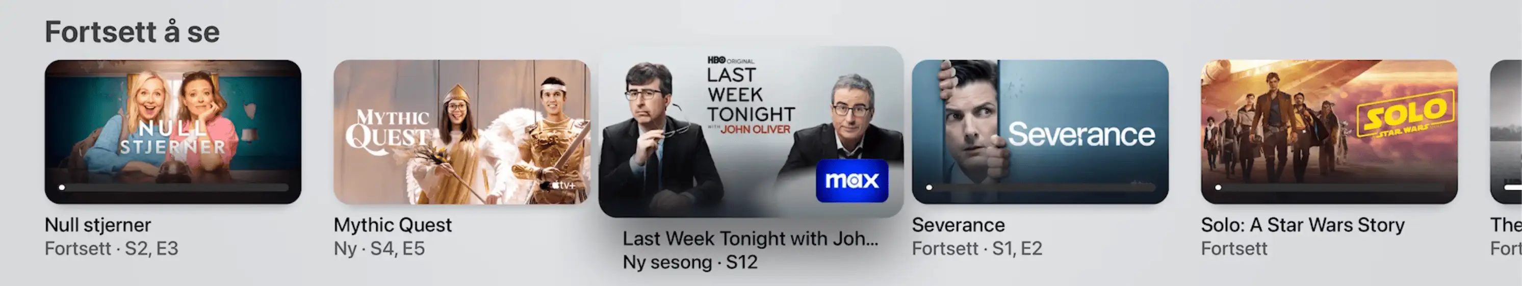
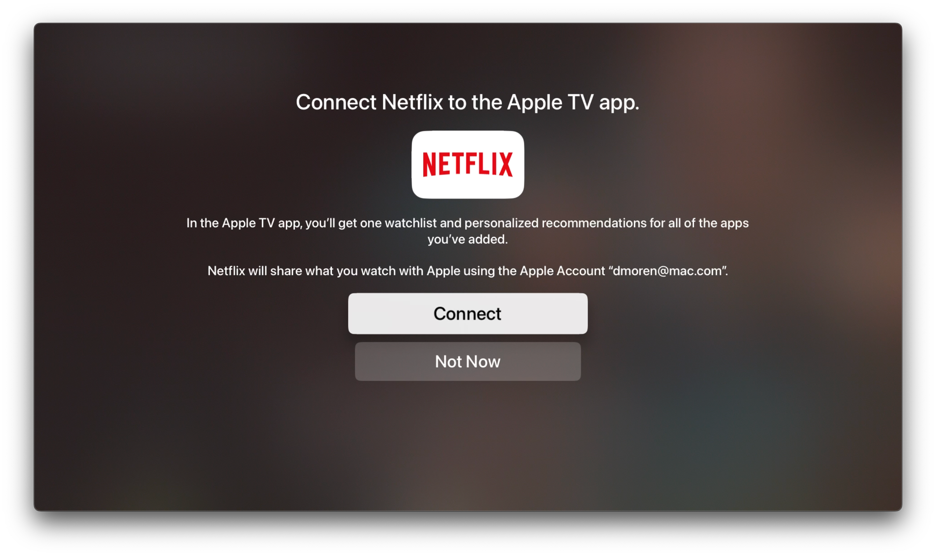
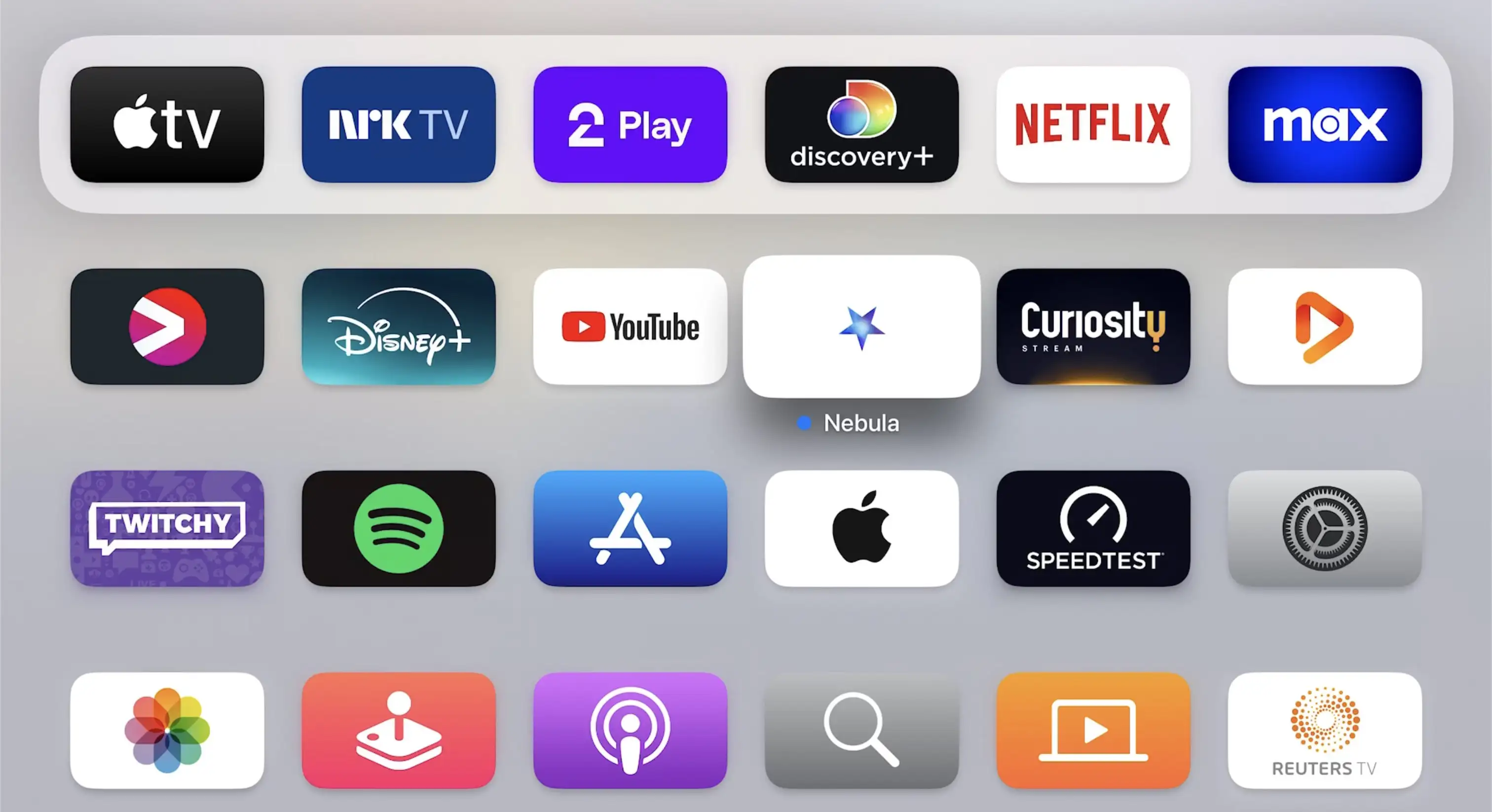
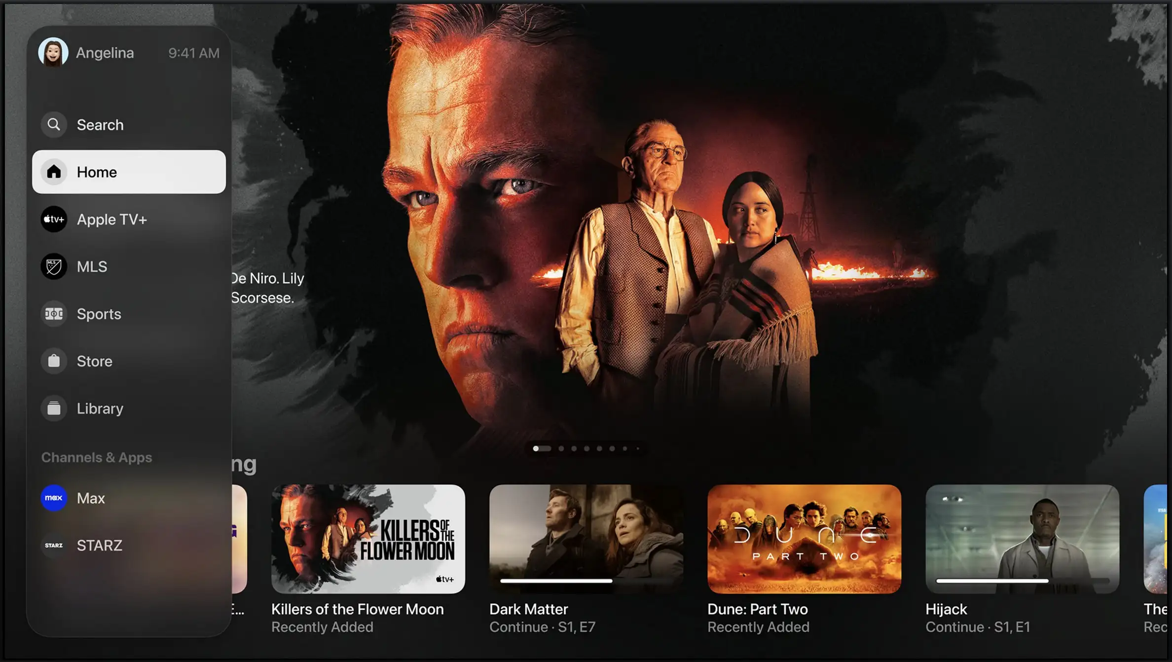


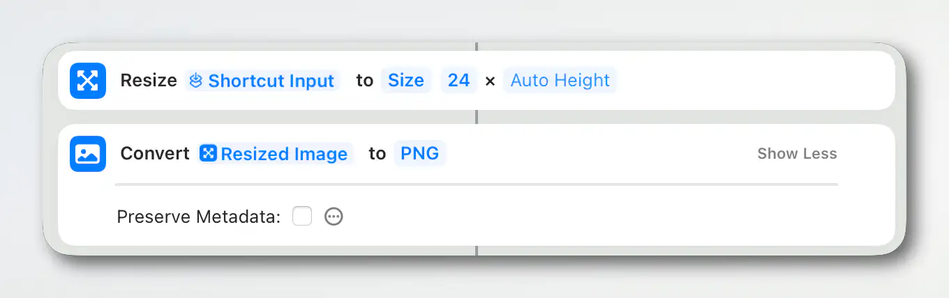
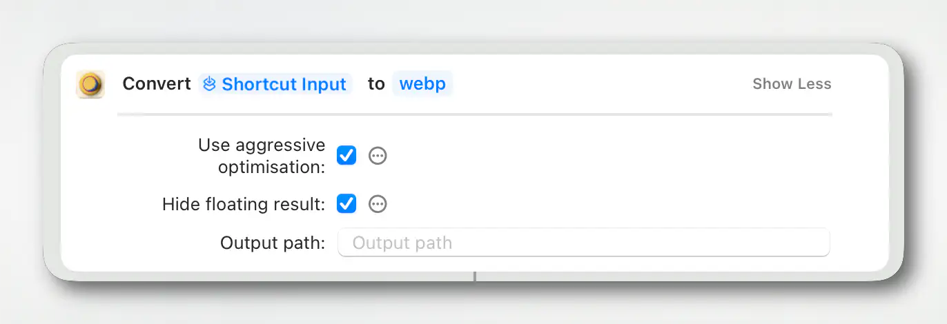
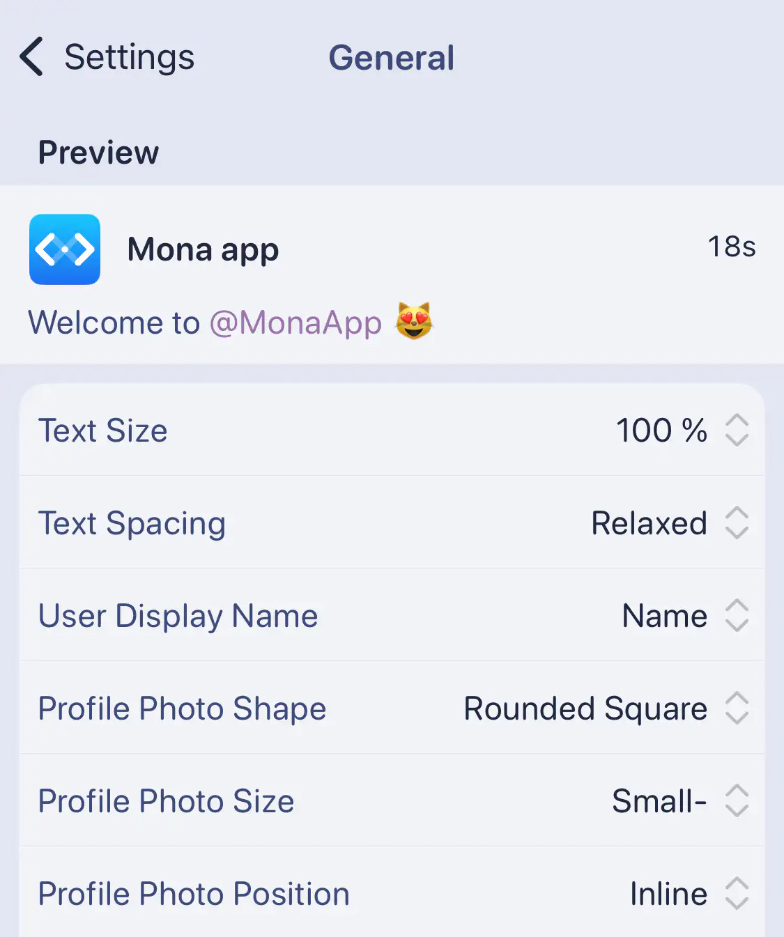
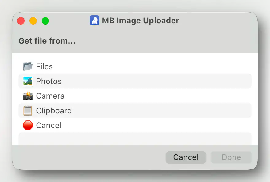
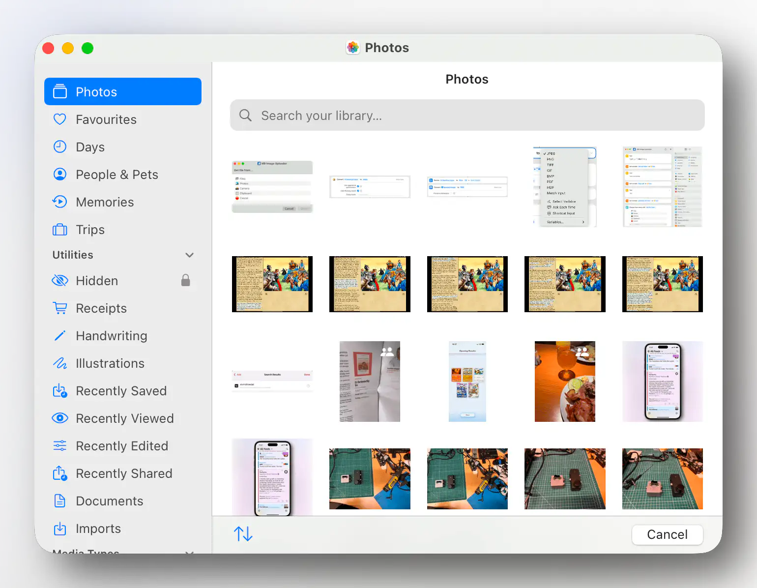
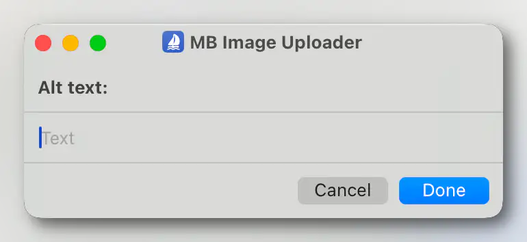
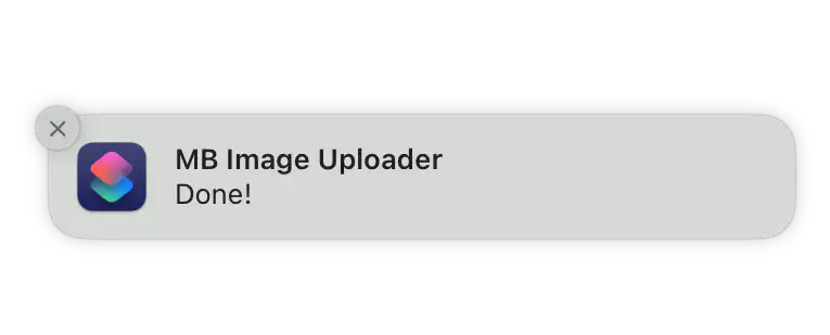

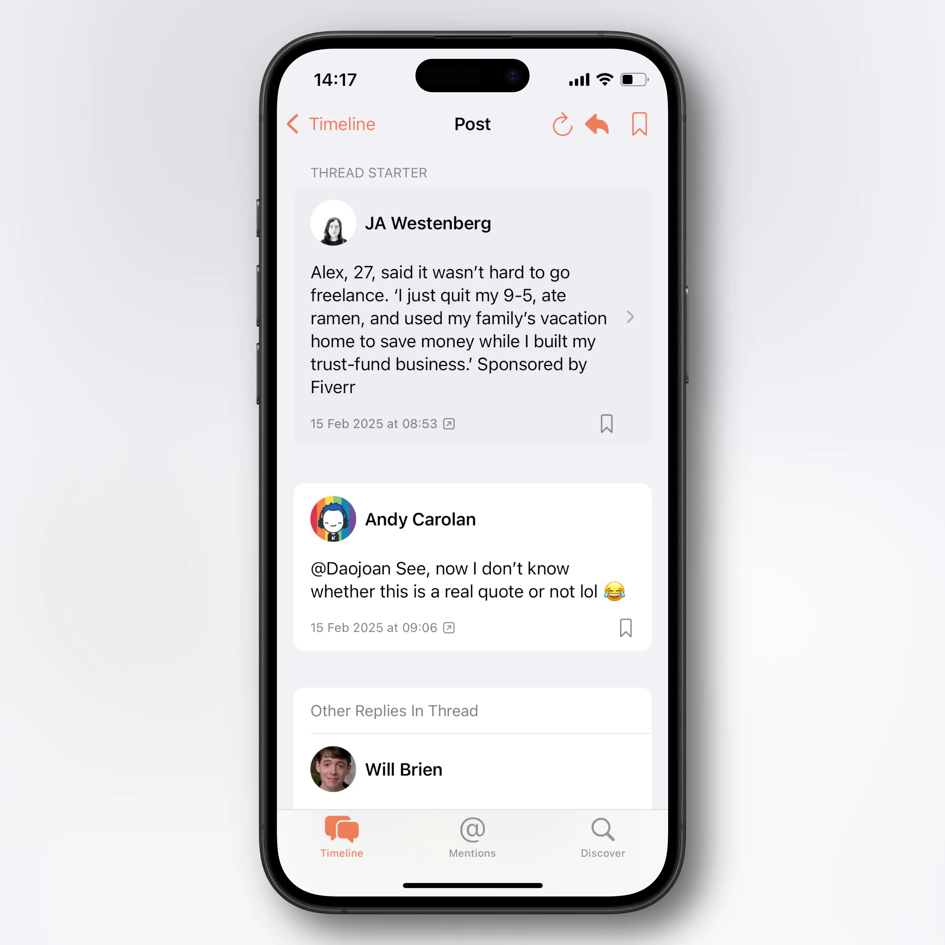

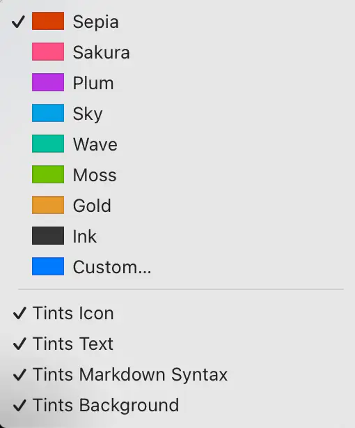

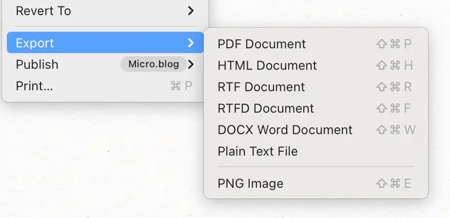


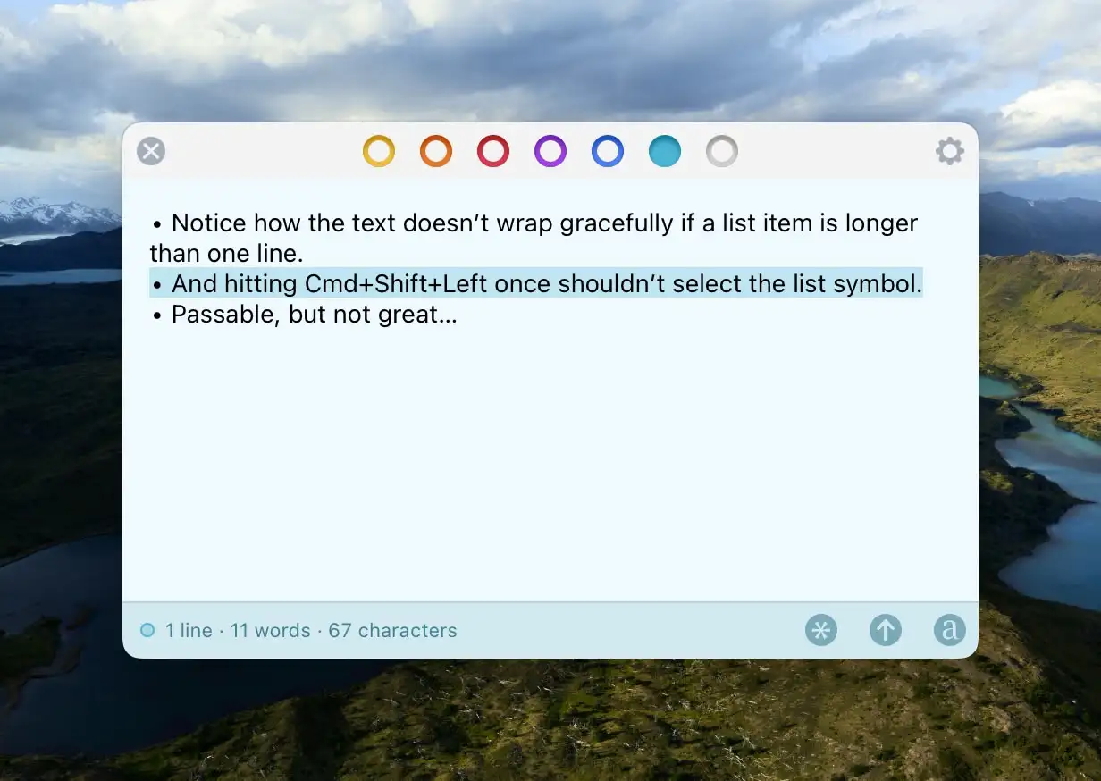
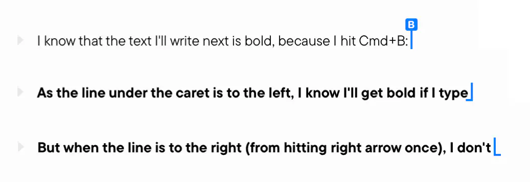
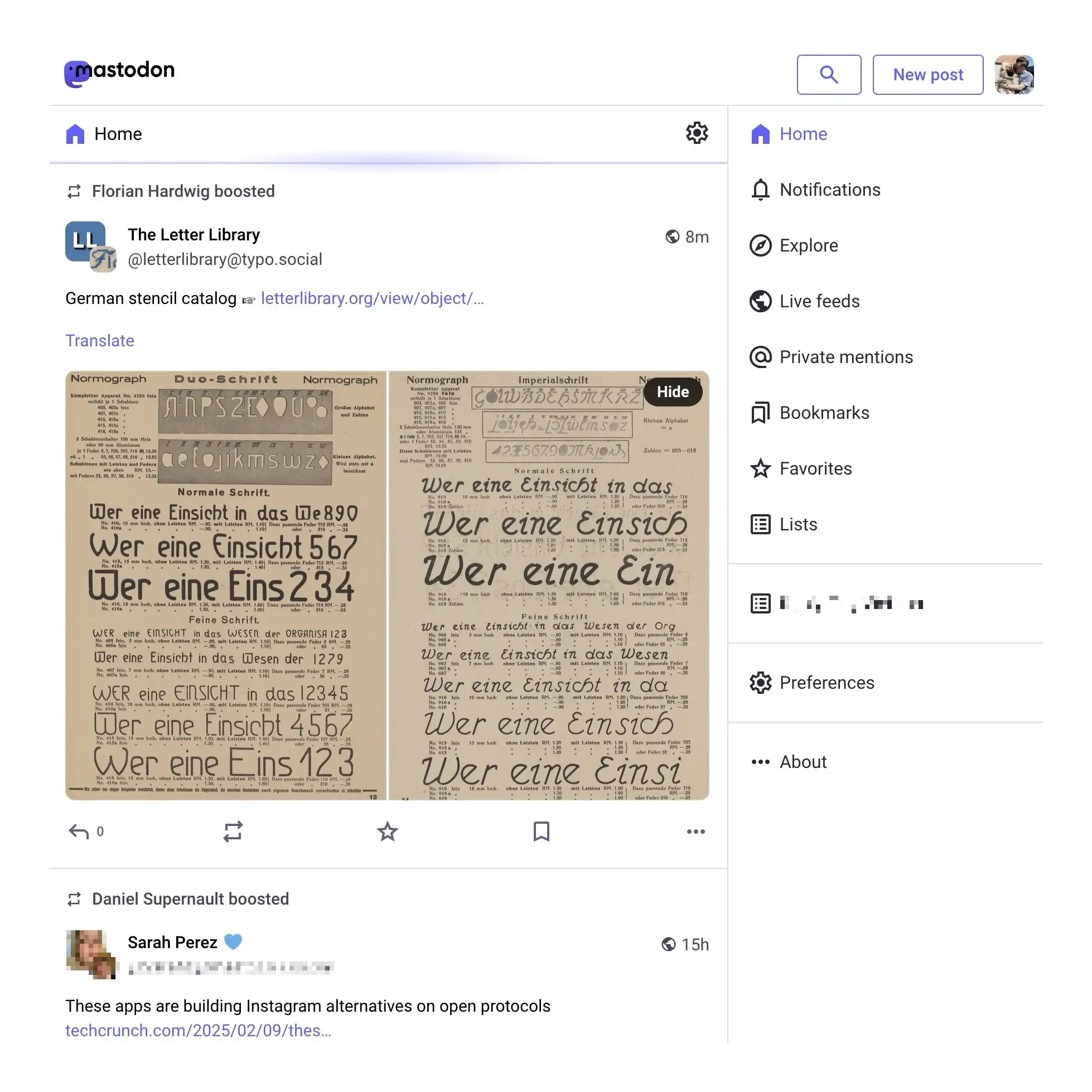
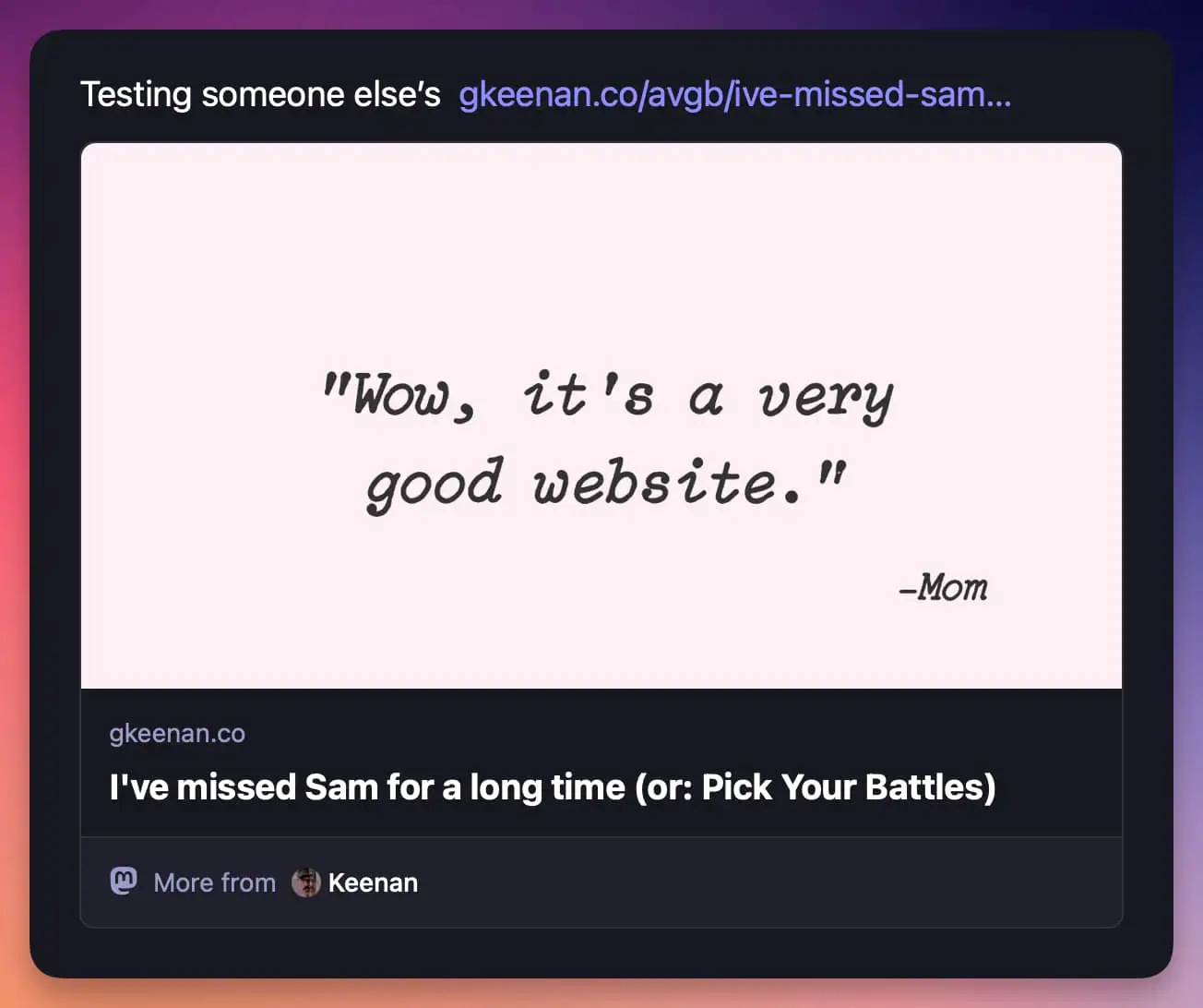

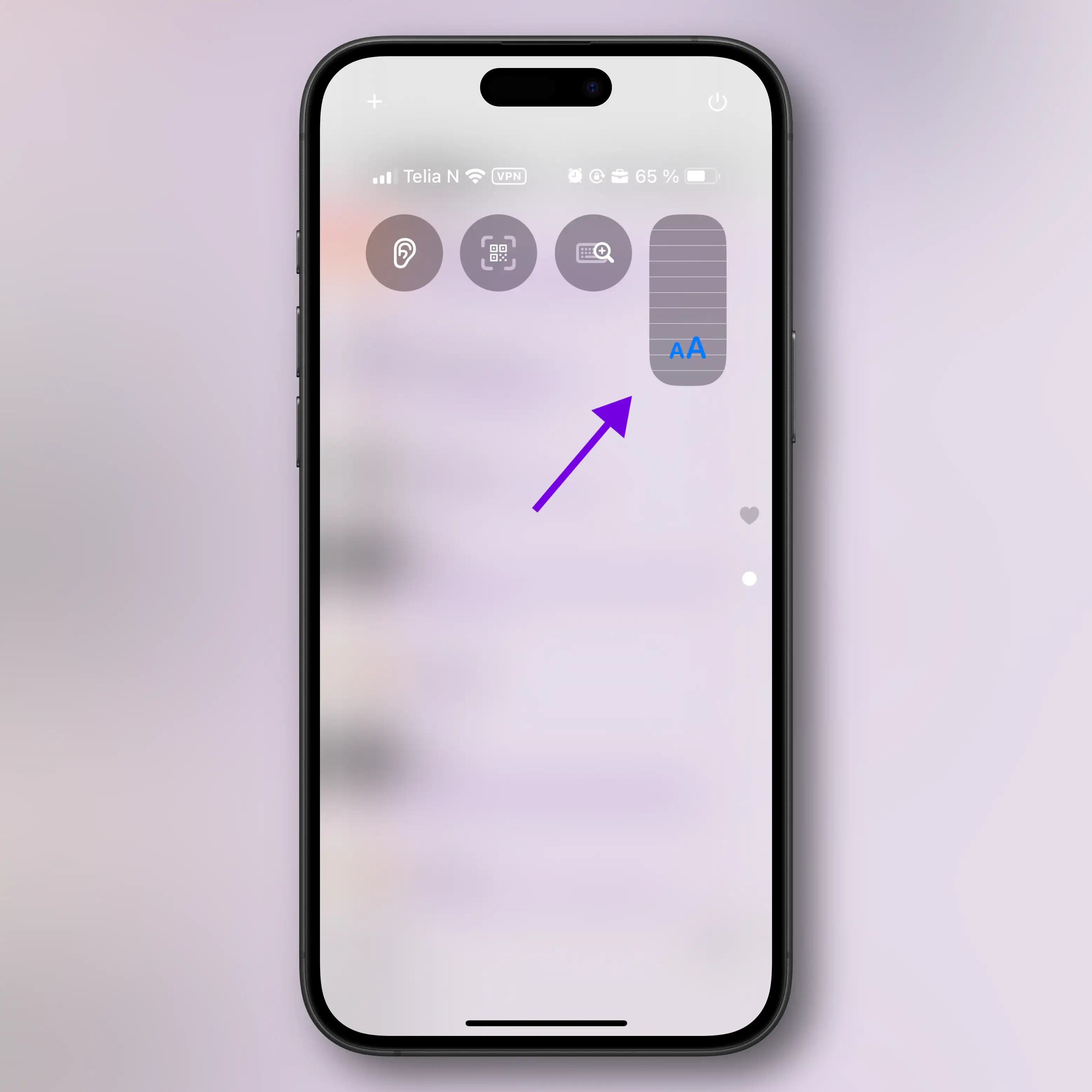
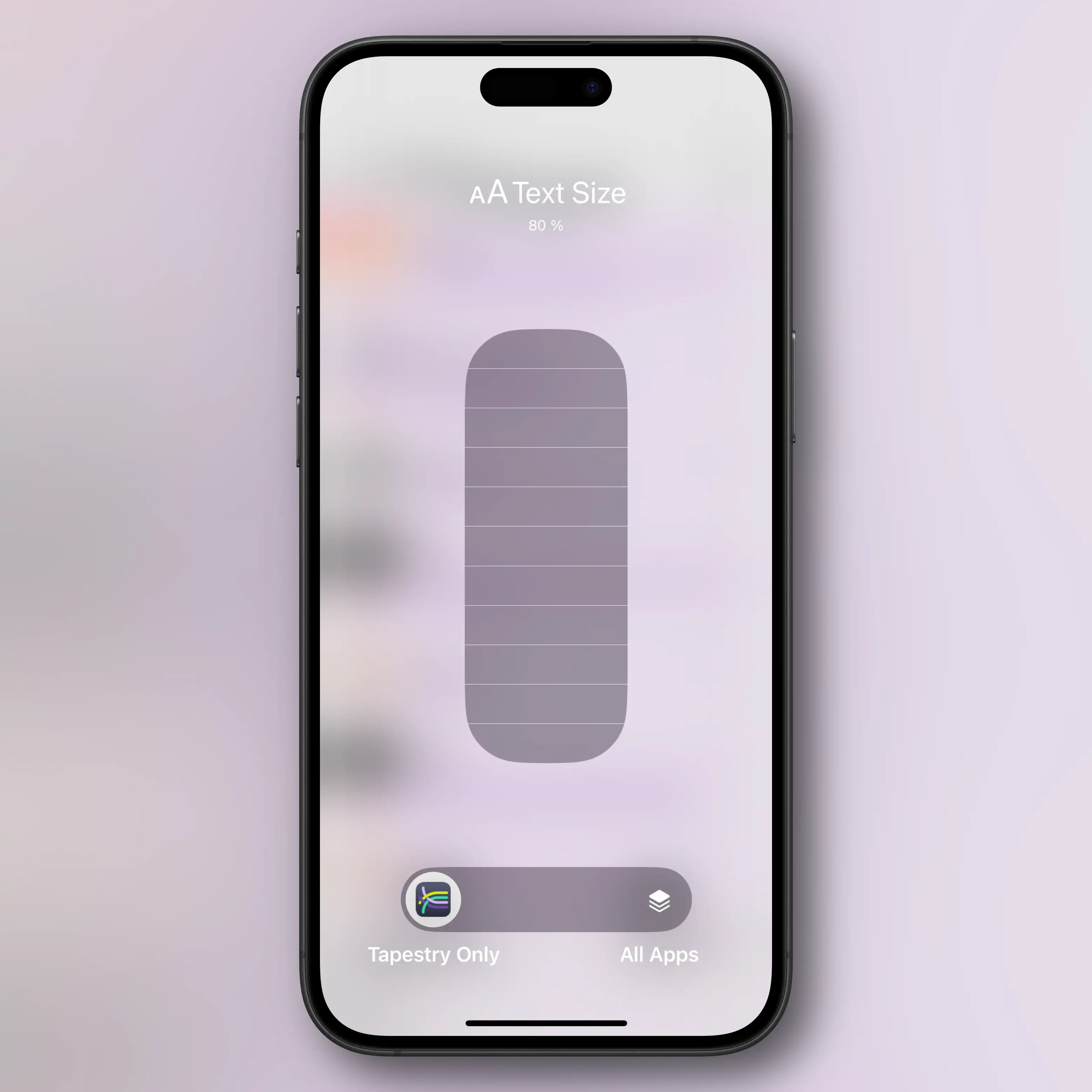
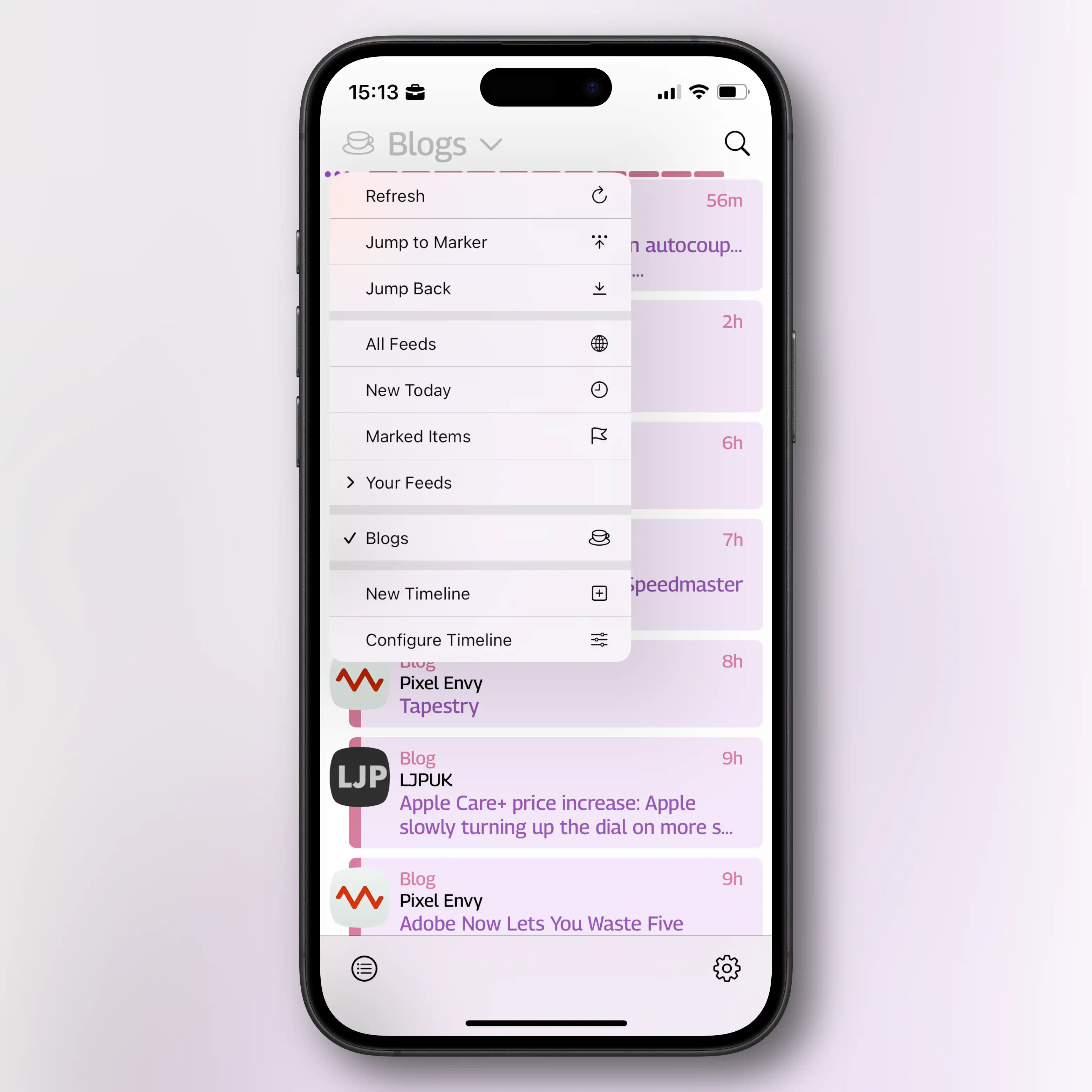

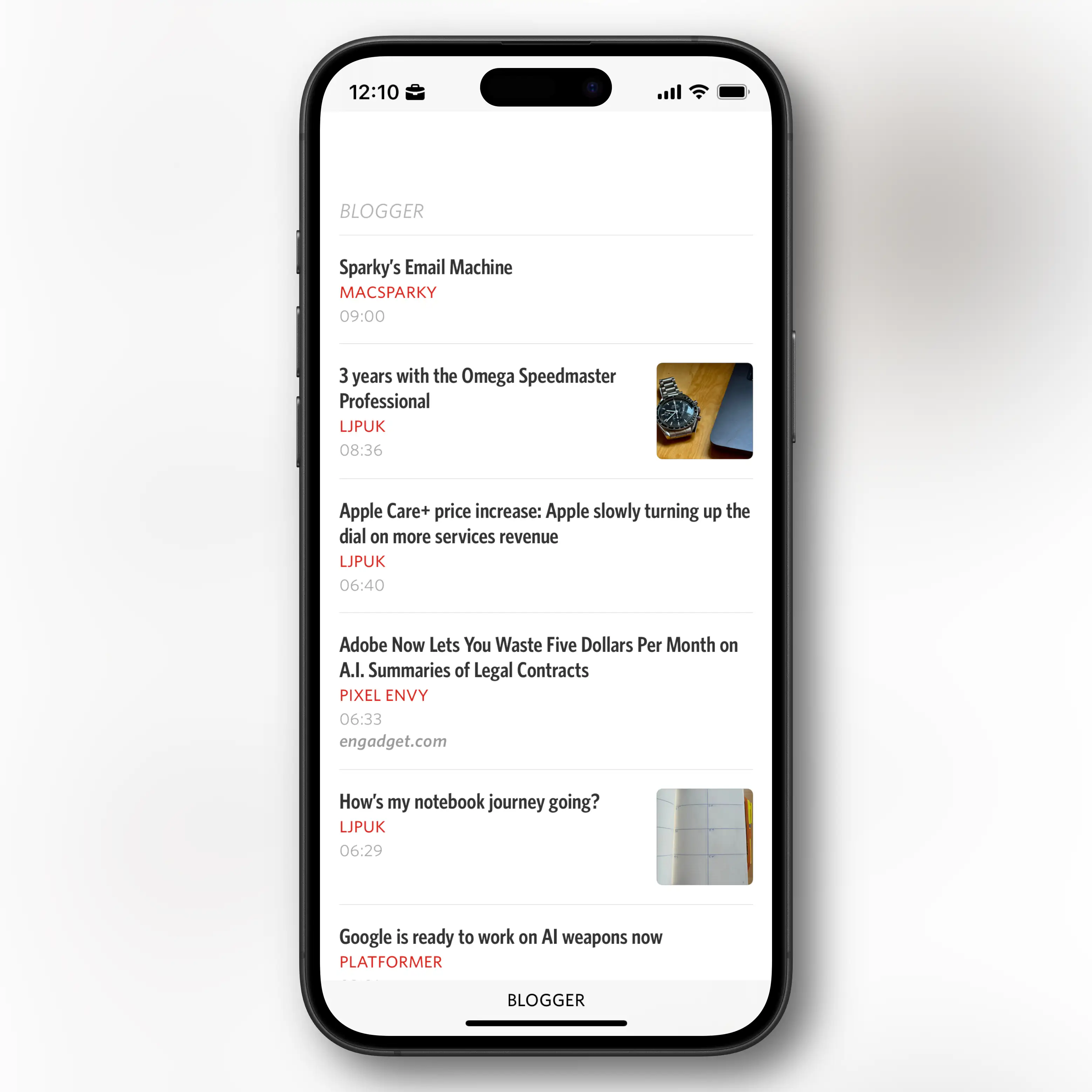

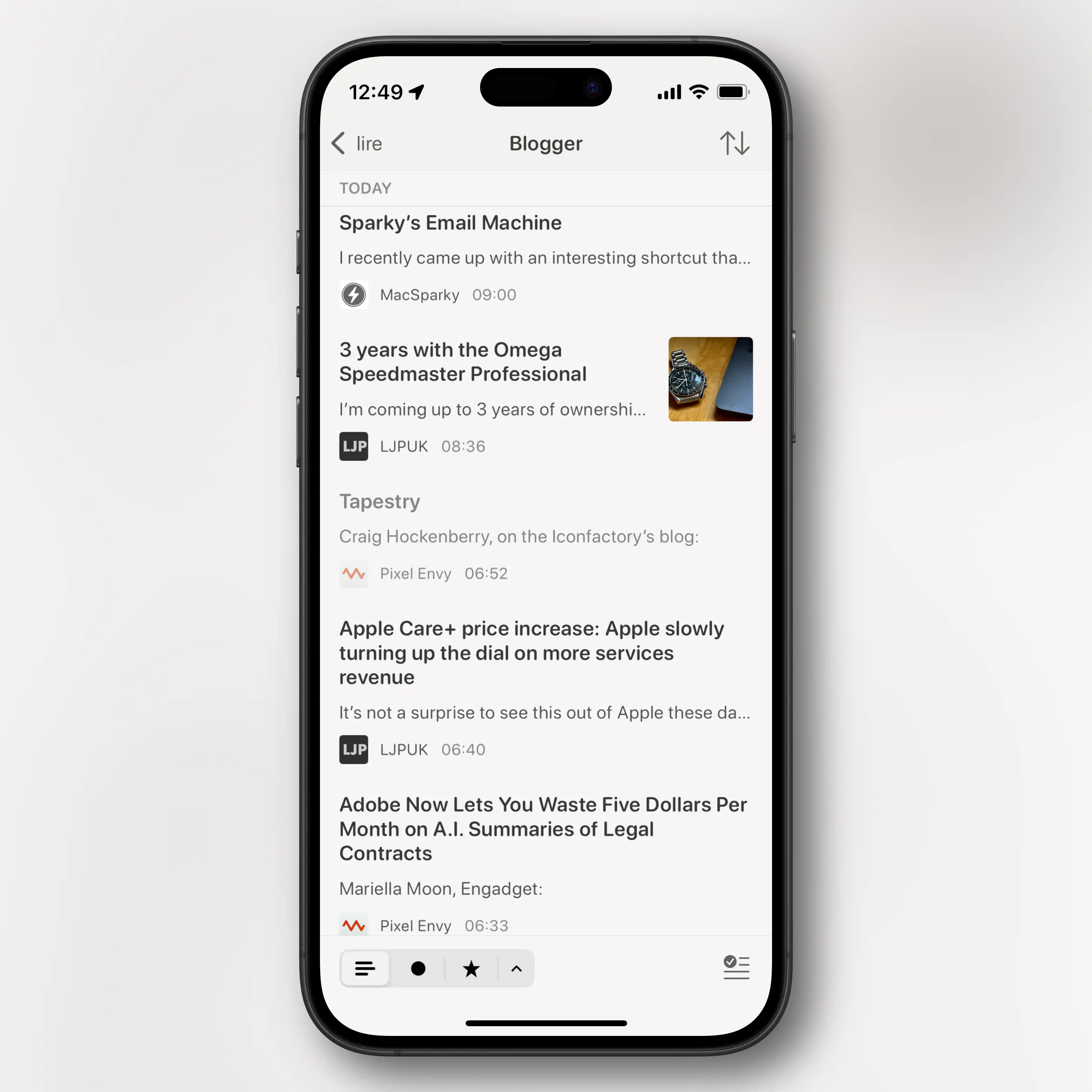


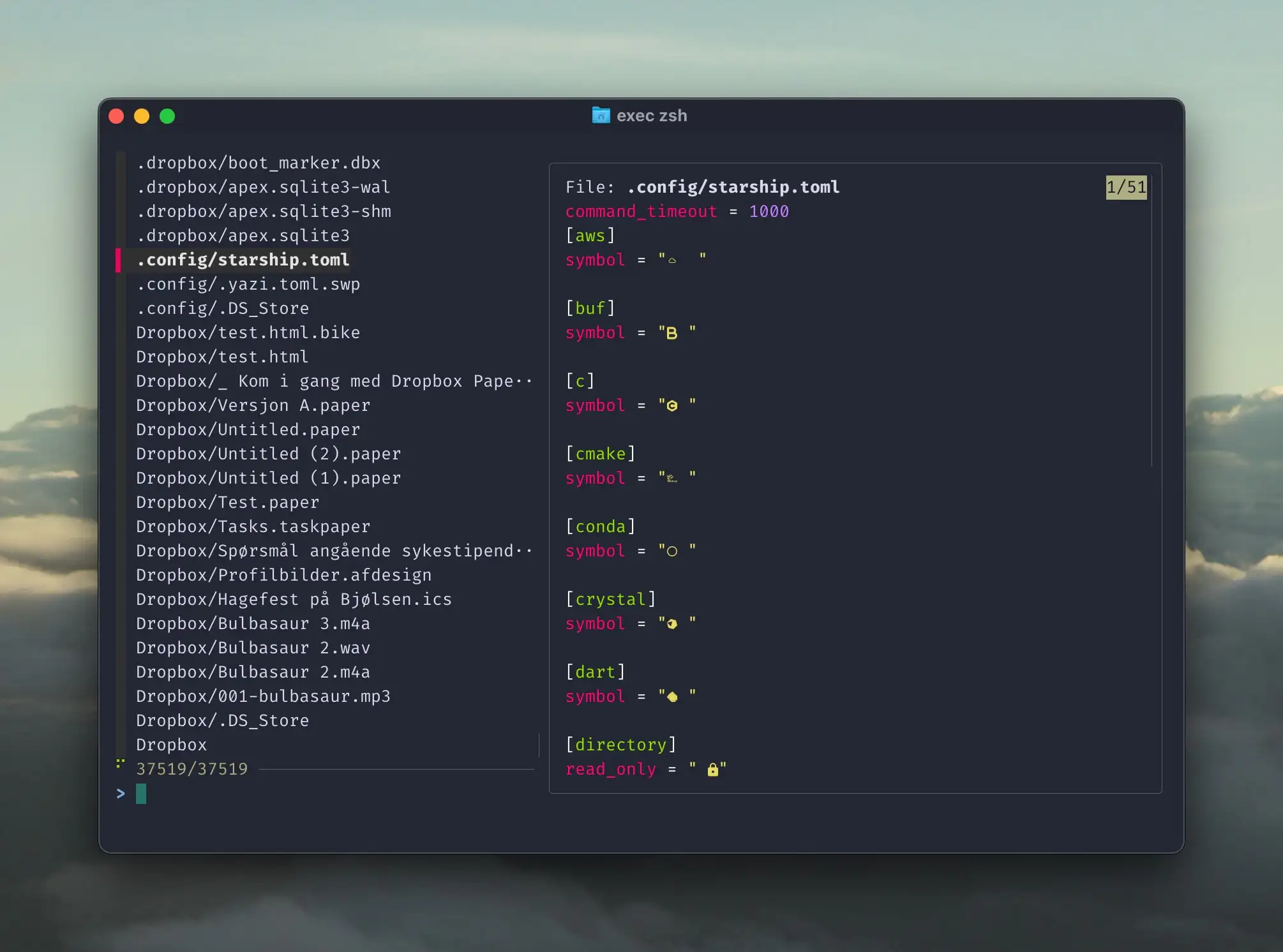
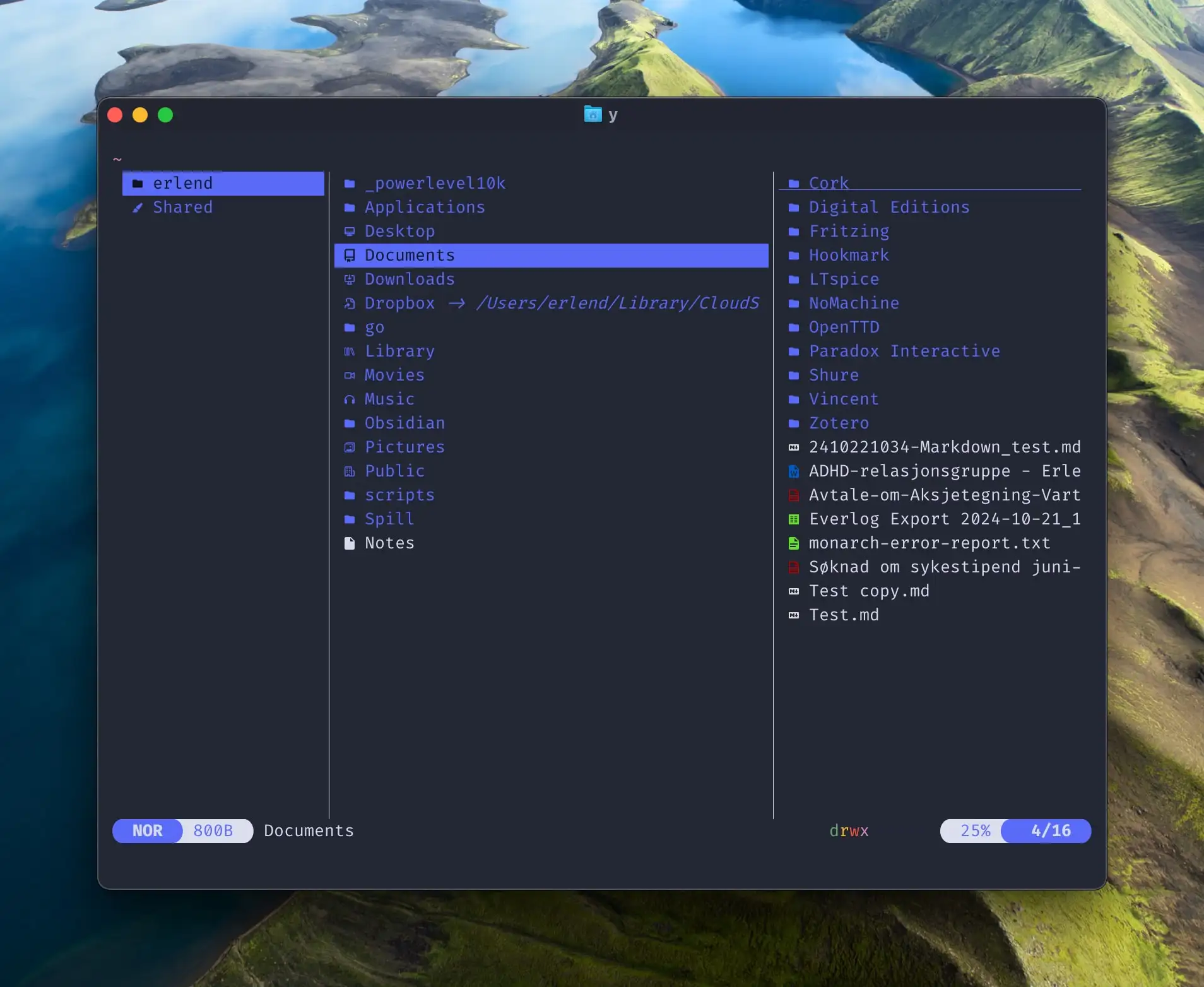


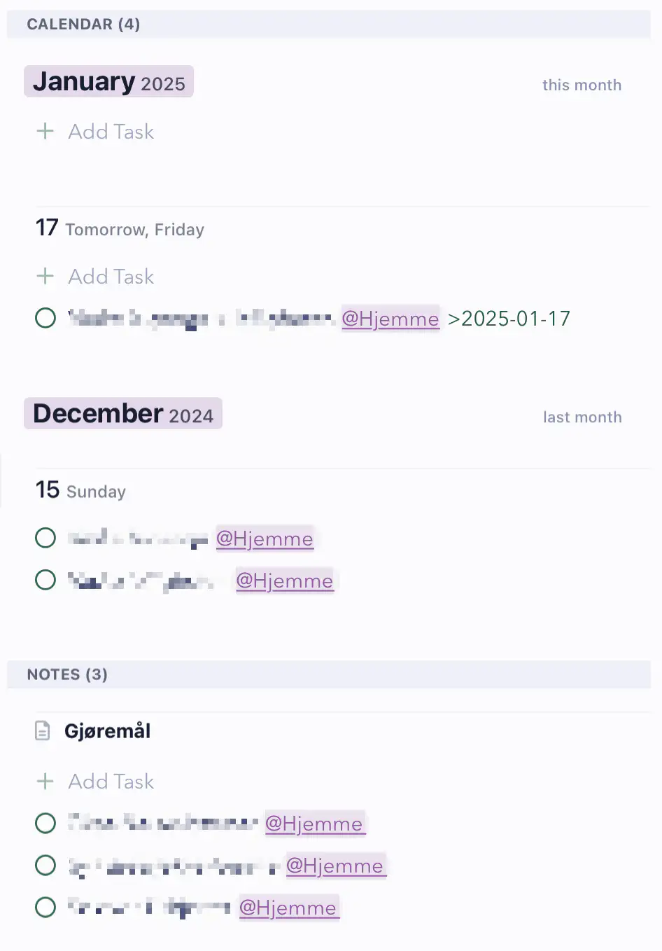


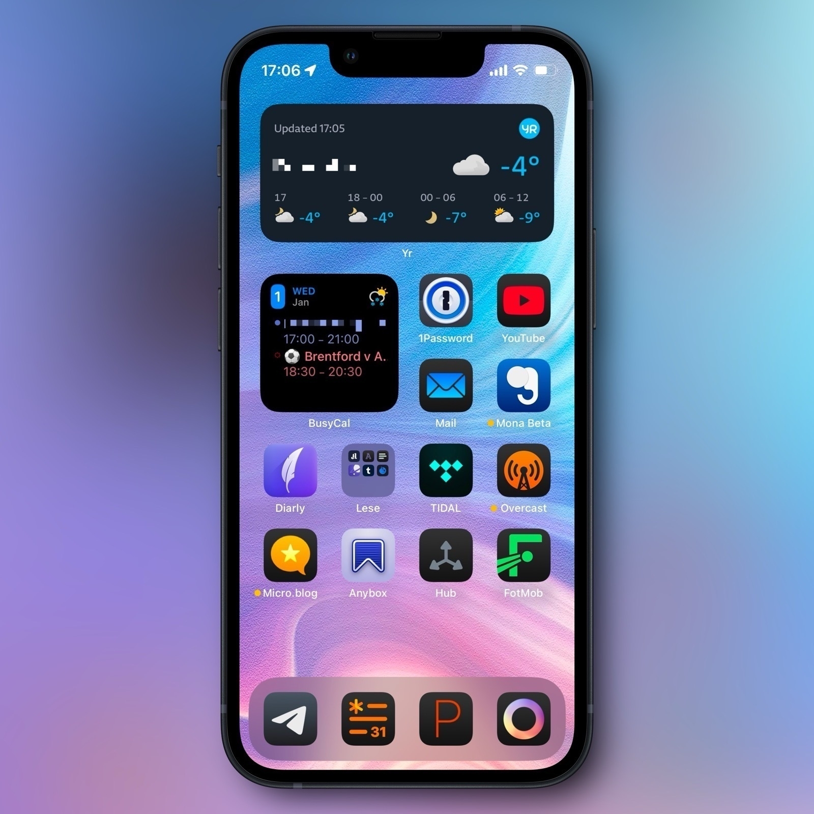
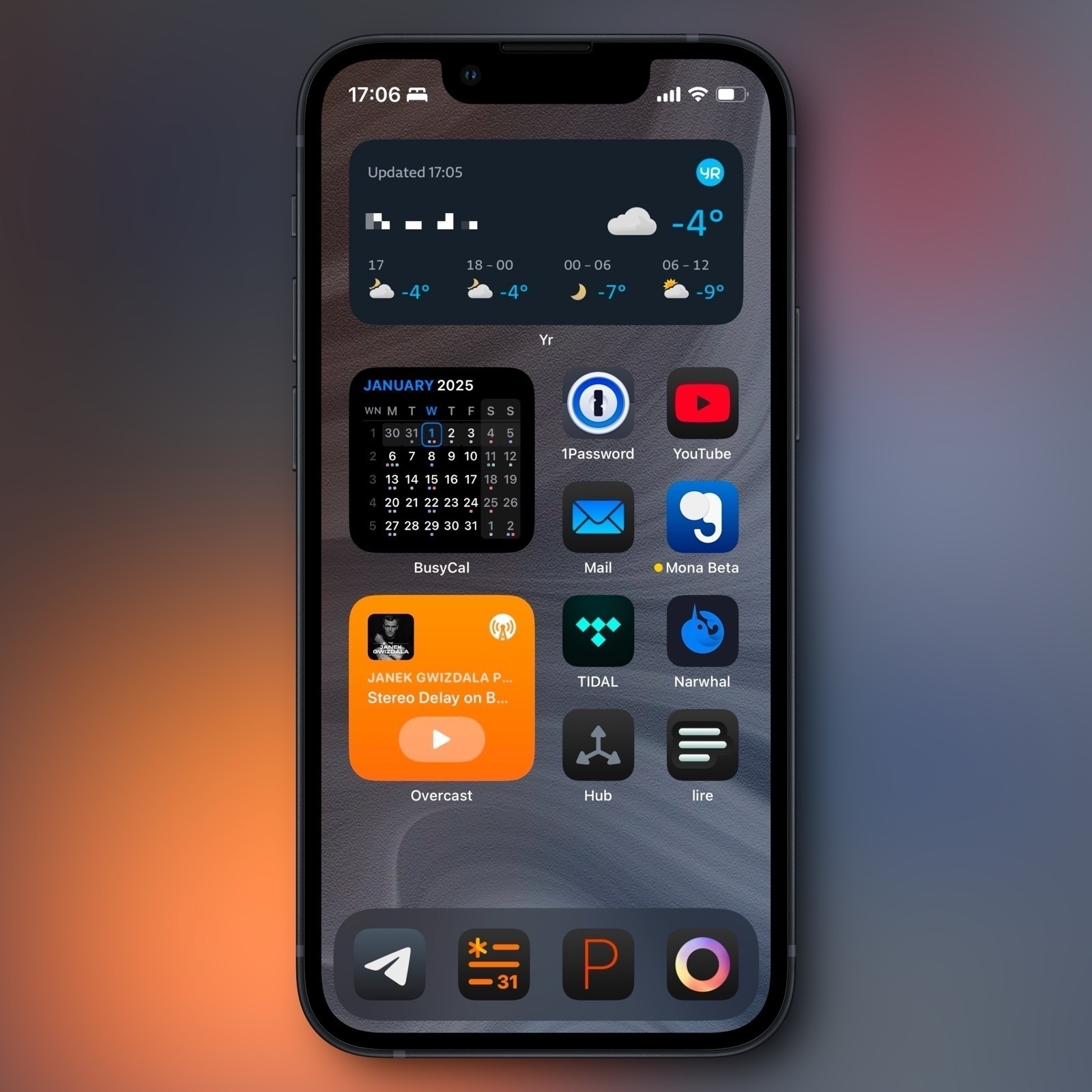


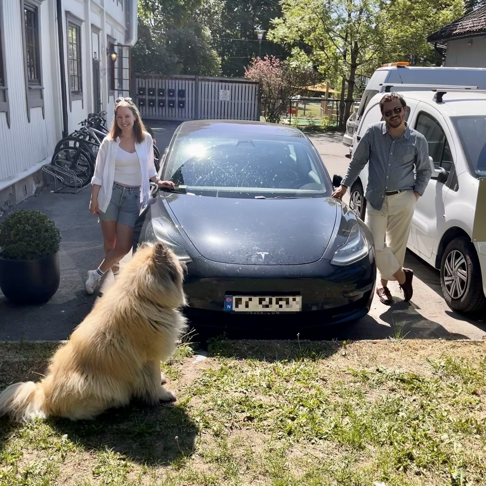
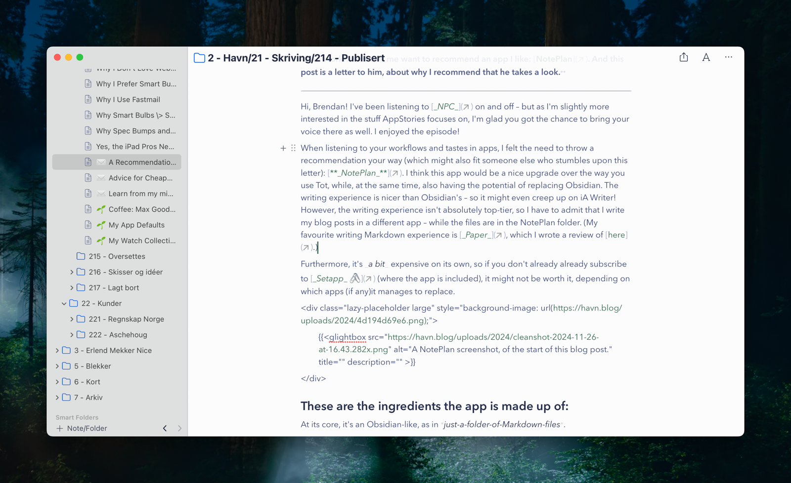
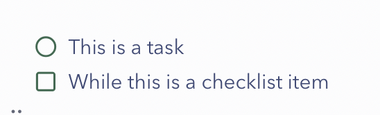
 and #tags.](https://havn.blog/uploads/2024/cleanshot-2024-11-26-at-15.18.152x.png)


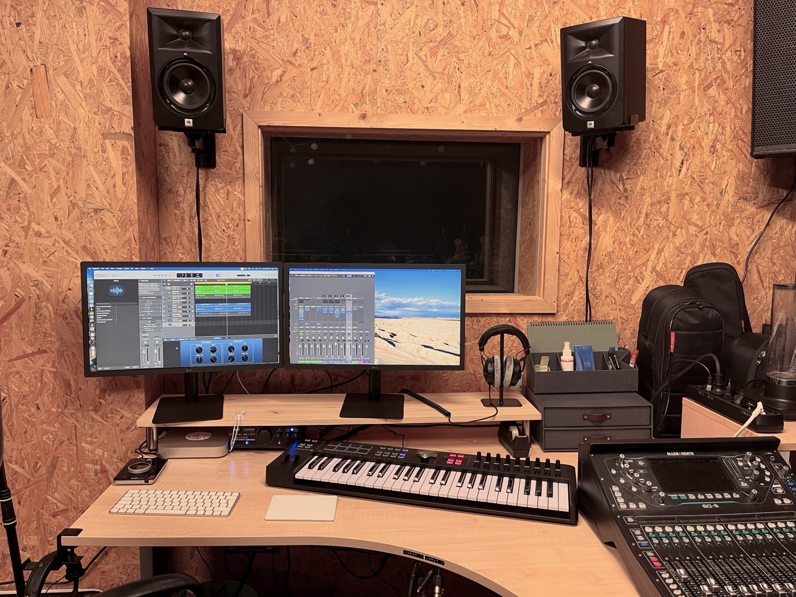

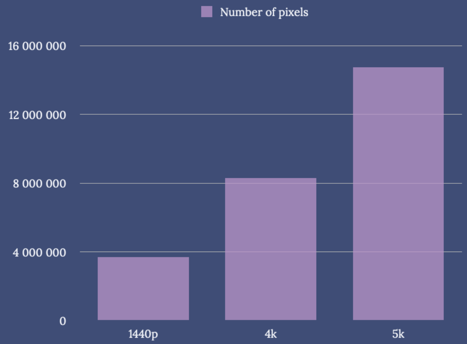
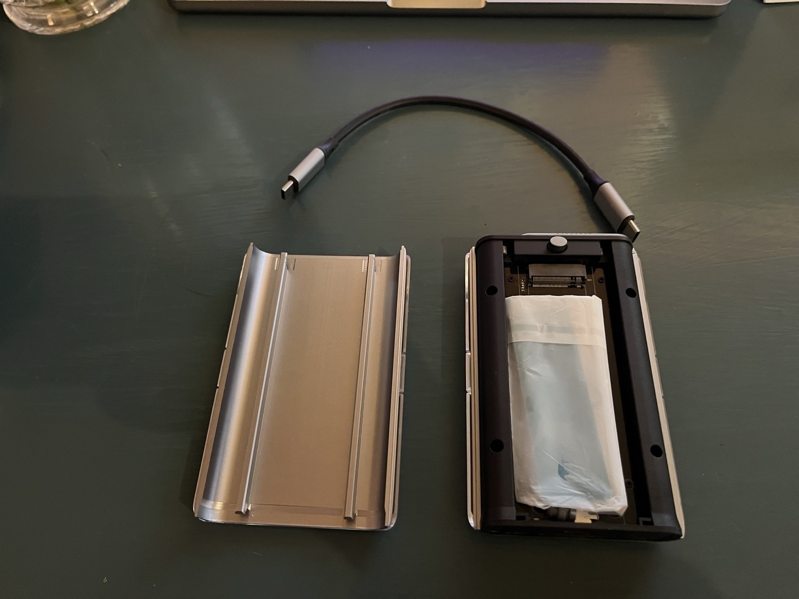
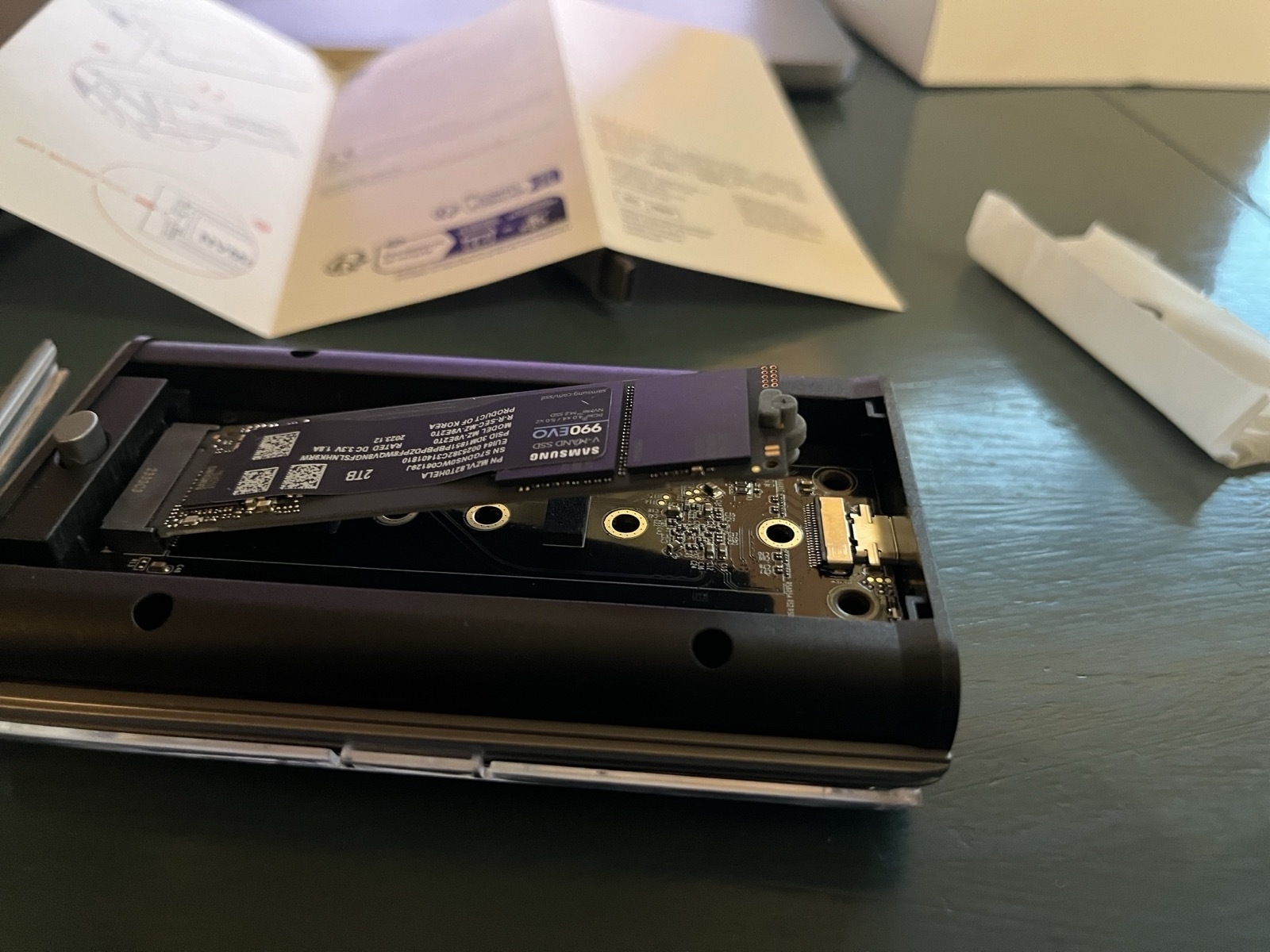


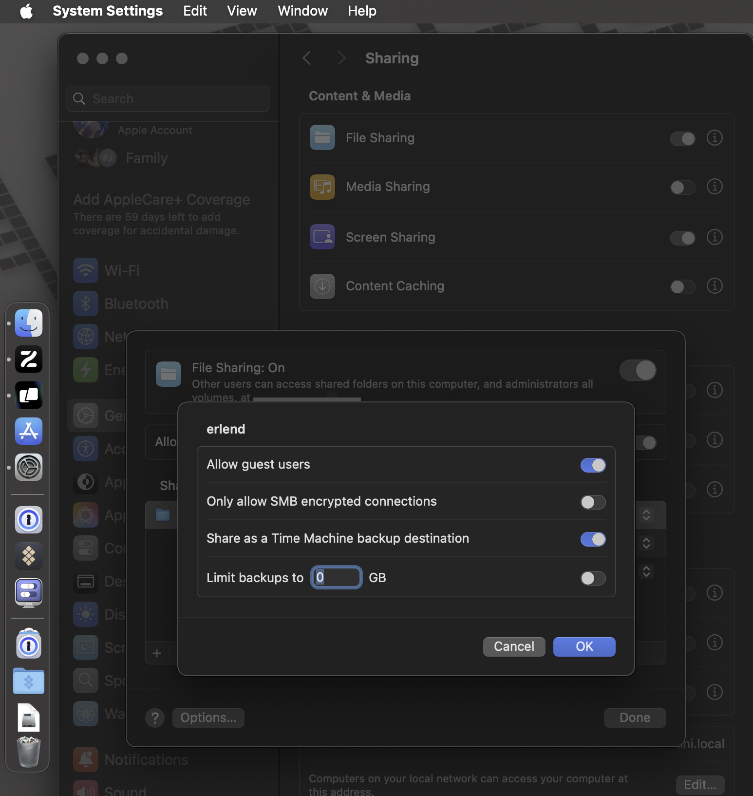
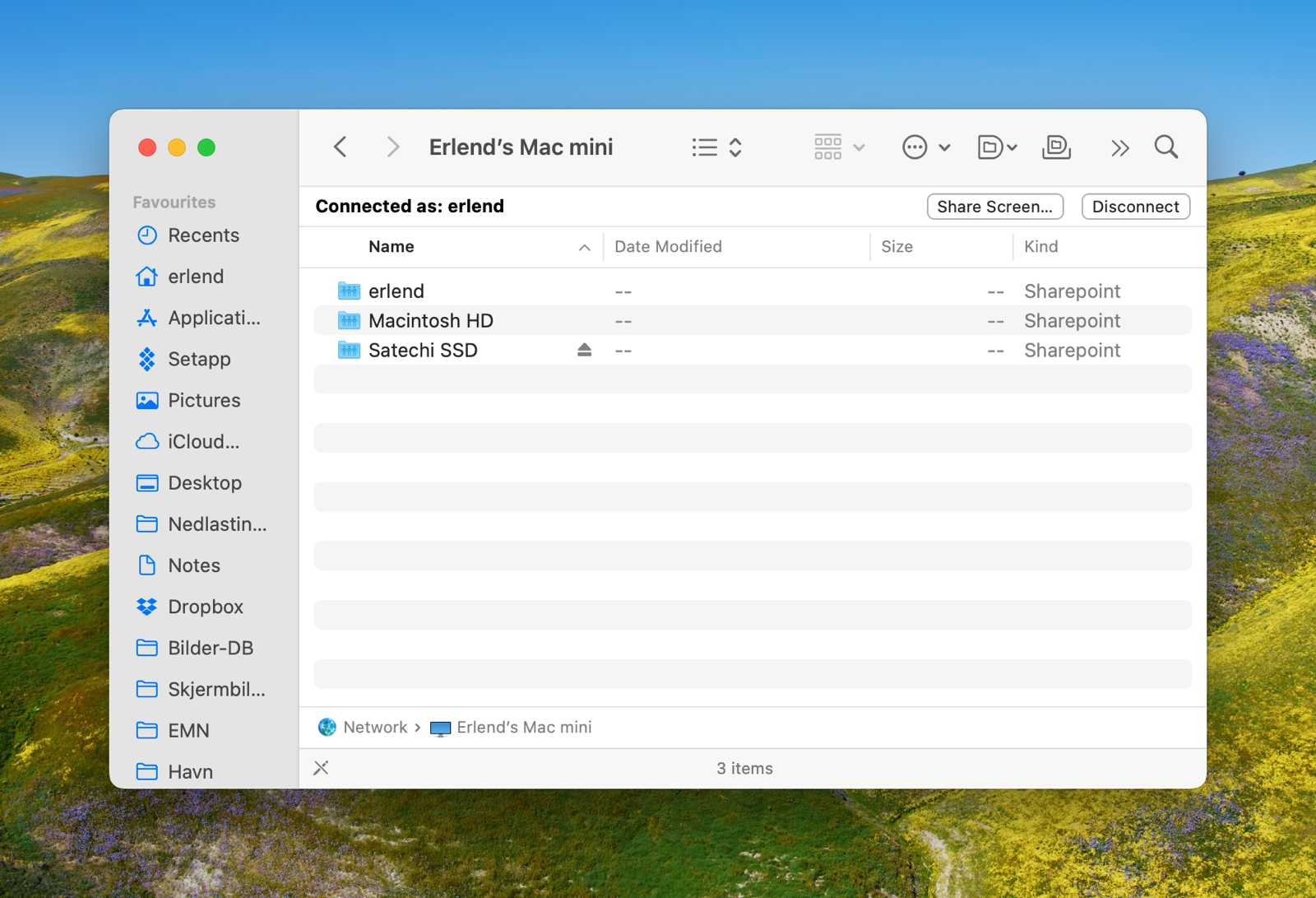


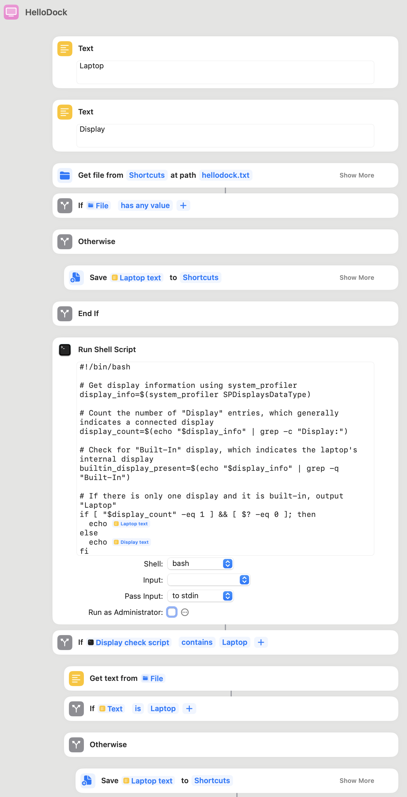

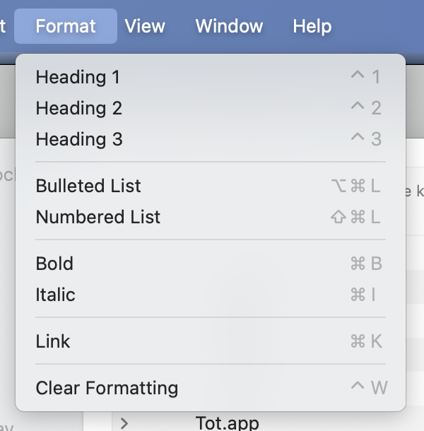
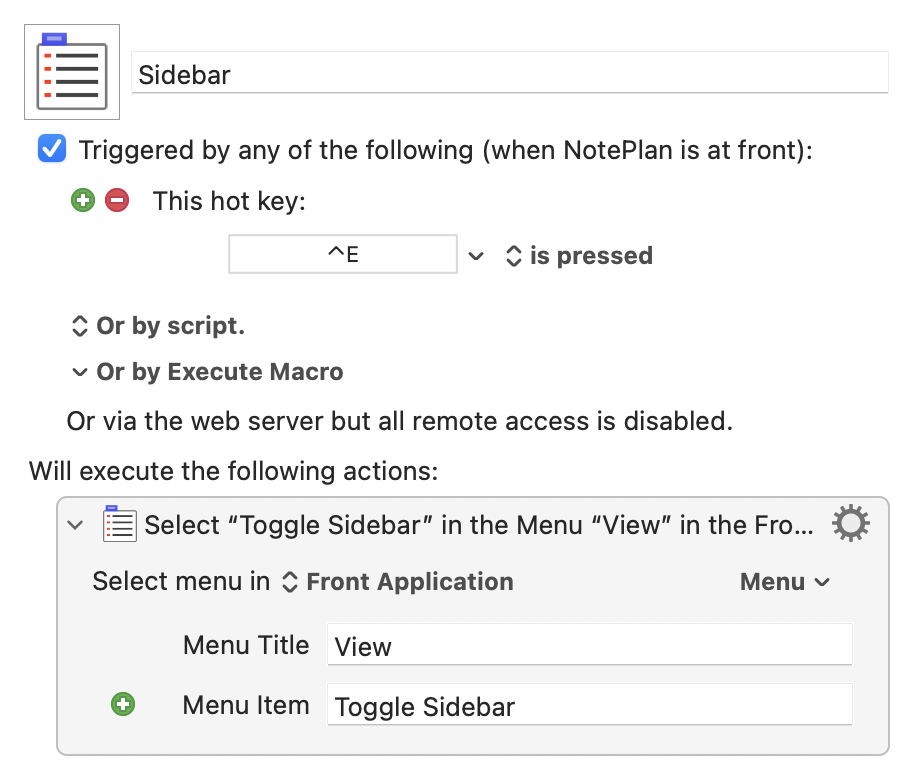
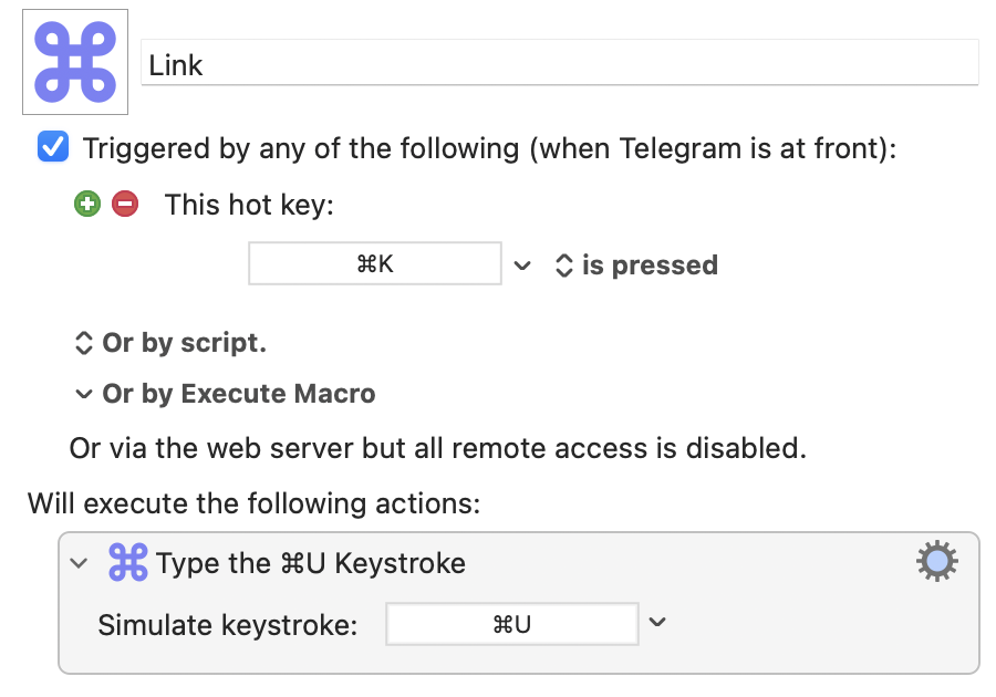
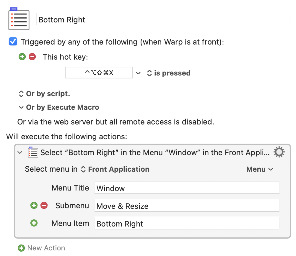

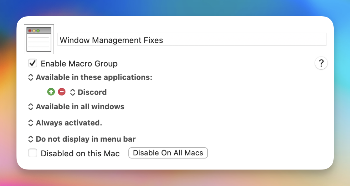
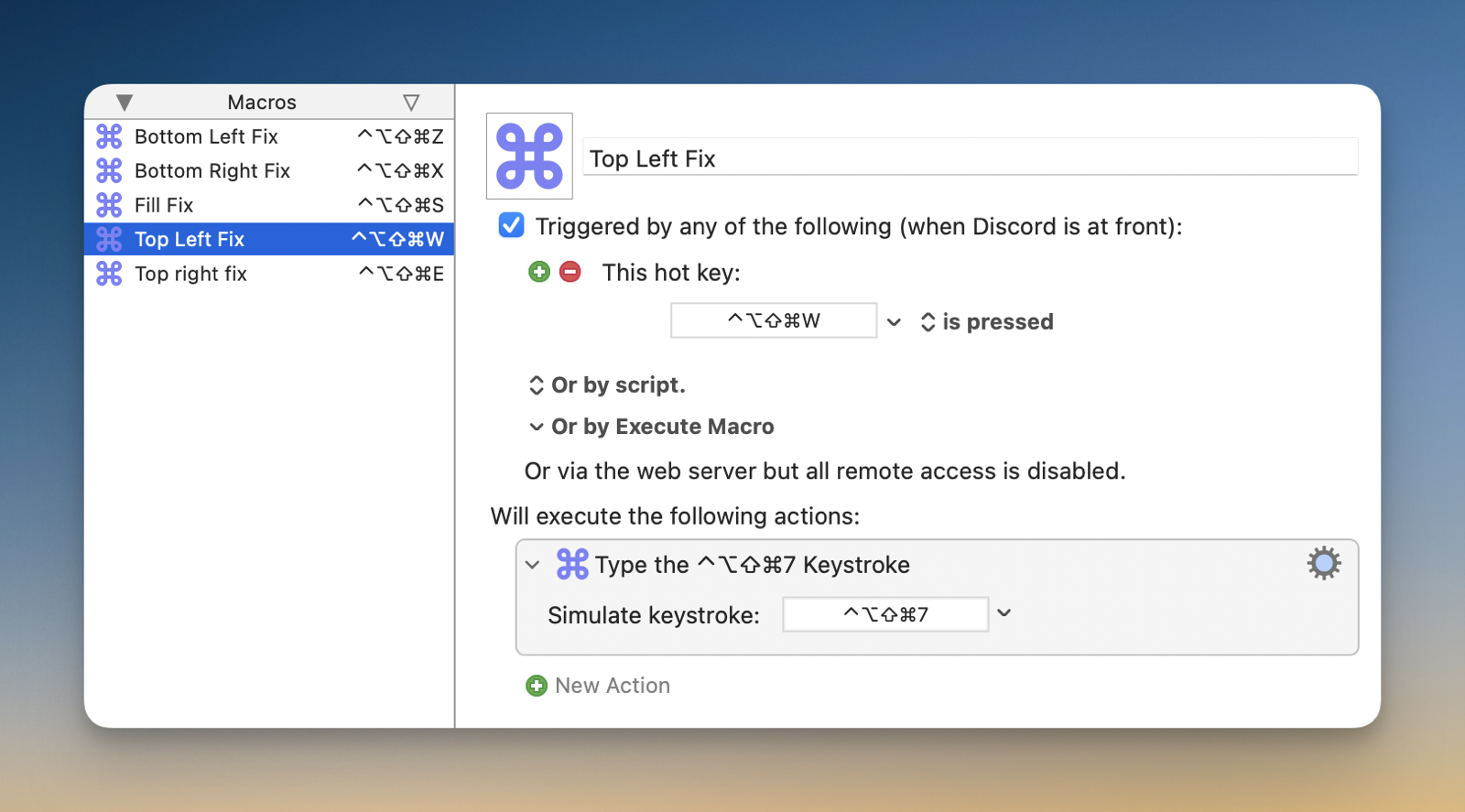
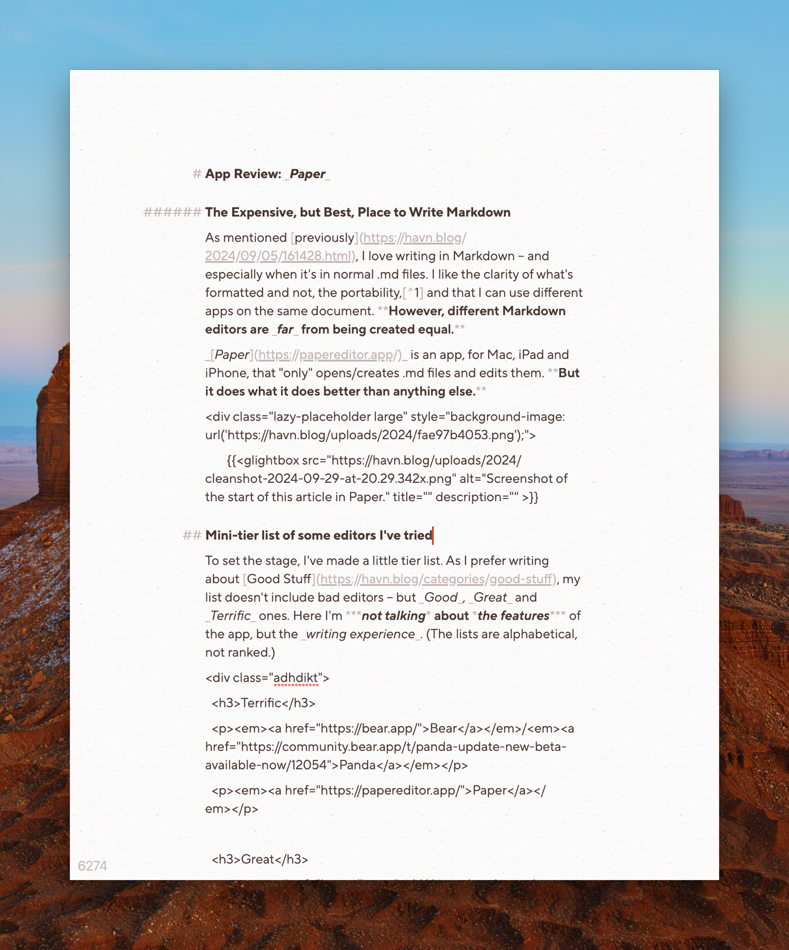

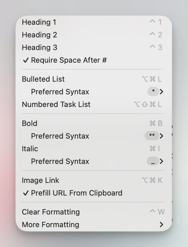
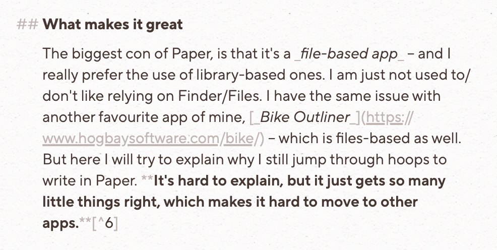
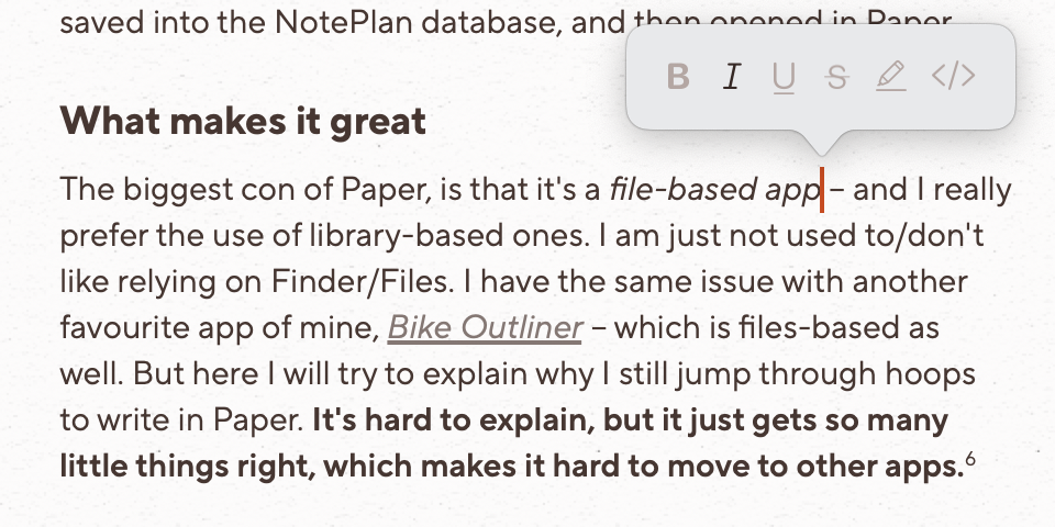

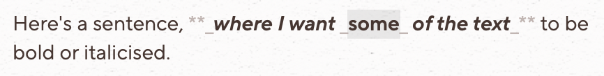


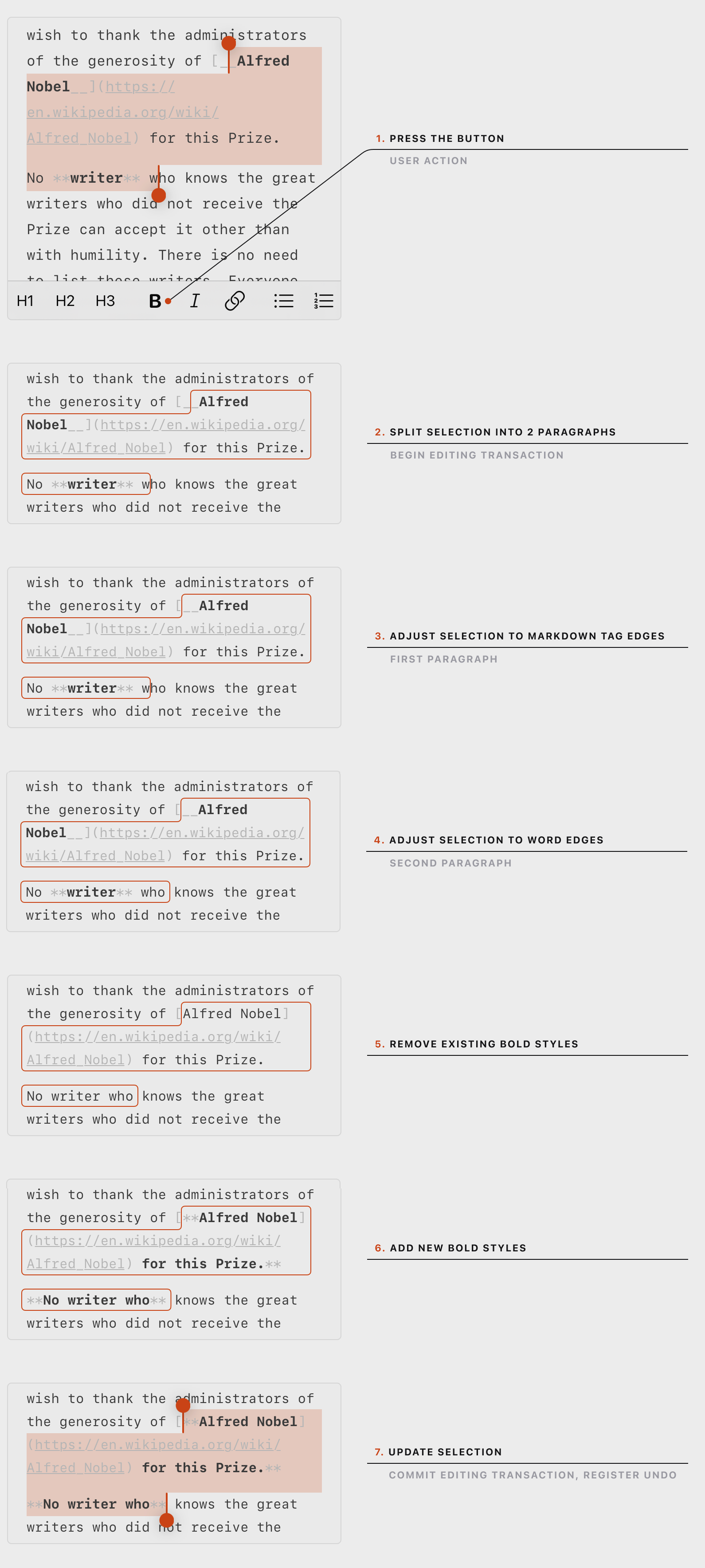
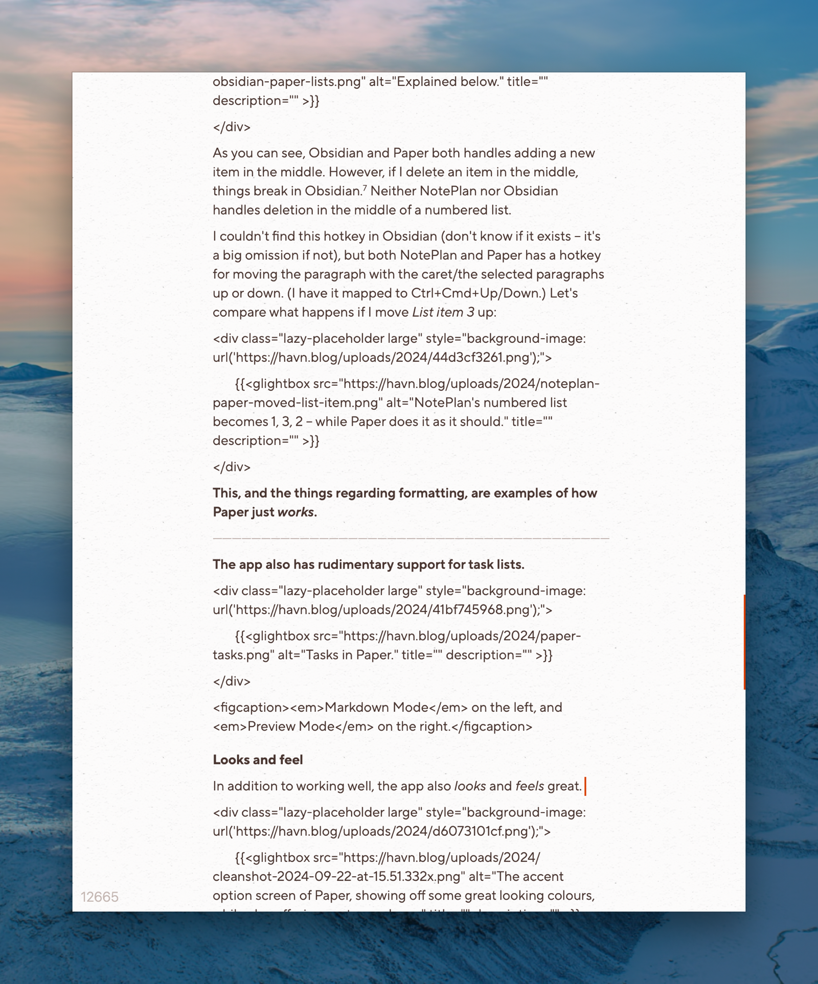
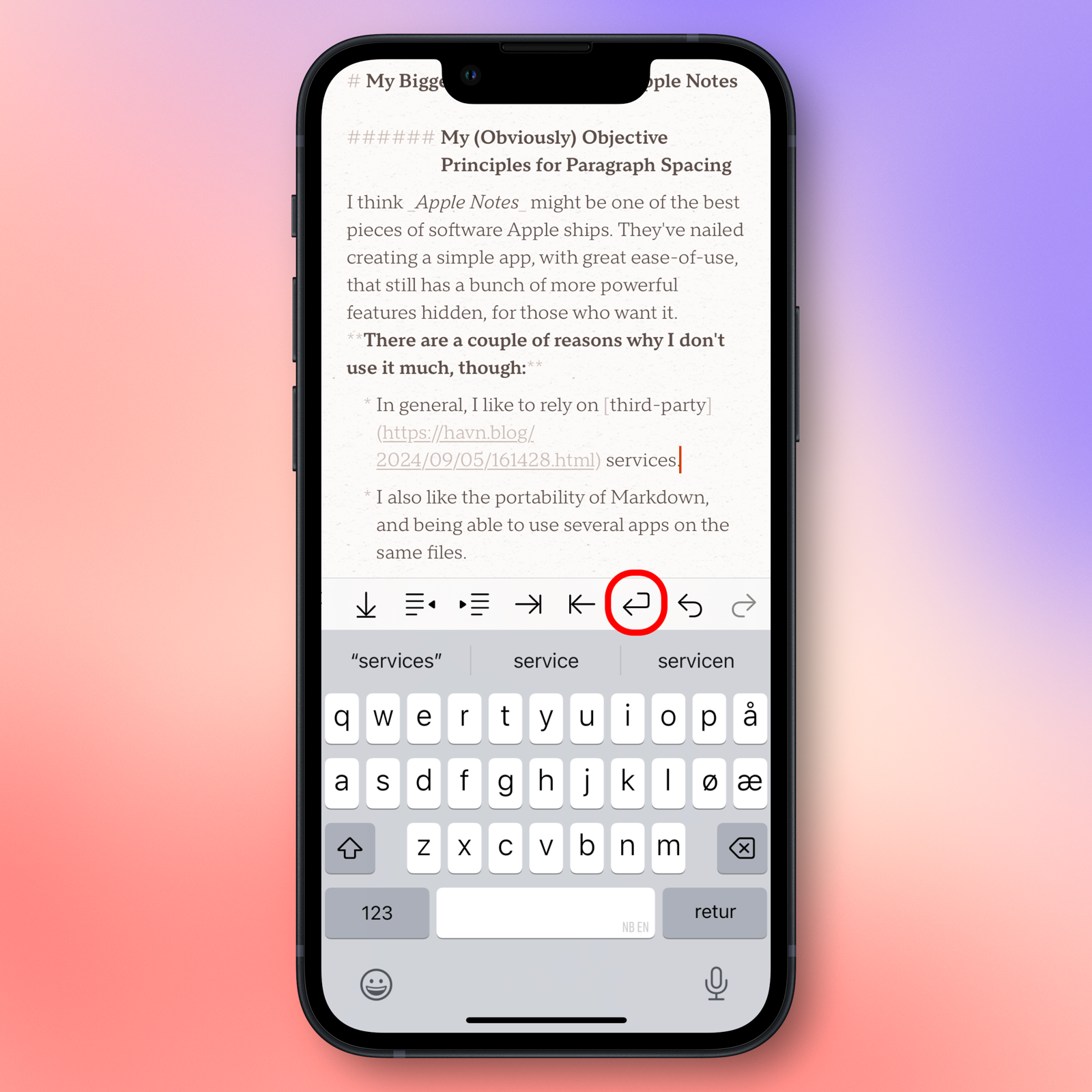
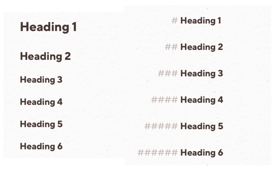
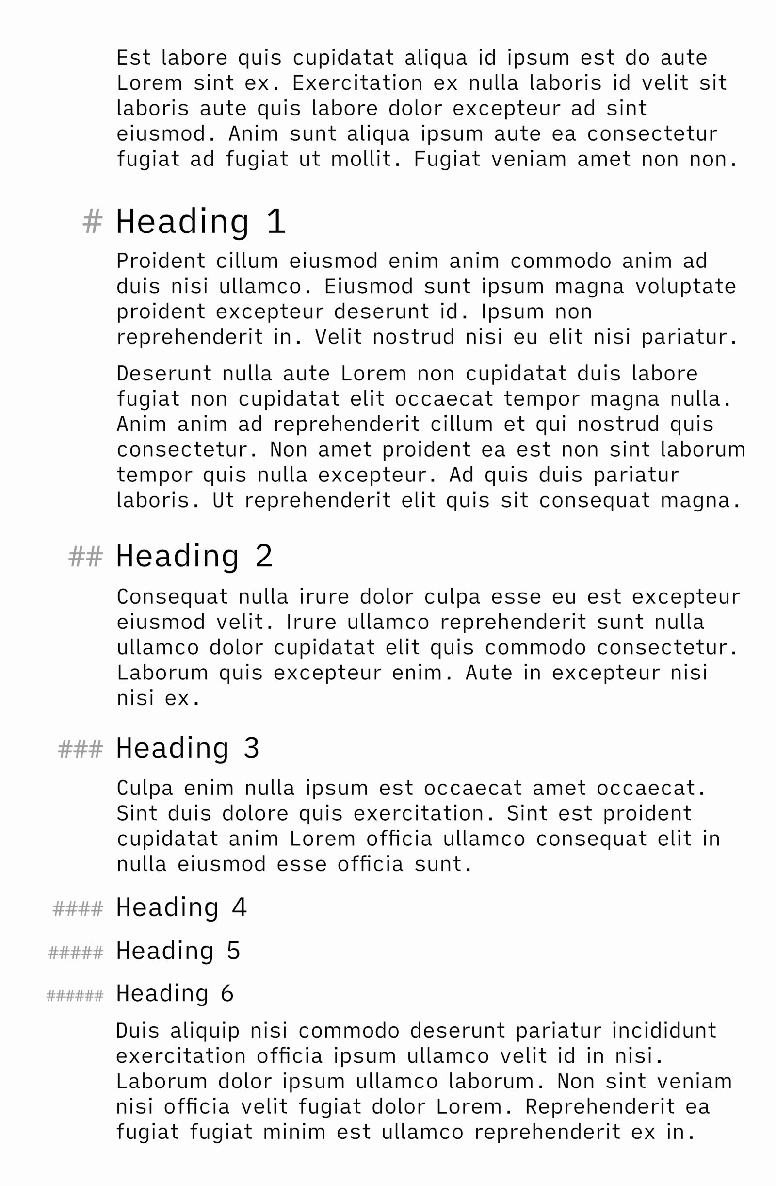
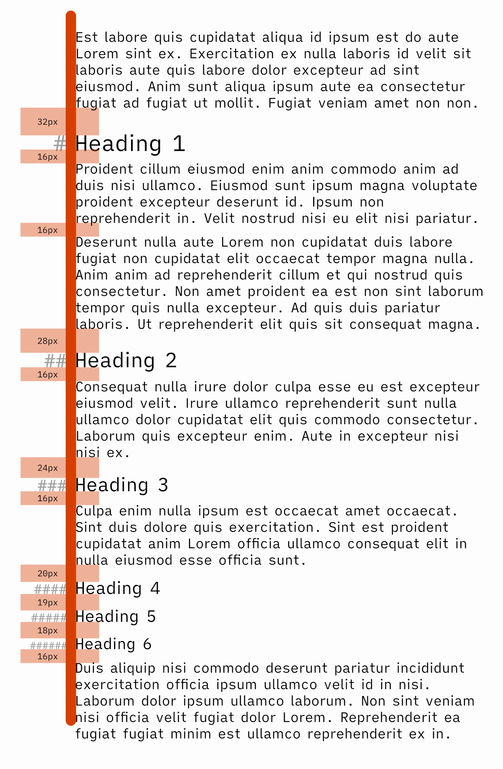
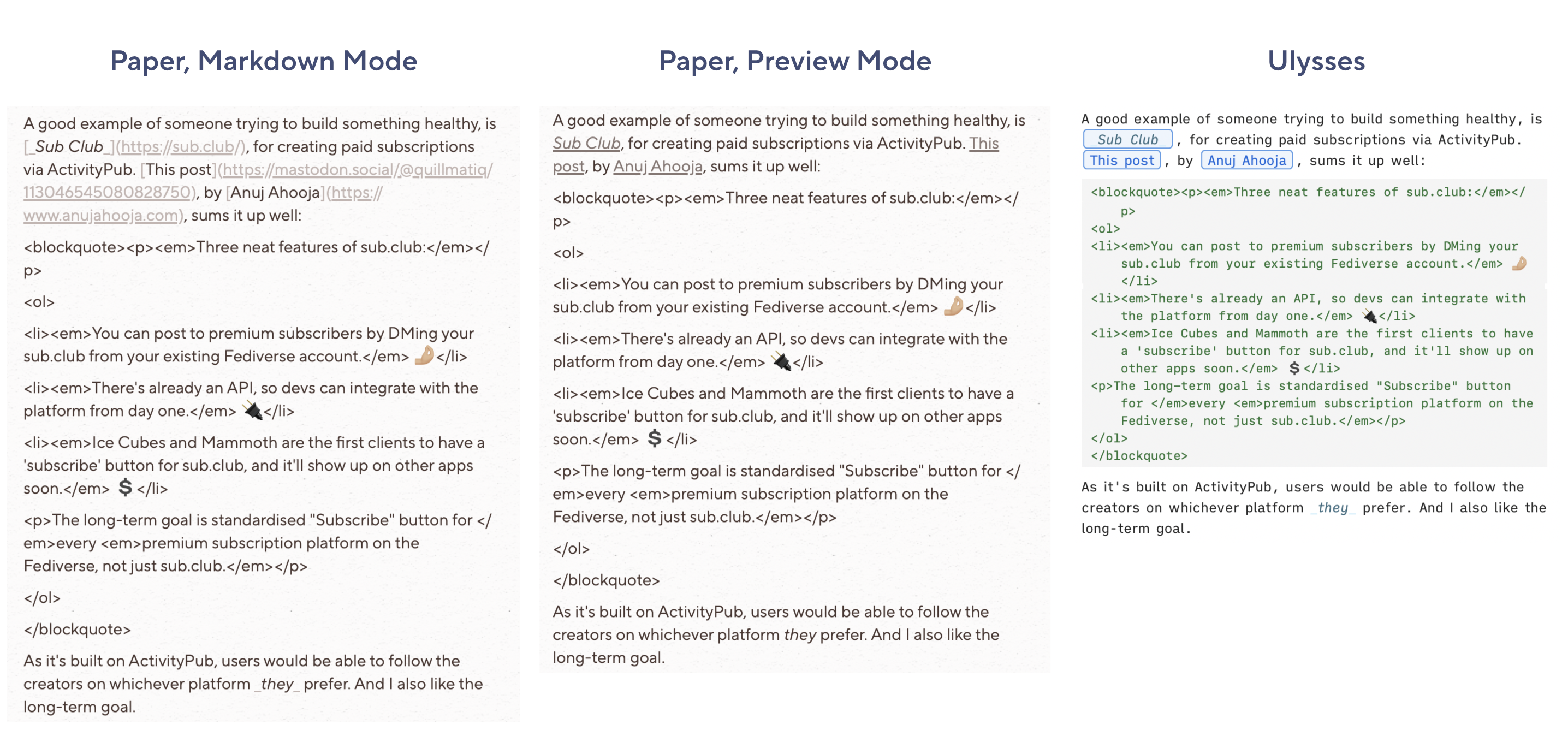
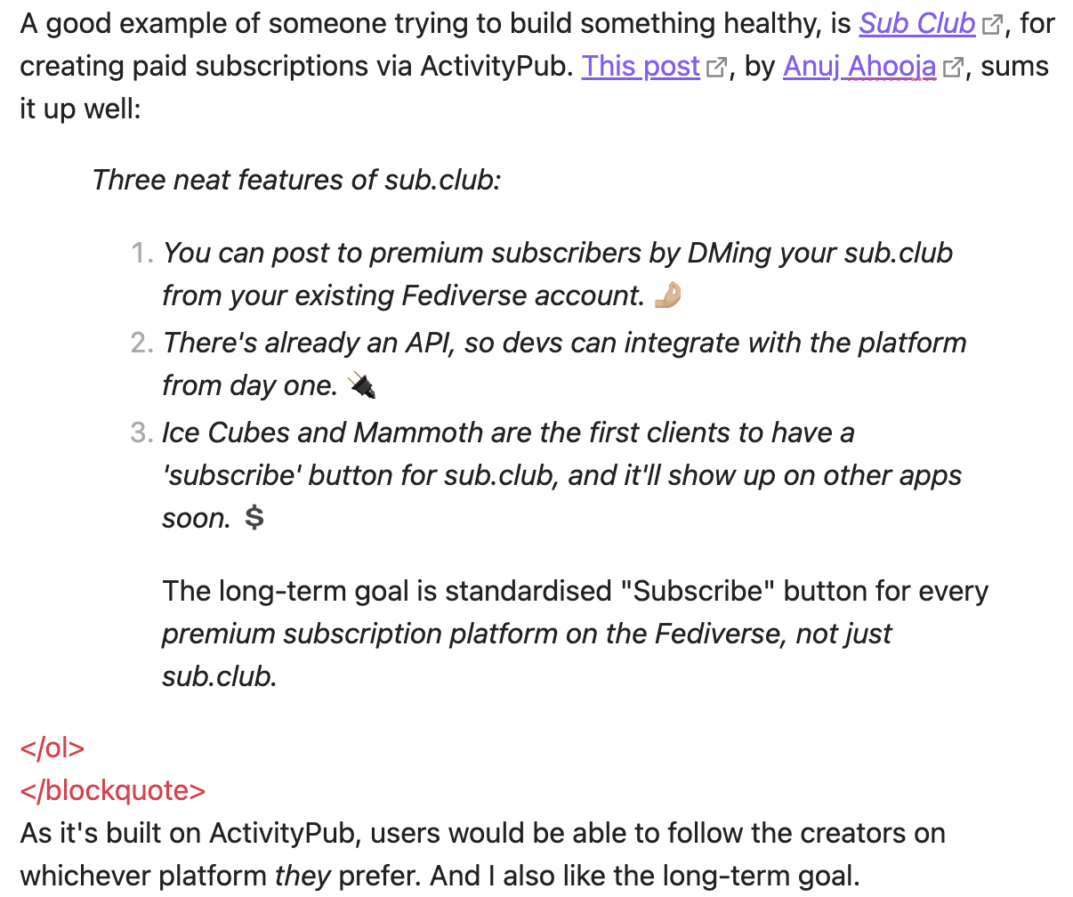
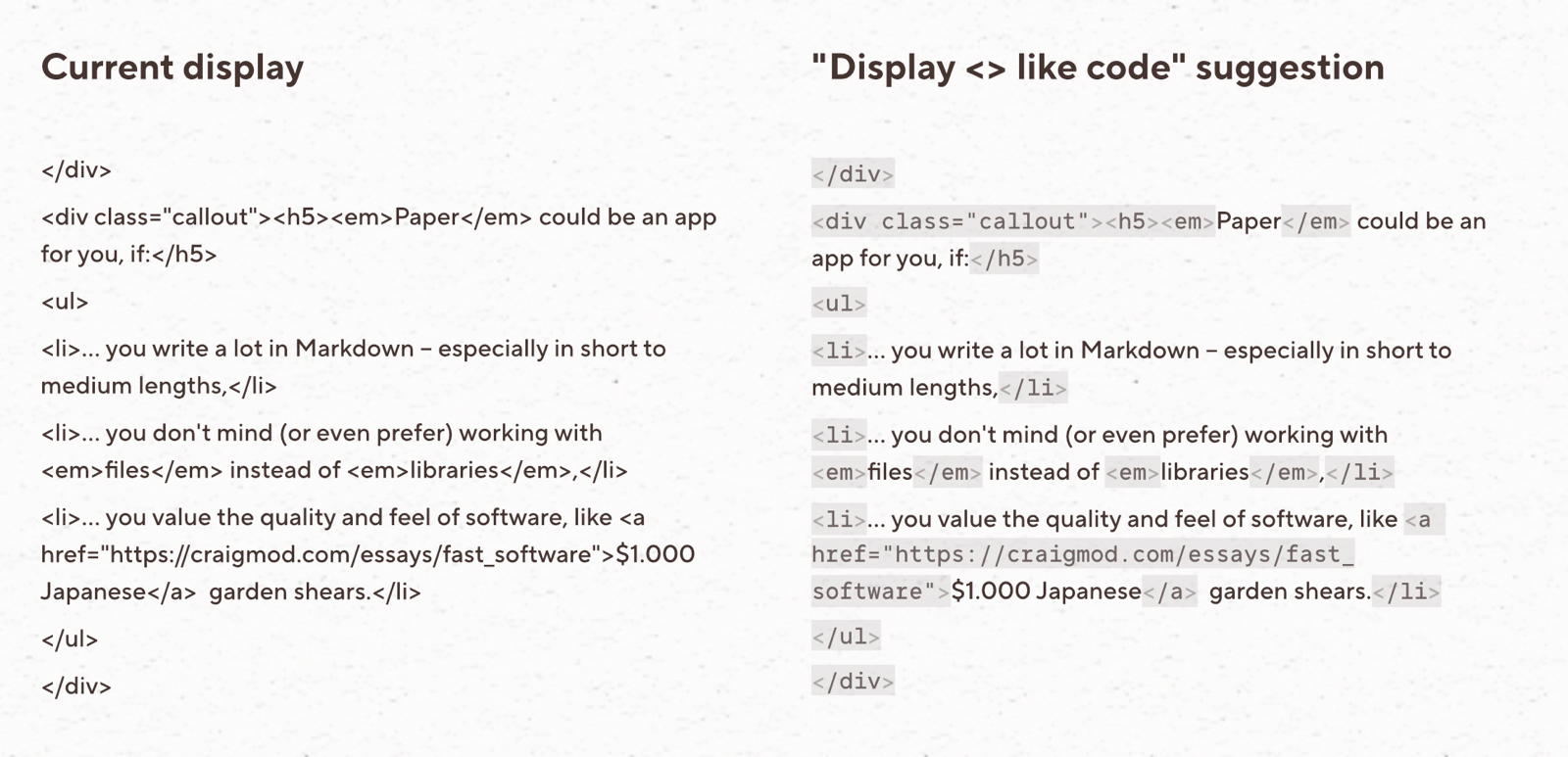
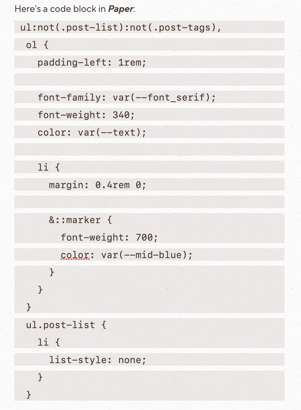
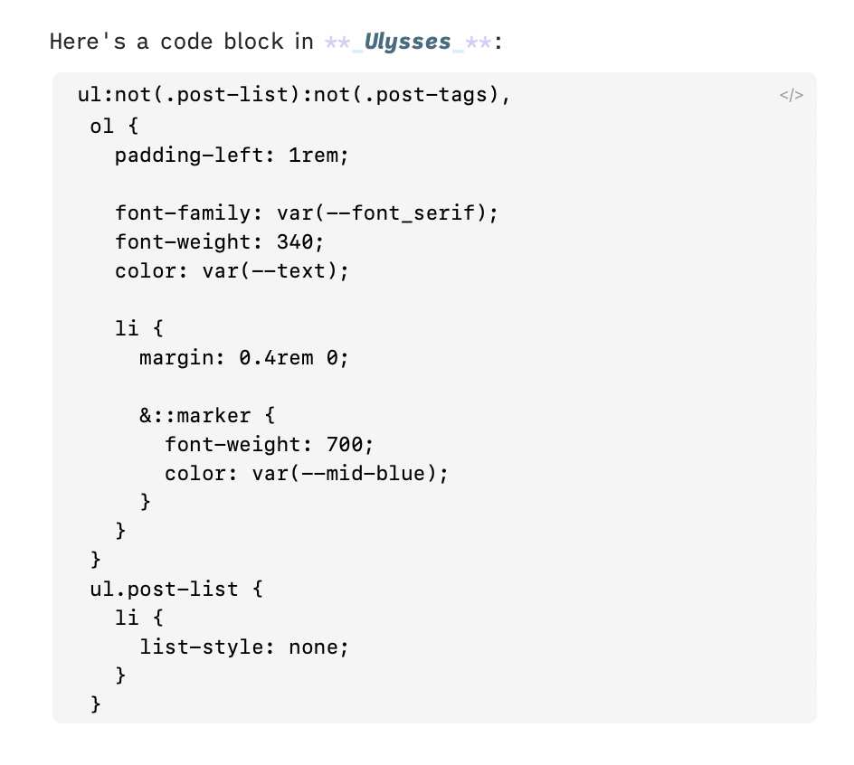
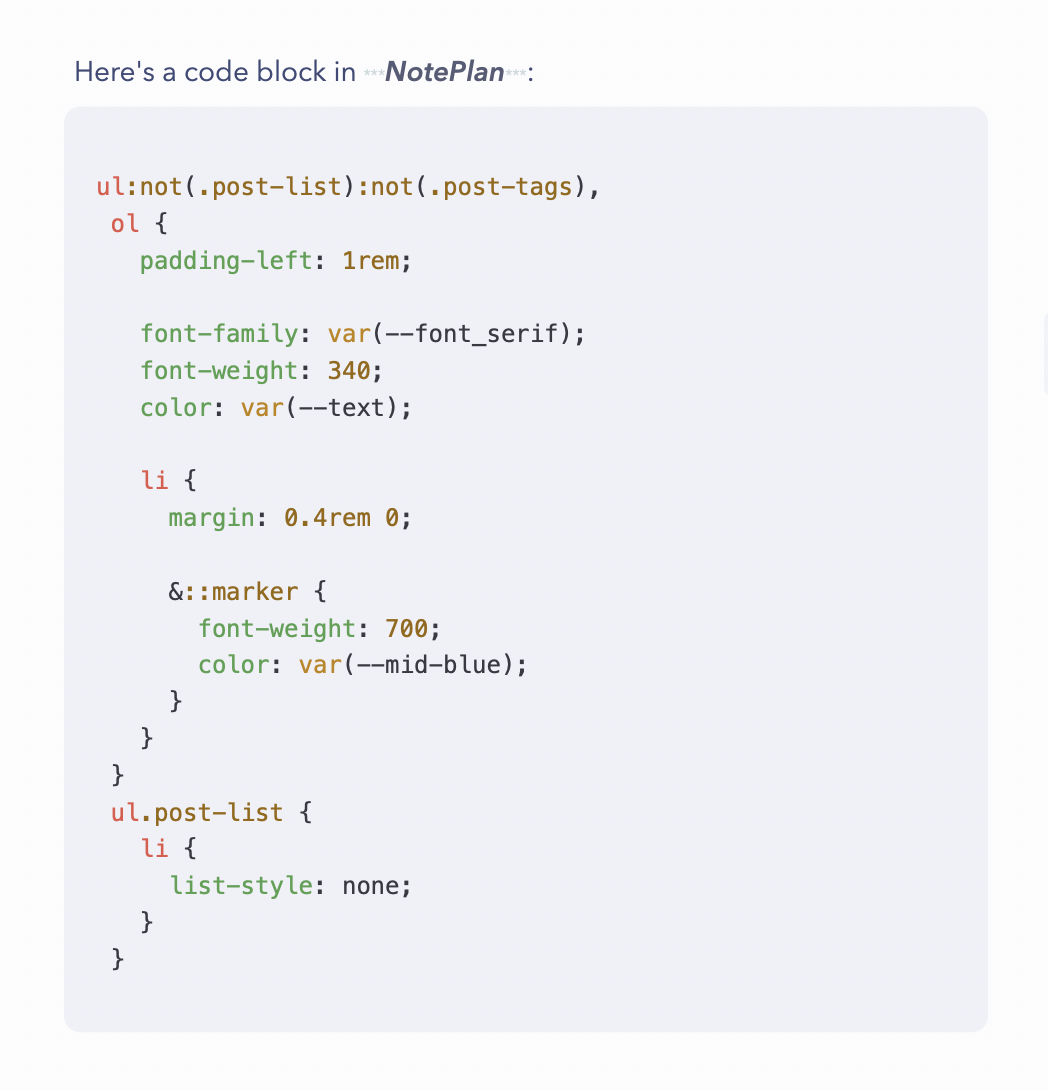
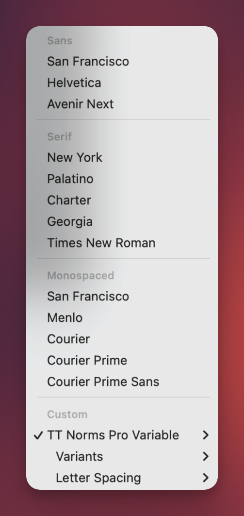

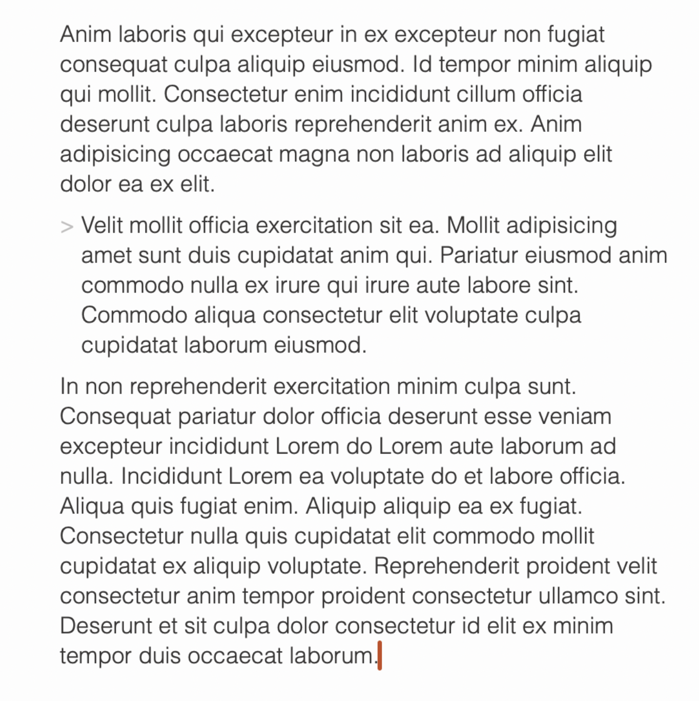
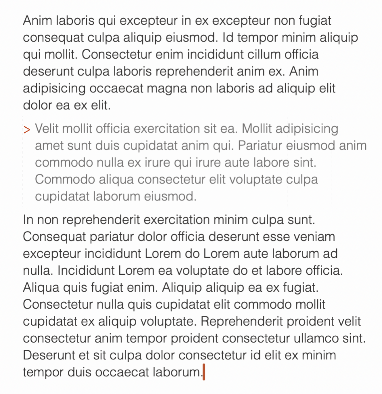
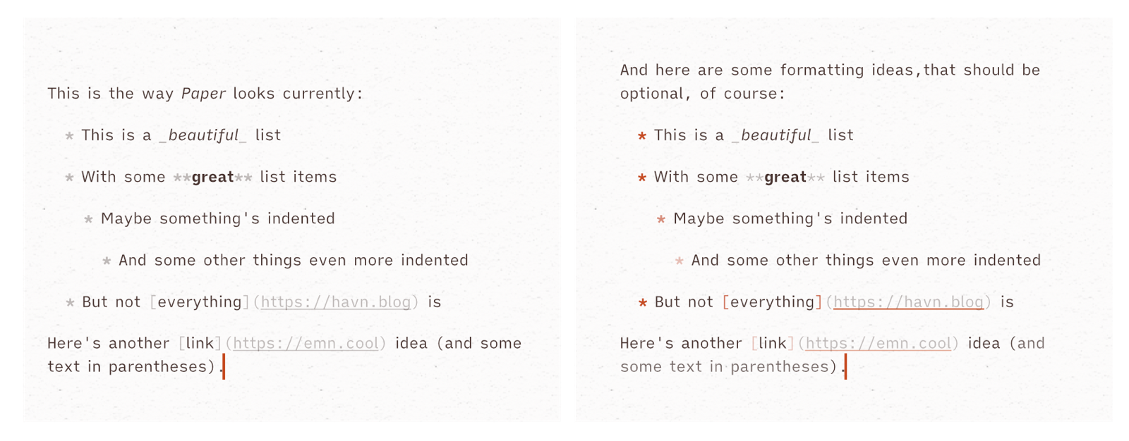
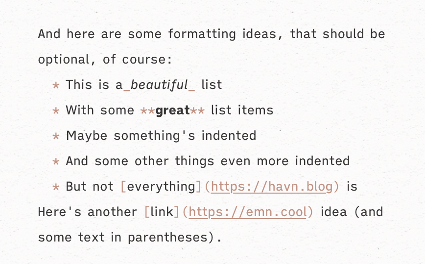


